PS5 UI revealed — and it actually looks next-gen
PS5 user interface should make getting to your games even faster

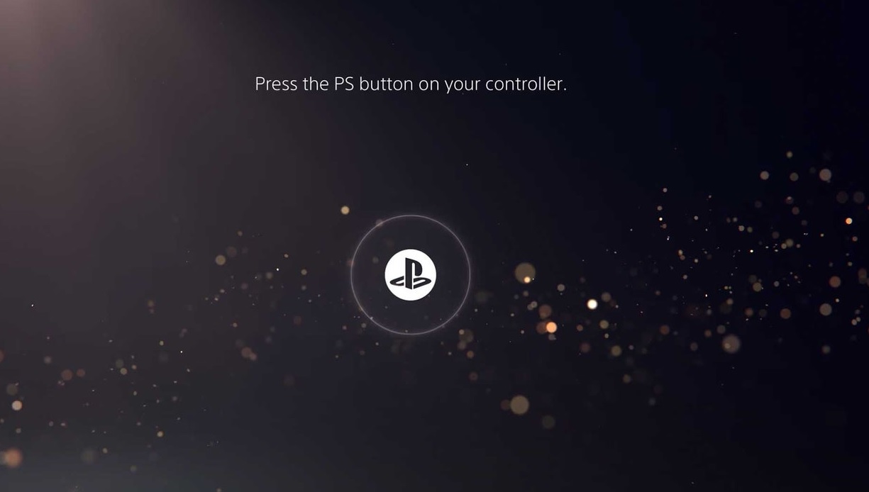
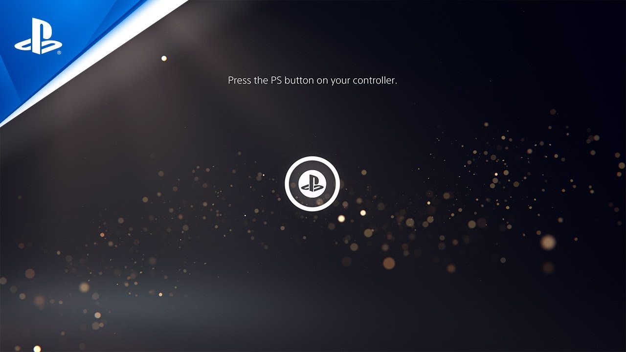
Less than a month away from the PS5's launch, Sony had finally revealed its next-generation console interface in a 12-minute long video that deep-dives into the UI.
Information comes from the official PlayStation Blog, where Hideaki Nishino, senior vice president of platform planning and management, detailed a few key points about the UI and linked to the much-longer video. If you want to watch the whole thing yourself, you can find it below.
- PS5 release date, price, specs, controller and news
- PS5 vs. Xbox Series X: Specs, price, exclusives and more
- Plus: PS5 DualSense controller teardown just revealed its killer feature
Nishino detailed how the the PS5’s user interface will differ from what the PS4 offered. The bottom line is that switching between apps will be easier, as will finding optional challenges in whatever game you’re currently playing.
A feature called “Control Center” is at the heart of the UI. If you press the PlayStation button on the DualSense controller, you’ll be able to access a whole bar of options, which include your profile, notifications, friends list, music, headset volume, microphone settings, controller battery and more. At first glance, this isn’t radically different from what was on the PS4, except it’s now in an unobtrusive bar at the bottom of the screen, rather than an enormous display on the left side.
What’s more different — and more interesting — is the Activities panel, which will pop up whenever you’re in a game. This displays a series of “cards” with various challenges that you can complete in the game, as well as approximately how long each one will take. You can even select many activities to get hints about them, up to and including watching videos on how it’s done. You’ll even be able to pin these videos to your screen to watch while you play, and try to replicate what you see.

Eagle-eyed readers may remember that we got a sneak preview of this feature way back in May, when we learned about a Sony patent for an “in-game information platform.” This is essentially what Sony was describing: a series of in-game prompts that could direct you toward challenges, tell you how long they would take, and give tips on how to complete them.
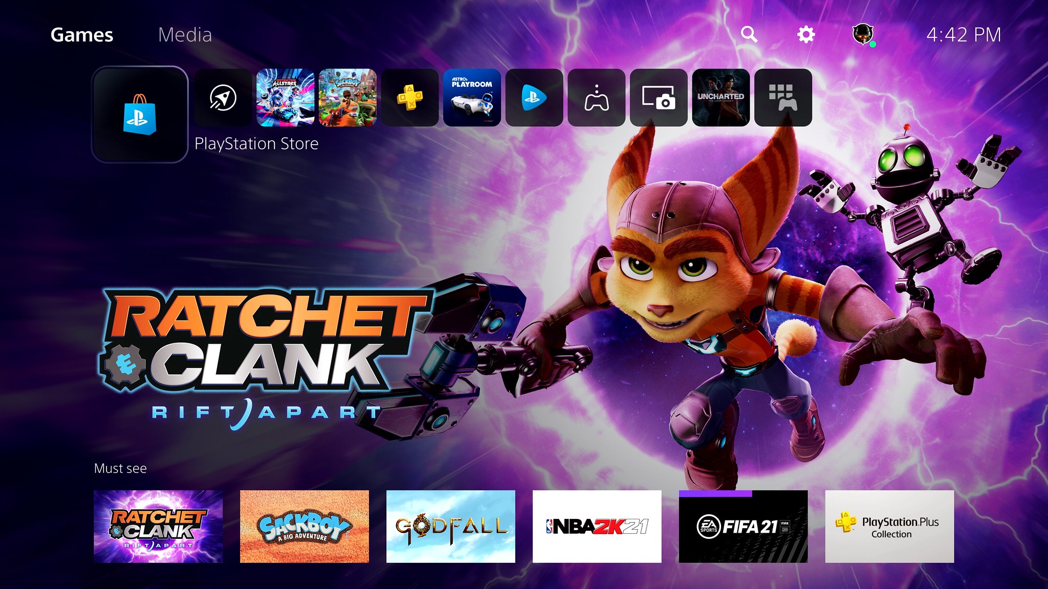
The rest of the features are fairly straightforward: joining voice chats, taking screenshots and so forth. We did get to see the main screen, however, which relies on scrolling horizontal bars, like the PS4 did. Each app will have its own “hub,” including a background picture that takes up the whole screen, which should make the interface a little more dynamic than PS4’s “blue-on-white” for everything.
Sign up to get the BEST of Tom's Guide direct to your inbox.
Get instant access to breaking news, the hottest reviews, great deals and helpful tips.
The UI will receive a few more tweaks between now and launch, and continue to improve over time after that. Still, the PS4 home screen doesn’t look drastically different now than it did seven years ago, so maybe the PS5’s interface will remain similarly consistent. Overall, the PS5 interface is looking like a big improvement over its predecessor, and with features like in-game tips and activities, could even change the way we play games.
Marshall Honorof is a senior editor for Tom's Guide, overseeing the site's coverage of gaming hardware and software. He comes from a science writing background, having studied paleomammalogy, biological anthropology, and the history of science and technology. After hours, you can find him practicing taekwondo or doing deep dives on classic sci-fi.


