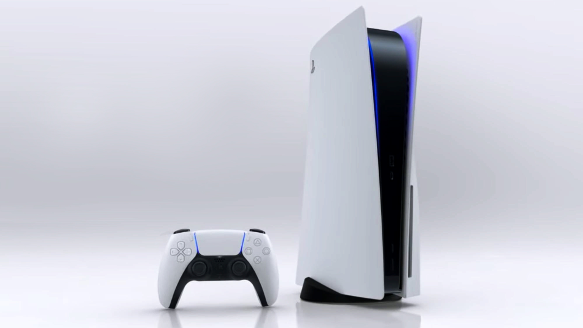
PS5 interface getting a huge overhaul with 'no pixel untouched'
The PS5 interface will prize function over form

Although we’ve seen the PS5’s physical design and a big chunk of its game library, we still have a few big questions: When will it come out? How much will it cost? And what will the system’s interface look like? We finally have a little information on the last question, courtesy of Matt MacLaurin, vice president of UX design at PlayStation.
MacLaurin has revealed small tidbits about how the PS5’s home screen and menus will work — and, believe it or not, we’ve already seen our first glimpse of it in action.
- PS5: Release date, price, specs, games and more
- PS5 vs. Xbox Series X: Which console will win?
- Plus: PS5’s most impressive new game is Ratchet & Clank — here’s why
Information comes from a LinkedIn thread where MacLaurin took questions from other industry professionals and, somewhat amazingly, answered the vast majority of them. Most of MacLaurin’s responses were short and cryptic, but his comments on the PS5’s interface gave us a good hint of what to expect.
A fellow UX designer asked MacLaurin about Sony’s plans for the UI. MacLaurin replied:
“It’s a very interesting evolution of the OS; more subtle than flashy but no pixel is untouched.”
In other words: We don’t know exactly what the PS5 interface will look like, but we do know that it won’t just be a flashier version of the PS4’s. This is perhaps not the most surprising news, but it does mean that Sony is sticking with its “function over form” interface strategy from the PS3 and the PS4.
Another designer asked if MacLaurin could share any screenshots from the OS.
Sign up to get the BEST of Tom's Guide direct to your inbox.
Get instant access to breaking news, the hottest reviews, great deals and helpful tips.
“There is an easter-egg-level reveal in the video,” MacLaurin wrote. Indeed, if you watch the PS5 conference video closely, there is a small segment in which we see a cascade of lights across a gray screen, followed by a prompt to press the PS button to start the system. Presumably, this is the PS5’s startup screen. The cascade effect was reminiscent of the PS3’s interface.
While the PS1 and PS2 had very limited interfaces (basically either “play the disc” or “don’t play the disc”), the PS3 had to manage disc games, downloadable games, streaming media, online connectivity and connecting with Sony’s handheld consoles. The PS4 has to do most of the same things, plus Remote Play and VR interfaces. As such, both the PS3 and the PS4 relied on scrollable horizontal menus to present options in a straightforward, uncluttered way. Neither the PS3 nor the PS4 has a particularly gorgeous interface, but they do make it easy to find your games and media.
A single startup screen isn’t much to go on, but we can infer a few things from it, as well as MacLaurin’s comments. The interface may not look just like the PS4’s, but it will probably keep the PS4’s streamlined, utilitarian approach. With more PS5 announcements and showcases expected in the lead-up to the console's holiday release, we should get our first official look at the interface sooner than later.
Marshall Honorof is a senior editor for Tom's Guide, overseeing the site's coverage of gaming hardware and software. He comes from a science writing background, having studied paleomammalogy, biological anthropology, and the history of science and technology. After hours, you can find him practicing taekwondo or doing deep dives on classic sci-fi.

