Nothing Phone (1) design hands-on — now this is different
Nothing's first smartphone is pretty flashy

Starting price: £399
Storage: 128, 256
Battery size: 4500 mAh
Screen size: 6.55 inches
Resolution (ppi): 2400 x 1080 (402)
Adaptive refresh: Up to 120Hz
Processor: Qualcomm SnapdragonTM 778G+
Rear cameras: 50MP (Main, Ultra Wide)
Front camera: 16MP
Colors: White, Black
Size: 6.3 x 3.0 x 0.3 inches
Weight: 6.8 ounces
Water resistance: IP53
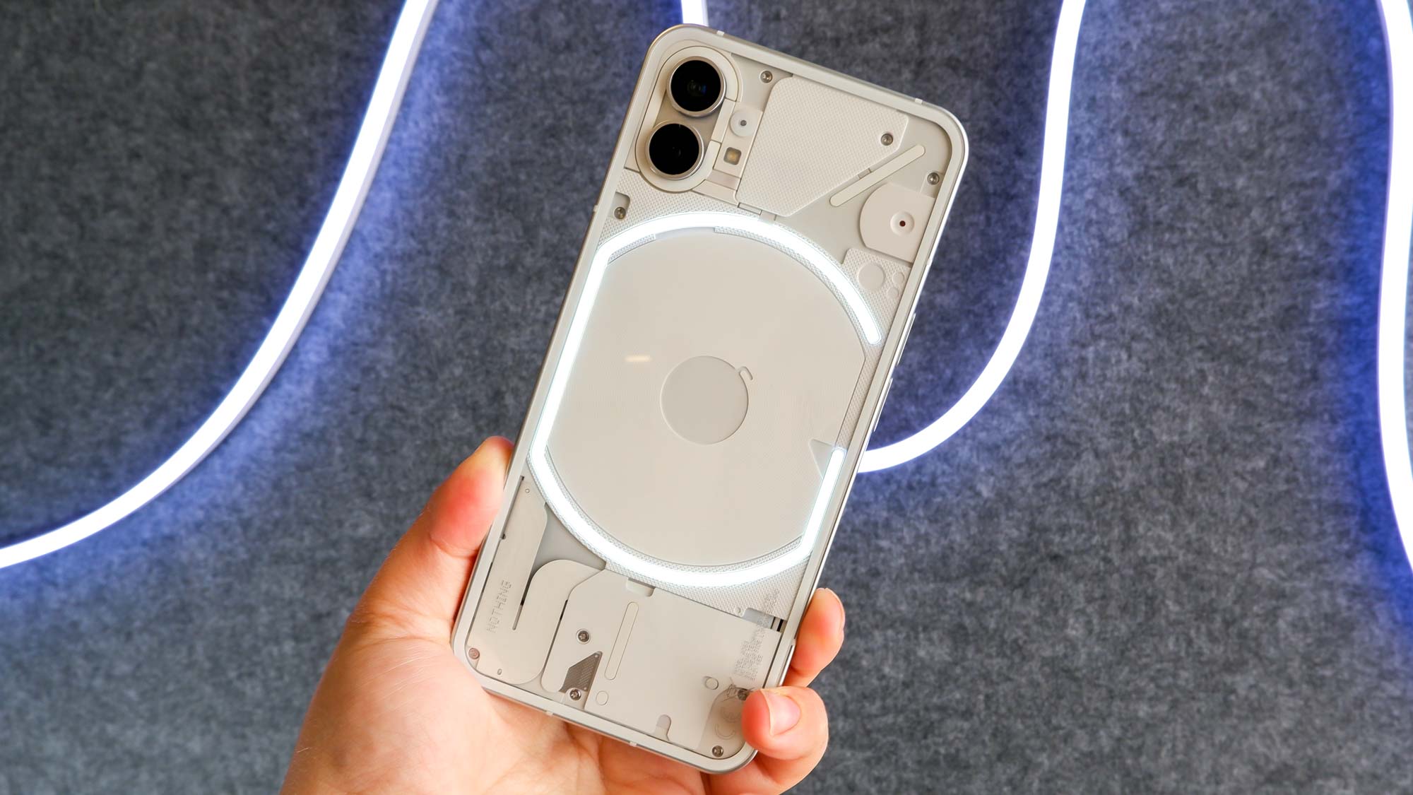
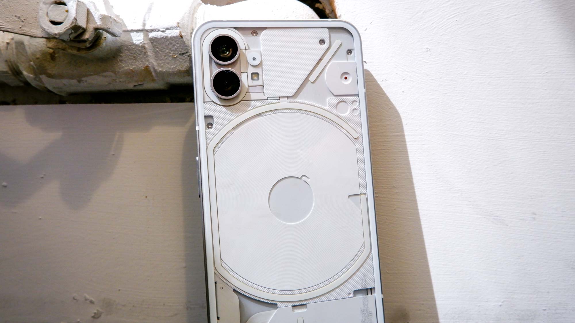
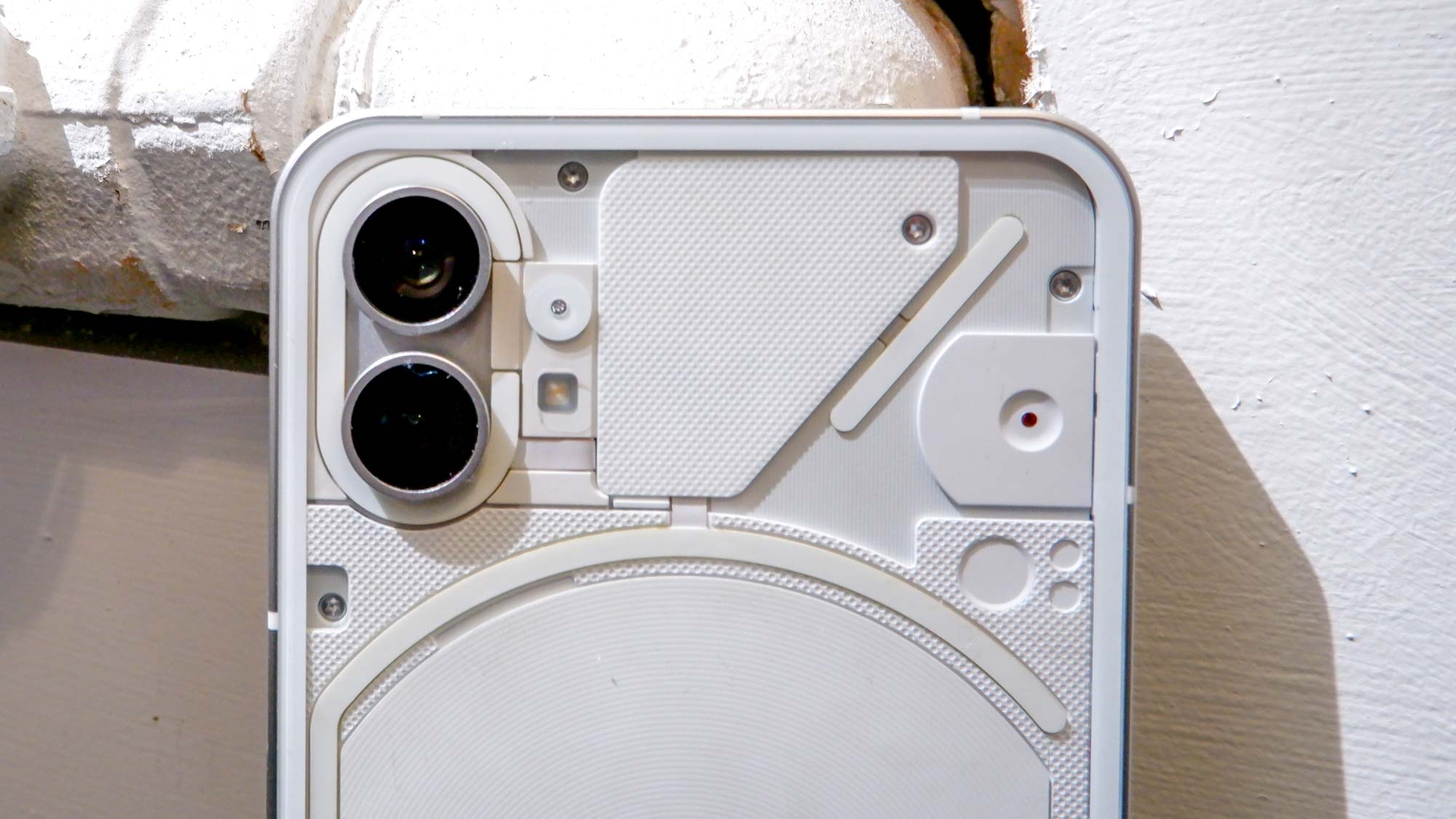
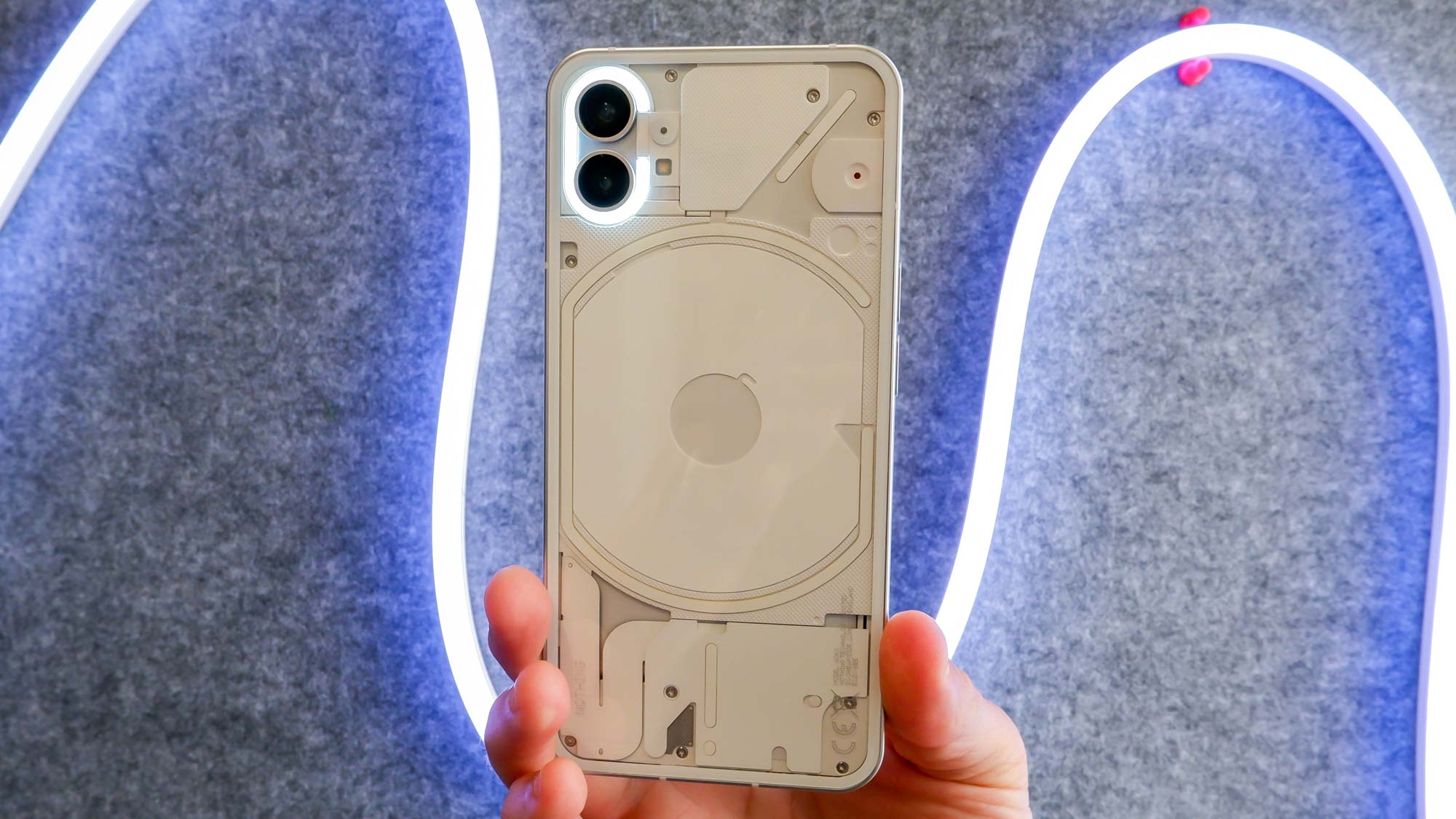
I haven’t seen a smartphone like the Nothing Phone (1) before, but I also have. (there is also a new accessory can make your iPhone look like the Nothing Phone (1)!) The transparent back illuminated by LEDs is eye-catching and even a little eccentric, but after spending a bit of time with the device, some of the handset’s design also feels very familiar.
Officially launched on July 12, the Nothing Phone (1) is the first smartphone from Nothing Inc. The newcomer bravely enters the market against the best phone flagships — so how does it plan to prevail? With a bold, see-through design that incorporates LED lights. You could say Nothing’s smartphone debut is pretty flashy.
Yet the flat-sided casing with a home button on the right and volume rockers on the left screams iPhone. I have no issue with the iPhone design, but the resemblance is so palpable that I, on multiple occasions, couldn’t quickly tell an iPhone 13 Pro Max from the Nothing Phone (1) with both devices face up.
@tomsguide ♬ Summer day - TimTaj
Still, I found a freshness in the experience of unboxing Nothing’s smartphone (which you can see if you follow Tom's Guide on TikTok.) Maybe it was the onslaught of puns the phone’s name alone attracts, or perhaps it was the way the device slipped out of the box, revealing the curiously transparent rear.


With any design-forward device, there’s always the concern of the enchantment wearing off. Or worse, being overshadowed by flaws in performance or software. We need to run our usual set of tests, analyze camera comparisons and see how the Nothing Phone (1) holds up in day-to-day use before coming to any conclusions.
But in my short time with Nothing Phone (1) there’s one design feature in particular that stood out. And it’s certainly one neither the iPhone, nor any of the best Android phones, have.
Nothing Phone (1) design hands-on — Glyphs

In a similar way to how the Samsung Galaxy Fold and Samsung Galaxy Z Flip have attention-grabbing designs at first, flaunting the magic of foldable displays, the Nothing Phone (1)’s LED lights promise a spectacle.
Sign up to get the BEST of Tom's Guide direct to your inbox.
Get instant access to breaking news, the hottest reviews, great deals and helpful tips.
The light show is powered by a system Nothing calls Glyphs, which can be found in the settings of Nothing OS. Nothing OS is a fairly standard Android skin, and simple to navigate. Even after holding the phone for just a few minutes, I found the Glyph settings quickly.
Glyphs are different series of light flashes that appear on the back of the Nothing Phone (1) based on your assignments. You can assign certain glyphs to your chosen contacts and app notifications the same way you set preferred ringtones based on incoming alerts.
Yet unlike a smartphone flashlight, the LEDs aren’t overly bright or arresting. So if you’re holding up the phone when a Glyph launches, people around you shouldn’t feel like you’re flashing a light in their eyes. I think in a dark movie theater, the glyphs could be annoying if you've forgotten to silence notifications, but in natural sunlight or in lit rooms, the lights are actually subtle.
The way the lights are tamed demonstrate thoughtful design, because even if flashy lights on the back of the phone might sound cool, you wouldn't hear "oohs and ahhs" if a Glyph distracted a meeting.
We'll need to spend more time seeing how much we like the Glyph-based alert system, but it's safe to say our initial experience has left us curious.
Nothing Phone (1) outlook
When an all-new phone enters the competition, there's a lot it has to prove. It seems many were hopeful the Nothing Phone (1) design would truly be unlike anything out there, but we're not sure we can say that's the case. The overall shape and flat-edges aren't unique, so it's up to the transparent backs and LEDs to impress.
Of course, things like camera performance, battery life and display responsiveness have just as much chance at making or breaking Nothing's first smartphone. Expect more on that soon.
The Phone (1) is available in both white and black starting at £399 for the 8GB/128GB configuration and going up to £499 for the 12GB/256GB configuration. Sales start on July 21, 2022.
Next: The Nothing Phone (1) is off to a good start but it's got to fix this and this new accessory can make your iPhone look like the Nothing Phone (1).
Kate Kozuch is the managing editor of social and video at Tom’s Guide. She writes about smartwatches, TVs, audio devices, and some cooking appliances, too. Kate appears on Fox News to talk tech trends and runs the Tom's Guide TikTok account, which you should be following if you don't already. When she’s not filming tech videos, you can find her taking up a new sport, mastering the NYT Crossword or channeling her inner celebrity chef.

