Tom's Guide Verdict
An admirable first try at a smartphone, the Nothing Phone (1) is a mid-range device with some heart. While it lacks performance and camera gusto, it makes a statement with a revised take on the familiar iPhone-like design. Starting at £399 for the base model, the Phone (1) might be worth considering if you’re looking for something new.
Pros
- +
Nice display
- +
Good battery life
- +
Glyphs seem like more than a gimmick
- +
Four years of security patches
Cons
- -
Mediocre performance
- -
Underwhelming cameras
- -
Hollow haptic engine
- -
No U.S. availability
Why you can trust Tom's Guide
Price: Starting at £399
Android version: 12, Nothing OS 1
Display: 6.55-inch OLED (2400 x 1080)
Refresh rate: 120Hz
CPU: Snapdragon 778G+
RAM: 8GB, 12GB
Storage / Expandable: 128GB, 256GB / No
Rear cameras: 50MP (f/1.8) main, 50MP (f/2.2) ultrawide
Front camera: 16MP (f/2.5)
Battery: 4,500 mAh
Battery life (Hrs:Mins): 10:50 (Adaptive), 12:57 (60Hz)
Charging: 33W, charger not included
Size: 6.3 x 3 x 0.3 inches (159.2 x 75.8 x 8.3 mm)
Weight: 6.9 ounces (193.5 g)
Colors: Black, white
Update: The first rumors of the Phone (2)'s upgrades have surfaced.
After much teasing and fanfare, the Nothing Phone (1) is here. I’ll be honest, I’ve been looking forward to this one. While I resisted the hype and went into this review with a healthy dose of skepticism, I was nonetheless excited to see the latest smartphone from OnePlus co-founder Carl Pei.
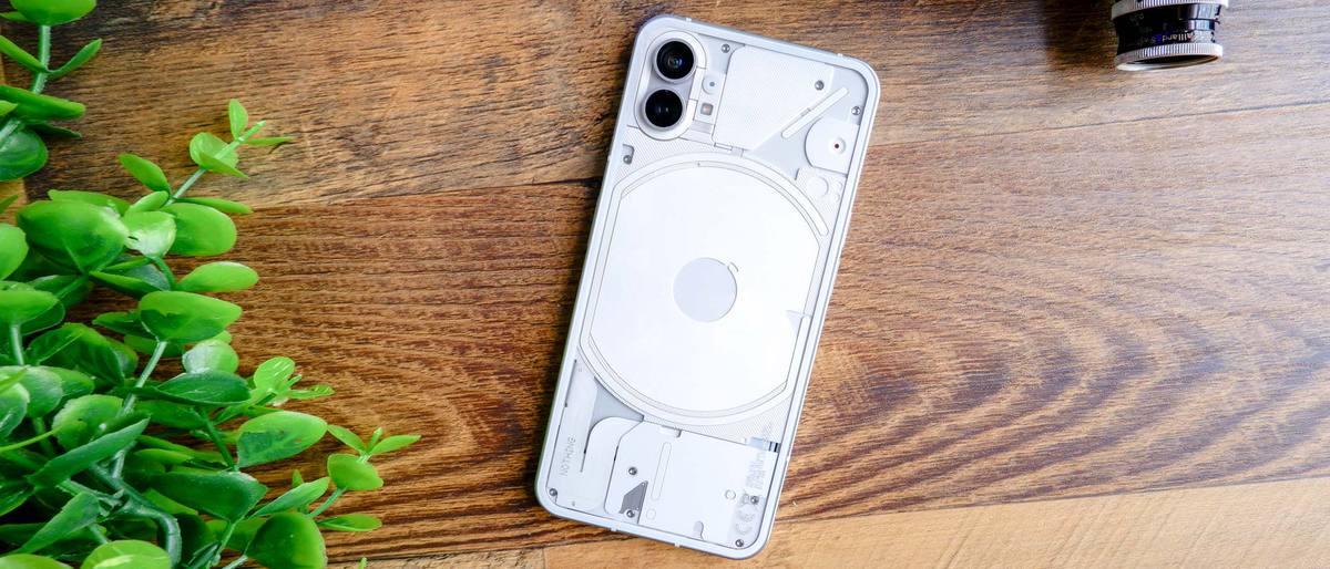
The result ends up a mid-range device with a very familiar yet eye-catching design. The Phone (1)’s claim to fame are its glyphs, white LED strips that create a sort of branching C pattern. More than just flair, they add both personality and utility to the Phone (1). As unique as the glyphs are, however, the Phone (1) otherwise looks almost exactly like a slightly larger iPhone 12. From the frame to the buttons and camera module, the inspiration for this phone is never a mystery.
In this Nothing Phone (1) review, I’ll break down why I think this phone is a strong start, even if the excitement doesn’t go beneath the surface.
Nothing Phone (1) review: Price and availability
The Nothing Phone (1) is available in the UK, EU, Japan and India only. Nothing does not have plans to sell it in the US, so if you decide to import one, you will probably run into issues with proper cell phone bands on the US carriers. We managed to get some support on T-Mobile, but Verizon is likely a no-go. However, Pei has since announced that Nothing Phone (1) will begin U.S. testing in 2023.
The base model with 8GB of RAM and 128GB of storage starts at £399. For £449, you can bump up to 256GB of storage — this is the variant I received for review. Finally, you can upgrade to 12GB of RAM and 256GB of storage for £499. As with the OnePlus handsets of old, the Phone (1) will go up for sale on an invite basis.
The Nothing Phone (1) squares off against the iPhone SE (2022), Galaxy A53 and the upcoming Pixel 6a. While we have to reserve judgment on comparisons to Google’s phone until we get our hands on it later this month, I can safely say that the Phone (1) struggles to match the cheap iPhone in terms of horsepower and cameras. As for Samsung’s mid-range device, the Phone (1) seems to be neck-and-neck with it for the same £399 price.
Nothing Phone (1) review: Design
At first glance, the Phone (1) looks both eerily familiar and unique. The transparent back and glyphs certainly add a novel veneer, but the rest of the device looks like a larger carbon copy of an iPhone 12.
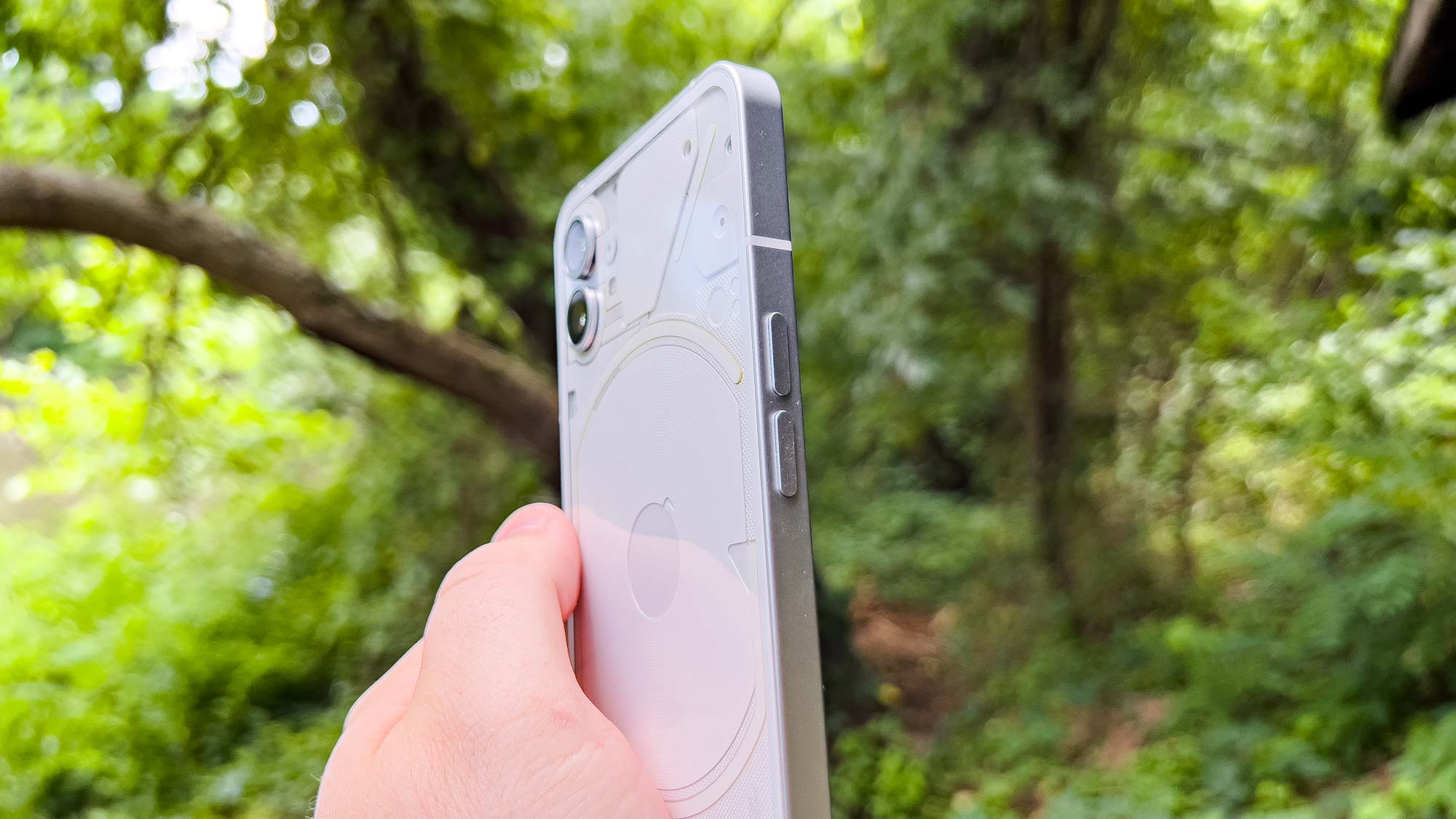
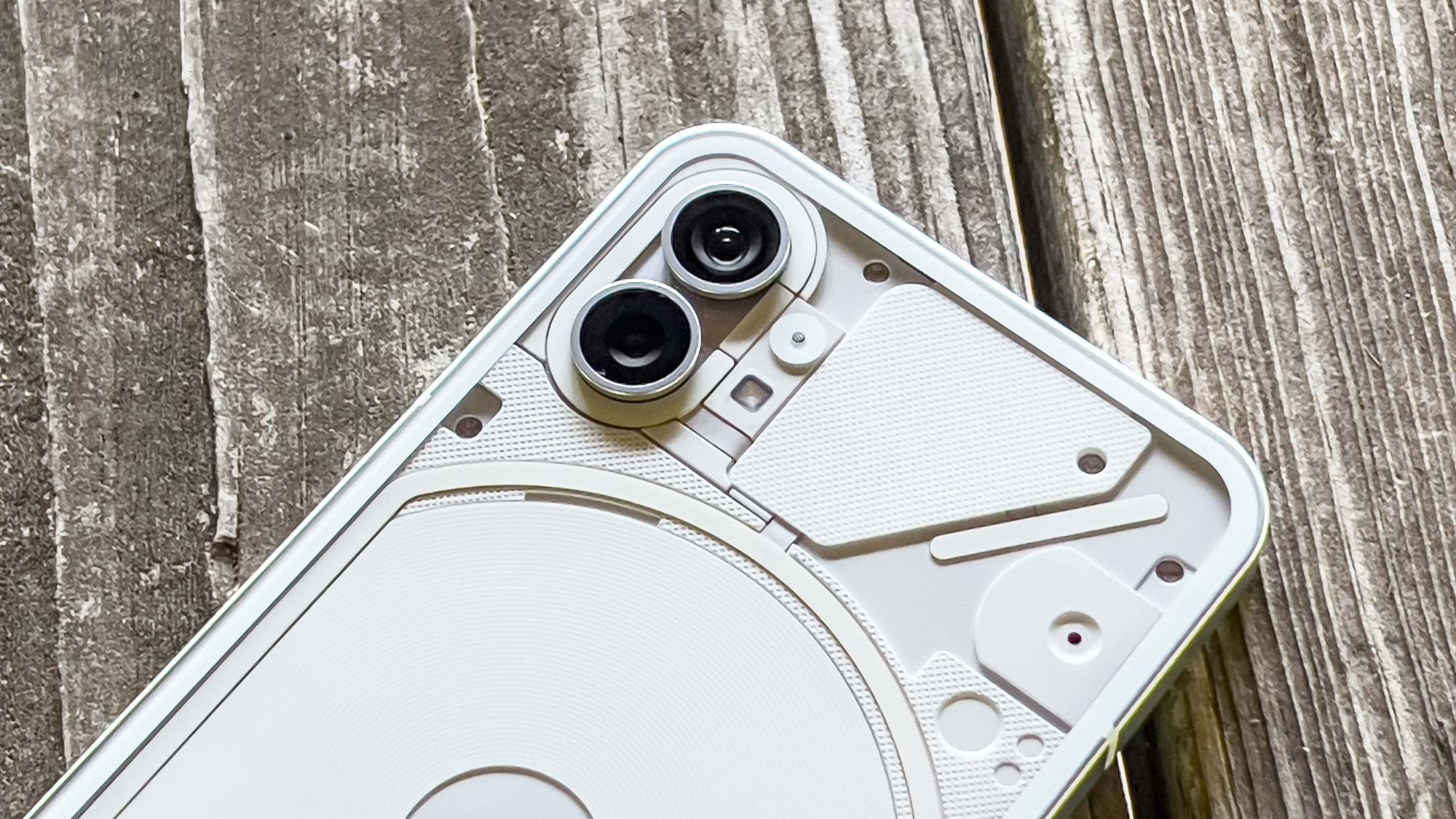
The squared, flat edges immediately scream modern iPhone design. The individual volume buttons look exactly like an iPhone’s, even right down to the placement. The dual camera array appears ripped right off an iPhone 12 and slapped on a transparent module.
From the front with the screen off, the Phone (1) and iPhone 12 are more or less indistinguishable. While it’s fine to take inspiration from other products, I don’t think the Phone (1) wins many points here. I like the transparent back and glyphs, but the phone just screams iPhone when it’s sitting on my desk since I rarely leave a phone lying face-down (though as I’ll get to later, perhaps Nothing intends you to do just that).
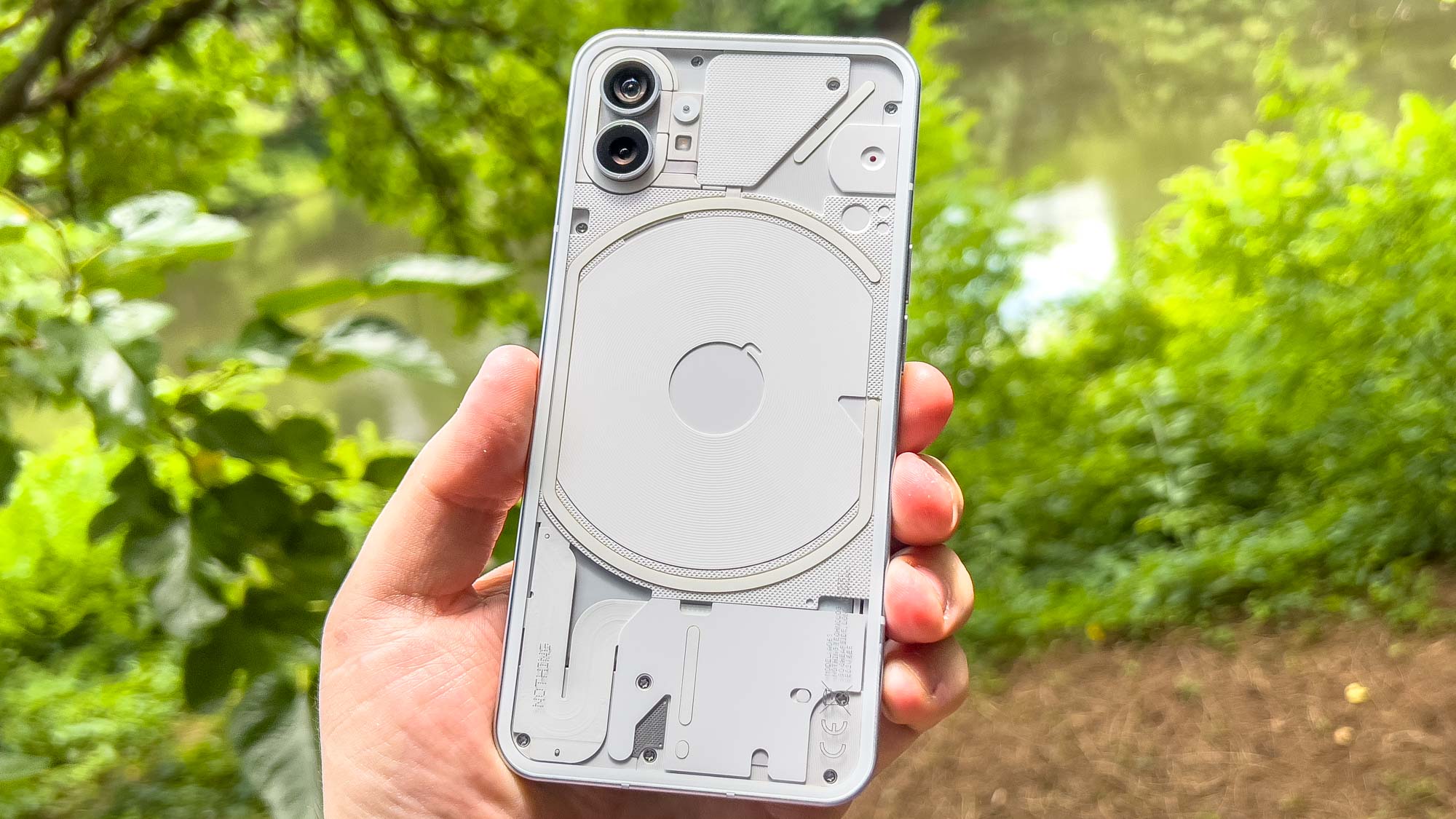
The Phone (1) really tries to stand out with what Nothing calls the glyph interface. Around the center is a C-shaped LED strip that nearly surrounds the wireless charging coil with a similar C around the camera module. Two more strips go out to the sides of the main glyph. All of them get very bright indoors, and they’re even visible outside.
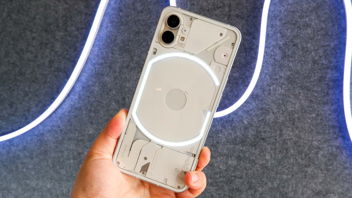
I’ll talk more about what the glyphs actually do in a bit, but they’re the main focus of the Phone (1)’s design. Without them, the handset looks like a copycat.
Nothing Phone (1) review: Display
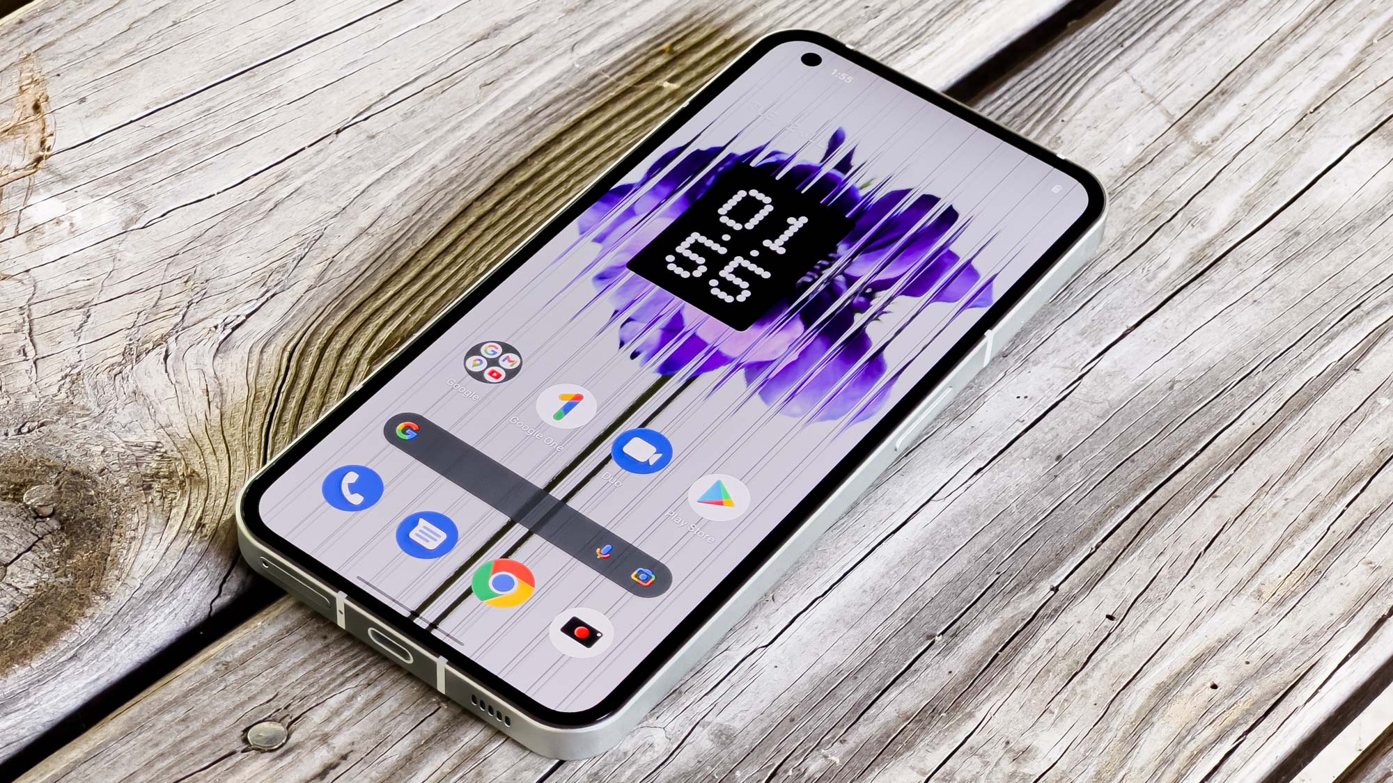
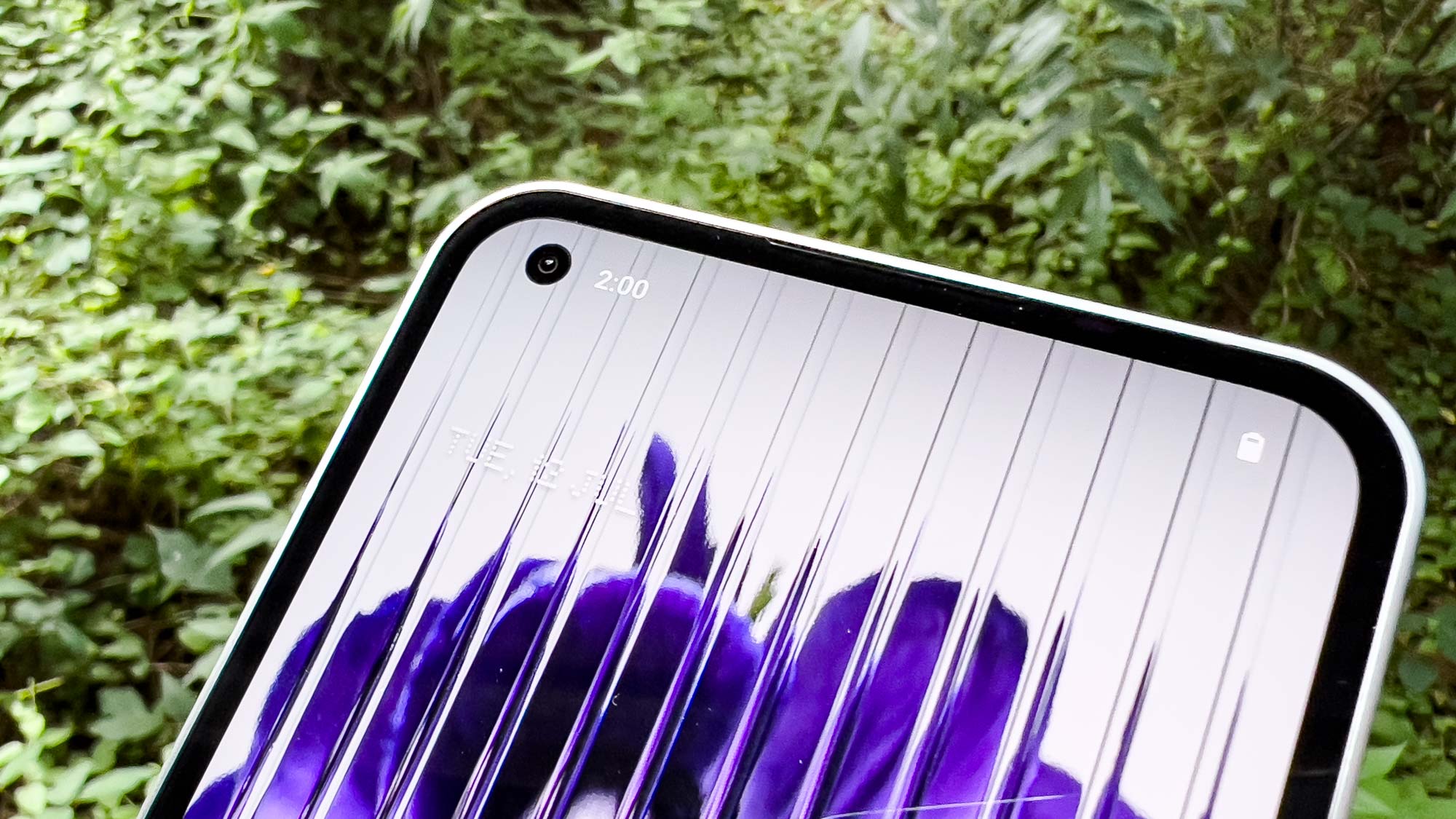
Measuring 6.55 inches, the Phone (1)’s 1080p OLED display impressed me. It has great colors in both its Alive and Standard calibrations, the viewing angles are superb, and the screen gets plenty bright enough indoors. It also sports an adaptive 120Hz refresh rate.
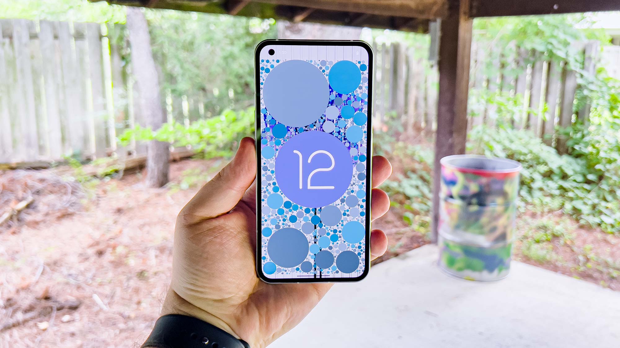
Whether I was watching the grungy ‘90s classic The Matrix, playing the anime-style Genshin Impact, or basking in the vibrant neons of Blade Runner 2049, I really enjoyed the Phone (1)’s display.
Here’s what we measured.
| Row 0 - Cell 0 | Phone (1) | Galaxy A53 | iPhone SE (2022) |
| Display size | 6.55 inches | 6.5 inches | 4.7 inches |
| sRGB (%) | 136 | 204 (Vivid) / 123 (Natural) | 115 |
| DCI-P3 (%) | 96 | 145 (Vivid) / 87 (Natural) | 81 |
| Delta-E | 0.22 | 0.32 (Vivid) / 0.31 (Natural) | 0.21 |
| Peak brightness (nits) | 458 | 693 | 550 |
In the natural color settings, the Phone (1) outpaces both the Galaxy A53’s AMOLED and iPhone SE (2022)’s LCD. It’s right in line with Apple with the Delta-E color accuracy score, where the closer to 0, the more accurate the colors. But we measured a relatively low 458-nit average for the Phone (1) in our lab testing, dimmer than both Samsung and Apple’s mid-range devices. In practice, that meant difficulty seeing the screen outside in sunlight.
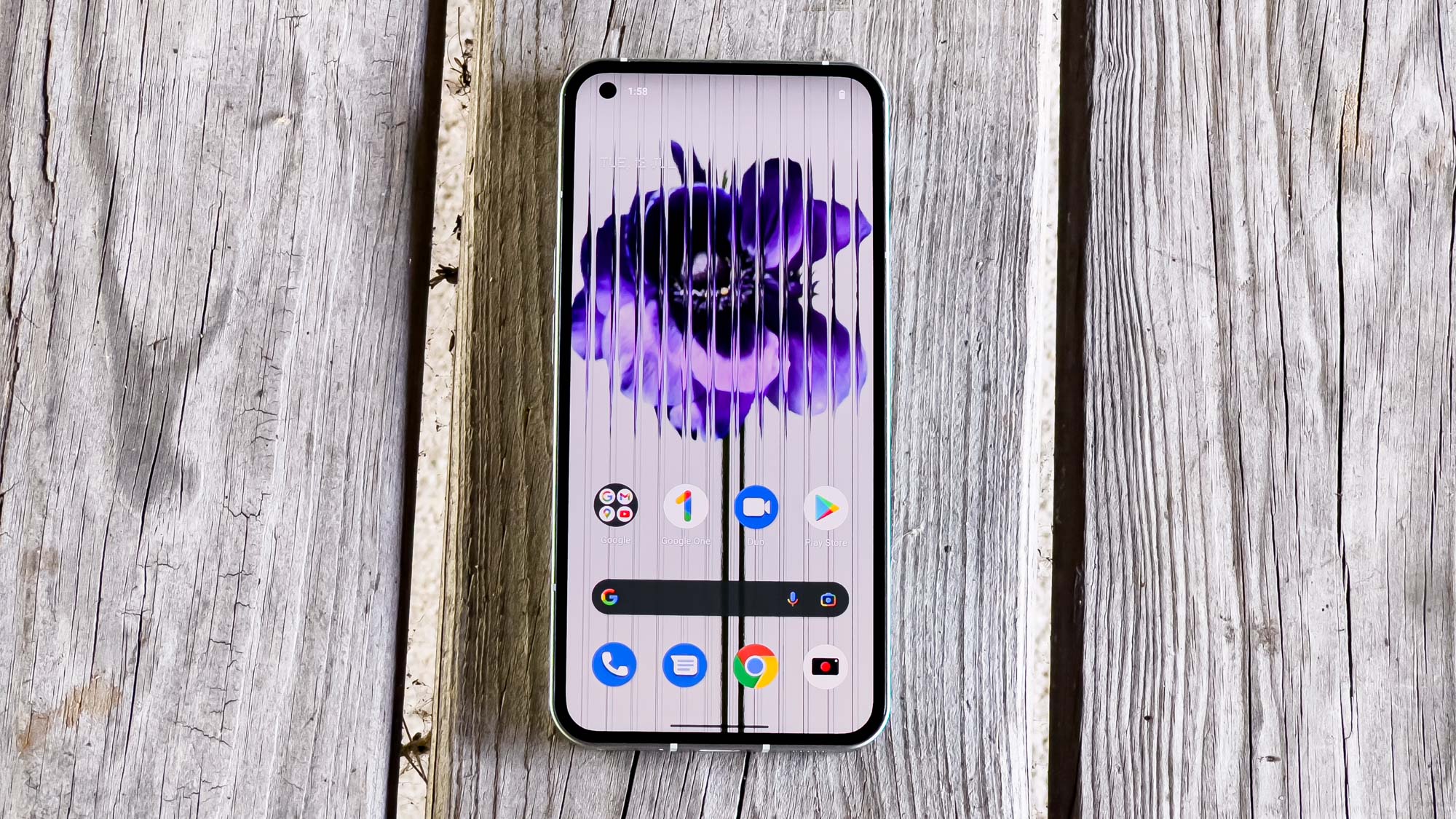
Overall, I think the Phone (1) has an excellent display. It definitely gives the Galaxy A53 a run for its money, but I wish Nothing’s handset offered a brighter screen.
Nothing Phone (1) review: Cameras
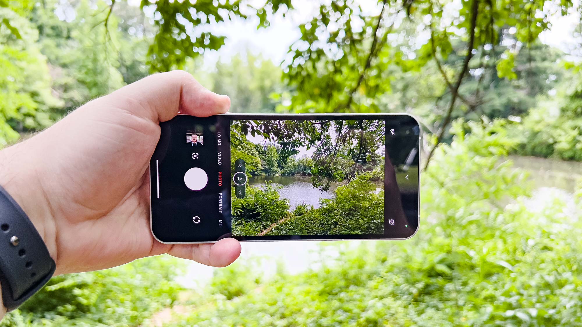
The Nothing Phone (1) features dual 50MP cameras — one wide-angle and the other ultrawide. Though featuring the same 50MP resolution, the main camera uses an IMX766 sensor while the ultrawide is a JN1. Around front is a 16MP selfie cam. So the hardware here is good and time-tested, but the software Nothing incorporates leaves much to be desired.
I brought out the Pixel 5a for our camera face-off, as it may be getting replaced by the Pixel 6a, but it’s still an outstanding camera phone. Starting off outdoors with this photo of my local pond, the differences immediately jump out.
The Phone (1)’s shot looks pale in comparison to the Pixel’s, which features vibrant colors on the vegetation. Shadows on the 5a’s image also look deeper, while the Phone (1) tried to bump up the exposure too much — this is probably why the colors look blown out. The Phone (1) also doesn’t have the same sense of depth that the Pixel has.
Looking at this basket of fruit out in the sun, the Phone (1) once again looks overexposed. It seemed to struggle with the sunlight, leaving subjects that look washed out when held side-by-side with the Pixel 5a’s shot. Google’s budget phone handled the light much better, presenting a toned-down image that looks great despite the harsh environment.
The Phone (1)’s tendency toward overexposure continues indoors with this photo of some of my books. The pinks and reds look washed out, though less so than the colors in the outdoor pictures I shot.
I don’t really like the look of the Phone (1)’s image, where some of the book spines appear blown out. This room gets a lot of ambient light, so I’m not sure why the phone over compensated. Contrast that with the Pixel 5a’s rendition with its much more subdued lighting and richer colors. It’s a way better photo.
This second indoor picture, using the same basket of fruit as before, proved much better than the Phone (1)’s previous attempts. I don’t see much evidence of overexposure, but the colors still look faded. The Pixel 5a showed up with richer colors in the foreground and background, plus a stronger focus. The Phone (1) fared better here, but the Pixel still wins by a large margin.
I tested the Phone (1)’s ultrawide lens using the same pond from earlier, but this time from my deck. You can once again see the exposure and color accuracy problem. Everything looks pale and flat, in stark contrast to the Pixel 5a. That photo is rich, deep, and vibrant. The sense of depth pulls you into the scene, whereas the Phone (1) looks disappointing.
The Phone (1) pulled off a decent portrait, despite the relatively harsh conditions. My photographer was unavailable to help me during daylight hours, but the Phone (1) managed something not half bad. While I prefer the zoomed in look of the Pixel 5a, the Phone (1) has a nice bokeh effect. The image quality itself leaves something to be desired, however. I look ghostly white with too much face smoothing applied, whereas I appear more true-to-life in the Pixel’s shot. The Phone (1)’s focus is also a bit weak.
Every phone at this price point struggles to keep up with the Pixel 5a’s Night Sight and the Phone (1) is no exception. Once again using the basket of fruit we’ve seen already, I went into my nearly pitch black laundry room to grab a photo. While I find the Pixel’s shot to be a bit too yellow, it certainly has better brightness and color reproduction than the Phone (1). For Nothing’s first stab at a phone, the Phone (1) has a decent night mode, but decent does not equal good.
Rounding out with selfies, the Phone (1) applied way too much face smoothing just like with the portrait. I look odd and unnatural with my skin losing a lot of its natural texture.
The Pixel 5a produced a much more accurate image. I seem less ghostly and my hair looks better. I’d much rather use the Pixel’s selfie than the Phone (1)’s.
Nothing Phone (1) review: Performance
Nothing opted to jump into the smartphone space with a mid-range device. The Phone (1) uses a Snapdragon 778G+ chipset, an updated version of the Snapdragon 778G released in May 2021. The Phone (1) tries to make the case that a phone doesn’t need to be blazing fast to be good enough.
The results of our testing certainly prove that the Phone (1) isn’t trying to be a powerhouse.
| Row 0 - Cell 0 | Phone (1) | Galaxy A53 | iPhone SE (2022) |
| CPU | Snapdragon 778G+ | Exynos 1280 | A15 Bionic |
| Geekbench 5 (single-core / multicore) | 823 / 2993 | 745 / 1888 | 1718 / 4482 |
| 3DMark Wild Life Unlimited (FPS) | 17 | 14 | 50 |
| 3DMark Wild Life Extreme Unlimited | 5 | 4 | 12 |
| Adobe Premiere Rush (Mins:Secs) | 1:53 | 1:58 | 0:27 |
The Phone (1) outperforms the Galaxy A53 in every benchmark, though that doesn’t mean it’s a performance monster or gaming virtuoso. The Phone (1) is fine when you consider it in a vacuum, but then the iPhone SE (2022) enters the stage with its industry-leading A15 Bionic chipset.
There’s honestly no use comparing the two — the gap is far too wide. While Geekbench and 3DMark Wild Life are synthetic benchmarks, which only tell a partial story, the Adobe Premiere Rush 4K-1080p transcode test gives a much better real-world example. The iPhone completed the task in less than 30 seconds, whereas the Phone (1) needed just shy of 2 minutes.
The Phone (1) struggles with more intensive games such as Genshin Impact or Apex Legends Mobile. The Snapdragon 778G+ just isn’t up to the task, so you might want to stick to more casual games or lower the settings in titles that support doing so.
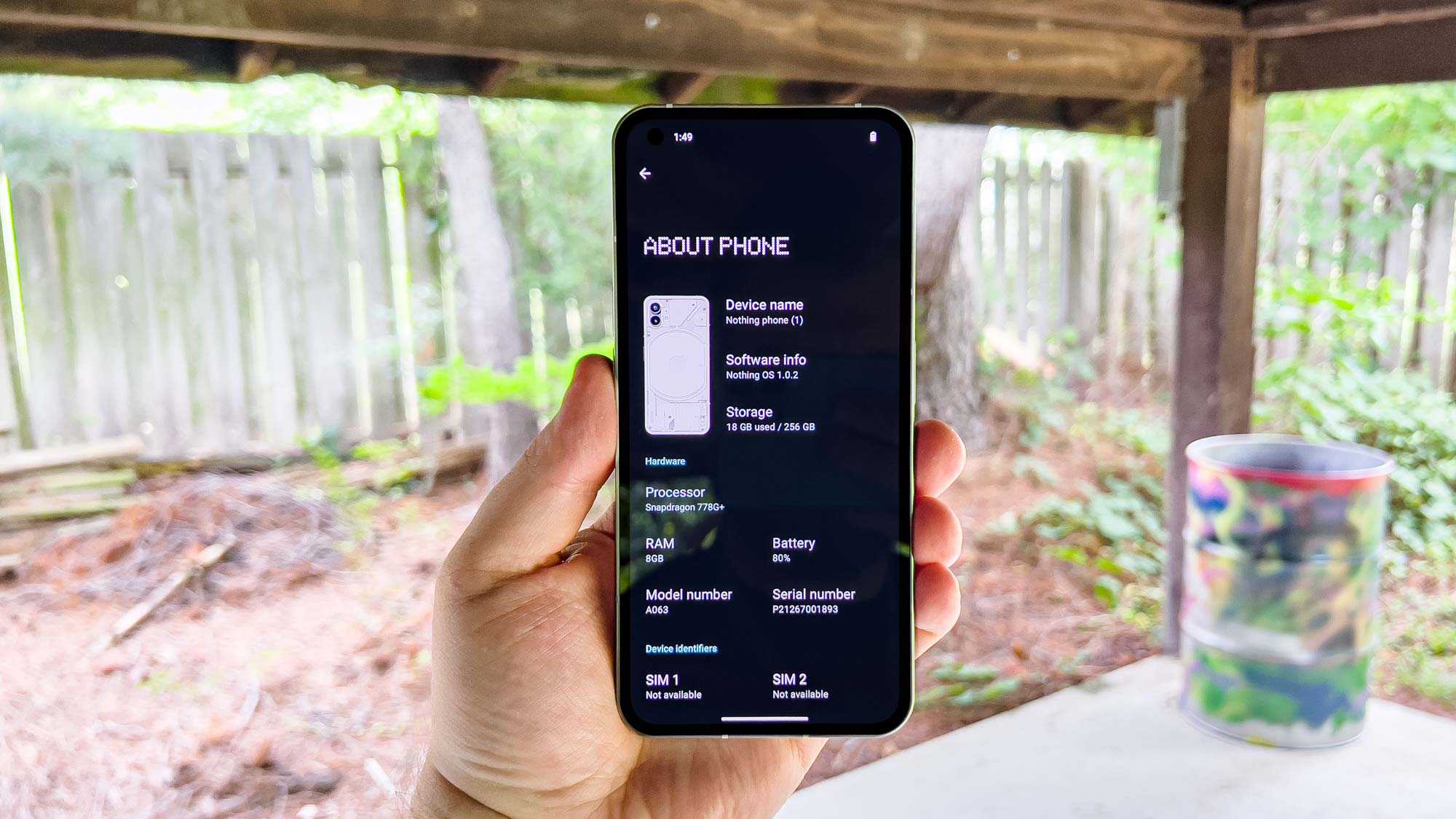
For day-to-day things like web browsing, typing emails and messages or scrolling through social media, the Phone (1) does just fine. Nothing makes a good point that you don’t need a ton of raw strength to fulfill most of your phone needs.
Nothing Phone (1) review: Battery life
After some lackluster results from the recent mid-range phones by Apple, Samsung and Google, I didn’t have very high hopes for the Phone (1)’s battery life. With the phone’s 120Hz adaptive display, I anticipated less than stellar results. There are times where I like being wrong, and this is one of them.
For the Tom’s Guide battery life test, we set a phone’s display to 150 nits of brightness and then have it reload web pages continuously over a cellular connection until the device kicks the bucket. Here’s how the Phone (1) did in comparison to the Galaxy A53 and iPhone SE (2022).
| Row 0 - Cell 0 | Phone (1) | Galaxy A53 | iPhone SE (2022) |
| Battery size | 4,500 mAh | 5,000 mAh | 2,018 mAh (estimated) |
| Battery life (Hrs:Mins) | 10:50 (Adaptive) / 12:57 (60Hz) | 9:48 (120Hz) / 10:38 (60Hz) | 7:38 |
| Charging speed | 33W | 25W | 20W |
| Recharge percentage (15 mins) | 24 | 25 | 31 |
| Recharge percentage (30 mins) | 49 | 46 | 61 |
Of all of the top mid-range handsets, the Phone (1) stands out as one of the longest-lasting ones. With a result of 10 hours, 50 minutes in its adaptive refresh rate mode, Nothing outdid Samsung, Apple and Google. (Though not listed above, the Pixel 5a turned in a result of 9:45 when we tested it last year.) Lock the Phone (1)’s display down to 60Hz and the gap widens, with the Phone (1) going for almost 13 hours.
Though I haven’t had as much time with the Phone (1) as I’d like during the course of this review, I have found that the device proves more than reliable in terms of battery longevity. I can browse Reddit for hours without trouble, and the Phone (1) barely lost any battery percentage while out on photography duty.
That said, I have noticed that the Phone (1) goes into a deep sleep mode, meaning that notifications and background downloads get pushed to the side until you wake the device again. OnePlus used to have a problem with this, and it’s a difficult line to walk. Since Nothing is new to the smartphone business, I imagine it hasn’t figured out how to strike that balance yet.
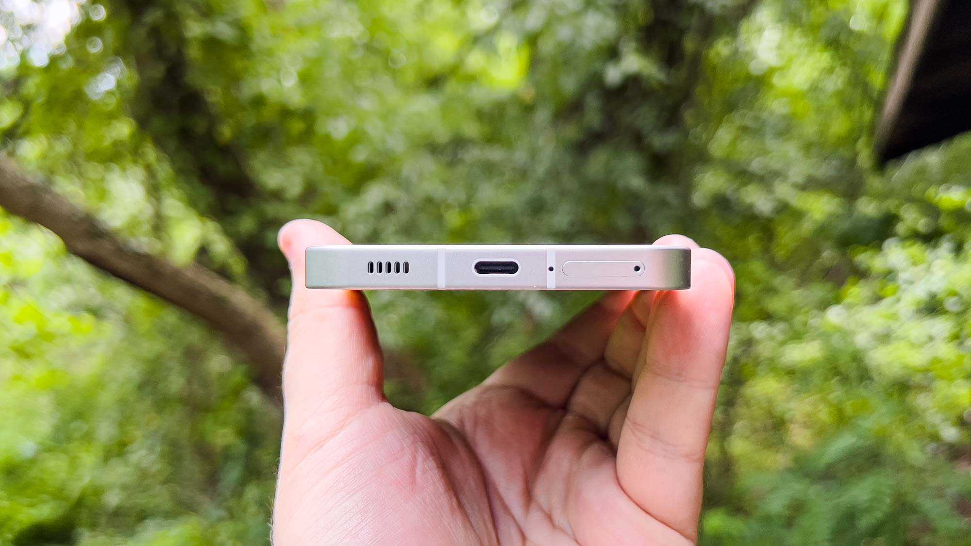
The Phone (1) supports 33W fast charging, besting the Galaxy A53’s 25W, the iPhone SE (2022)’s 20W and the Pixel 5a’s 18W. Though not crazy numbers, the Phone (1) regained about half of its battery capacity in 30 minutes. You’ll have to supply your own charger, however.
Nothing Phone (1) review: Software and special features
The Phone (1) comes with version 1 of Nothing OS, a minimalist take on Android 12. It feels very much like Google’s vision, just with a bit of flair on top. Unfortunately, it looks like users will need to get comfortable with Android 12. According to Android Authority, the Nothing Phone (1) will not get Android 13 until the first half of 2023.
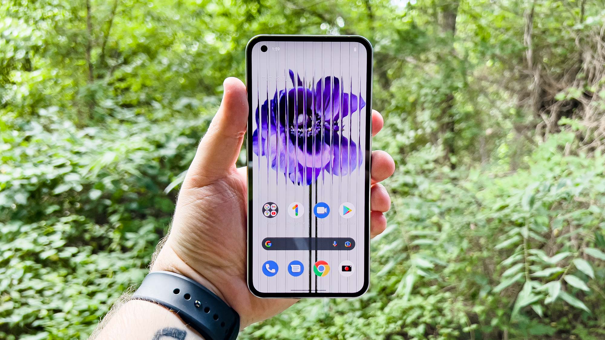
During the Phone (1)’s lengthy preview phase, Nothing already showed off the dot-matrix font for the widgets, which you’ll also find in some of the Settings menus as headers.
I like the bespoke effect since it lends itself to creating a more unique take on Android. It also has this retro vibe that I totally dig. One of my favorite little touches is the built-in Recorder app, which blends digital and analog into a cool UI.
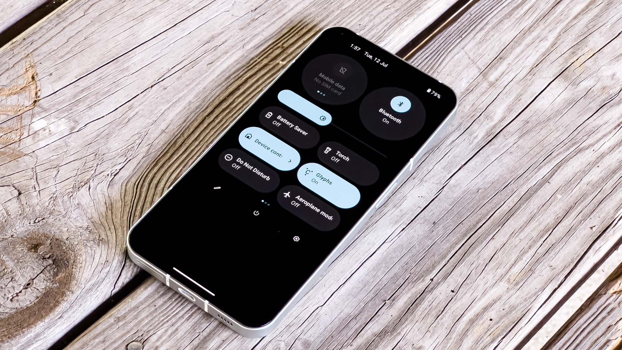
Otherwise, Nothing OS is pretty basic. Its final major talking point lies in the glyph interface and its settings. Here is where you control the rear LEDs. You can adjust the glyph “ringtones,” basically tweaking the light flash pattern when you get a phone call — you can even assign individual patterns to specific contacts so that you can easily identify who’s calling.
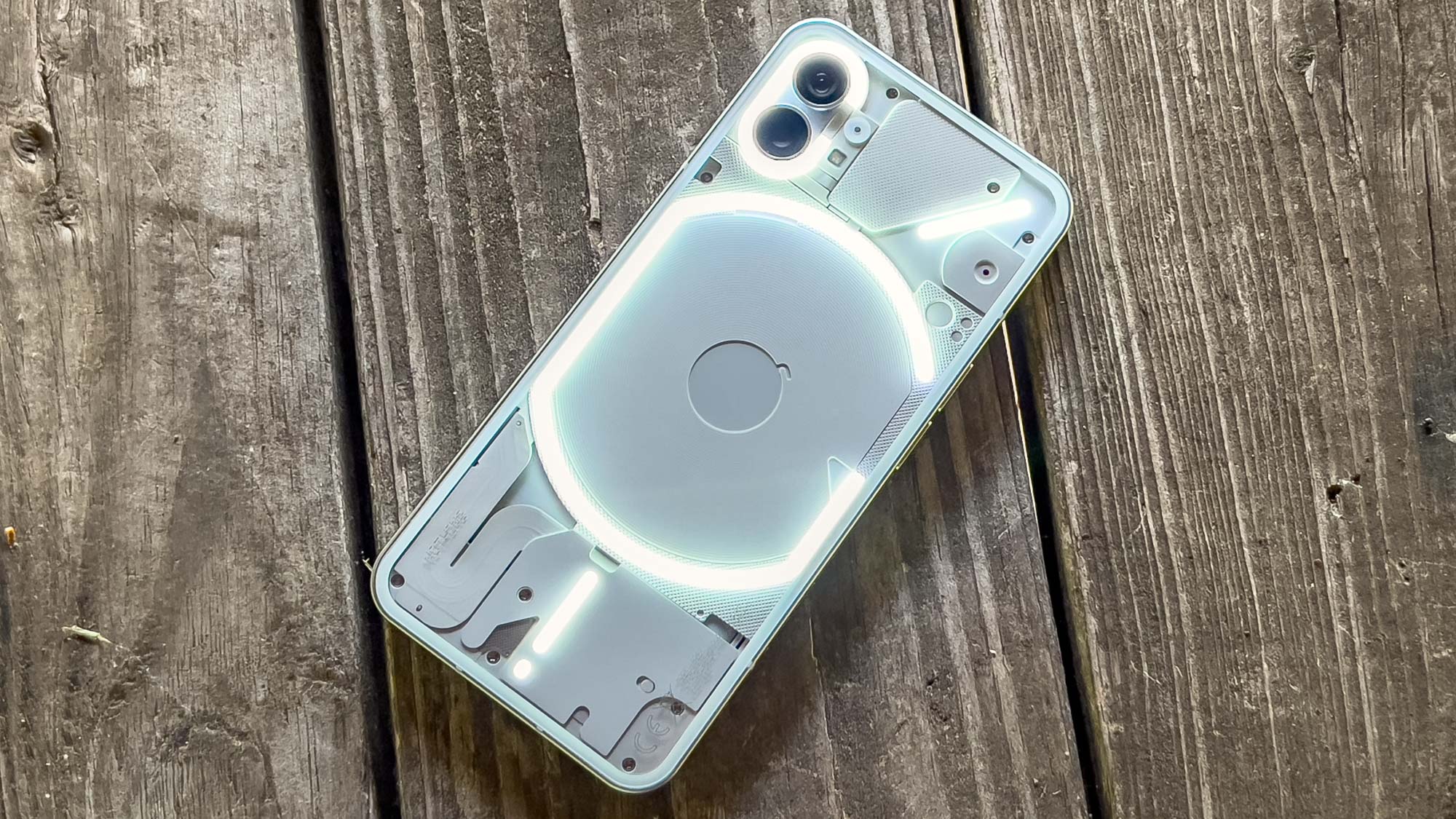
Notification sounds also get tied to a glyph light pattern. I wish you could choose pre-built patterns and sounds separately, but Nothing lets you add your own sounds with patterns. The glyphs also can show a charging or Google Assistant indicator. Essentially, Nothing really wants you to put the Phone (1) face-down.
Nothing Phone (1) review: Verdict
For a first attempt at a smartphone — a notoriously difficult product to get to market — the Nothing Phone (1) does several things right. While I think the cameras need a lot of work to be more than passable, the handset’s price, display, and battery life make up some lost ground.
For £399, the Phone (1) enjoys several victories. It’s more powerful than the equally-priced Galaxy A53 with much better battery life, and I think the Phone (1)’s OLED display is better than the A53’s AMOLED. The iPhone SE (2022) is much stronger in terms of performance and daylight photography, but I think the Phone (1) puts up a good fight.
Entering the market with a mid-range device was the right decision. Smaller companies like Essential tried to take off with a flagship, and look at how that ended up. Even big players like LG eventually left the smartphone business altogether. Building a smartphone, and ensuring its success, isn’t easy, so I respect Nothing’s plan to start small and then maybe go big a few years from now when it’s built a solid foundation.
The Phone (1) is a flashy start that, while not without shortcomings, gets most of the basics right. And for that £399 price, you can’t ask for much more.
Next: The Nothing Phone (1) is off to a good start but it's got to fix this and this new accessory can make your iPhone look like the Nothing Phone (1).
More: You can also check out our full review of the Nothing Ear (Stick) $99 earbuds.

Jordan is the Phones Editor for Tom's Guide, covering all things phone-related. He's written about phones for over six years and plans to continue for a long while to come. He loves nothing more than relaxing in his home with a book, game, or his latest personal writing project. Jordan likes finding new things to dive into, from books and games to new mechanical keyboard switches and fun keycap sets. Outside of work, you can find him poring over open-source software and his studies.
