Netflix just killed a feature that seemed like a great idea
Netflix's shuffle button gets shuffled off into the graveyard

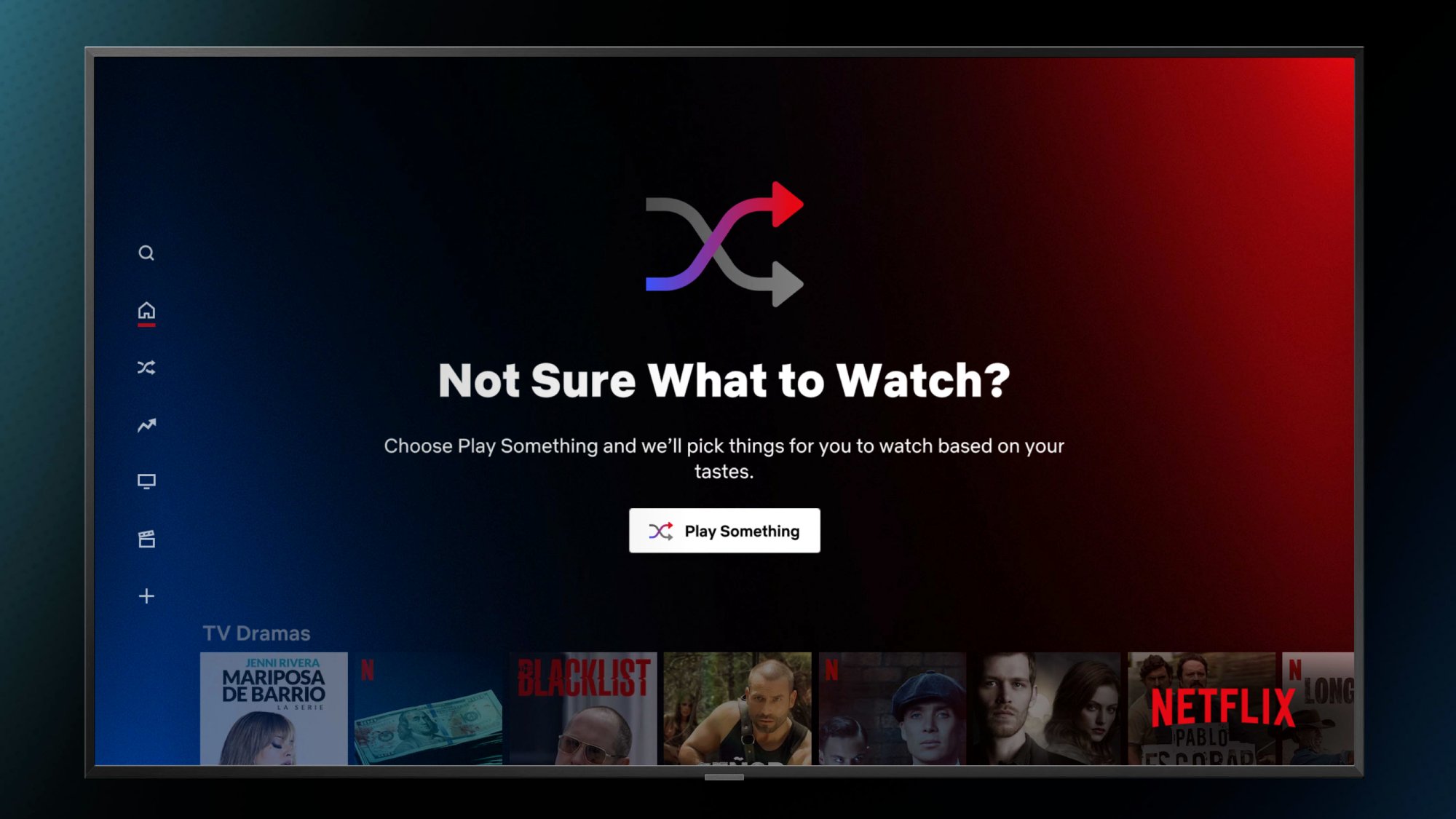
Netflix offers far too many movies and shows to pick and choose from, and it appeared that the company knew this was an issue. That's why it launched a title-shuffling feature dubbed 'Play Something' in late 2021.
It was, as my colleague Kelly Woo described, a way to "wake up and choose chaos." Instead of reading our lists of the best Netflix movies and the best shows on Netflix, you could just ask the system to give you something to watch.
And Netflix's algorithm would use its smarts to find something for you, based on your watch history. And now, you can't simply ask Netflix to just Play Something anymore, as the service quietly terminated this feature recently.

The Wall Street Journal reports that, according to a Netflix spokeswoman, Play Something was removed due to fact that not enough people were using it. The big red streaming machine believes the button isn't necessary because it found that users boot up Netflix with intent to watch a specific title or genre.
Netflix is not giving up on new means of discovering shows and movies, as that aforementioned spokeswoman said "We will continue to explore other ways to give members more options and ways to explore and discover content they want to watch."
This change comes at a turbulent time for Netflix. Subscriber stagnation is pushing the giant to try everything it didn't seem interested in years ago, from adding commercials to shows and movies that weren't made for them with Netflix Basic with Ads to its ever-expanding password sharing crackdown.
Analysis: One easy way to fix the Netflix home screen
If this feature wasn't being used enough to deserve a spot in the Netflix interface, this change is a good idea. It frees up screen space for something more valuable, and we are curious what Netflix believes that is.
Sign up to get the BEST of Tom's Guide direct to your inbox.
Get instant access to breaking news, the hottest reviews, great deals and helpful tips.
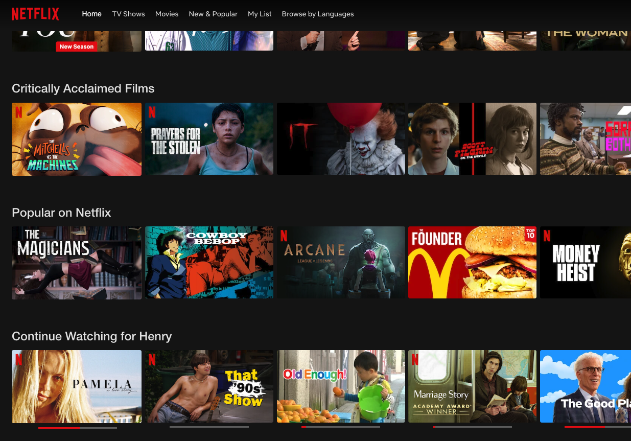
If Netflix believes that customers minds are often made up when they tune in, I'm curious why the Netflix home page is laid out the way it is. At the time of publication, we're seeing the My List row up top, which is great. But the thing that's very frustrating is the placement of the Continue Watching row.
We're guessing that many subscribers who come back to Netflix want to pick up where they left off. So, why is Continue Watching buried in the seventh row?

The likely reason, one would assume, is that Netflix wants to get you hooked on the stuff it promotes in the other rows. The more shows and moves you watch, the less likely you'll feel able to cancel Netflix.
That said, nobody likes paying for a service they don't like using. And clicking down 6 times before I can jump back into the adorable Old Enough! is friction I don't want to go through.

Henry is a managing editor at Tom’s Guide covering streaming media, laptops and all things Apple, reviewing devices and services for the past seven years. Prior to joining Tom's Guide, he reviewed software and hardware for TechRadar Pro, and interviewed artists for Patek Philippe International Magazine. He's also covered the wild world of professional wrestling for Cageside Seats, interviewing athletes and other industry veterans.
