Netflix just got an iPhone redesign — here's the new look
A shame Netflix's worst flaw is still here

A new look that just dropped makes the iPhone app for Netflix look more befitting of one of the best streaming services than ever before. We noticed changes (after updating the app) when a "snap" sound effect played after selecting a user profile that uses Thing from the popular Wednesday show.
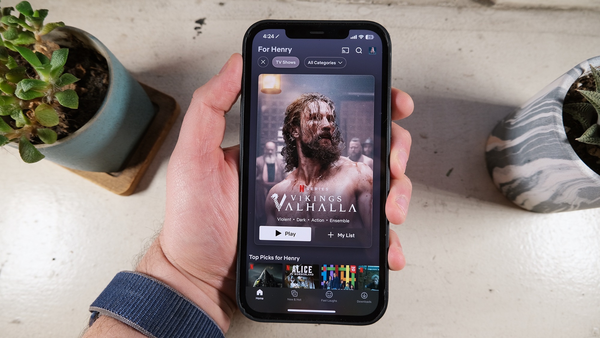
Changes like those, that make some of the best Netflix shows feel more "alive" in the app, are neat. And often the new-look Netflix feels like it's all about championing a specific show or movie. A new "billboard" layout presents one show at the very top of the screen as you navigate by TV, movies and genres — and might make you feel like you're browsing posters at the movie theater.
This update, which is currently rolling out, was previewed yesterday (Jan. 16) by engineer and interaction designer Janum Trivedi, who led the refresh for the Netflix app. posted about it on Twitter. He highlighted five new features, starting with the billboard layout that reacts to how you move your iPhone.
After updating the Netflix app to check it out for myself, I saw that the posters that appear at the top of the screen move a little bit as you reposition your phone.
Trivedi also highlighted "wallpaper gradients that are created on-the-fly from the art" of the show that's highlighted, a feature that takes us back to the old days of the Apple Music app. Navigating around the Netflix app, you'll also notice new animations in transitions as you move from show to show. Those animations are essentially "live" as they happen, as you can interrupt one mid-motion. You may notice haptic feedback, too.
This last year, I’ve been leading a UI refresh to make Netflix feel more fluid, delightful, and polished.Today, all that work shipped!Huge thanks to @nebson and @b3ll for helping bring this to life ❤️Details below, but try it out yourself! pic.twitter.com/cZFb7c42FdJanuary 16, 2023
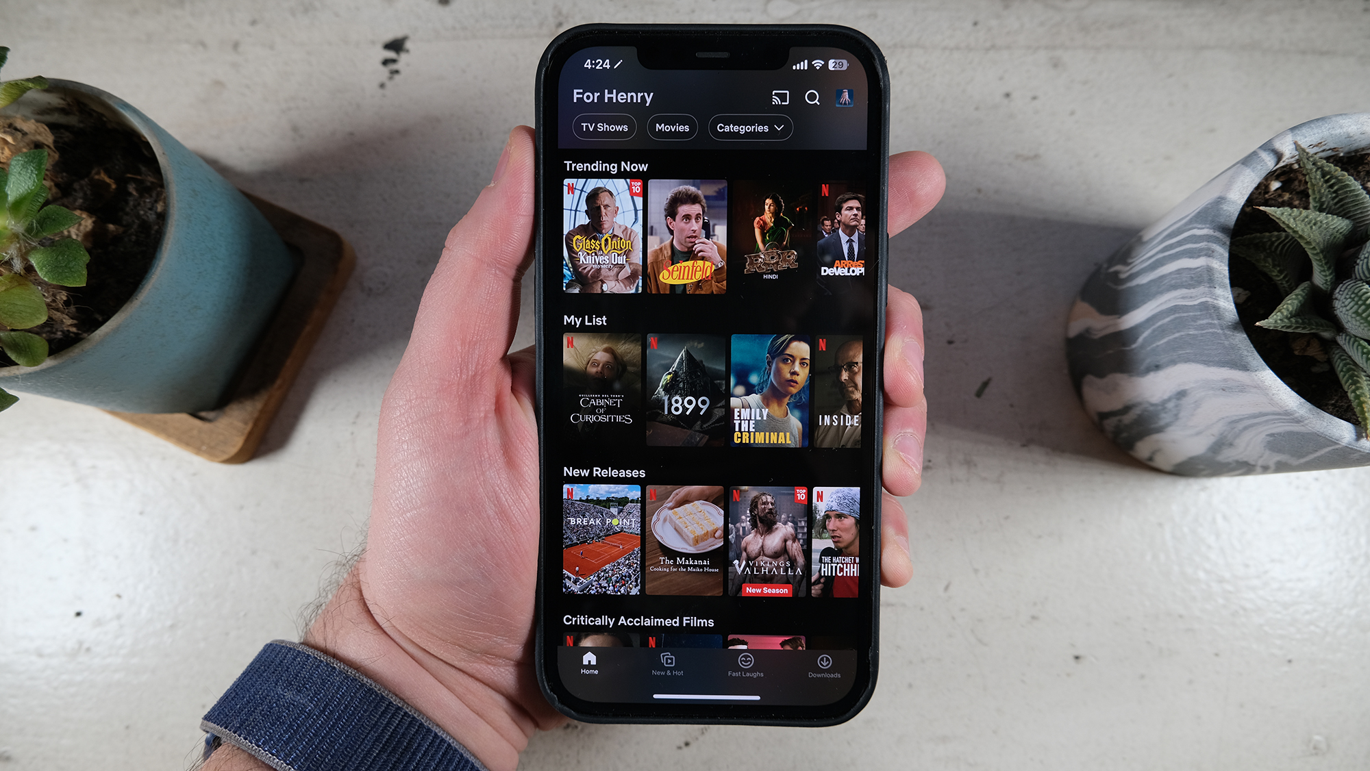
The biggest updates, though, if we had to say, involve the Coming Soon section getting rebranded as "New & Hot." Here, you'll see a mix of upcoming Netflix shows, such as That '90s Show, and current popular titles. We've also seen a Fast Laughs section, which is more like a Stories section from TikTok or Instagram.
That said, the Netflix app is still your normal Netflix app, especially with its big grids of skimmable show and movie tiles.
Sign up to get the BEST of Tom's Guide direct to your inbox.
Get instant access to breaking news, the hottest reviews, great deals and helpful tips.

Analysis: The Netflix app still suffers from its biggest flaw
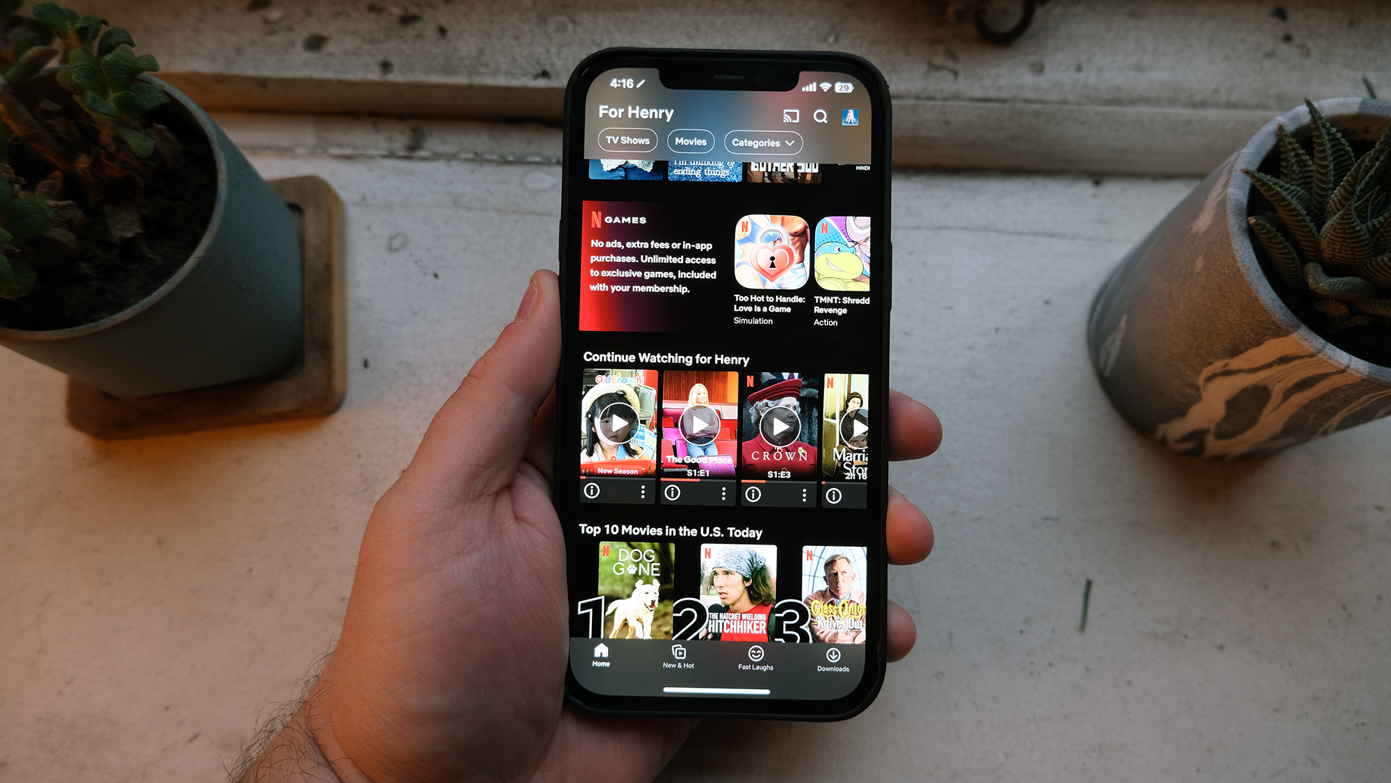
Netflix, like many streaming service apps, does a bad job of helping you find the list of shows and movies you were just watching. In our testing, that row is currently three whole iPhone screen lengths down.

They've even put it below the Games section. Somehow, Netflix thinks going back to the show you were watching is something to do after you've considered its forgettable gaming options.
This makes Netflix look completely out of touch with how we see it. I don't know anyone who loves Netflix games, and I doubt people open the app looking to game.

Henry is a managing editor at Tom’s Guide covering streaming media, laptops and all things Apple, reviewing devices and services for the past seven years. Prior to joining Tom's Guide, he reviewed software and hardware for TechRadar Pro, and interviewed artists for Patek Philippe International Magazine. He's also covered the wild world of professional wrestling for Cageside Seats, interviewing athletes and other industry veterans.
