Microsoft's new coronavirus tracker is useful but needs work
Microsoft's coronavirus tracker could be better, but add it to your bookmarks anyway

After all of the confusion regarding Google’s coronavirus site, Microsoft has jumped in with a whole new dashboard to monitor the Covid-19 infection through the entire world all the way down to your state and community.
It’s called the Bing Covid-19 Tracker and, while it’s a good first effort, it definitely needs some improvement.
- Coronavirus maps: Track the disease with these interactive dashboards
- Where to buy hand sanitizer: These retailers still have stock
- Just in: T-Mobile and Sprint providing unlimited data to all customers for coronavirus relief

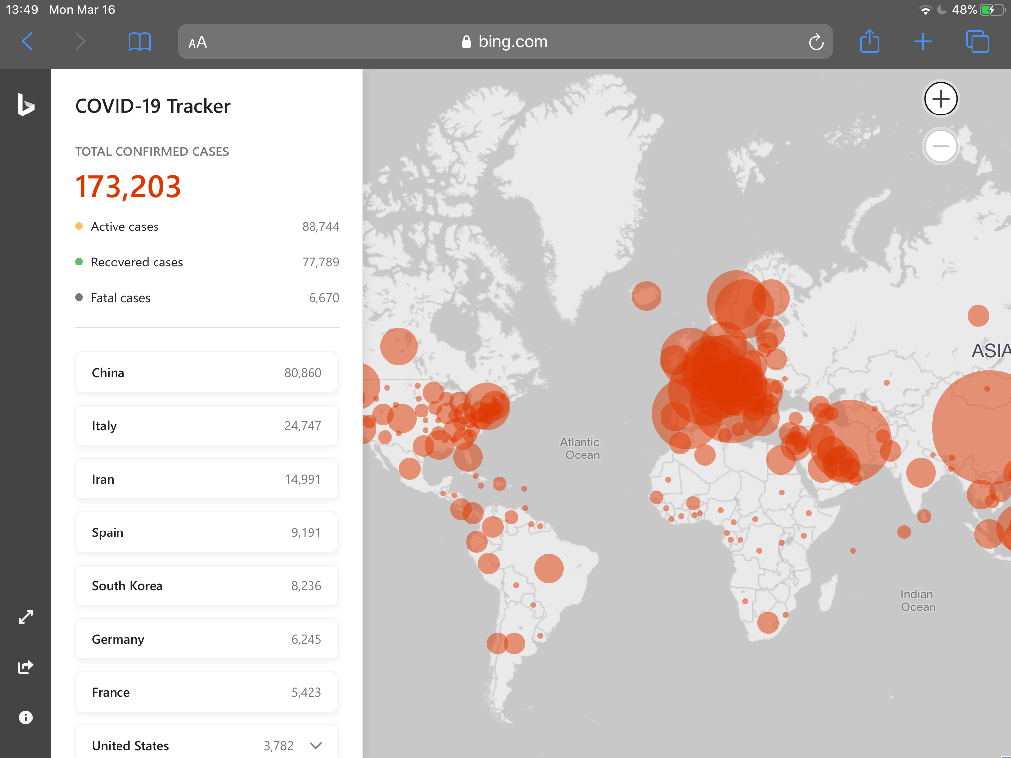
The user experience of the Bing Covid-19 Tracker is really good. There's a clean interface that starts by presenting you a worldwide view of the infection, with red circular areas centered on each country or, in the case of the U.S., each state. The areas increase in size depending on the number of cases in that particular zone.
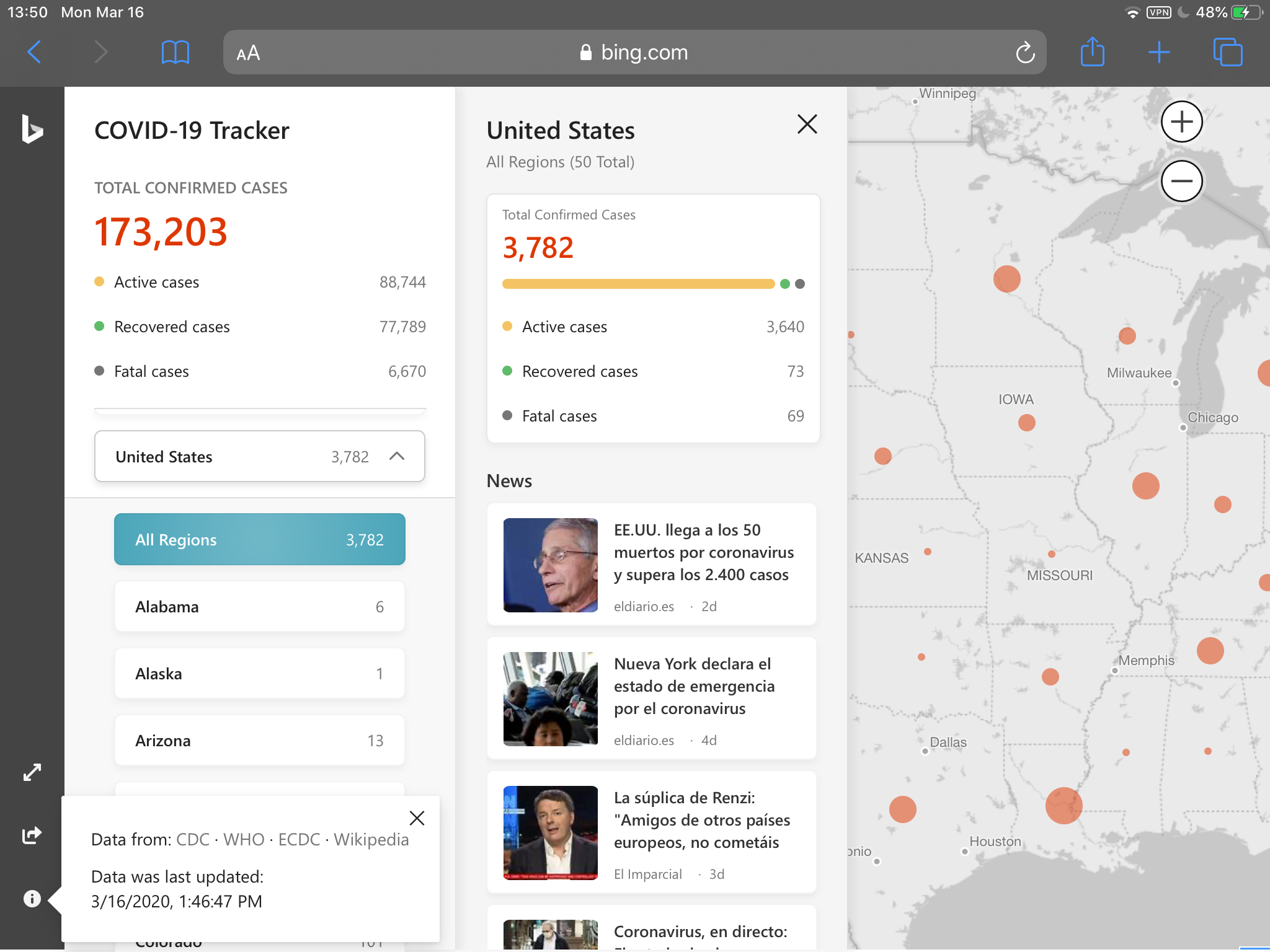
On the side there is a column that shows you figures on active infections, fatal infections and recovered cases — plus a list of countries that allow you to drill down into the world map.
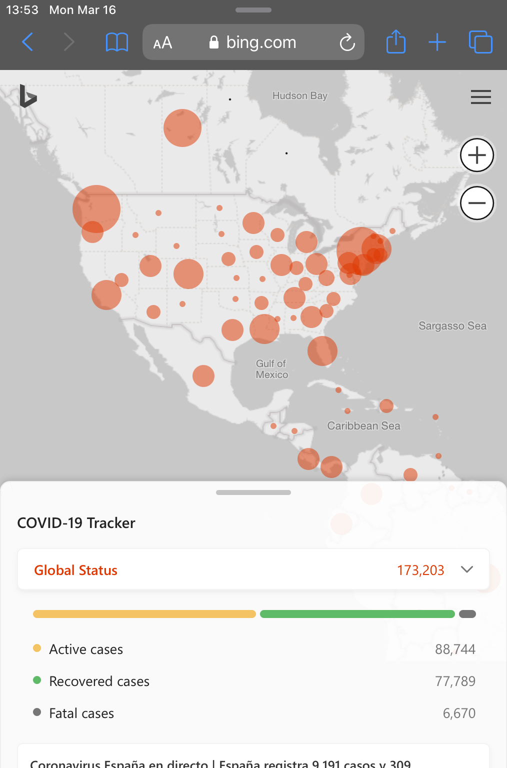
The UX is fluid, so it adapts to any screen size and device, as you can see below.

Unfortunately, the user experience doesn’t match the information presented by the tool.
First and foremost, the tracker lacks granularity in many fronts. While it’s nice to know how many cases are in countries or states, people will be more interested in knowing how many cases are in the area where they live. All countries except the United States are represented as one whole and that doesn’t really paint a useful picture of the people living in that country. I’m in Madrid at the moment, where everything is locked down, but I can't see information about the region, let alone the city or each barrio.
Sign up to get the BEST of Tom's Guide direct to your inbox.
Get instant access to breaking news, the hottest reviews, great deals and helpful tips.
Only the United States allows you to drill down by state, but that’s not very helpful either, as most states are gigantic. People may like to know about information specific to their area or the area in which their loved ones live.
The other lack of granularity comes from the news and videos presented by the tool. While they will change depending on the country you select, they don’t change depending on the state. And since there is no way to select specific counties, cities or boroughs, there’s no way to stay up to date about your most immediate surroundings.
For these type of sites to be truly useful, Microsoft, Google and anyone else should really flex their search and AI muscles and put together a truly useful dashboard that actually helps individuals — not just give them a world or country view of what’s going on.
Perhaps as the crisis evolves we will see these companies actually adding more power to these tools but, for now, it all feels very feeble. And, as someone who lives in Spain, we are definitely running out of time to put the information in place to actually help individuals and communities the way South Korea has done.
As we wait for more resources around COVID-19, we advise that you keep your distance, follow the coronavirus tips for staying safe, practice social distancing and avoid going out unless you absolutely have to.
Jesus Diaz founded the new Sploid for Gawker Media after seven years working at Gizmodo, where he helmed the lost-in-a-bar iPhone 4 story and wrote old angry man rants, among other things. He's a creative director, screenwriter, and producer at The Magic Sauce, and currently writes for Fast Company and Tom's Guide.
-
gopalaj We've put a data hub together that we hope will be of help to the community: https://www.knowi.com/coronavirus-dashboards. Would be great to hear your feedback.Reply
Jay

