Tom's Guide Verdict
The Microsoft Surface Duo feels truly innovative in how it’s built to help you get things done, but its myriad software inconsistencies, outdated hardware and subpar camera — all for an exorbitant price — betray its inspired design.
Pros
- +
Gorgeous, practical dual-screen design
- +
Intuitive gestures
- +
Pairing apps unlocks potential
Cons
- -
Crippling software glitches
- -
Poor camera
- -
Underwhelming performance
- -
Expensive when not on sale
- -
No 5G
Why you can trust Tom's Guide
Price: $1399 (MSRP) / $699 (Current)
OS: Android 10
Display: Two 5.6-inch AMOLED (1800x1350); 8.1 inches combined
CPU: Qualcomm Snapdragon 855
RAM: 6GB
Storage: 128GB/256GB
microSD slot: None
Camera: 11MP (ƒ/2.0)
Battery: 3,577 mAh
Size (closed): 5.71 x 3.67 x 0.39 inches
Size (open): 5.71 x 7.35 x 0.18 inches
Weight: 8.8 ounces
The Microsoft Surface Duo is a beautiful tragedy. I've never been simultaneously enamoured and frustrated with a phone, even if it feels a little unfair to call the Surface Duo a 'phone' in the purest sense of the word. The reality is it's a productivity powerhouse that just happens to be able to handle calls and text messages.
When you think about things that way, it's easy to call the Surface Duo a success. It's capable of things no other phone can do efficiently. But at the same time it struggles with some of the basics. Software is glitchy thanks to the dual-screen design, camera performance is mediocre, and it packs in a bunch of outdated hardware. Th phone may well be crafted meticulously, but that price tag is still astronomically high.
- Microsoft Surface Duo 2 review: Vastly improved and still flawed
- The best foldable phones you can buy
The overall result is a charming handset that is still difficult to recommend. While it's a little too rough around the edges to be able to claim a place on our list of the best phones, our Microsoft Surface Duo review showcases what makes this one of the most curious devices of recent times.
Microsoft Surface Duo review: Price and release date
The Surface Duo is on sale now, though if you want to be able to buy it on contract you'll have to go through AT&T. If you want to take the phone to Verizon or T-Mobile, you’ll have to pick up one of the unlocked models.
Originally the Surface Duo would have set you back $1,399, and for that you get a device with 128GB of storage and no microSD card slot for expandable memory. If you wanted double that capacity, it would have set you back $1,499.
That said, Microsoft has made some hefty price cuts on this phone since the start of the year. It dropped to $1,000 ahead of the phones international release, and dropped down to $699 this past May. That's over 50% off the original price, and the 128GB model is still available at that discounted price point. The 256GB model is a slightly more expensive $749.
Of course that will only buy you last year's model. With the Surface Duo 2 starting at $1,499, you want to pick up one of those instead. Not only does it have a faster Snapdragon 888 processor, it also packs in a bunch of features the original Surface Duo lacked, like Surface Slim Pen 2 support, and new, more versatile, design.
Microsoft Surface Duo review: Design
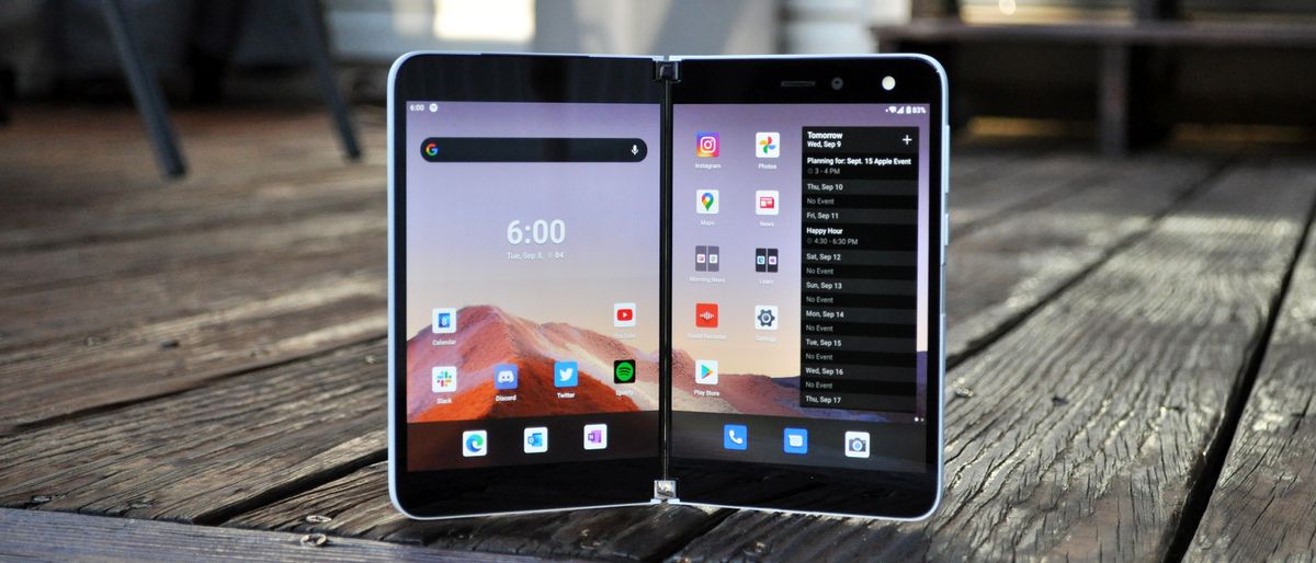
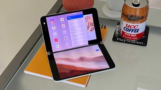
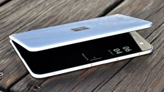
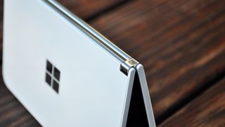
The Surface Duo looks dull in pictures, it has to be said. In an age of devices with flexible displays, the Duo has two separate, conventional 5.6-inch Gorilla Glass-shrouded panels with gigantic bezels. The phone’s exterior is clad in white painted glass with a matte white frame, and all that exists to break that up is the stainless-steel double-barrel hinge and similarly-mirrored Microsoft logo.
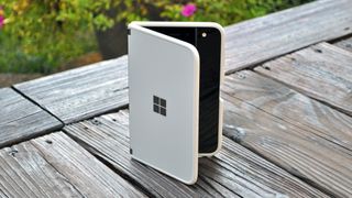
But then you hold the Surface Duo, and in spite of this drab and somewhat dated motif, it feels incredibly special.
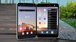
A lot of that has to do with just how phenomenally slender the Surface Duo is. At just 4.8 millimeters thin, Microsoft’s dual-screen phone is about as thick when shut as the Galaxy Note 20 Ultra when you factor in the enormous camera bump on Samsung’s device. As smartphones have gotten progressively more complex over the past decade, phone makers have had to concede thinness to fit larger batteries and antenna arrays for faster data speeds.
Returning to a device of wafer-like proportions like the Surface Duo rekindled an amazement in compact mobile technology I haven’t felt in quite a long time. (Though I’d still appreciate a little less bezel around the display.)
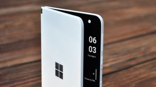
It helps too that the build quality is impeccable. For such a slim phone, the Surface Duo feels remarkably sturdy and balanced no matter how you hold or orient it. The hinge strikes the perfect midpoint between being rigid and resistant enough to remain in place when tented up on a table, while also being smooth and compliant enough to pry open easily. There’s a pleasing muffled clap to shutting the Surface Duo, rather than the glass-on-glass snap you might expect; it’s just a joy to physically interact with, from start to finish, and it’s that attention to detail that kept me eager to use it during the review phase.
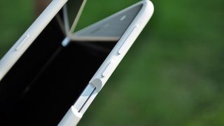
The Surface Duo feels incredibly special, and a lot of that has to do with how phenomenally slender this design is.
All that said, the Surface Duo’s proportions do come with a few drawbacks, regardless of how good the device might feel in hand. The slenderness of this device meant Microsoft had nowhere to fit wireless charging or NFC coils for tap-and-pay transactions — two features you’d surely expect on a $1,400 phone. It also means the device has a hard time staying cool when put through its paces. When the Surface Duo is being strained — if you’re in a video call, for example, and both screens are on — you can feel it complain right then and there, as the back center of the right half of the device heats up awfully quick.
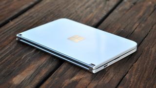
Additionally, given its width (the Surface Duo is seven-tenths of an inch wider than the Galaxy Note 20 when closed) this is not a device that’s natural to carry around in a front pocket. Thus, you might naturally think to stash it in your back pocket, though I wasn’t comfortable doing that either because of how far the top of the phone stuck out of my jeans. For how hard Microsoft clearly worked to make the Surface Duo as compact as it is, it’s still unwieldy at times.
The dual-display design makes the Surface Duo well suited for multitasking or interacting with two apps at once.
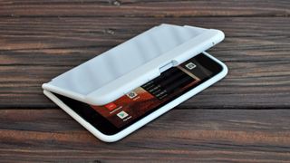
Oh, and one more design oddity: Microsoft is generous enough to include a bumper case in the box with the Surface Duo, which should be industry-standard practice with devices that cost this much. However, be sure to take care when applying it. I say “apply” because the bumper doesn’t just snap around the edges of the phone; it’s a rubbery silicone jacket with peel-away adhesive encircling the inner grooves. It’s easy enough to put the case on; just be aware that after you do, you won’t want to take it off, unless you’re willing to shell out money for a replacement. The bumper also collects lint like nobody’s business.
Microsoft Surface Duo review: Displays
Critics may lament Microsoft’s decision to go with two 5.6-inch AMOLED screens on the Surface Duo rather than one big bendy one, but there are reasons for the approach. Aside from all the obvious benefits to durability and cost-saving, as well as the fact Microsoft wants the Surface Duo to stand up to the rigors of its Surface Pen, the dual-display design makes this device better suited for multitasking or interacting with two apps at once to complete tasks more swiftly.

Microsoft prefers to envision each of the Duo’s displays as natural windows, which is certainly the most intuitive way I’ve ever heard a company pitch a device with multiple screens. In this sense, the gap presented by the hinge doesn’t really matter, because for the most part, the user isn’t really encouraged to spread a single app across two disparate panels anyway.
The only scenario in which using both screens for one window is particularly useful is when turning the Surface Duo on its side. In that pose, the two 4:3, 5.6-inch displays comprise one 8.1-inch canvas that takes on a narrower aspect ratio, making it very accommodating for scrolling through webpages or social media feeds.
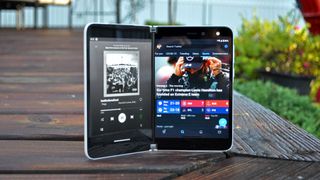
Nevertheless, I have some qualms with Microsoft’s insistence on 4:3 screens: most Android apps aren’t built to put wider aspect ratios to good use, and so you end up with a lot of extraneous space in Spotify and Slack, to name two apps. Typing is made easier by the way Microsoft breaks up its Swiftkey keyboard for one-handed use, depending on which side you’re approaching it from. However, the keyboard becomes a little too wide and cumbersome when holding the Surface Duo sideways (in an orientation I like to call “Nintendo DS-style”), where the text field is partitioned off to the upper panel as you type on the bottom one.
The 4:3 aspect ratio also isn’t conducive to watching media, resulting in a lot of black bordering in YouTube. That said, your content will still look good on either of the Surface Duo’s 1800 x 1350 displays, as Microsoft has gone to great lengths to ensure that the color temperature and brightness of both screens is as close to identical as possible. Indeed, I noticed no difference in the presentation of apps, videos and games across both of the Duo’s screens.
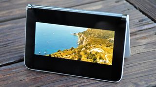
That’s an important detail to reiterate, because panel variation tends to be a persistent and hard-to-eliminate problem for dual-screen hardware, like the LG V60 ThinQ 5G. Under our light meter, we measured peak brightnesses for 458 nits on the left display and 461 nits on the right. Colors are also very close, with the Duo rendering 133.9% and 132% of the sRGB color space on the left and right panels, alongside Delta-E color accuracy ratings of 0.26 and 0.28, respectively.
That’s in line with other top-rated devices, like the Galaxy Note 20 Ultra, which notched 121.5% and 0.24 in those tests. It’s worth noting, however, that the Note gets much brighter, peaking at 662 nits, and also features a dynamic 120Hz refresh rate for smoother animations — something you won’t find on Microsoft’s phone.
Microsoft Surface Duo review: What’s good about the software
Opening apps, placing them where you want and running them side by side in harmony — this is where the Surface Duo shines.
No matter how nice the Surface Duo feels to hold, or how pretty its displays look, the software experience was always going to make or break this phone. While Google has updated Android over the years with provisions for flexible and multi-screen devices, this is still an operating system that, at its core, isn’t really intended for anything like what Microsoft is trying to do here.
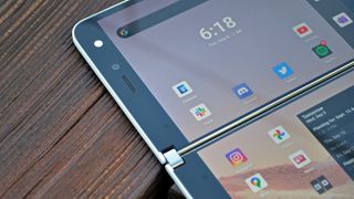
When the Surface Duo works, it really does work. I love how simple and intuitive Microsoft has made the system for moving apps between the displays. Each screen has its own gesture navigation bar, as is common in many Android phones. However, when an app is open in one screen, you can pull up from that bar and flick the app over to the other panel if you’d rather have it there, or place it between both screens to extend it across. You can also pull up the Recents page — an overview of all your running software — and shuffle apps from side-to-side from that interface as well.
Opening apps, placing them where you want and running them side by side, in harmony — this is where the Surface Duo shines. Like on Samsung’s foldables, you can create shortcuts that open two apps of your choosing together; you can even select which sides they default to. I quickly made this a part of my morning routine, setting Microsoft News and Slack to open simultaneously so I could catch up with the day’s news while also discussing topics to cover with my colleagues.

The Surface Duo is also one of a small yet growing number of Android phones (the others being recent Samsung models) that support both Link to Windows and phone screen mirroring via Windows 10’s Your Phone app. With Your Phone on desktop, you can respond to texts, view notifications, browse your device’s storage and media gallery and even navigate it, all from your PC. It’s a nice power play from Microsoft to bring some cross-platform integration between Windows and Android, though the screen mirroring feature has proven rather laggy and low-resolution in my experience, no matter whether I was using the Surface Duo or the Samsung Galaxy Note 20.
Microsoft has also punched up its own Android apps, like Outlook, OneDrive and OneNote, to take advantage of the Surface Duo’s unique form factor. If you extend Outlook across both of the Duo’s displays, it will cleverly keep a view of your inbox on the left side, while allowing you to read one selected email in particular on the right.
If you then begin a response and flip the device sideways, the keyboard will take over the bottom portion, while the compose field will reside up top. Dragging and dropping text and images even works across screens (provided you’re using Microsoft’s apps, anyway). Indeed, the Surface Duo can be very slick when it wants to be.
The Surface Duo also supports touchscreen controls for certain games on Xbox Game Pass. While we haven't tested this feature, it does mean that you can stream compatible games to the phone and use it like a Nintendo DS.
Microsoft Surface Duo review: What’s bad about the software
But therein lies the problem. When the Surface Duo reacts to your actions in predictable, helpful ways, you see the potential in it. Suddenly, that whole concept of “flow” that Microsoft has been proselytizing — navigating seamlessly through tasks on a pocketable device, without forcing you to relocate to a PC or tablet for duties that are simply too elaborate for a phone — seems like much more than marketing fluff.
All too often, though, the Surface Duo does not respond predictably. Sometimes that’s due to obtrusive design, but it’s mostly the result of crippling, incessant glitches.
My Surface Duo exhibits lag about half the times I return to the home screen. Sometimes, apps and widgets will take moments to redraw, and in other circumstances they’ll be present, albeit unresponsive to taps or swipes for upward of 5 seconds. Swiping up to return home from one app or summoning the keyboard often moves and repositions the app on the other display unintentionally. Even the wallpaper on my review unit occasionally disappears, only to be replaced by solid black. Locking and unlocking the device brings it back.

The SwiftKey keyboard is a particular source of consternation. It’s often unstable and occasionally resizes itself from my preset preference since the last time I used it. In one especially annoying use case, if I’m holding the Surface Duo sideways with the entire bottom display used for typing, the keyboard frequently disappears without warning as I’m actively tapping away on it.
All too often, the Surface Duo does not respond predictably, and it’s mostly the result of crippling, incessant glitches.
The Surface Duo can be folded with its screens out, so it becomes more of a traditional, candybar-style device you can almost use with one hand. In these instances, the UI is designed so that the user can double tap the opposite display if they want to turn the device over for any reason.
Unfortunately, in my experience, the double tap action rarely works as intended because the screen you don't want to use lacks palm rejection — so even when you flip the Surface Duo over, it thinks the panel facing away from you is still actively being used, and won't relinquish control to the other side.
Even Google's mainstay Android apps, like YouTube and Google Duo (the video chat client, not to be confused with this phone) are easily flummoxed by the Surface's complexity. Turning the device to landscape mode while YouTube is open but a video isn't expanded to full-screen mode will cause the narrow, 4:3 orientation of the app to show in a landscape space. In other words, the app doesn't resize itself to better fit the wider crop — it just rotates the exact same window 90 degrees, thus only using about 50% of the total real estate of the screen.
The list of general nuisances and bugs goes on and on — and none of those even touch upon the most concerning unintended behavior I discovered with our review unit.
After a few days of using the Surface Duo, I noticed the phone no longer automatically locked itself and went to sleep when I closed it shut. Perplexing though this was on its own (it turned out a factory reset was necessary to set it right), it led to far more serious troubles down the line.
One day, as I threw the Surface Duo into my bag for a little photography journey, the device’s camera must have launched; I either inadvertently opened the camera myself by double tapping the power key, or it managed to fire up on its own. Regardless, when I pulled the device out of my backpack two hours later, it was piping hot. The camera had presumably been on for two hours, reducing the battery level from 60% to 20%, all while the device was shut. The phone was so scorching, I could barely touch it; truth be told, I don’t think I’ve ever handled a device that hot before.
These are the sorts of issues that drag the Surface Duo down, transforming it from a genuinely innovative and practical exercise in design to an unrelenting series of unexpected frustrations. To its credit, Microsoft did push out one firmware update during my time with the phone, and while it seems to have made app positioning and changing screen orientation a bit more reliable, the majority of those other qualms haven’t been stamped out. Weirdness can still happen, like when turning the device sideways while watching a YouTube video.
Of course, these glitches should be fixable, and Microsoft has also expressed a desire to add basic functionality to the Surface Duo that isn’t present at the time I’m writing this review. For example, a double tap to wake feature isn’t supported on our review unit, though the company says it will deliver the capability soon.
Similarly, there’s no action button or shortcut to flip screens while using the camera. (As I’ll later explain, this is important because the Surface Duo has only one lens, that serves both out-facing and selfie duties depending on how you’re holding the phone.) Rather, the device is just supposed to know where to put the viewfinder based on input from its motion sensors, though that approach doesn’t always work in practice. The Surface Duo development team tells us it’s sorting this out as well.
Still, none of this instills confidence, considering both the Surface Duo’s high price as well as the fact that there are several other expensive phones on the market that don’t suffer these hang ups. You can spend upwards of a grand and a half on Microsoft’s promise of productivity, but it won’t buy you peace of mind.
Microsoft Surface Duo review: Performance
When the Surface Duo was announced in late 2019 with a Snapdragon 855 processor at the helm, many people understandably assumed Microsoft would update the device’s chipset during development with the then yet-to-be released Snapdragon 865. That chip would have also given the Surface Duo the ability to run on 5G cellular networks.
However, that never came to pass. Thus, the Surface Duo enters the crowded fray of 2020 flagship phones with silicon that’s over a year old, as well as just 6GB of RAM, which is admittedly on the low end of the spectrum by today’s standard of premium handsets. Consider that the Note 20 Ultra packs twice the RAM that the Surface does, alongside a much faster Snapdragon 865 Plus CPU, even though Samsung’s device has but one screen and less of a multitasking slant.
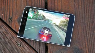
Now, the old 855 chip isn’t slow, but it’s also not blisteringly quick anymore when compared to other phones you can buy for this money. Couple that with the software gremlins already discussed, and the Duo simply doesn’t feel quite as snappy as you’d hope. Funnily enough, playing games is thoroughly pleasant, as the Adreno 640 GPU in the 855 is still adept enough to ensure a decently smooth experience playing graphically-demanding titles like Asphalt 9 Legends.
Where the Surface Duo bogs down are those occasions when you’re repositioning the device while two apps are going at once. Changing orientations and moving between single-screen and dual-screen modes can either occur without a hitch, or transpire in a delayed, clunky fashion. This of course could be chalked up to more of a software optimization issue than a hardware one, but it all contributes to the perception of performance nevertheless.
In terms of benchmarks, the Surface Duo’s multi-core Geekbench 5 score of 2,862 points is distant from the Note 20 Ultra’s 3,294 result, as well as the iPhone 11 Pro Max’s 3,500 score. Turning to graphics, the Surface totaled 1,073 frames in GFXBench’s Aztec Ruins test for high-tier devices, at 17 frames per second. That also paled in comparison to the Note 20 Ultra (1,455 frames) and iPhone 11 Pro Max (1,657 frames).
Again, the omission of a newer Qualcomm chipset means that the Surface Duo isn’t future-proofed for 5G — whether you’re talking about long-range networks, like sub-6GHz 5G, or the much faster, short-range millimeter-wave infrastructure in cities. At the moment, that’s not a huge loss; 5G isn’t ubiquitous or performing well enough to really justify buying a particular device for its 5G support alone. That said, if you’re considering picking up a Surface Duo, it stands to reason you want to squeeze out more than a few years from your $1,400 phone. 5G might not matter much today, but that probably won’t ring true come 2022 or 2023.
Microsoft Surface Duo review: Camera
Microsoft’s imaging hardware and software simply can’t extract the vividity or sharpness you’d probably expect from the camera in a $1,400 smartphone.
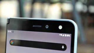
If you’re hopelessly searching the Surface Duo’s exterior for some kind of elaborate array of lenses, as so many other premium handsets tend to have these days, I regret to inform you Microsoft’s taken a considerably low-key approach to cameras. There’s just one 11-megapixel, ƒ/2.0 camera located above the right half of this dual-screen phone, and that’s the camera you use whether you’re shooting a vast landscape or an impromptu selfie.
Now, that might sound like cause for disappointment, and indeed, with only one tiny 11MP lens, the Surface Duo obviously won’t pull off a caliber of photography that will embarrass the Galaxy Note 20 Ultra or any one of the other best camera phones we’ve tested. That said, the Surface Duo’s humble shooter can punch above its weight on occasion.
Perhaps the best example of that is the image of a flower above, captured with the Surface Duo. While it took many attempts before I ended up with a result that was properly in focus, the detail on display in the petals and the nuance with which Microsoft’s phone captured the various shades of pink and white produced a shot that’s more visually engaging and realistic than the Galaxy Note 20’s oversaturated version of things.
But it isn’t all praise for the Duo. The further you zoom in, the more you begin to notice graininess pervading darker areas of the frame as well as the background. And speaking of the background, the Note 20 surprised with a stunning natural depth-of-field effect that wasn’t intentional, but is nevertheless very pretty. The Surface Duo couldn’t match it, even when I attempted to use Portrait Mode.
As it turns out, Portrait Mode on the Surface Duo needs to recognize faces to work consistently; you can’t just use it to take a dramatic bokeh shot of anything. Still, even when I used it to take a selfie, I was underwhelmed. The Duo appears to favor cool, dreary colors, compared to the iPhone’s tinge of warmth and Samsung’s penchant for punching up hues. I’m a relatively pale individual, but there’s a bit more life within me — not to mention the greenery behind me — than Microsoft’s camera would have you think. The blurring around my hair is also clearly inconsistent through the Duo’s lens, while the iPhone 11 Pro does a better job of gradually fading the foreground into the background.
Sadly, things don’t get better for the Surface Duo from here. This comparison of shots from a river demonstrates how Microsoft’s imaging hardware and software simply can’t extract the vividity or sharpness you’d probably expect from the camera in a $1,400 smartphone. And while you could argue that that’s not really the purpose of the Surface Duo, when devices like the Galaxy Note 20 Ultra are cheaper and camera quality is a major consideration for the vast majority of phone shoppers, you can’t overlook it, either.
From inside a covered bridge, it’s clear to see the Surface duo exhibits trouble resolving the sunlight outside in this challenging scene. The Note 20 better balances the highlights in addition to the shadows within the bridge, pulling out impressive sharpness, clarity and color from the wooden beams above.
The Surface Duo doesn’t have an optical zoom lens, nor does it capture enough megapixels to emulate lossless zoom with sensor cropping alone. Microsoft also hasn’t gifted this phone with a software-based solution like Google’s Super Res Zoom, and thus, the Surface Duo is woefully under-equipped when shooting from far away. The Note 20’s digital zoom can be cranked all the way up to 30x, but the Surface Duo’s tops out below 10x (an exact value isn’t provided in Microsoft’s camera app.) Alas, even at a distance of 10x for the Note 20 and an estimated 8x for the Surface Duo, the rendition from Samsung’s camera is infinitely clearer thanks to the Galaxy’s higher megapixel count and smarter zoom algorithms.
Lastly, we turn to the Surface Duo’s performance in low light, which is unfortunately quite limited as this device doesn’t have a night mode like you find on countless other flagship handsets these days. This comparison serves as an illustration of what you miss out on.
At the time these photos were taken, dusk hadn’t entirely concluded yet, and so there was still a bit of light in the sky for both devices to work with. The Note 20 churned out a gorgeous result, incorporating the light from the streetlamp illuminating the leaves of the tree above as well as the shine of the pavement. It’s plain to see that none of these plaudits ring true for the Duo’s shot.
Regardless of how middling or disappointing the Surface Duo’s photography is, what’s even more frustrating is the user experience within the camera app. As stated earlier, the Surface Duo can be comically terrible at guessing what screen you’d like the viewfinder on, and thus, what direction you’re attempting to shoot in. The only way to attempt to change it is to turn the phone over, though that doesn’t always produce the intended response. By the time you've got the camera pointed in the proper direction — which even in the best case scenario, delays picture taking by a second or two — it’s quite possible you’ve missed your shot. I’d much rather Microsoft simply employed a manual switch button in the interface instead.
Microsoft Surface Duo review: Battery life and charging
Keeping both of the Surface Duo’s large displays lit is a 3,577-mAh battery that’s actually split into two units on each half of the device. That’s a somewhat impressive size, given how thin this phone is, but it’s also not a lot of juice compared to what other flagships are packing. The Galaxy Note 20 Ultra has a 4,500-mAh battery, and even the power-sipping iPhone 11 Pro Max has a greater capacity, at a shade under 4,000 mAh.
Therefore, we didn’t expect the Surface Duo to last especially long through Tom’s Guide’s custom battery test, where devices are tasked with endlessly refreshing web pages until they run out of juice, over an LTE connection and while set to 150 nits of screen brightness.
Given the Surface Duo’s unique setup, we ran the test in two configurations: twice with only one display active, and twice again with both screens lit. In single display mode, Microsoft’s device averaged 9 hours and 27 minutes. That fell to 7 hours and 7 minutes in dual-display mode. Both pale in comparison to the Galaxy Note 20 Ultra (10:26 in 60Hz mode; 7:59 in 120Hz mode) and the iPhone 11 Pro Max (11:54).
The Surface Duo incorporates 18-watt USB Power Delivery charging which, coupled with the somewhat small size of the battery, helps Microsoft’s handset reach 49% from empty in 30 minutes. Some flagships, like the $899 OnePlus 8 Pro, can hit half capacity a bit more quickly, but require proprietary charging bricks and cables to do it.
Microsoft Surface Duo review: Should you still buy one?
It's been almost a year since Microsoft launched the Surface Duo, and in that time the price has dropped pretty heavily. The question is, is it still worth buying the phone after all this time? The obvious answer is that you probably shouldn't.
With the Surface Duo 2 now here, and with a $1,499 price, Microsoft has taken the best parts of the Surface Duo and improved them somewhat. It's not perfect, and still has its flaws, but it still managed to address a lot of the complaints people had about its predecessor.
The Surface Duo 2 keeps the same dual screen design as its predecessor, but upgrades the chipset to the Snapdragon 888 chipset, larger 5.8-inch displays , a 90Hz refresh rate, mmWave and Sub-6 5G, and a triple-lens rear-facing camera with 12MP wife and telephoto lenses, 16MP ultrawide lens, and 2x optical zoom. There's also a 12MP selfie camera.
On top of this the phone comes with a power button fingerprint scanner, support for the Surface Slim Pen2 stylus, and a significantly larger battery. That extra capacity amounted to an extra 20 minutes of power in single display mode, and 31 minutes in dual display mode. You have to pay for these changes, but it's up to you to decide whether it's worth the extra $800.
Then there's the Samsung Galaxy Z Fold 3 to consider. While considerably more expensive than the Surface Duo was at launch at $1,800, it's still a true foldable phone. That means it has a single uninterrupted screen rather than two separate screens with a hinge.
The Z Fold 3 also has powered stylus support with the S Pen, even if the optional extra does cost an additional $49, or $99 if you opt for the more powerful S Pen Pro.
In other words, there are much better options than the original Surface Duo - particularly given how flawed the phone has proven itself to be. It's just up to you whether you think those phones are worth the extra money.
Microsoft Surface Duo review: Verdict
I want to love the Surface Duo, and sometimes when I’m using it, I really do. Despite its flaws, this device feels truly special. The Surface Duo’s meticulous craftsmanship and thoughtful design supports its dual-screen ambitions remarkably well. It encourages you to try things and work in ways you previously never imagined on a mobile phone.
The Surface Duo isn’t quite a smartphone, nor is it a small tablet. Yet, I could see it filling the roles of both — at least in concept — making the $1,400 price tag slightly more excusable.
What isn’t excusable, however, are the myriad glitches and the disappointing compromises. There are times you’ll use the Surface Duo when you’re not entirely sure how it’s going to respond to your actions, or why it’s responded that way it’s chosen to. There are times it’ll hang when you’re doing something as simple as returning to the home screen, or the keyboard will just give up on you as you’re tapping away at an email. Whatever chains and limitations the dual-screen design eradicates, the software hiccups and general lack of responsiveness bring the whole experience crashing back down to Earth.
It’s at that point you have to face the fact that the Surface Duo doesn’t give you the same amenities its flagship contemporaries do, even though it costs far more in some cases. Surface Duo users will have to live with an underwhelming camera that’s a pain to use; an outdated processor with the bare minimum of RAM; no 5G, wireless charging or NFC; and only average battery life. The more you ruminate over everything you give up, the more you’re convinced to cut your losses and go with a more reliable big-screen phone like the Galaxy S21 Ultra instead, or a better foldable like the Galaxy Z Fold 3.
What surprised me most about the Surface Duo during my time with it is that it proves Microsoft right in a sense. I can recognize now that there’s enormous potential in dual-screen devices when done properly, and Microsoft has gotten closer to realizing it than anyone before them. As it stands, though, the Surface Duo’s potential is in dire need of refinement, and it’s saddled by a few too many headaches to recommend.
Adam Ismail is a staff writer at Jalopnik and previously worked on Tom's Guide covering smartphones, car tech and gaming. His love for all things mobile began with the original Motorola Droid; since then he’s owned a variety of Android and iOS-powered handsets, refusing to stay loyal to one platform. His work has also appeared on Digital Trends and GTPlanet. When he’s not fiddling with the latest devices, he’s at an indie pop show, recording a podcast or playing Sega Dreamcast.
-
Hegerty Being a Fold user for over a year I can say folding devices are wonderful. I'm looking forward to the Duo as it takes folding to the next level, something the Samsung will not have until the Fold S comes out.Reply
Microsoft and Samsung are pushing Android into something very usable.
I understand that the Duo may be less then the Fold, but its offering is so much more and exciting. -
Purplehenkel I look at it like this in cases where a truly different approach requires user testing. The reality is that there is always a small group that is willing to pay for the privilege of being the tester. I haven’t seen a foldable screen approach that brought more to the table than look at the cool thing we can do that you didn’t ask for. The 2 windows idea does offer a new way to use phones.Reply -
FinnL I love the Surface Duo. Software issues have been solved and you can pick them up for about $400 now. People have become so used to wanting their phones do do absolutely everything and then pouting if something isn't there. But this is a fantastic productivity/gaming/media device in your pocket and I couldn't care less if it has wireless charging or a top-of-the-line camera. I really think this review misses the mark by judging the duo largely on criteria for standard phones and not giving nearly enough credit to the value of the new form factor and the possibilities it opens.Reply -
Coolcity I love this device too, although I didn't use it a lot at first as I found it a little too big to carry around with me all the time, more so that I expected. But you do get used to it.Reply
This is a slightly odd review, as it seems to try to praise it then find fault with everything at the same time. The comment, "...you hold the Surface Duo, and in spite of this drab and somewhat dated motif, it feels incredibly special", is typical of this. It seems to be nit-picking in the extreme to berate the Microsoft logo. I don't think it's drab and it's not dated either - why does a brand need a new logo every 5 minutes? But that's not the point - it's completely unnecessary.
It's worth mentioning that the updates that followed each month for the three months following the review have made a huge difference, and that's something that needs to be taken into account. It is now well worth purchasing either the Duo 1 or Duo 2 if you were concerned about the bugs, which in my opinion were ridiculously overstated anyway.
Then the price is slated, before recommended the vastly more expensive Samsung folder, which is entirely missing the point. This is designed and intended as a dual screen device, not a folding screen one (the clue is in the name). It's a great concept and as with any new product early adopters do tend to be guinea pigs for the format, but in terms of usability and reliability the Duos have come on in leaps and bounds and easily justify their price tag compared with anything else on the market.
Incidentally I have no clue where you got that night shot from, mine offers infinitely better results than that. I'm considering the Duo 2 now the price has dropped.
