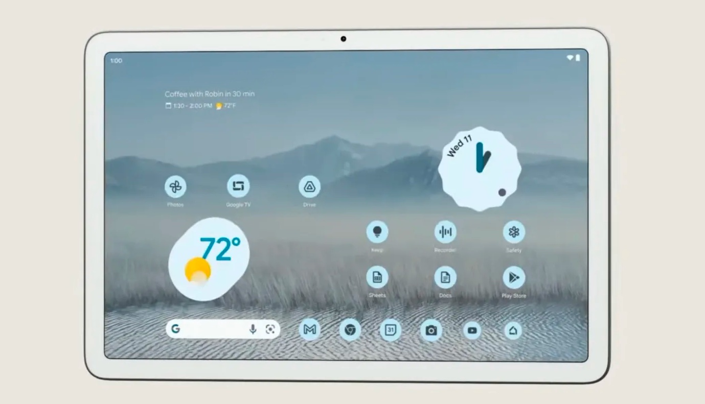
Is this an early look at the Google Pixel Tablet’s UI?
Google reveals its latest Android tablet work

Google will launch its Google Pixel Tablet in 2023 and while we know it is poised to be a two-in-one smart screen that can also become a smart home hub when docked on a speaker stand — what isn't known yet is how the UI will look and feel on the tablet.
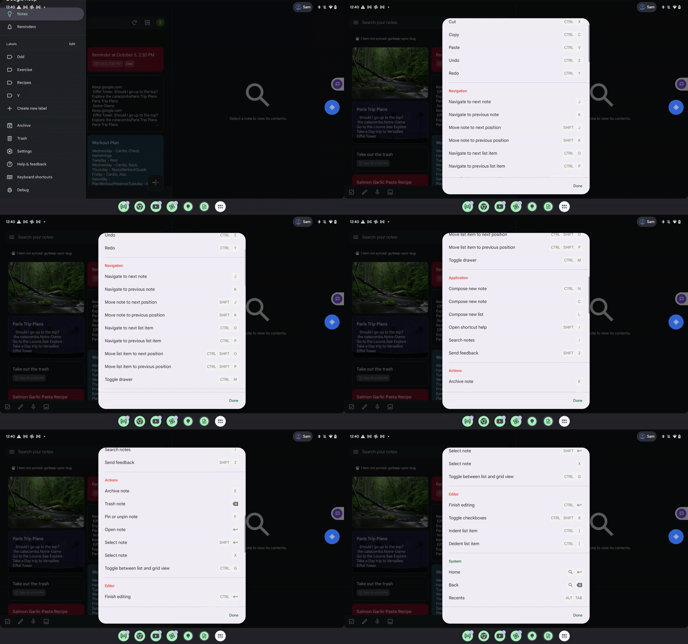
Leaked images recently showed what Google Assistant and Discover could look like on the tablet. Now, on its relatively low-profile Workspace Updates blog, Google has just provided a GIF which may give us an early glimpse of what the upcoming Pixel Tablet’s UI will look like.
The update shows the company’s latest efforts in ensuring a “top-class user experience on large screen devices” and shows the arrival of keyboard shortcuts for the Keep app.

But as 9to5Google notes, the GIF above is 674 x 421, which scales up to 2,560 x 1,600. That’s the resolution that the Pixel Tablet will reportedly offer when it’s released next year.
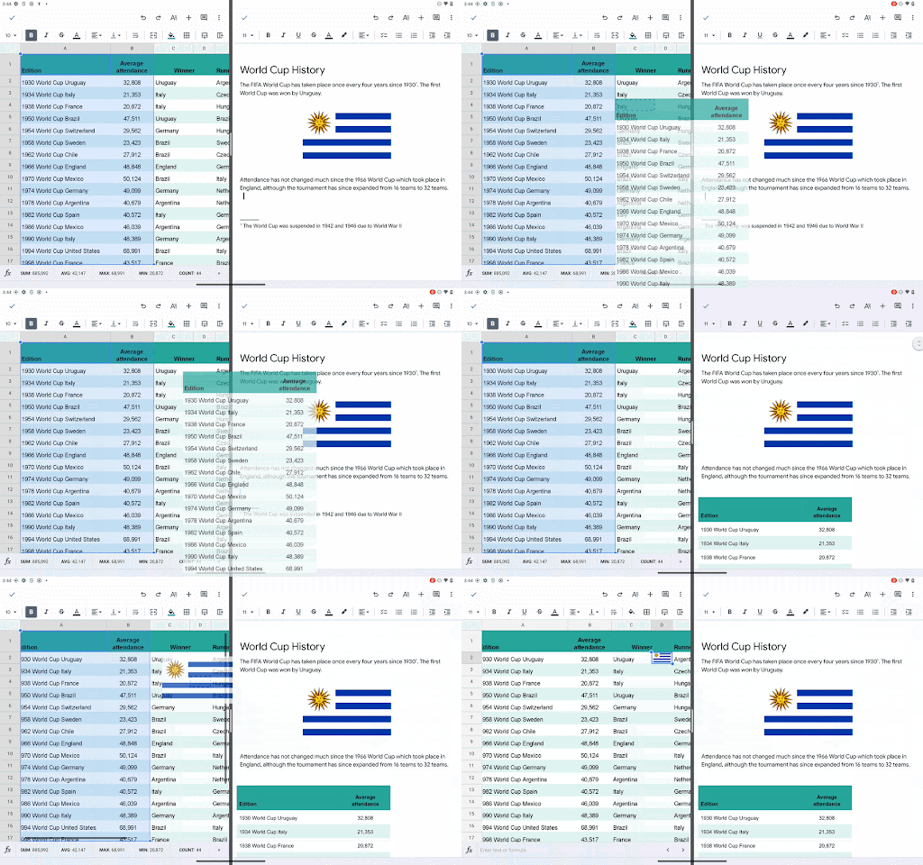
Notably, a post on the same blog from July showed another tablet UI update in Google Sheets for tablets. Its resolution? 512 x 320. If you multiply that by five you also reach 2,560 x 1,600.

It’s worth noting that other Android tablets like the Samsung Galaxy Tab S8 also share the 2,560 x 1,600 resolution, but whether or not this was screen recorded directly from a Pixel Tablet prototype or something else, it still gives us an idea of how Google may want things to work.
The first thing of note is that across both, the status bar and taskbar are a lot taller than you might expect. In the former, icons and the time are further away from the screen edges than you see on mobile, and there’s a prominent account-switching icon on the Keep GIF. That suggests that Google views tablets as less of a personal device and more one that can be shared between family members.
Sign up to get the BEST of Tom's Guide direct to your inbox.
Get instant access to breaking news, the hottest reviews, great deals and helpful tips.
The icons along the bottom of the screen differ between the two, but both have a shortcut for viewing your full app list. Notably, app windows appear to be embracing rounded edges too, even when you’re viewing two side by side, as in the second GIF.
When two apps are positioned like that, it also looks like you’ll be able to resize them, as the second GIF appears to show an app slider nestled between the two.
Add these GIFs to the tranch of screenshots found in the Google Search beta yesterday, and you’ve got a good taste of exactly how the Pixel Tablet will look and feel when it’s released.
We already know that said release date won’t be this year, as Google clearly earmarked it as a 2023 product when it was first revealed at I/O in May. Still, with 2022 drawing to a close that means we’ll get to try this for ourselves at some point within the next 14 months. You never know, it might be as few as three months.
Freelance contributor Alan has been writing about tech for over a decade, covering phones, drones and everything in between. Previously Deputy Editor of tech site Alphr, his words are found all over the web and in the occasional magazine too. When not weighing up the pros and cons of the latest smartwatch, you'll probably find him tackling his ever-growing games backlog. Or, more likely, playing Spelunky for the millionth time.

