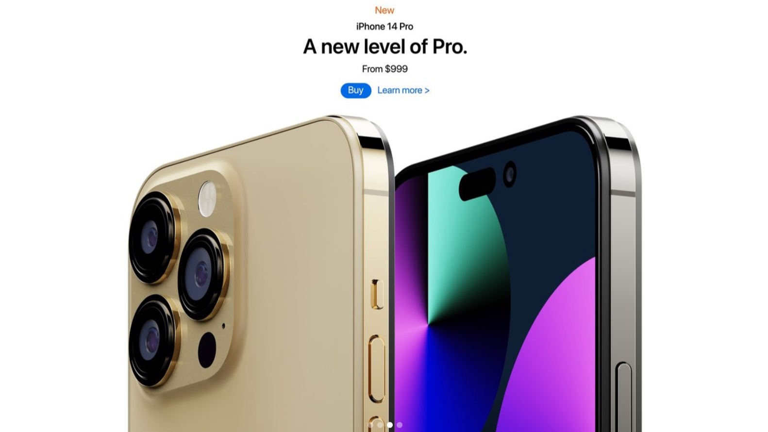
iPhone 14 — not even this gorgeous concept can make dual cutouts look good
Apple's rumored plan to replace the notch looks a little jarring when you see it as a render

Update: Don't expect Touch ID on the iPhone 14, or any future iPhone flagship for that matter, since a new rumor claims APple has pulled all engineers off the project to work on Face ID
The iPhone 14 is likely to ditch the notch that's adorned Apple handsets since the iPhone X, at least on some models. But Apple's rumored solution for getting rid of the notch could be as jarring as the notch itself.
Thats the only thing we can conclude after seeing the latest round of iPhone 14 concept renders created by a designer. While there's nothing wrong with the design conceived by Volodymyr Lenard and posted to Instagram — really, the phones look quite striking overall — there's just no ignoring the multiple display cutouts that take the place of the notch.
That look wasn't pulled out of thin air. Rumors about Apple's iPhone 14 design plans suggest Apple is going to go with a pill-shaped cutout in lieu of a notch. But, because Apple has to find a home for Face ID sensors along with a front camera, there would also be a punch-hole cutout alongside that pill-shaped hole.
A post shared by Volodymyr Lenard (@vovalenard)
A photo posted by on
And that's exactly what Lenard's iPhone 14 design depicts. Perhaps this is something we could get used to should Apple opt for this approach, but the more holes one punches in a phone's display, the more obtrusive they seem.
The benefit to a punch-hole cutout for a camera is that it's just one hole in the screen that's easy enough to obscure. A pill-shaped cutout is a lot less subtle and a second cutout next to it draws unnecessary attention. Sticking with the notch would almost be better in this case, as that's something iPhone fans are at least familiar with.
Speaking of familiarity, Lenard's iPhone 14 concept design should look pretty familiar if you've seen the iPhones Apple has produced in recent years. Again, that's not out of line with any iPhone 14 rumors, which have predicted a lot of similarities to the current iPhone 13 models, right down to the straight edges and square camera arrays.
Sign up to get the BEST of Tom's Guide direct to your inbox.
Get instant access to breaking news, the hottest reviews, great deals and helpful tips.
That camera array is especially noteworthy, given what we've seen with the newly released Galaxy S22 Ultra. Samsung's latest flagship phone features multiple lenses that blend somewhat seamlessly into the back of the phone. It's a sharp contrast from the prominent camera bumps featured on recent phones, including the iPhone 13 series — and this iPhone 14 concept which shows off the Pro models and their three-camera array.
Samsung has shown a better way to house cameras with the Galaxy S22 Ultra, and it's a design others should pick up on,. While Apple tends to forge its own design path — with a very good track record of success, we should add — the iPhone design is beginning to show its age, and one area that could stand some improvement is making the cameras jut out less.
It'll be some time before we find out what design Apple has planned for the iPhone 14. Those flagship phones aren't expected to arrive until September, while the iPhone SE 3 is rumored to be coming within a month. Of course, that money is rumored to retain its current design, too.
Philip Michaels is a Managing Editor at Tom's Guide. He's been covering personal technology since 1999 and was in the building when Steve Jobs showed off the iPhone for the first time. He's been evaluating smartphones since that first iPhone debuted in 2007, and he's been following phone carriers and smartphone plans since 2015. He has strong opinions about Apple, the Oakland Athletics, old movies and proper butchery techniques. Follow him at @PhilipMichaels.

