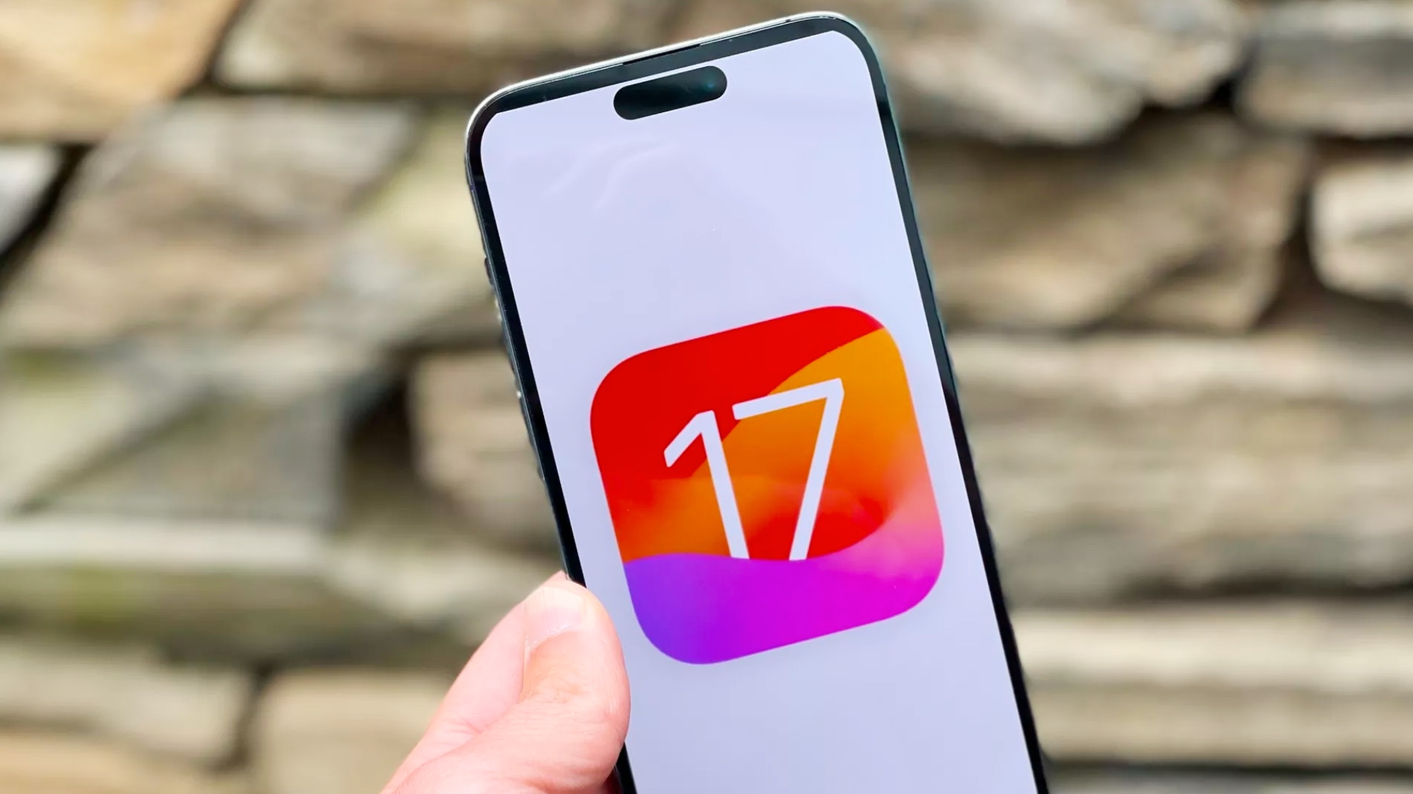
iOS 17 beta just moved the End Call button again — plus other changes
It looks like Apple just caved due to the outcry

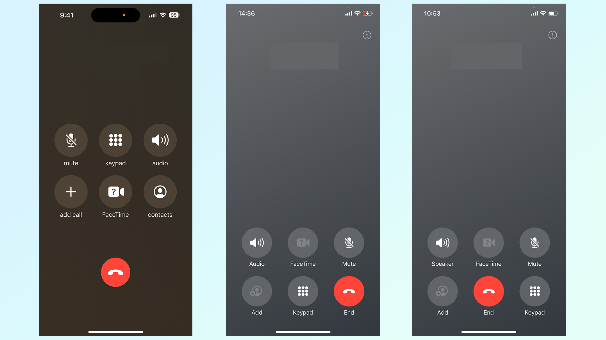
Last week it was revealed that the iOS 17 beta had made some changes to the call screen, and moved some of the buttons around — including the red End Call button. It seems Apple hasn’t quite figured out what sort of layout it wants, because the latest iOS 17 beta has shifted the button positioning yet again.
The iOS 17 public beta 4 (also known as developer beta 6) has just started rolling out, and with it comes this tweaked version of the call screen. It’s very similar to the last version of the call screen, which featured some major changes from the interface on iOS 16. Only this time Apple has swapped the positioning of the End and Keypad buttons.
This means the End Call button is now back in the center, albeit still at the bottom of the screen, while the Keypad is sitting in the bottom right.

It’s not clear why the interface has been changed again, and Apple doesn’t have a habit of explaining such decisions. There was a bunch of outcry against this change, though, especially since the FaceTime button now lives where the End call button used to be.
But that backlash really only gained traction last week, and that would mean a very short turnaround for the latest change. To be fair, people are making considerably less phone calls than they used to — and the younger the user the fewer calls they seem to make.
In those instances people tend to look at their screen and hit the big red button, rather than relying on muscle memory alone. Of course some people still do that, and the kind of change Apple preaviously implemented in the iOS 17 beta may have caused them some minor awkwardness for the first few days and weeks after upgrading.
At least now the button has moved down the screen by about a quarter of an inch, instead of diagonally. If you are one of those muscle memory fans, that should make it a lot easier to readjust your habits.
Sign up to get the BEST of Tom's Guide direct to your inbox.
Get instant access to breaking news, the hottest reviews, great deals and helpful tips.
Other additions in iOS 17 public beta 4
There’s more to the new iOS 17 beta than just a newly-tweaked call screen — though it will no doubt be welcome news to users.
In the Messages app, long-pressing the “+” button in the bottom left will now bring up the Photo gallery — saving you the minor hassle of selecting Photos from the menu. The Photos app itself has a new splash screen when you open it for the first time, explaining all the new features that have been included in the update. There's the option to have Albums in the Photos widget, albums of your pet pictures, pinch-to-crop and more customizable memories.
Animations for Mood Tracking have also had some tweaks, with faster animations and more rings around each shape. It looks like the wallpaper icons in the Display & Brightness section of the settings app has also had a minor update.
The launch of iOS 17 is drawing ever closer, and if past experience tells us anything it’ll arrive right before the iPhone 15 launch. Currently the Apple September Event is rumored to be happening on September 12, which means we could be less than a month away from the full public release.
With that in mind, it means all future beta updates will be similar to this — smaller tweaks and enhancements rather than big flashy features. Because at this stage Apple is going to be focussed on refining the iOS 17 update, and not potentially adding things that could cause more problems.
Be sure to check out our iOS 17 hub for the rundown of all the latest features coming to your iPhone, and believe me there are a lot of them to sift through. And if you still can’t wait for the public release, we have a guide on how to install the iOS 17 public beta. That gives you the chance to check everything out a little early, but with the risk that some of it may not work as expected.
More from Tom's Guide

Tom is the Tom's Guide's UK Phones Editor, tackling the latest smartphone news and vocally expressing his opinions about upcoming features or changes. It's long way from his days as editor of Gizmodo UK, when pretty much everything was on the table. He’s usually found trying to squeeze another giant Lego set onto the shelf, draining very large cups of coffee, or complaining about how terrible his Smart TV is.
