iOS 16 Lock Screen — 5 surprising things Apple just revealed
Apple explains the thought behind the new look iOS 16 Lock Screen
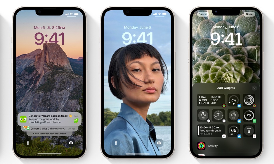
With iOS 16, Apple is giving the iconic Lock Screen a substantial makeover allowing for customization and widgets to spruce up the simple minimalism that has defined it over the first 15 years of the iPhone’s life.
But this isn’t just a thoughtless attempt to mimic Android’s free-for-all customization options, and Apple has given the changes a lot of thought. In a wide-reaching exclusive interview with our sister site, TechRadar, Apple’s SVP of Engineering, Craig Federighi, and VP of Design, Alan Dye, explained some of those thoughts behind it.
The whole piece is worth reading, but here are five of the key design choices explained by the two men.
Segmentation is key
Since the first iPhone in 2007, the clock has sat imposed onto whatever picture you chose. That’s important, and while Apple did apparently consider ditching it, it was ultimately considered too iconic to remove.
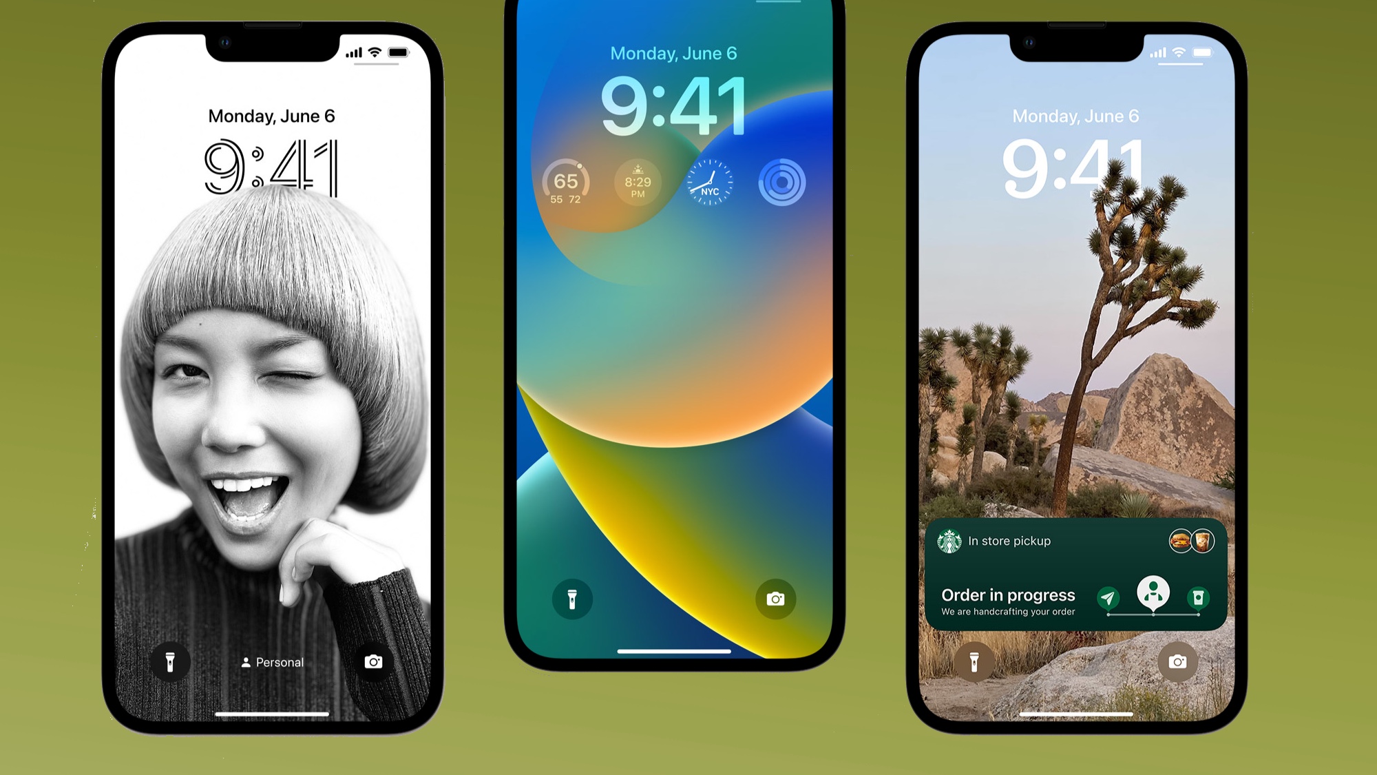
But that doesn’t mean it’s unchanged. In iOS 16, elements of your Lock Screen photograph can overlap the time in the same way established magazines sometimes cover up a bit of their header for an arresting image.
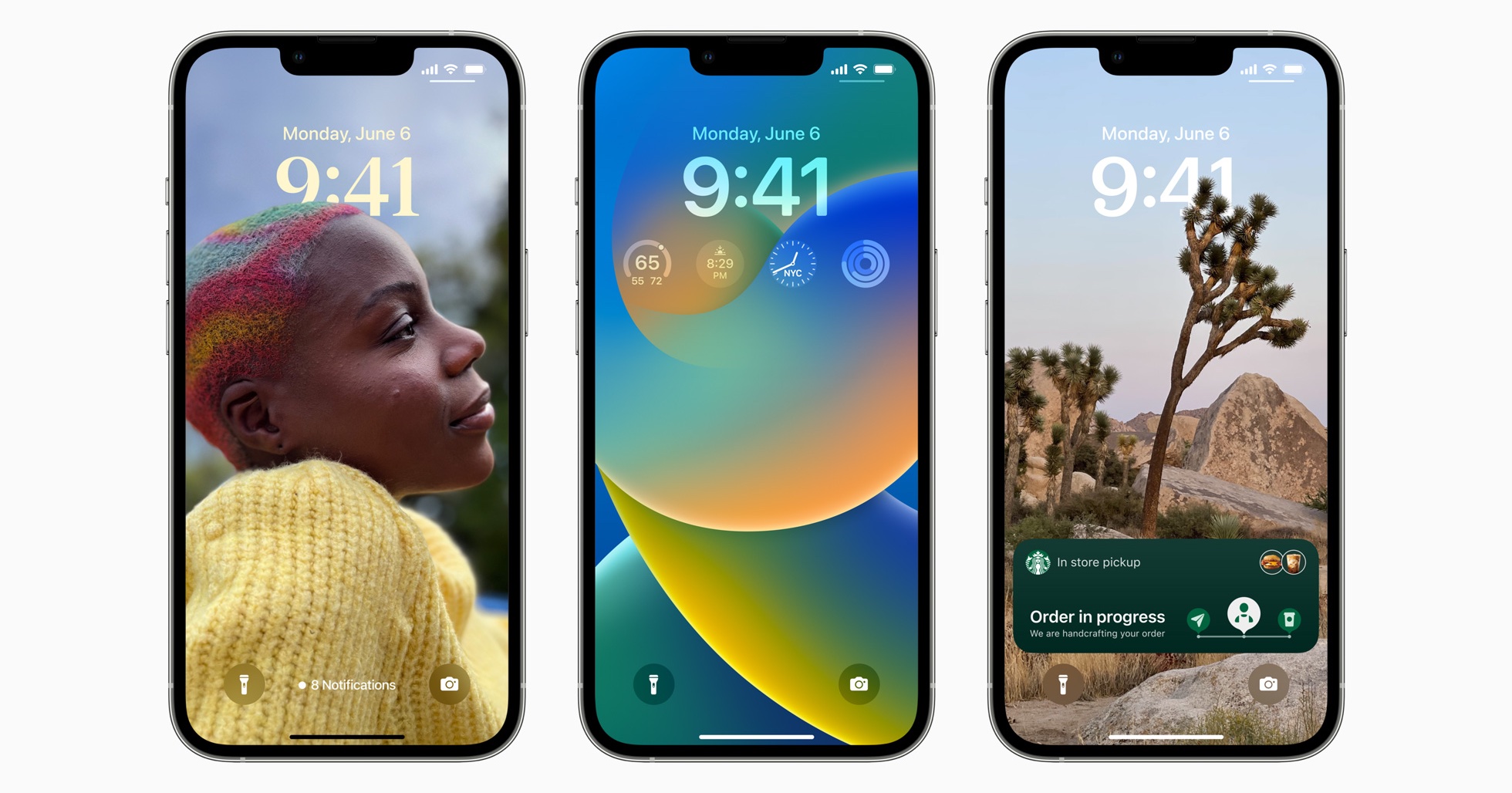
“From a Design Team perspective, our goal was to create something that felt almost more editorial, and to give the user the ability to create a Lock Screen that really… ends up looking like a great magazine cover or film poster but doing it in a way that’s hopefully really simple to create, very fun, and even with a lot of automation there,” explains Dye.
The automatic overlapping of images that brings it all together — something Apple calls “segmentation” — is no easy accomplishment. “We’ve been wanting to achieve this look, but the segmentation’s gotten so good, that we really feel comfortable putting [in there],” Dye explains. “Unless the segmentation is just ridiculously good, it breaks the illusion.”
Sign up to get the BEST of Tom's Guide direct to your inbox.
Get instant access to breaking news, the hottest reviews, great deals and helpful tips.
Thanks to the power of the AI Neural Engine on Apple’s recent chips that with the A15 Bionic powering the iPhone 13, the result is almost instantaneous. The phone can “take a photo we’ve never seen before and figure out the subject, and segment it, and allow that interaction so fast, that we can do it the moment that your finger hits the glass,” Federighi explains.
The Apple Watch influence is real
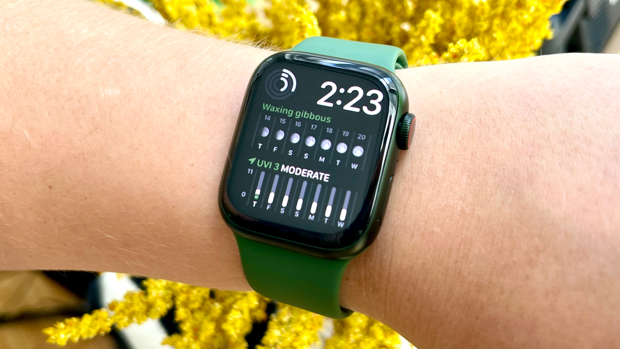
Then there are personalizations — what Android users would know as “widgets” — are here for the first time and they may look slightly familiar to those who already wear an Apple Watch.
“Of course, we took a lot of inspiration for Apple Watch complications in designing these widgets that make it very easy to get information at a glance,” explains Dye.
“There’s no question – one of the benefits of having one design team that works on every product and the design across all of our products, we learned a lot about glanceable information and how to portray that over a variety of different images,” he added.
You’ll be nudged towards aesthetically pleasing choices
While most implementations of Android will let you do just about anything with your locked screen, iOS 16 is apparently aiming to nudge you towards more aesthetically pleasing choices.
First of all, the number of personalizations allowed on the lock screen is capped, and they can’t just be placed anywhere. “This is very intentional,” Federighi explains. “It would’ve been very easy for us to say, ‘Hey, drag anything anywhere.’ Honestly, technically, this would not have been a challenge.”
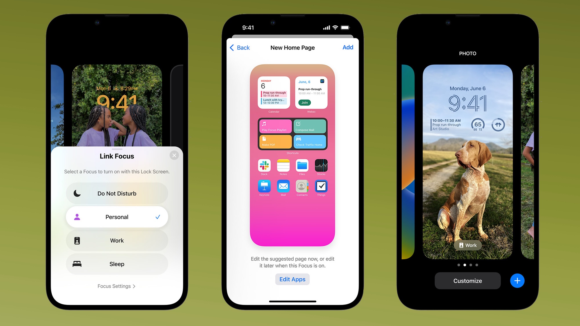
Secondly, iOS 16 will automatically surface photos that the AI knows will work well. “[There are] actually about a dozen neural networks that judge the photo based on whether it’s a desirable subject, if there are people there, how they’re framed and cropped in the photo, their expressions,” says Dye. “All these things that allow us to surface automatically really great, compelling options for people and then to render them on the screen in a way that makes them feel almost all-new.”
These are “so much more than filters,” Dye explains. And if Apple doesn’t think something will work, it won’t suggest it. “You get something so much more compelling than just laying a filter over the photo,” Federighi explains.
Notifications are side-lined for a reason
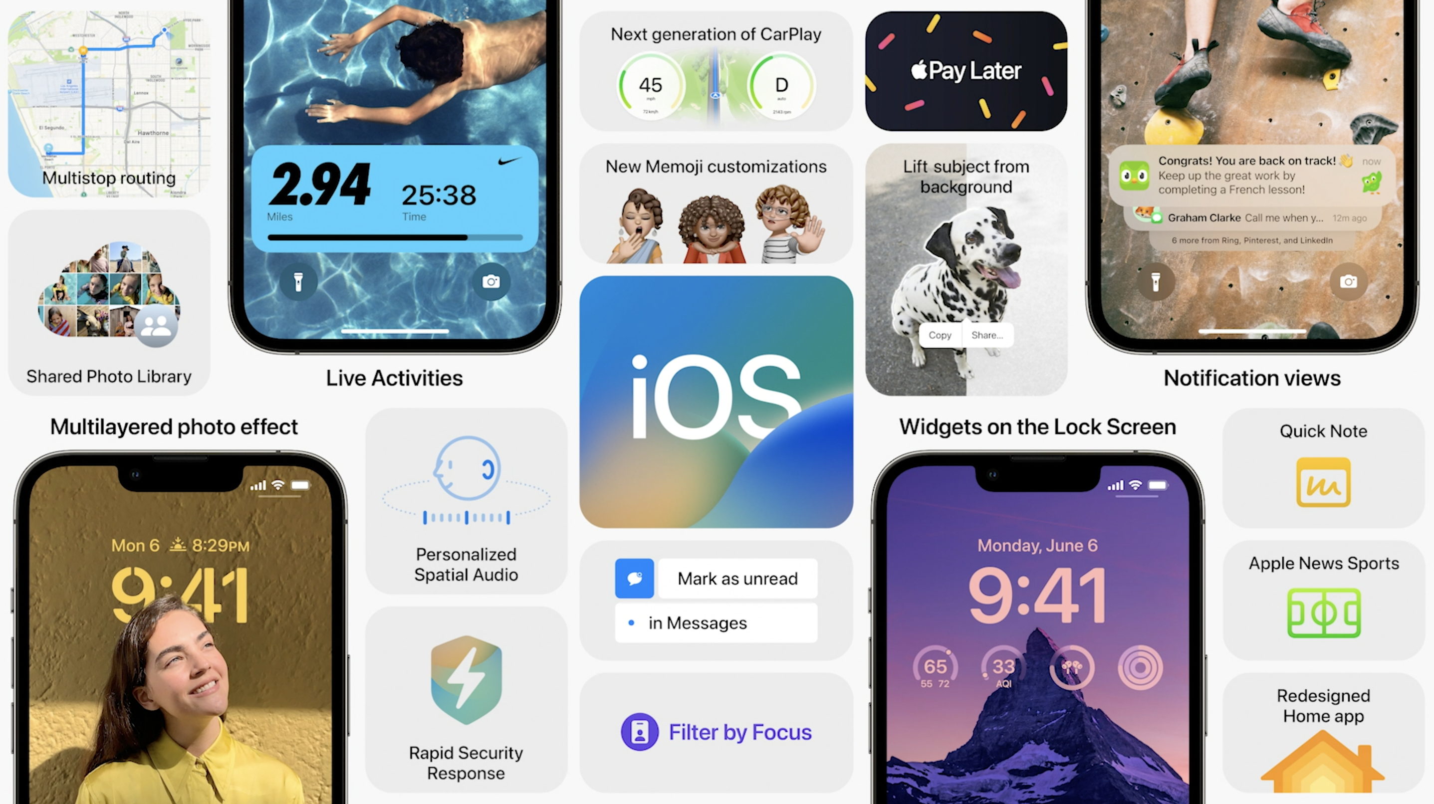
While Android tends to put notifications front and center, Apple has taken a different approach, pushing them to the bottom of the Lock Screen where they can be safely ignored and, crucially, don’t interfere with the artwork you’ve chosen.
“This notion where they flow in from the bottom is especially nice if you think about the personalization part because so often we see notifications completely obscuring the photo on your Lock Screen, which we didn’t want to do with this new design,” Dye says.
Change is optional
The trouble with any kind of change — no matter how positive — is that it can seem overwhelming. And when the Lock Screen has been largely unchanged for 15 years, Apple is very aware of this.
“When someone upgrades to iOS 16, they essentially won’t be confronted with any big change,” Federighi says.
“Somebody who would occasionally change the photo on their Lock Screen, they’d go into settings, and they’d go to that screen [that lets them make the change],” he continued.
“We meet them right there, as they go there and, some of this isn’t in the seed build right now, but we make them aware of their option to either change what they have like they did in the past or to add another [lock screen].”
You can read the whole interview at TechRadar. And for more of the latest Apple software updates, check out our WWDC 2022 recap.
Freelance contributor Alan has been writing about tech for over a decade, covering phones, drones and everything in between. Previously Deputy Editor of tech site Alphr, his words are found all over the web and in the occasional magazine too. When not weighing up the pros and cons of the latest smartwatch, you'll probably find him tackling his ever-growing games backlog. Or, more likely, playing Spelunky for the millionth time.

