iOS 15 redesign may have just leaked — thanks to these new icons
Apple might be shifting its design language for iOS 15

iOS 15 will launch alongside the iPhone 13 series later this year. Until then, we likely won't hear much about the direction Apple is taking with the latest version of its mobile OS until WWDC 2021 this summer.
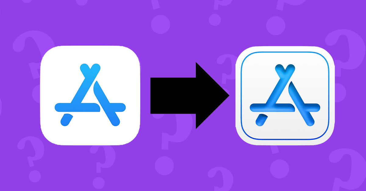
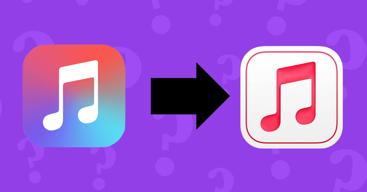
But leaks will happen, such as the one right here. We've seen two new icons that show quite a shift, one for Apple Music for Artists and the other for App Store Connect. The biggest change is the addition of depth.
- iOS 15: Everything we know so far
- iPhone 12 Pro vs OnePlus 9 Pro: Which phone wins?
- Plus: iPhone 13 release date, price, specs and leaks
While these icons are not necessarily indicative of the entire software design language for iOS 15, it certainly gives us a good glimpse at what we might expect. Apple seems to have placed an emphasis on depth, reflecting some of the changes the company has made with Big Sur.
The new App Store Connect icon in particular looks like it's hearkening back to the 3D everything of the 2000's, with the icon looking etched into the background. The Apple Music for Artists looks less pronounced, but the note definitely stands out from the background whereas it looked like a part of it in the old icon.

Spotted by Reddit user DimVI (via TheNextWeb), these new icons somewhat follow what's known at the nuemorphic style. From all appearances, nuemorphism in graphic design emphasizes depth in otherwise flat elements. Apple isn't necessarily embracing this design philosophy, but the influences are there.
Both icons now use a white background with an accent-colored border. Some speculate that the white background means that the icon can go dark if iOS's dark mode is enabled. It'd be a cool touch if true.

Like we said above, these two icons are not necessarily indicative of the overall design language for iOS 15. While we think Apple should introduce some fresh design language with iOS 15 (Google is doing it for Android 12), nobody but Apple knows what the future holds.
Sign up to get the BEST of Tom's Guide direct to your inbox.
Get instant access to breaking news, the hottest reviews, great deals and helpful tips.
That being said, it'd be weird for these icons to just stand out on their own. We expect to see more and more iOS icons make this shift in the coming months as Apple gears up for the iOS 15 reveal and betas this summer.
- More: The best iPhones right now

Jordan is the Phones Editor for Tom's Guide, covering all things phone-related. He's written about phones for over six years and plans to continue for a long while to come. He loves nothing more than relaxing in his home with a book, game, or his latest personal writing project. Jordan likes finding new things to dive into, from books and games to new mechanical keyboard switches and fun keycap sets. Outside of work, you can find him poring over open-source software and his studies.
