iOS 15 gives Safari a huge overhaul — here’s what I love (and hate)
Safari gets a new — and divisive — interface on the iPhone

iOS 15 packs in a lot of changes for the built-in apps on your iPhone. But the biggest overhaul to an existing app can be found in Safari. Not only does iOS 15 add new capabilities to your phone's built-in browser, it revamps the very look of Safari itself.
Safari's overhaul isn't limited to the iPhone. Both macOS Monterey and iPadOS 15 change the look of the browser on both Macs and iPads, opting for a more streamlined approach. iOS 15's version takes a very phone-centric approach that's unique to the iPhone's more limited screen real estate. The results, frankly, are a bit of a mixed bag.
- iOS 15 Maps — 7 biggest changes
- Here are the hidden iOS 15 features you should know about
- Plus: How to download the iOS 15 public beta right now
I've spent some time with iOS 15's Safari as part of my iOS 15 beta hands-on review. While some of the changes introduced by Apple are certainly welcome, others will require a little getting used to — and maybe even some tweaks by Apple before the final version of iOS 15 ships this fall.
Here's a closer look at what's new in iOS 15 Safari, in addition to which changes are hits and which ones are misses.
iOS 15 Safari's new customizable start page is great
The start page — that place in Safari that houses your bookmarks, reading list, frequently visited pages and other browsing activities — gets the makeover you didn't know it needed. And this new look figures to be very satisfying, as it's you making all the changes.

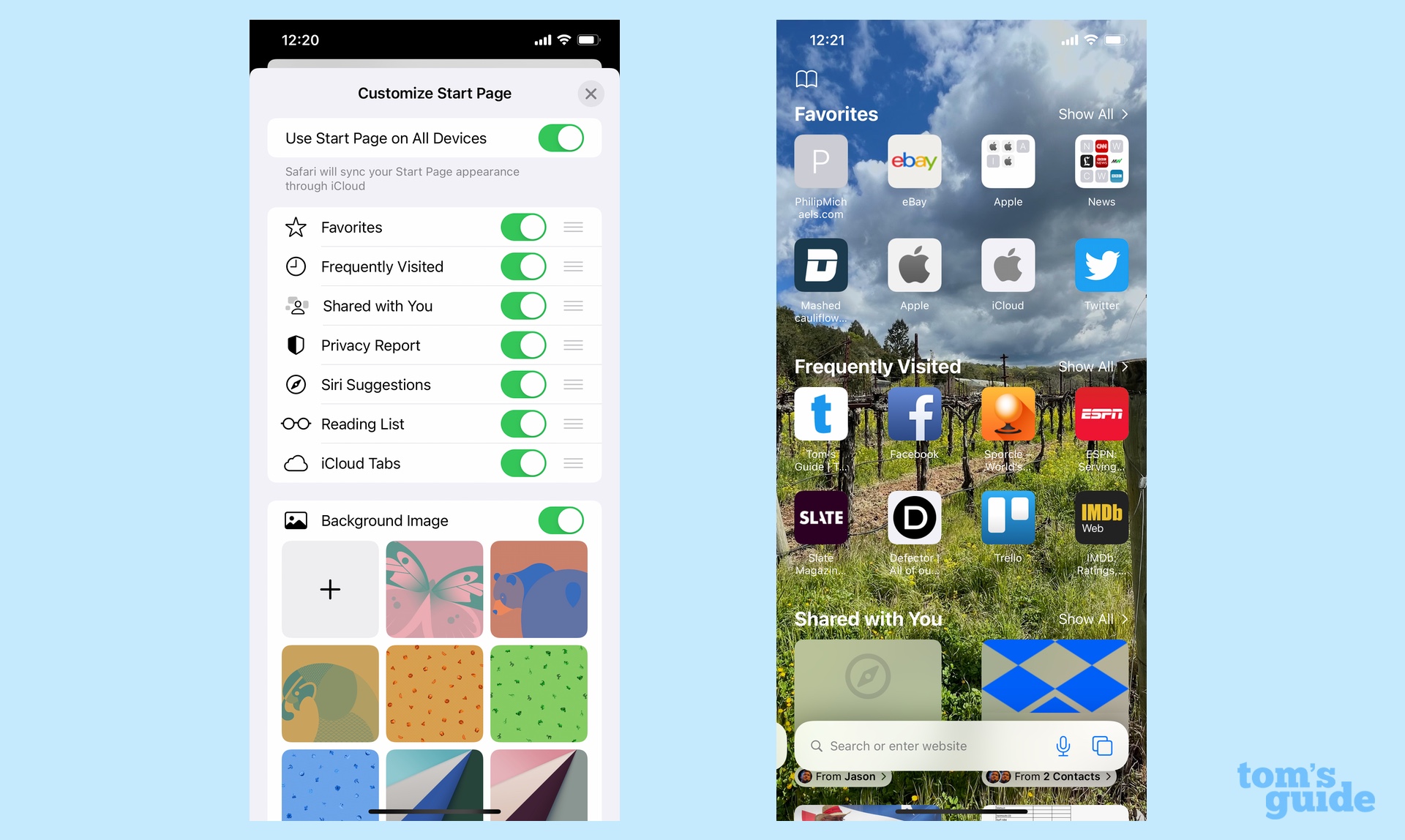
iOS 15 Safari lets you customize the start page to your liking. That means you can change the order in which sections appear or remove them entirely. You also get the option of adding a background image to the start page — Apple offers its own backgrounds, though you can also select an image from your photo library. And there's a button for making sure that your start page syncs across all your different Apple devices (assuming they're running the latest Apple software, too.)
To get to your start page, tap the tab bar at the bottom of the screen — yes, I know, we're going to talk about that soon — and scroll all the way to the bottom of the page to edit what appears there. You have the option of showing favorite pages, frequently visited sites, links that have been shared with you, Apple's privacy report, Siri's suggested web pages, your reading list, and tabs you have open in other devices. You can also use the three horizontal bars to move around what order those items appear in.
Sign up to get the BEST of Tom's Guide direct to your inbox.
Get instant access to breaking news, the hottest reviews, great deals and helpful tips.
You may not make any changes at all or you may determine that a background image isn't to your liking. The point is, Apple puts the control in your hands, and that's probably the best addition to iOS 15 Safari.
Shared with You is a welcome addition to iOS 15 Safari
The other great new feature in Safari on iOS 15 is one that's actually included across multiple apps. Shared with You has its home in Messages, but it extends to Safari, as well as Photos, Podcasts, Apple Music, Apple News and Apple TV.

Here's how it works — when someone shares something with you via Messages, it will appear in a newly added Shared with You section of the relevant app. In the case of Safari, that means any web links will be stacked up in Shared with You on your Safari start page, so that you can click through to the links at your leisure without having to dig back to Messages to find them.
Even better, if you feel compelled to reply to the person who sent you the link, you can do so directly from Safari. Just tap the name of the person underneath the shared link, and a messaging window will pop up, allowing you to text a reply. It's a convenient way of following up without having to shuffle back and forth between apps.
Tab Groups is a promising feature, though maybe not for mobile
Whatever Apple device you're running Safari on, the new version adds a feature called Tab Groups. The name tells you all you need to know — instead of keeping a lot of individual tabs open, you can group related ones together, contracting and expanding those tabs on a need-to-browse basis.

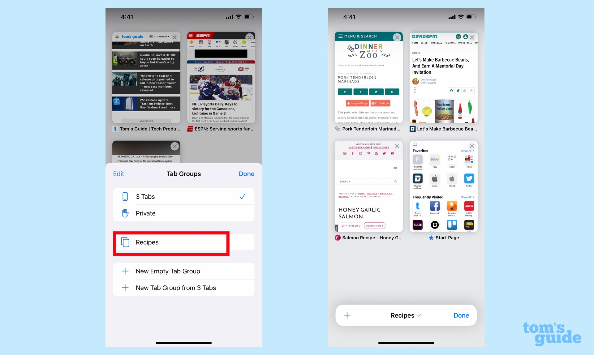
I haven't used macOS Monterey yet, but I imagine that Tab Groups really cuts down the clutter on the Mac version of Safari. That's less of a concern on the iPhone, where tabs are tucked away. Accessing your Tab Groups in iOS 15 is not necessarily intuitive, either. You tap on the double page icon to view all your tabs **and then** tap on the tab bar on the bottom of the screen to pull up your available Tab Groups. (Like many features in Safari, Tab Groups follow you across your different Apple devices.) Select your Tab Group by tapping and the taps spread out into a grid-like view of page thumbnails.
That's a lot of tapping to get to Tab Groups, but the organizational feature is a lot better than swiping through all those fanned out tabs in iOS 14. I collect a lot of online recipes, and the Tab Groups view provides a much handier interface for picking the linked recipe that I want for dinner or switching over between recipes if I'm prepping more than one dish.
Tab Groups may be a more appropriate fit on the Mac or iPad, but I'm still glad it's included with iOS 15 Safari.
You can search using your voice in iOS 15 Safari

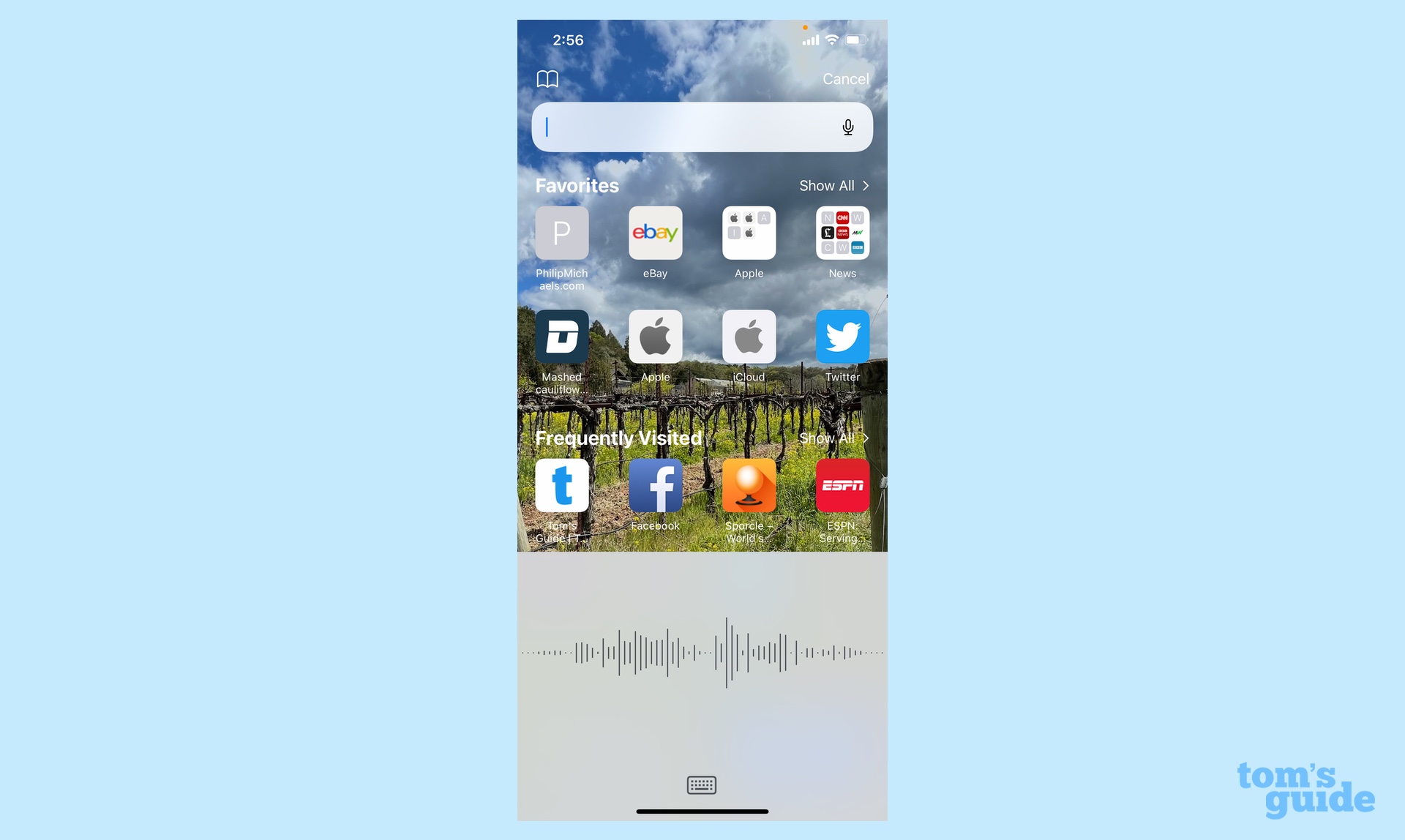
Tap the Tab Bar at the bottom of the screen — trust me, we're getting to that — and you'll now see a microphone icon appear in the far right of the text field. Tap the mic and you can dictate your search term to Siri. The moment you're done talking, the search takes place automatically, without you having to tap or type anything else. It's very convenient.
The placement of iOS 15's Tab Bar is very jarring
So about that Tab Bar. As in the other Safari revamps, it's been streamlined as a place to enter both URLs and search terms. It's also been moved to the bottom of your screen in iOS 15 Safari, though there's some method to Apple's apparent madness. Placing the Tab Bar down there puts it in easy reach of your thumb, enabling one-handed browsing even on iPhones with larger screens — or so the argument in favor of the move goes.

Charitably, I'd say this switch will take some getting used to. I've been using the iOS 15 beta for a couple weeks now, and I still find myself tapping the top of the Safari page and being surprised when I can't enter in a URL. It doesn't help that a lot of web pages have headers that look a lot like tab bars. Your eye — and your finger — is naturally drawn there, especially with Apple tucking away the Tab Bar when it's not in use.
That creates a more pressing problem than not being used to the placement of the Tab Bar. You summon it by tapping, and you don't have a lot of screen real estate to work with. The tab bar is housed just above the bar you swipe to exit apps. A lot of modern web sites also stick ads at the bottom of their page. So, essentially, you've got an ad and an app switching bar and a small Tab Bar strip wedged between them. A small thermal exhaust port on a fully operational Death Star makes for a more inviting target.
Navigation in iOS 15 Safari is also complicated
If you think it's hard tapping the Tab Bar, just wait until you try to navigate between tabs in iOS 15 Safari. You do this by swiping left or right, which is certainly natural enough. But to successfully swipe, you've got to first tap the tab bar and then swipe on top of it. Forget that first step and you'll swipe your way right out of Safari and into the last app you had open (if you're swiping right). It's very annoying and I hope Apple makes the swiping easier to pull off before the final version of iOS 15 comes out.
The jury's still out on web extensions in iOS 15 Safari
There's one feature in iOS 15 Safari that I haven't really tested yet. Apple's built-in browser now supports web extensions, the first time you can say that in 14 years of the iPhone. According to Apple, you can customize your iPhone-based version of Safari as much as you have on the Mac.
I'm not the intended audience for this, as I don't make much use of extensions for Safari on my MacBook Air. But more to the point, I don't know that there's many iOS Safari-ready web extensions to be used with iOS 15 Safari at this point. That's likely to change as more developers spend more time with the beta, but for now, let's just file web extension support under "Sounds promising."
iOS 15 Safari outlook
The new version of Safari on the iPhone has a lot going for it, while a few design changes are working against it. Unfortunately, the latter threaten to overwhelm the former. As welcome as the customizable smart page and Shared with You are, the frustrations of navigating through Safari outweigh those benefits. Perhaps that will ease up with time — or even better, with some modest intervention from Apple.
Philip Michaels is a Managing Editor at Tom's Guide. He's been covering personal technology since 1999 and was in the building when Steve Jobs showed off the iPhone for the first time. He's been evaluating smartphones since that first iPhone debuted in 2007, and he's been following phone carriers and smartphone plans since 2015. He has strong opinions about Apple, the Oakland Athletics, old movies and proper butchery techniques. Follow him at @PhilipMichaels.

