iOS 14 home screen ideas: Our favorite custom iPhone layouts so far
Some inspiration for designing your dream iPhone home screen.

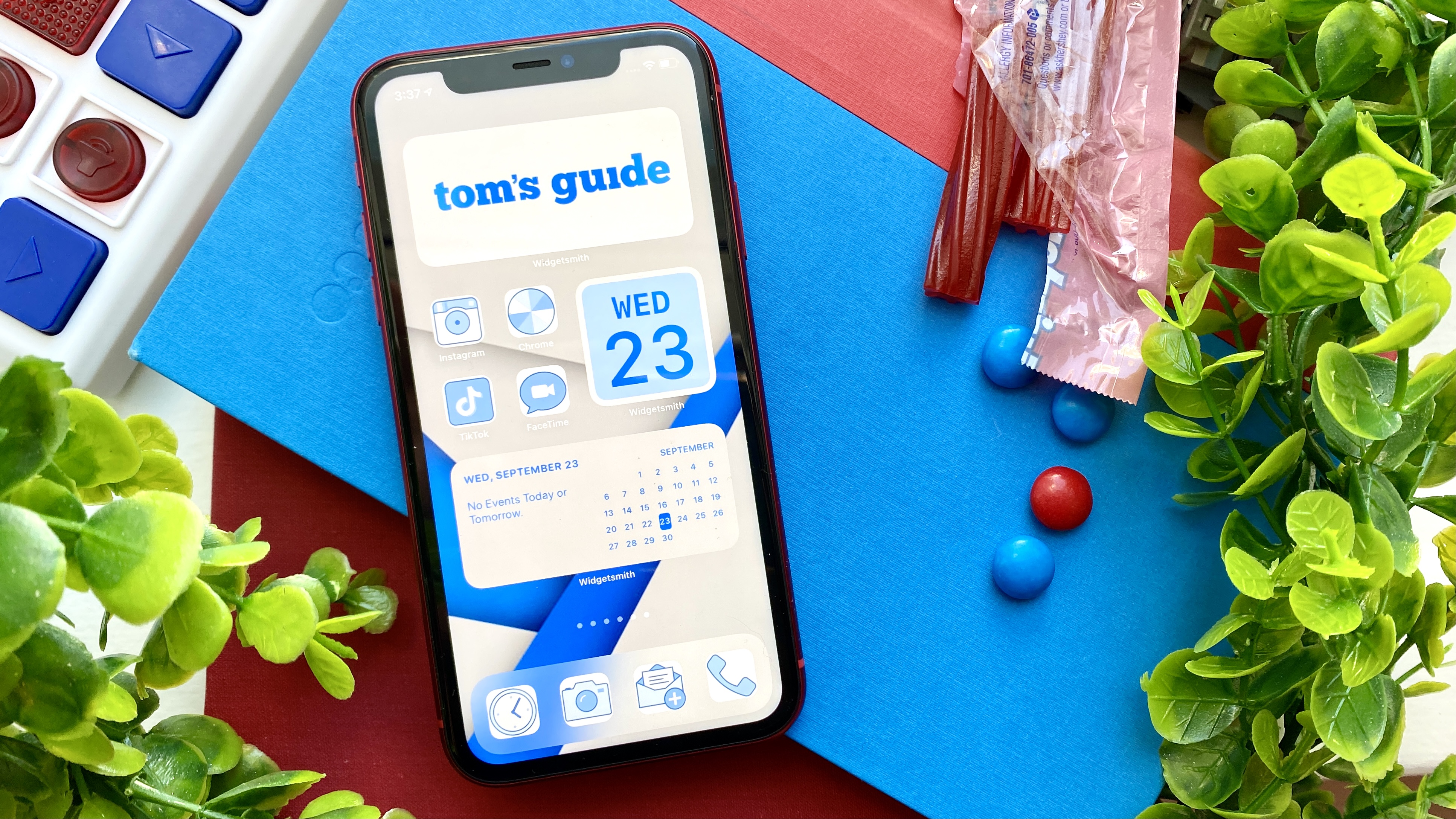
iOS 14 home screen ideas for your iPhone can help you customize your icon and widget setup around a unified theme.
iOS 14 has sparked a surge of creativity with the software’s new customization tools. You might notice the option to add widgets — or snippets of visual information that come in a variety of sizes — among your home screen’s apps. While Apple provides a collection of native widgets, there are a number of third-party widget design apps available, too.
- The best iOS 14 widgets you can use now
- How to change your default apps in iOS 14
- Just in: Google Maps just got a huge update
As a result, users have hacked a way to create iPhone home screen themes, combining their new widgets with custom app icons. Perhaps you’ve seen the utterly incredible Animal Crossing and Microsoft Paint-inspired layouts trending online.
Our guide on how to make custom iPhone widgets and app icons with iOS 14 explains how to go about designing the display of your dreams, but if you’re in need of some inspiration, or just want to see how clever the internet can be, keep reading for a round up of iOS 14 home screen ideas.
1. Hand-drawn doodles
iOS 14 let’s you re-do app icons so naturally remade them all much worse in MS paint style Sorry to all app icon designers that spent years making them nice pic.twitter.com/bsa0E5VvSySeptember 20, 2020
Relive the days when crude doodles were cool. Microsoft Paint makes everyone nostalgic, for better or for worse — either way, this homage is pretty awesome. But if you don’t have access to a machine with MS Paint, any of the best drawing apps can help you design your very own hand-drawn icons.
2. Old-school iOS
I'm still rockin that iOS 5 feel. pic.twitter.com/j4UBHWhvdEDecember 11, 2020
This might be another throwback theme, but hey, any year is better than this one. You can’t restore bygone iOS software to your iPhone, but you can recreate the aesthetics of early-2010s Apple devices with old-school app icons. The best part? You still get to charge with a lightning cable. Even better if you have an ancient iPod touch for reference.
3. Monochrome
Current iOS 14 home screen setup. pic.twitter.com/gtFjRnMkq7September 20, 2020
There are a couple different routes to take when organizing a monochrome iOS 14 home screen. You can make each page a different color of the rainbow by separating apps based on their original icon colors. Or, you can make custom app icons that match a single color. An all-black layout is especially sleek, although any color will work.
Sign up to get the BEST of Tom's Guide direct to your inbox.
Get instant access to breaking news, the hottest reviews, great deals and helpful tips.
4. Pastels
My new iPhone Home Screen do be looking kinda cute now pic.twitter.com/twi9Mf4BVkSeptember 19, 2020
Pastel colors are ideal for spring, but can be used all year round to give your iPhone home screen a soft, Miami Vice vibe. Light pinks, purples, blues, yellows and greens look great together, so unlike a monochrome theme, a pastel one provides a broader color palette.
5. Neon
Working progress but I have to stop now it’s taken me half a day🤯#ios14homescreen pic.twitter.com/wgSQjxK93GSeptember 20, 2020
The ’80s-inspired Neon trend has infiltrated iPhones, and we have to admit, it looks pretty mesmerizing. When you turn all your app icons into miniature neon signs against a dimly-lit background, it creates a cool depth effect on your display. Check out this link for a collection of neon icons you can use to transform your iOS 14 home screen.
6. Neutrals
i know i’m late but here’s my #ios14homescreen pic.twitter.com/56N1a3mu1XSeptember 22, 2020
If eye-catching colors aren't your thing, try out this neutral iOS 14 home screen idea. Something about the minimalism of beiges, nudes and charcoals make us feel like our most polished selves.
7. Animal Crossing
Turned my iPhone into a NookPhone with iOS 14! Icons made by okpng on Twitter via /r/AnimalCrossing https://t.co/0RoD5AylqH #acnh #animalcrossing pic.twitter.com/lDoACEpEN1September 21, 2020
Moving away from color themes and into fandom-inspired iOS 14 home screen ideas, this recreated Nook phone from Animal Crossing: New Horizons might be the most incredible custom layout we've seen yet. You can use any of the best Nintendo Switch games as your inspiration, and even turn your gameplay screenshots into photo widgets.
8. Minecraft
If everyone’s showing their new #iOS14 #ios14homescreen then here’s mine pic.twitter.com/eIyrqI4KHHSeptember 21, 2020
The deceptively-simple looking Minecraft is still one of the hottest games around. If you're a Minecraft fan, you might appreciate constructing an iOS 14 home screen theme, using icons as your building blocks. And if you're not a fan, well, 8-bit icons look cool no matter what.
9. Star Wars
Finally finished my Star Wars iOS 14 homescreen! pic.twitter.com/o8SNuzDTBbSeptember 23, 2020
Star Wars can be interpreted for several different iOS 14 home screen ideas, although if it were up to us, we'd revolve each page around a trilogy, or maybe a character. It depends how many apps you have. This Lego Star Wars homage is clever, too.
10. Avatar the Last Airbender
Can't get good over how good my ios 14 homescreen looks pic.twitter.com/IE288Tl2tTSeptember 23, 2020
Ever since ATLA and The Legend of Korra hit Netflix, there's a renewed interest in the Nickelodeon sagas. As two of the best Netflix shows to binge watch now, these related series make stellar iOS 14 home screen themes.
Kate Kozuch is the managing editor of social and video at Tom’s Guide. She writes about smartwatches, TVs, audio devices, and some cooking appliances, too. Kate appears on Fox News to talk tech trends and runs the Tom's Guide TikTok account, which you should be following if you don't already. When she’s not filming tech videos, you can find her taking up a new sport, mastering the NYT Crossword or channeling her inner celebrity chef.
-
N. Ringheim Good looking stuff. It seems that the community that since the beginning of android expressed how dum and stupid looking widgets were, they have sure taken to it ;-) I believe it is a good thing, that the two platforms can inspire eachother. they might even inspire my phone layout.Reply

