I would buy an Apple HomePod — if it had this feature
A HomePod smart display would help HomeKit keep up with Alexa and Google Assistant

There aren’t many Apple product lines I haven’t owned or tested. One I’ve avoided is the HomePod — meaning both the original Apple HomePod and the $99 Apple HomePod mini — which is odd, since I write about smart home devices for a living.
My hesitation with HomePod is that it doesn’t fulfill a purpose for me. I already have plenty of the best smart speakers laying around, from superb Sonos soundbars to my ever-reliable Amazon Echo Dot with Clock. When I need to speak to Siri, I summon it from my iPhone or Apple Watch.
Apple has taken major steps to improve the HomeKit experience on my iOS and watchOS devices, specifically updating the app’s interface in watchOS 8 on my Apple Watch 7. The revamped HomeKit app is the most underrated new Apple Watch feature in watchOS 8, if you ask me.
Plus more best smart home device companies offer HomeKit-compatible options than ever. We saw several HomeKit-friendly video doorbells at CES 2022, as well as Schlage’s new smart lock that works with Apple’s digital keys for NFC control via iPhone or Apple Watch.
So it’s not really HomeKit that’s the problem. It’s Apple’s in-house HomeKit hardware. Though the HomePod mini provides solid audio quality and ensures Siri is always in voice’s reach, it’s not diverse enough to drive a purchase compared to the variety found among the best Alexa speakers and best Google Home speakers.
Something both the Google Nest and Amazon Echo device lineups have that Apple has yet to embrace is smart displays. Whether it’s on my kitchen counter or bedside table, smart displays provide visual interfaces for communications, entertainment, smart home controls and more.
It took me until recently to realize a HomePod with a display is the HomeKit device I’ve been waiting for. I caught sight of beautiful HomePod smart display concepts designed by Parker Ortolani for 9to5Mac a few days ago, and haven’t been able to stop thinking about them since.
Sign up to get the BEST of Tom's Guide direct to your inbox.
Get instant access to breaking news, the hottest reviews, great deals and helpful tips.

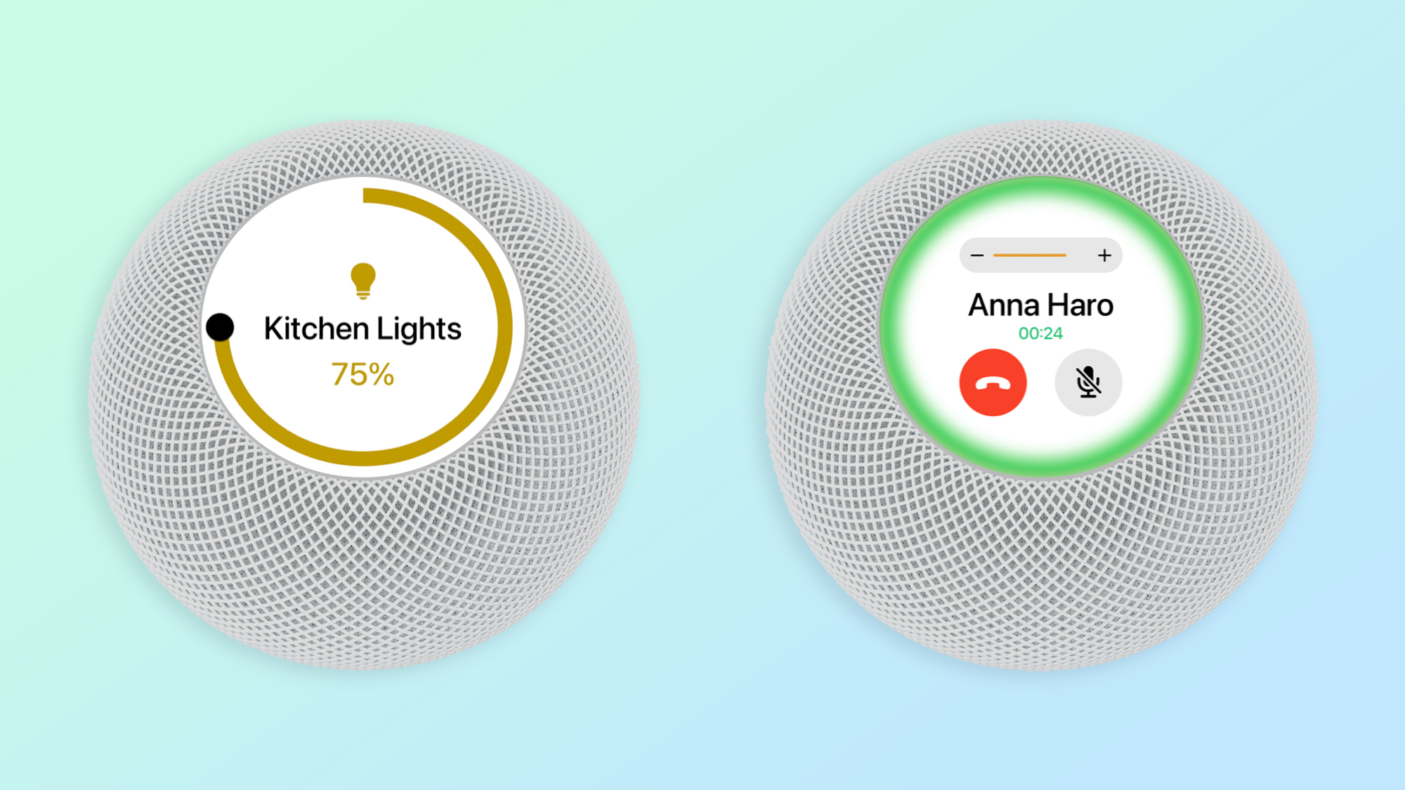
In the realistic-looking renders, Ortolani conjured up a HomePod with a circular screen. The device sits on a tilt compared to the actual HomePod mini, placing the speaker's touchscreen display in a natural light of sight.
Ortolani makes a very convincing case for the "HomePod touch," suggesting it should run a version of watchOS. It could borrow the Apple Watch's watch faces, music player and, of course, HomeKit controls. You can already make and answer phone calls using the HomePod mini, but with a display you could perhaps see contact images, volume levels and the status of the mute function.

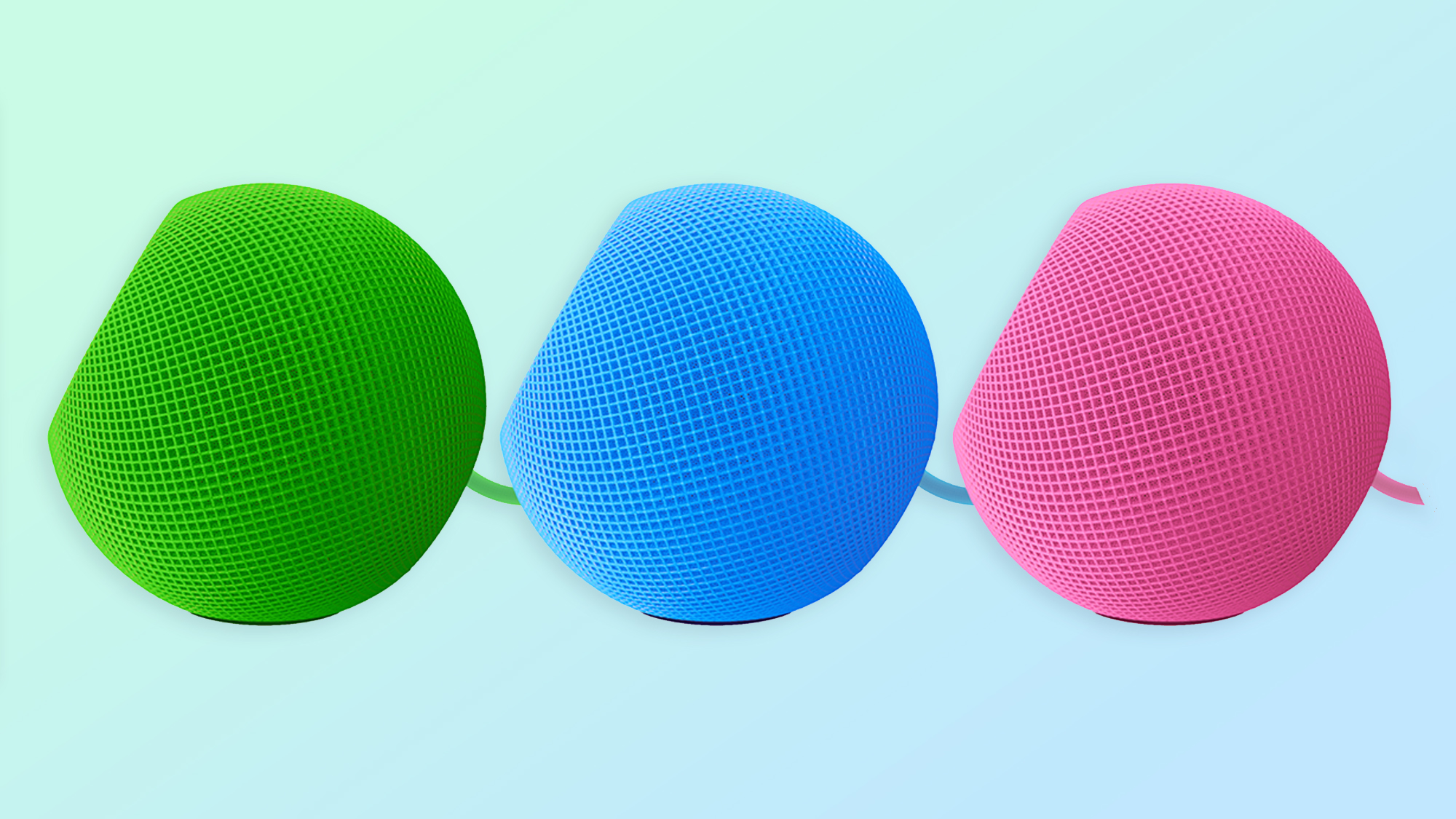
The product designer proposes expanding the exterior HomePod mini color options, too. Apple initially rolled out the HomePod mini in black and white, then added orange, yellow and blue versions during an Apple event this past October. While a hot pink HomePod might look nice alongside my pink iPad mini 6, I'm far less preoccupied with the casing details as I am with wanting a HomePod smart display.
Again, HomeKit successfully won me over. It took a few years, but it's catching up to Alexa and Google Assistant. I'm just waiting on the HomePod speaker-smart display of my dreams to give HomeKit its main character moment in my smart home.
Kate Kozuch is the managing editor of social and video at Tom’s Guide. She writes about smartwatches, TVs, audio devices, and some cooking appliances, too. Kate appears on Fox News to talk tech trends and runs the Tom's Guide TikTok account, which you should be following if you don't already. When she’s not filming tech videos, you can find her taking up a new sport, mastering the NYT Crossword or channeling her inner celebrity chef.

