Google Assistant could get big redesign — here’s your first look
Google Assistant gears up for a redesign

Google could be developing a fresh look for Google Assistant that uses dropdown menus to give more information to users, plus a bunch of new microphone sounds for Google Assistant. It's the biggest change to the interface since 2020, when Google added a lighting feature.
While the new changes are by no means certain, they could indicate a more information-dense interface.
- The best Google Assistant commands
- Google Photos unlimited free photos ends June 1 — what to do now
- Plus: Chrome 91 includes 32 security fixes — why you need to patch now
Google Assistant: Dropdown menu design
The information comes to us via 9to5google, which decompiled an app that Google had uploaded to the Google Play Store, in order to analyze its contents and see if it could reveal any upcoming changes to the virtual assistant. The site cautioned that these changes were far from certain, though.
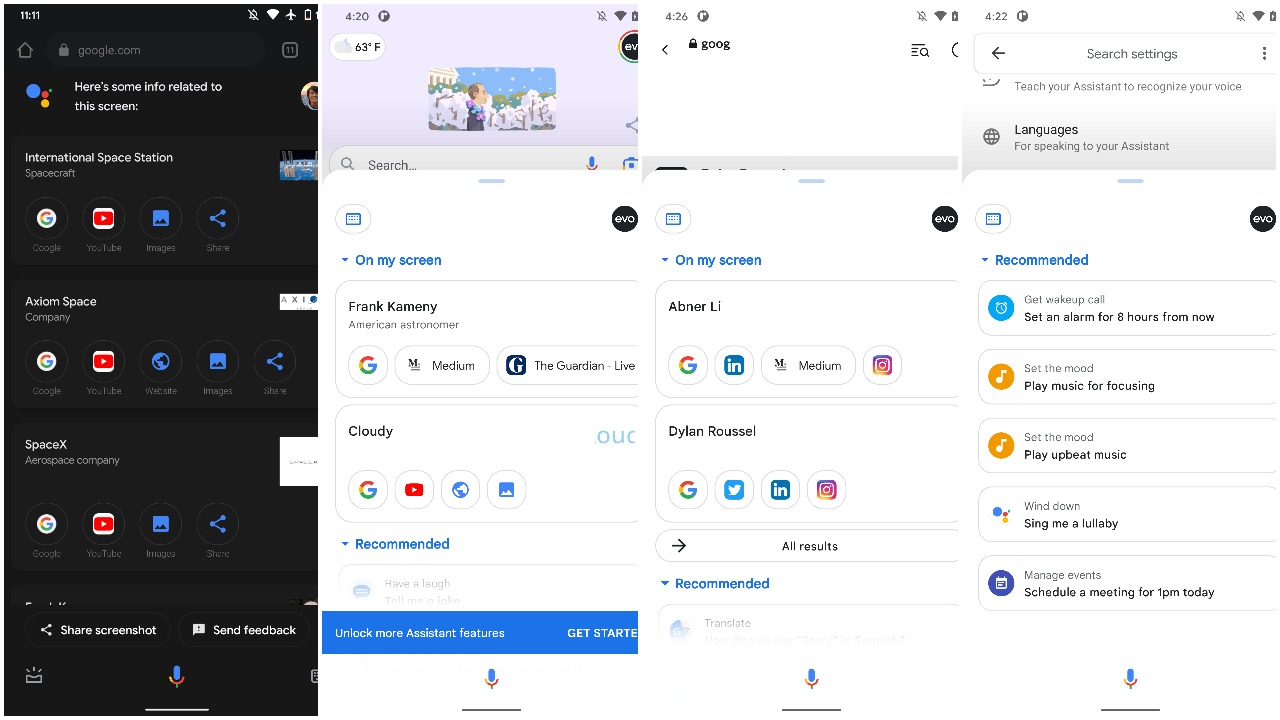
While Google has kept the sliding Assistant panel, it only partially covers the phone's screen, enabling users to still see what's happening in the background of their mobile device. The small profile avatar in the top-right corner of your phone also appears to be untouched.
However, Google now appears to have added a small capsule-shaped button on the opposite side to your avatar. This button triggers keyboard entry, thereby leaving the space at the bottom of the screen exclusively for the multi-colored Google Assistant microphone. Before this, there was a pill-shaped keyboard button on the bottom of the screen to the right of the mic.

By hiding unnecessary results, Google presumably hopes that users can access useful and relevant information in a far more efficient way.
Two such dropdown menus featured here are 'Recommended' and 'On Screen,' with the former presenting users with a list of actions and the latter clearly showing a bunch of app buttons and results from the web. All of this is in aid of a cleaner user experience; it's also part of Google's wider push to show users exactly what Assistant can do.
Sign up to get the BEST of Tom's Guide direct to your inbox.
Get instant access to breaking news, the hottest reviews, great deals and helpful tips.
Google Assistant: New microphone sounds
Other new features that have been reported are the addition of new sounds to improve Google Assistant's voice capabilities.
When launching assistant with 'open_mic,' the "chime being softer and less sharp," better suited to Google Assistant's language design, plus the 'close_mic,' chime which now reportedly fades out more smoothly rather than echoing. You can listen to the full range of new sounds at the bottom of 9to5Google's article.
If these improved mic sounds do end up rolling out to the best Android phones, it's a small but user-focused improvement that shows Google is as interested in the finer details as the bigger updates to its smartphones. Google I/O 2021 recently showcased some of Google's more meaty upcoming updates, but buried amongst those was a more discreet Android 12 feature that users may have missed.
Of course, it's worth keeping in mind that Google may not ship these features, but it gives users an idea on where the company may possibly be heading with its Google Assistant software.
Google has been directing a fair amount of attention towards Google Assistant in the last few months. A recent new feature to power down your Android phone through Google Assistant is one such example of Google's increasing focus on products users frequently interact with every day — and this new Assistant design should help Google stay top of the pack.
More: Android 12's new interface will bring some big changes to your phone
Luke is a Trainee News Writer at T3 and contributor to Tom's Guide, having graduated from the DMU/Channel 4 Journalism School with an MA in Investigative Journalism. Before switching careers, he worked for Mindshare WW. When not indoors messing around with gadgets, he's a disc golf enthusiast, keen jogger, and fond of all things outdoors.

