Get a taste of the Surface Duo with the new Microsoft Launcher Preview
It’s no Windows Phone
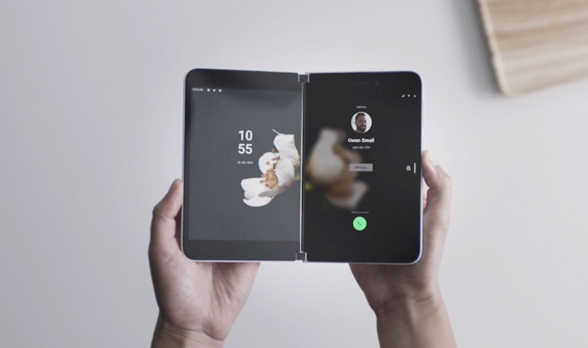
Microsoft Launcher will be the soul of the Surface Duo, the much anticipated foldable phone that the Redmond company doesn’t want you to call a “phone.” And you can try it right now on your Android device.
The new Microsoft Launcher is available now as a preview app in the Google Play Store. It is an entirely new codebase developed with the Surface Duo in mind.
Obviously, this version is lacking many of the things you will see in the Duo. Here you will not be able to try its dual-screen support, which is the main selling point of the Duo user experience. And you will be missing all of the custom Microsoft apps that will come with that hardware device. But it’s a good glimpse into where Microsoft is going.
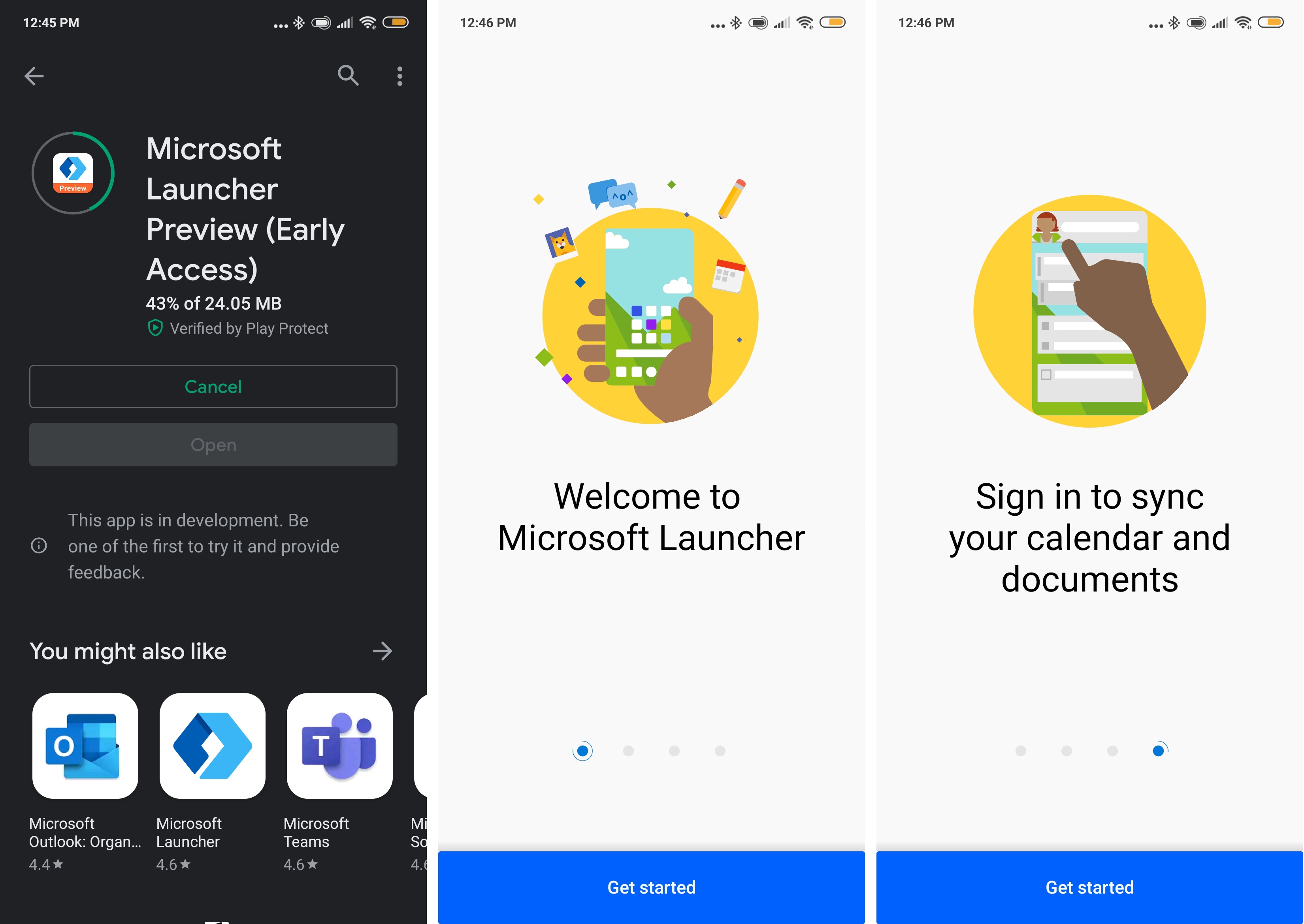
First impressions
I installed the Microsoft Launcher Preview and temporarily replaced my favorite Android launcher (the minimalistic Evie). And I hate to say that it is... ok, I guess?
It just feels like any other launcher I’ve tried. It is polished and it has some nice things like dark mode support and landscape mode, which demonstrates how the incoming hardware will be able to operate in any orientation or combination of screens thanks to Android 10’s fluid interface nature.
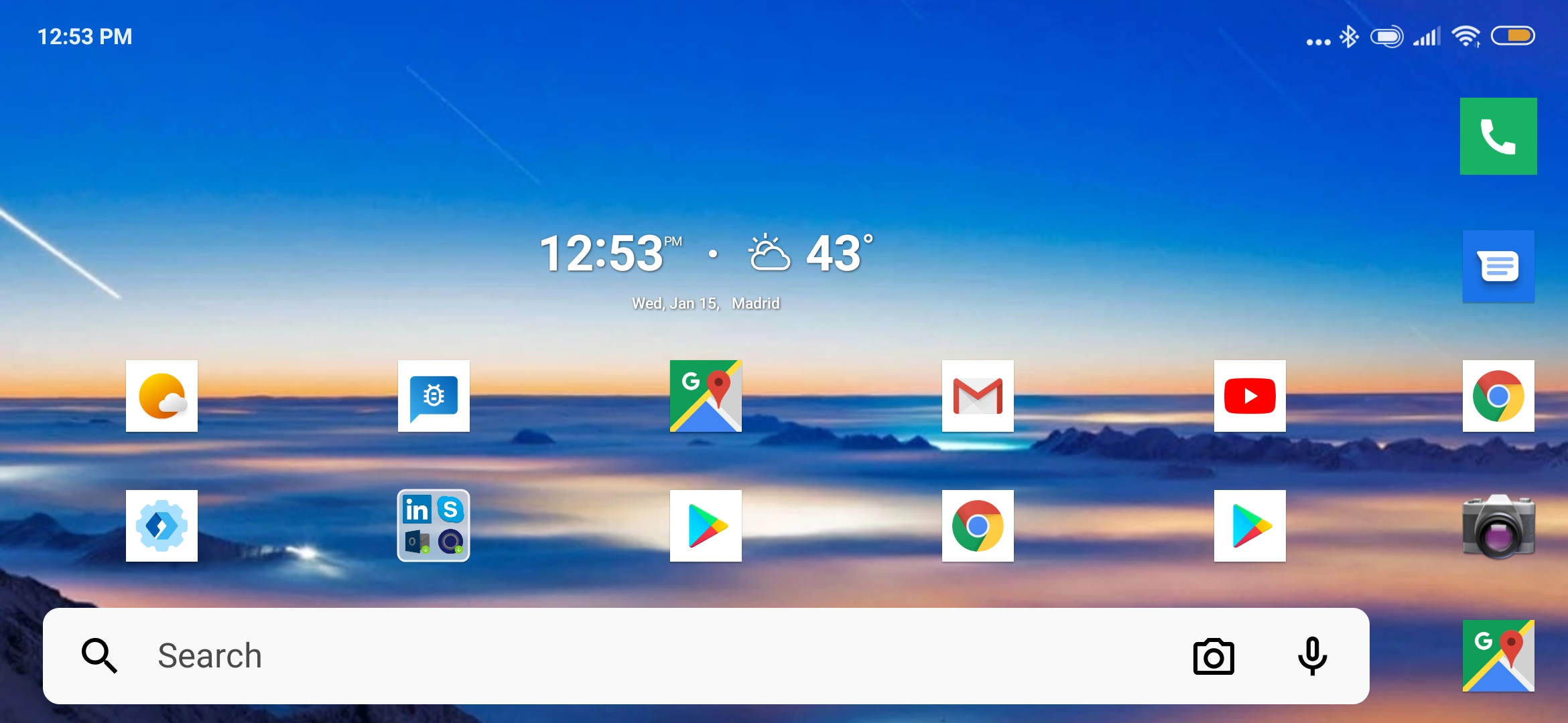
But other than the landscape mode, that’s about it in terms of ”new,” really.
Don’t get me wrong. The new Launcher is fine, clean and fast — especially when you consider that this is kind of an alpha release. But! if you were expecting a completely new and surprising user interface paradigm — like the excellent Windows Phone UX — you will come empty handed. The Launcher looks and feels exactly like the what we saw at last fall's Microsoft event.
Sign up to get the BEST of Tom's Guide direct to your inbox.
Get instant access to breaking news, the hottest reviews, great deals and helpful tips.
Which to me, it is a disappointment. I thought the company was going to use Android as its base and create an skin to match the Microsoft Surface experience. In fact, I was hoping that Microsoft would surprise us with a Windows Phone redux.
For all its faults — mainly the lack of apps and some inconsistencies in the way it integrated services — the Windows Phone UX remains the most innovative and useful interface in a mobile phone. It replaced a 1990s icon grid design with an active, neat, totally customizable view that gives you direct access to information you need without even having to open an app.
But, alas, that’s not what we are getting.
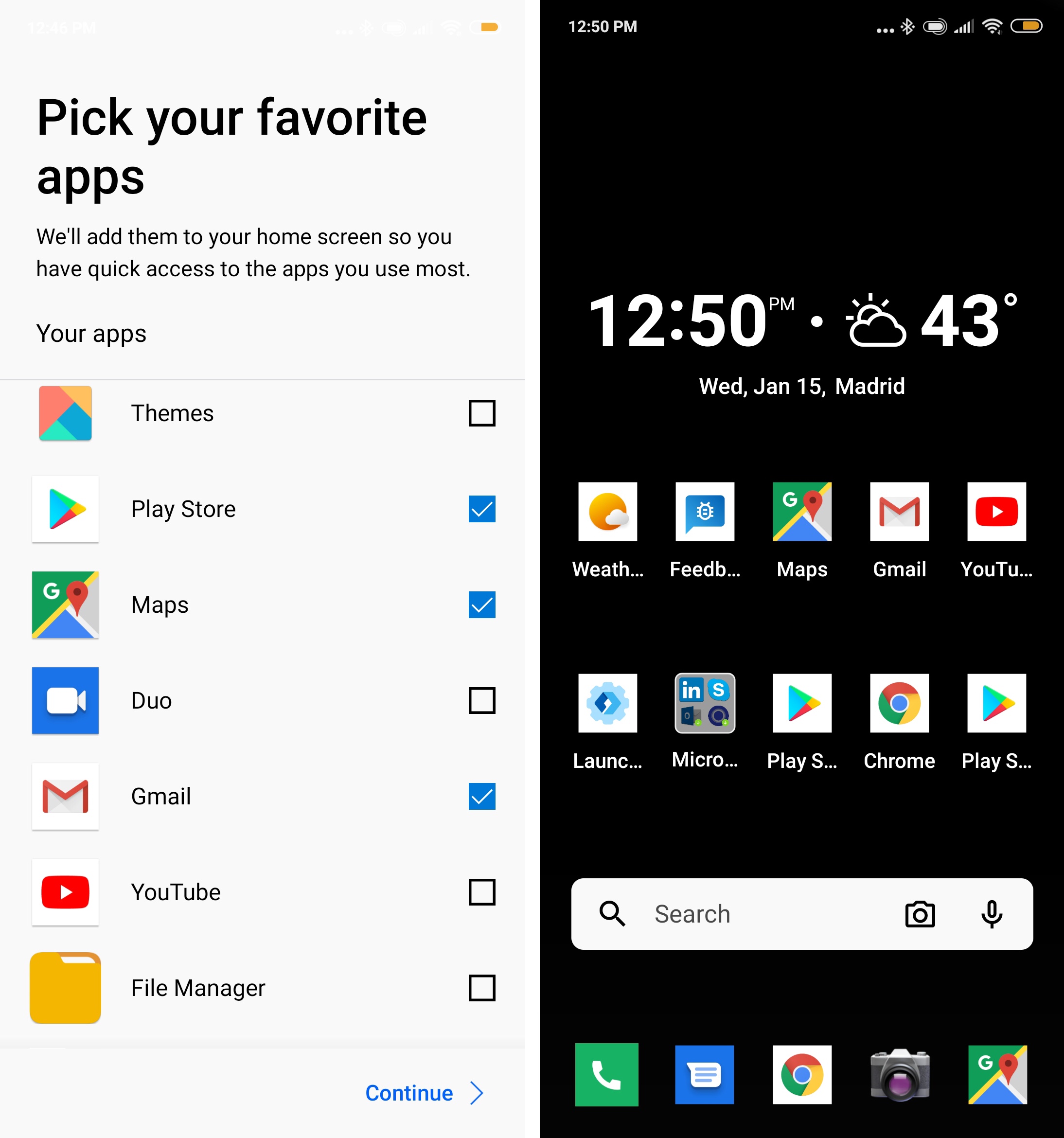
The launcher includes a tray that is accessible by sweeping your finger from the left edge of your phone. Here you will find access to three panels:
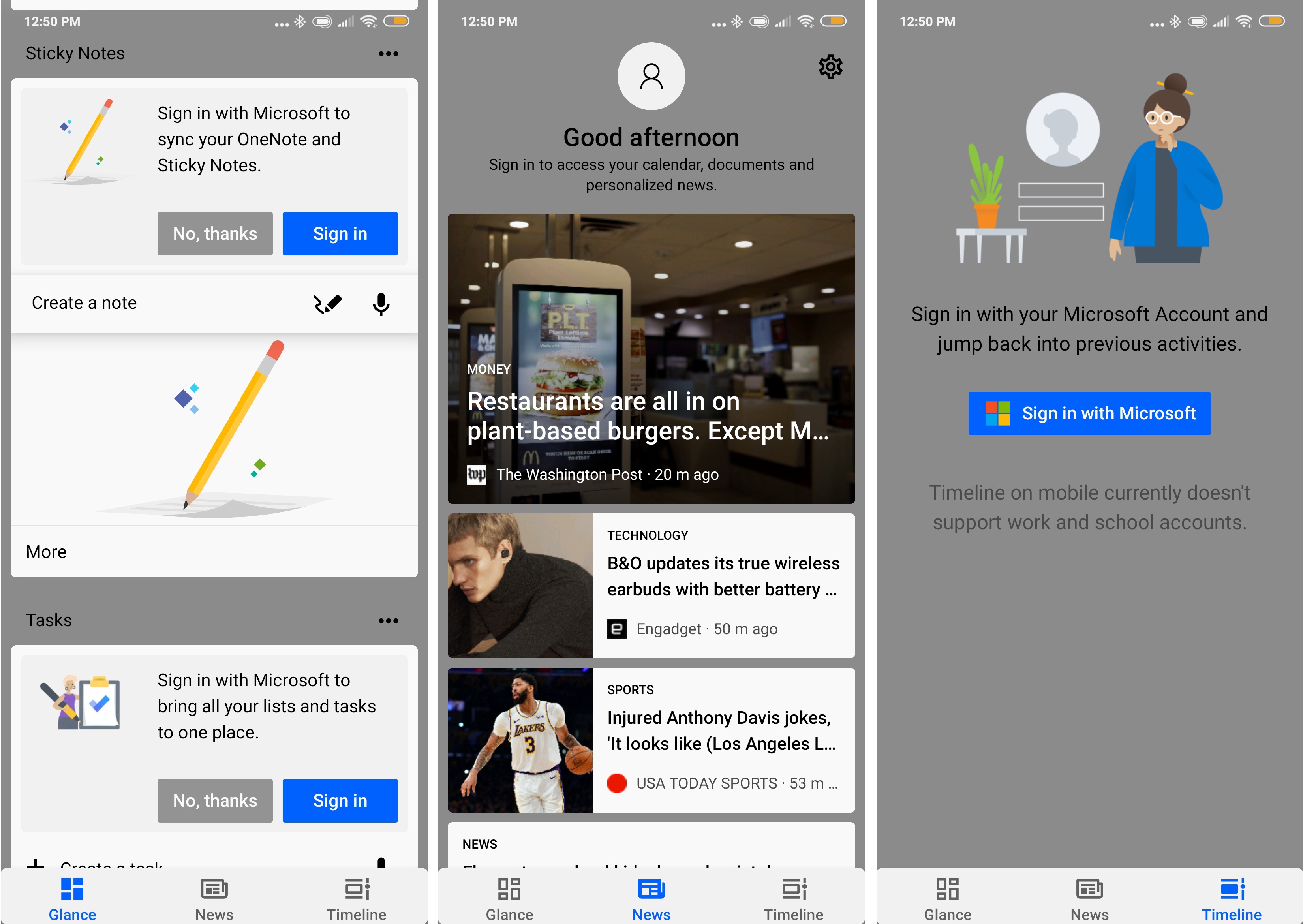
The first is Glance, which gives you a view of all the information you need. It gives you access to your calendar appointments (and a button to create new ones), mail, messages, notes — and it can be integrated with Microsoft’s services or your native phone services.
The second is News, which is just that, Microsoft News. It also links to your Microsoft account so you can have a customized feed that matches your preferences.
And lastly there’s Timeline, another Microsoft service that ties to your Windows Timeline.
All of this seems fine and useful, especially if you are integrated in Microsoft’s ecosystem.
Room for improvement
Nothing is set in stone yet, though. There’s room for improvement, although perhaps not too much.
In the description, Microsoft claims that it has released this preview app to give you the chance to experience “brand-new early-stage features as we build an improved version of Microsoft Launcher.” The software (and now hardware) giant says that it will be updating the app regularly with new features and tweaks, presumably with an eye set on the Surface Duo launch later in 2020.
I doubt that we will see any significant changes in the final version of the UX, but Microsoft says that “the goal of this program is to gain your valuable feedback to improve quality, performance and shape the overall user experience. Give it a try and use the feedback button in the app to let us know what you think.” So, why not try it and give them a nudge in the direction you want?
Jesus Diaz founded the new Sploid for Gawker Media after seven years working at Gizmodo, where he helmed the lost-in-a-bar iPhone 4 story and wrote old angry man rants, among other things. He's a creative director, screenwriter, and producer at The Magic Sauce, and currently writes for Fast Company and Tom's Guide.

