Google Play Store gets Dark Mode: How to turn it on now
Dark mode finally comes to the Play Store
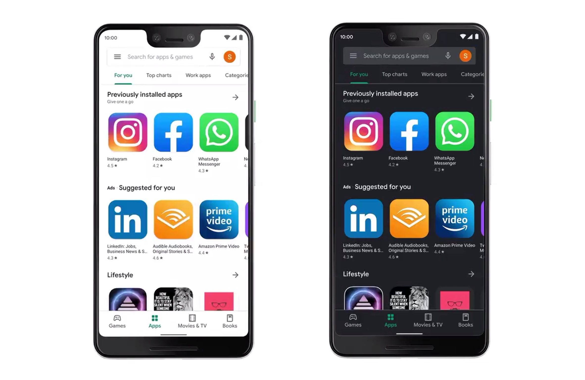
It’s been a long time coming, but, at last, Dark Theme is available on the Google Play Store for every Android phone out there.
Google is now pushing this Dark Theme version of Google Play Store after its official announcement. This update comes on the heels of popular chat app WhatsApp finally getting a dark mode.
- Whatsapp Dark Mode is here for everyone
- Plus: Huawei P40 may be cheaper than Galaxy S20 -- but there's a big catch
I had sideloaded a beta version package of the Google Play Store with Dark Theme, so I’ve been using the new look for a while. However, last night I noticed how the entire interface turned back to the light theme after an automated update of the Play Store app. Now it seems that everyone should be getting this version.
If you haven’t yet, go to the Play Store, click on the hamburger button on the top left corner and check for updates in order to get the new mode.
How to activate Dark Theme in the Google Play Store
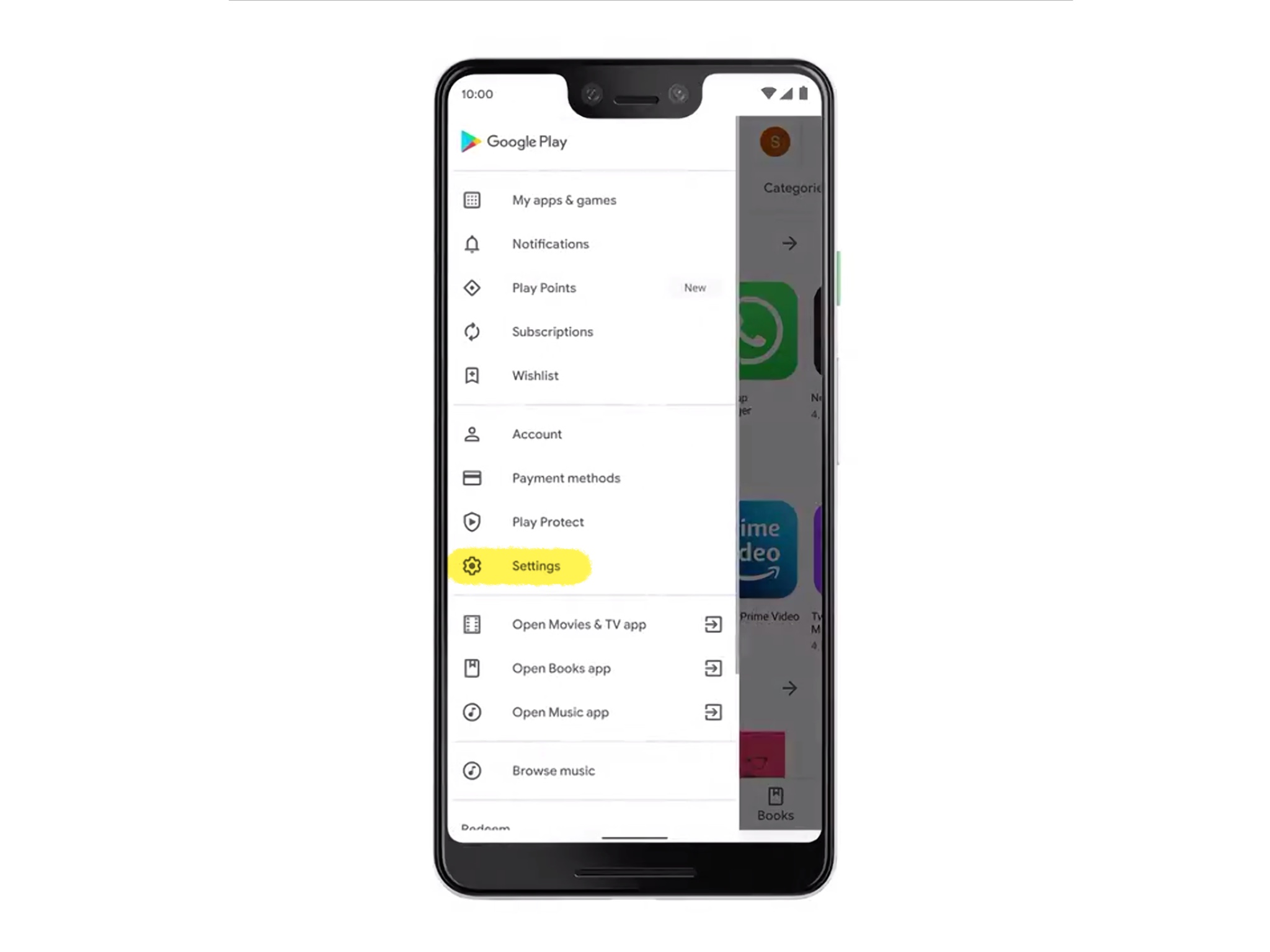
1. Click on the hamburger menu on the top left corner of Google Play Store. Then select “Settings.”
2. Click on “Theme.”
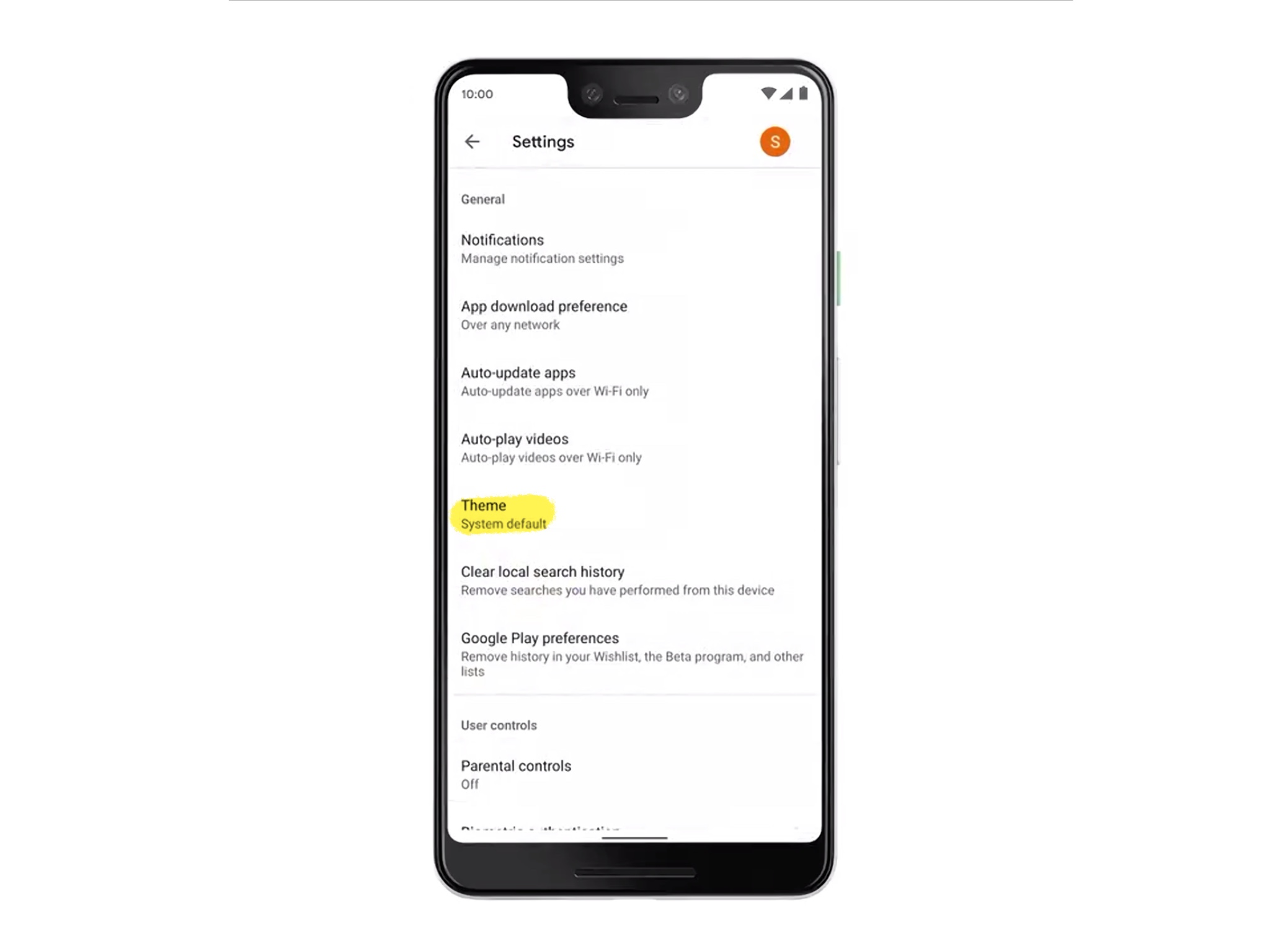
3. Finally, select “Dark” if you want the app to be permanently in dark mode or “System default” if you want it to follow your phone’s general dark theme setting (which may or may no be there depending on your version of Android).
Sign up to get the BEST of Tom's Guide direct to your inbox.
Get instant access to breaking news, the hottest reviews, great deals and helpful tips.
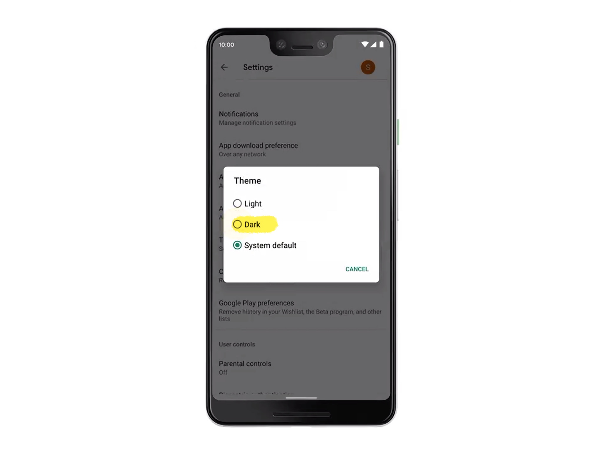
You are done.
Please Google, give us an AMOLED Black option
The only bad thing about this dark mode is that, like with WhatsApp, it doesn’t use 100% black. The best Dark Mode apps use what is called AMOLED black which, in OLED panels, means that every black pixel will be totally turned off, saving you precious battery life.
Many apps offer AMOLED black by default. Some give it as an option (like Reddit). The Google Play Store uses a dark gray instead, like Google Photos. And that — although it saves some energy — is very annoying. Never mind the energy savings, though: AMOLED black just looks cooler to me. I wish all apps allowed this, perhaps with a system-wide setting. It doesn’t change things for the companies and from a UX point of view, it doesn’t really make a big difference. Right now it looks like I’m wasting my AMOLED-based phone, which looks like a washed-out LCD black.
Jesus Diaz founded the new Sploid for Gawker Media after seven years working at Gizmodo, where he helmed the lost-in-a-bar iPhone 4 story and wrote old angry man rants, among other things. He's a creative director, screenwriter, and producer at The Magic Sauce, and currently writes for Fast Company and Tom's Guide.

