Chromecast with Google TV is great — but there's one big problem
The Chromecast with Google TV gets in the way of its apps
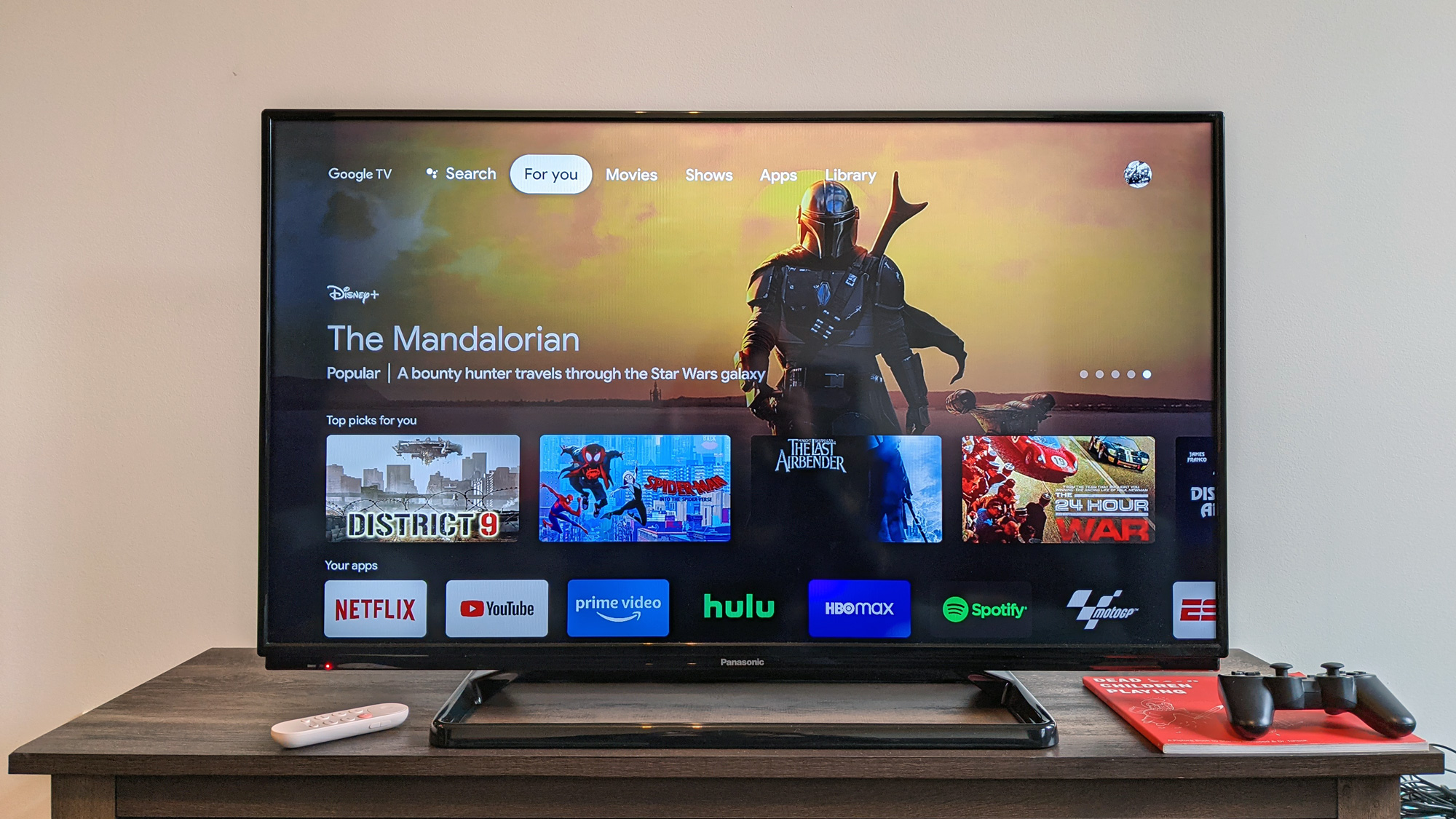
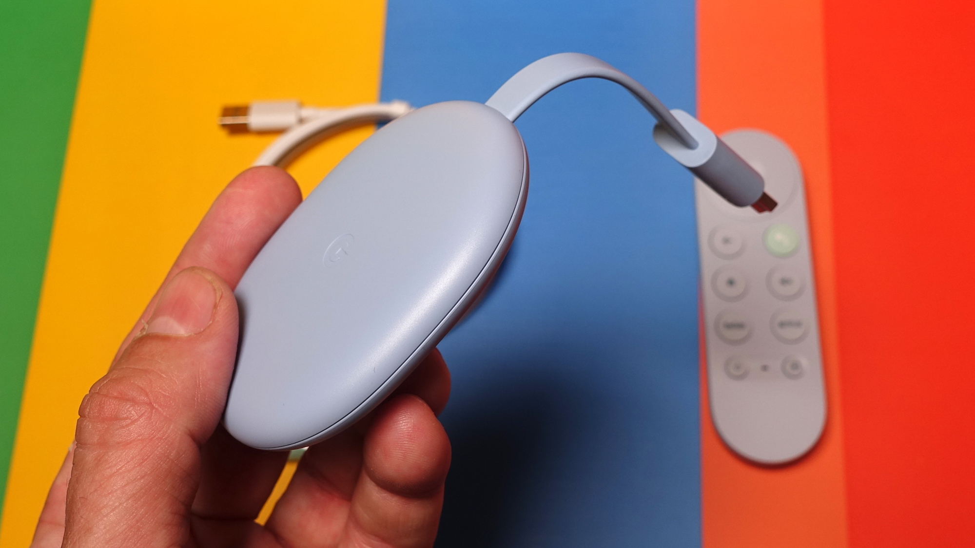
When I finally got my hands on the Chromecast with Google TV, I was really excited. I'd long wanted this device to exist — I'm one of the folks who thought the Chromecast needed apps and a remote — so to see that come to fruition felt like a win for logic. But I quickly found an issue.
To be fair, we at Tom's Guide really like the Chromecast with Google TV overall. It quickly earned a spot on our best streaming devices page, and my colleague Adam Ismail wrote that it's the best streaming device he's ever owned.
- How to watch the Apple November event: Apple Silicon Macs are coming
- Plus: Apple TV app just landed on new Chromecast with Google TV
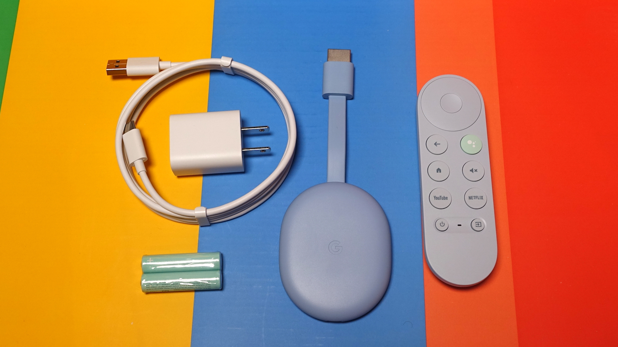
My one complaint, though, is that The home screen is organized in ways that don't really click with me.
The Chromecast with Google TV keeps apps at arm's length
I get the premise behind the Chromecast with Google TV interface, which puts content first and foremost. People are always looking for something to watch, but in my experience, the apps themselves do a pretty good job of that.
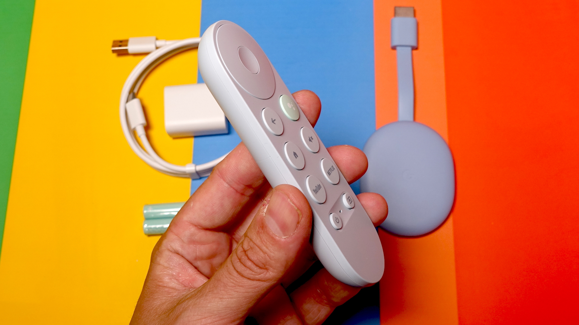
I don't know about you, dear reader, but when I start using a streaming device, I have a sense of what app I want to use, and I want to get to it ASAP. The Chromecast with Google TV gets this, partially, with dedicated YouTube and Netflix buttons. Roku, similarly, has four buttons for popular apps. These buttons can feel like ads, though, if those apps don't matter to you (memorably, Roku app buttons have included ESPN+, which always makes me chuckle).
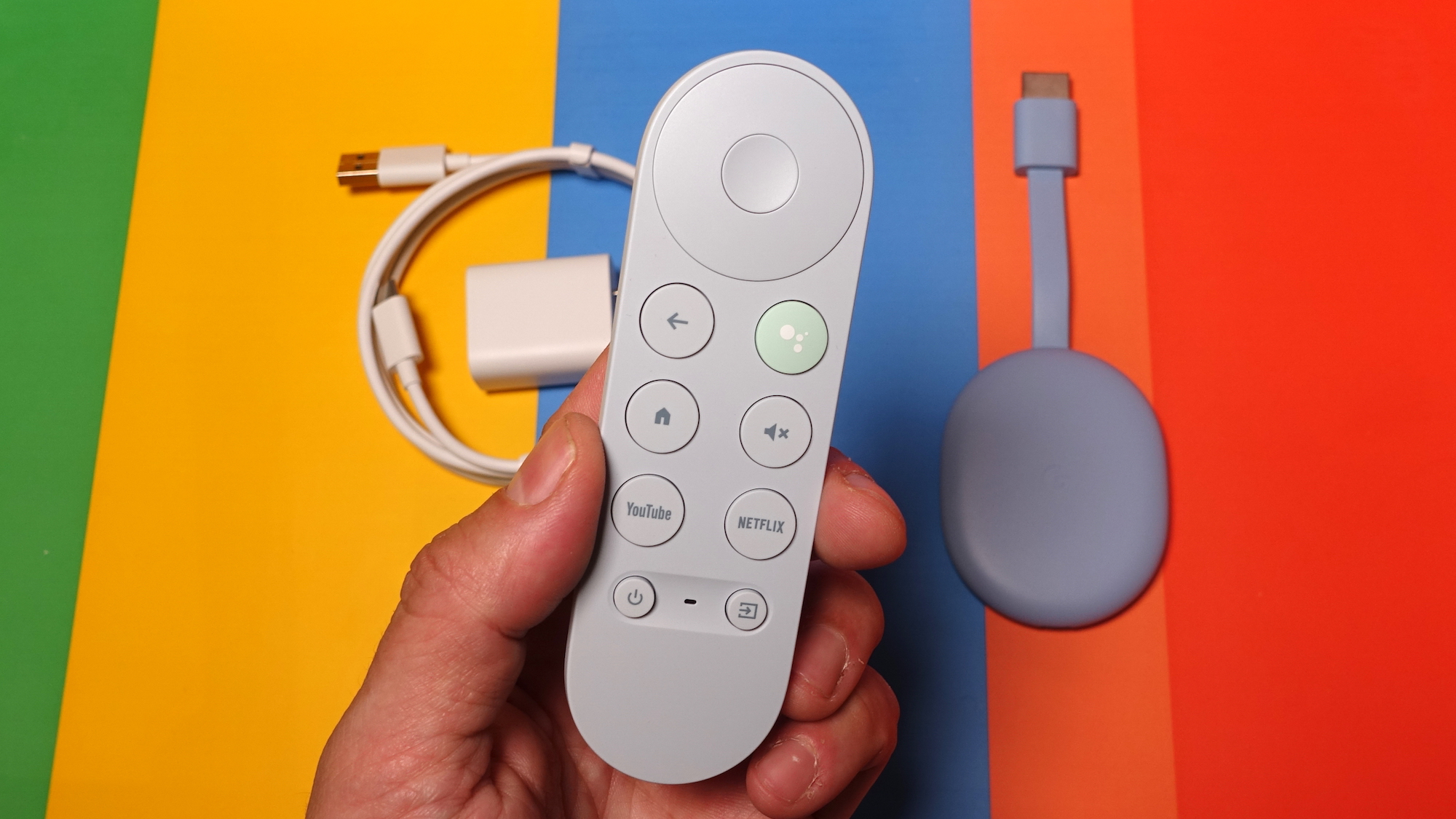
The Chromecast with Google TV interface, however, makes you click down twice (or right, thrice) to get to your actual apps. In the intervening moments, the interface promotes content you might want to watch. Oh, and when you click right, to go over to the apps section, you've got to click down one more time, to scroll past the promoted app.
How other streaming devices do it
As someone who owns a Fire TV Stick 4K, Apple TV 4K and Roku Ultra, I've seen what each of the major streaming platforms look like, and I know clutter when I see it.
Sign up to get the BEST of Tom's Guide direct to your inbox.
Get instant access to breaking news, the hottest reviews, great deals and helpful tips.
If you've ever used a Roku or Apple TV, you have experienced what I believe to be the ideal streaming device home screen. A grid of app icons, which you can reorganize as you see fit. Apple does it a bit better in my experience, with no ads, but that's a conversation from a different article.
Amazon's about to roll out a new Fire TV interface, and while I reserve judgment for it when that arrives, I've always thought less of those devices because — just like the Chromecast with Google TV — it makes you click down twice to get to your apps, navigating past shows and movies that it thinks you may want (or the company was paid to promote, we'll never know).
The home screen doesn't even work right
I'd probably be less annoyed with the Chromecast with Google TV home screen if it worked a little better. When it suggests something I don't want to see, something I want to remove to get another recommendation — which happened most recently with Zack Snyder's terrible adaptation of Watchmen — you can't actually get rid of it.
You hold Select down to bring up a secondary window, and when you click the Dislike button, it just signals that it accepts your opinion … and keeps that block on your home screen. If you tell any app that you dislike one of its prompts, that item should go away immediately. What, does the Chromecast with Google TV not have any other suggestions?
How I'd fix it
Since my colleagues like the Chromecast with Google TV for the same reasons I do — casting, apps and a remote — I think this is an easy fix. Just give this device the standard Android TV interface that had been around forever. A top row of apps, and then other rows for other content.
But since Google probably won't do that — they pivoted away from the old Android TV interface to this new design — I have a compromise. Bring the apps row up a row, swapping it with the Top Picks For You row. It's super easy, and you can continue to promote content in that top row.
In the meantime, I'll go plug my Apple TV 4K back in, and keep the Chromecast with Google TV nearby for when I want to cast something to it.

Henry is a managing editor at Tom’s Guide covering streaming media, laptops and all things Apple, reviewing devices and services for the past seven years. Prior to joining Tom's Guide, he reviewed software and hardware for TechRadar Pro, and interviewed artists for Patek Philippe International Magazine. He's also covered the wild world of professional wrestling for Cageside Seats, interviewing athletes and other industry veterans.
