Check out Windows 10’s biggest Start menu change in years
Say goodbye to Windows 10’s live tiles
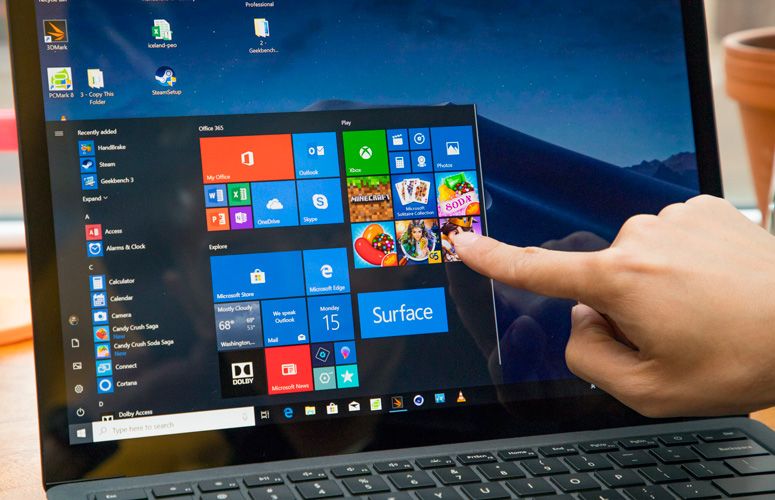
Windows 10’s Start menu is losing its Live Tiles — the variable-sized squares loaded will real-time app information that were added in Windows 8 as part of the Metro user experience. It will be its biggest redesign since 2012.
We got the first rumor about the change a few days ago, when we learned that the Live Tiles were going to be replaced by big static icons for each app you want to pin in the Start menu — a move that was heralded by start menu in Windows 10X, the operating system that will power the Surface Neo and other multiple-screen PC devices.
- Best laptops: The top-rated laptops you can buy
- The best all-in-one PCs
- JUST IN: Google zaps coronavirus apps from Play Store searches
Now we have a clear view of what the (alleged) menu will look like, courtesy of Aggiornamenti Lumia, the Italian tech blog that already gave us an early look at the new icons. Here it is:
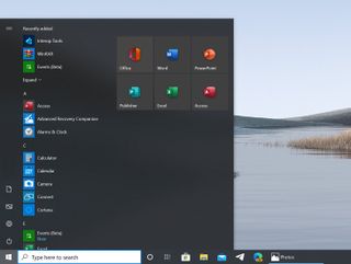
The change was then confirmed by Microsoft itself, who showed the daylight mode too — which apparently has an all-white background that could be made translucent:
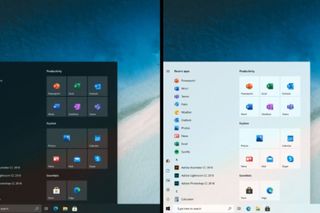
And here’s the current one, for comparison:
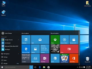
It looks like Microsoft hasn’t only cut Live Tiles loose, replacing them with simple, large icons. It has also cleaned up and streamlined the entire menu, with a new icon column and separating common system functions — like file explorer, settings, and power — on a simple first column that also serves as a spacer to give some air to the entire menu.
Live no more — for now?
Live Tiles were actually a good idea that was first introduced in Windows Phone. It answered two simple UX questions. First, why have space wasted by static app icons when you can convey information at first glance? And then, why force users to open an app when you can give them a glimpse of what‘s cooking — like a summary of the weather, messages, or any notifications — by just glancing at the screen?
Sign up to get the BEST of Tom's Guide direct to your inbox.
Get instant access to breaking news, the hottest reviews, great deals and helpful tips.
The UX concept started in Windows Media Center and grew on the Zune before adopting its final form in Windows Phone 7. From there, it came to many other Microsoft operating system, from the Xbox 360 and Xbox One user experience to Windows Phone and Windows 8. The Live Tiles were key to the merging of tablet and desktop in form of the Surface hardware and software.
But, with Windows Phone's failure, it appeared that people didn’t care much for Microsoft’s Metro or Live Tiles. Developers were slow to adopt them and, eventually, Microsoft stopped to update them, effectively killing them.
There’s a glimmer of hope, though. According to The Verge, Windows Insider senior program manager Brandon LeBlanc says that “Live Tiles are not going away, we have not announced anything of the sort. Those that enjoy their Live Tiles will continue to be able to do so.” Looking at the screenshots, it doesn’t look like that’s the case though. Perhaps there are other plans for them in future versions of Windows, who knows.
In any case, it’s too bad to see them go away because it was a good concept that was botched by circumstances and less-than-stellar execution.
Jesus Diaz founded the new Sploid for Gawker Media after seven years working at Gizmodo, where he helmed the lost-in-a-bar iPhone 4 story and wrote old angry man rants, among other things. He's a creative director, screenwriter, and producer at The Magic Sauce, and currently writes for Fast Company and Tom's Guide.
-
reader134 Windows tiles were trash. It's not sad to see them go. It's a celebration! The more they can make windows like windows 7 the better. 7 was the G.OA.T.Reply -
d0x360 Replyreader134 said:Windows tiles were trash. It's not sad to see them go. It's a celebration! The more they can make windows like windows 7 the better. 7 was the G.OA.T.
I liked them for certain things and I'd rather they not make 10 more like 7... I kinda prefer a more secure OS and if you give me that telemetry crap as a negative my response is its not really what people think it is, websites spread clickbait FUD to get hits and more importantly it can ALL be easily shut off.
You can also make 10 look exactly like 7 so staying on 7 is and was absolutely foolish. -
cbSpdX dumb move backwards killing LiveTile(s) for the Weather and News app for which LiveTiles seemed 100% effective :(Reply

