Apple TV just got a massive upgrade — what you need to know
A revamped Apple TV app has replaced the iTunes Store

Apple just overhauled its Apple TV interface, and it should be a major upgrade for one of the best streaming devices we’ve ever tested.
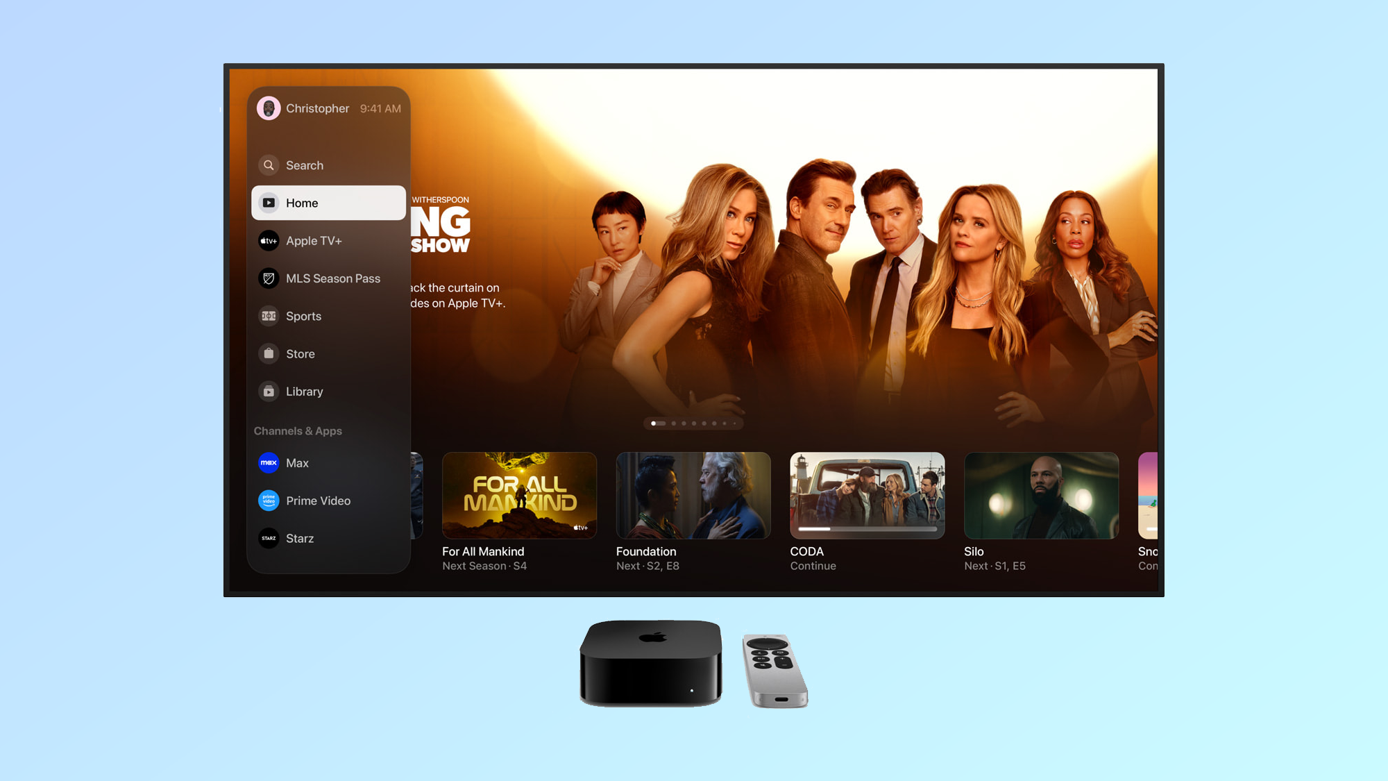
Starting yesterday (Dec. 11), the Apple TV app is going to look a lot different for users. The tech company gave the app a refresh as part of a tvOS 17.2 update, but it’s not just limited to tvOS devices like the Apple TV 4K (2022). It also adds some much-appreciated features.
Chief among these improvements is a new sidebar, which gives you quick access to Apple original content like Apple TV Plus and MLS Season Pass, as well as shortcuts to channels and apps, including streaming services like Max, Disney Plus, Paramount Plus, Prime Video and more. It makes it much easier to find exactly what content you’re looking for while also giving Apple the benefit of highlighting some things it wishes you were watching.
Adios, iTunes: Apple TV is replacing the old iTunes Store
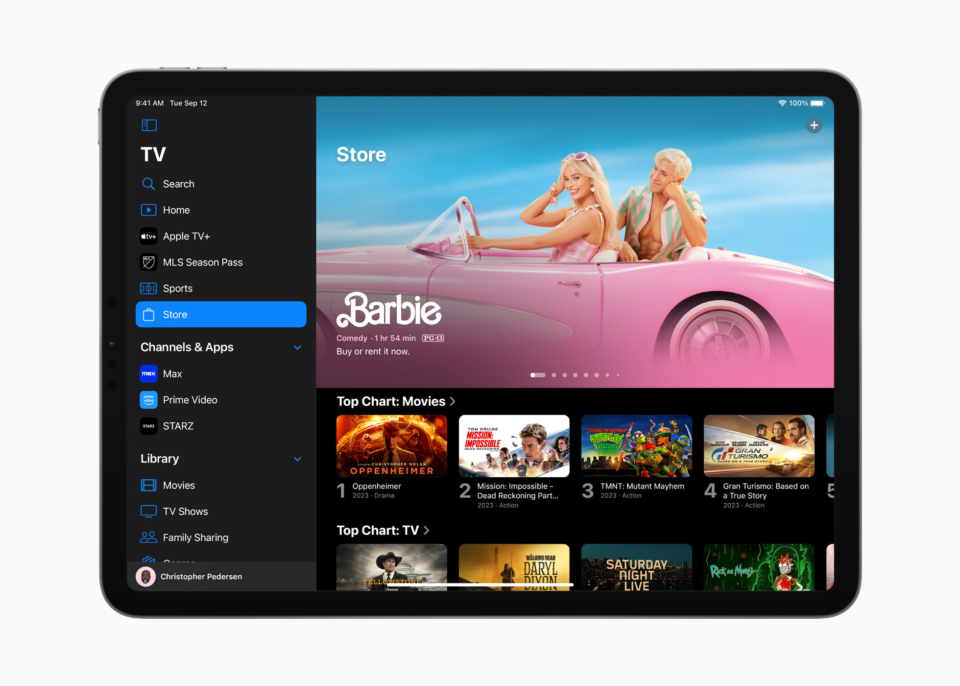
Aside from this sidebar, the other major update is an updated store in the Apple TV app. This Store tab allows you to shop for TV shows and movies to buy or rent, replacing the old iTunes Movies and iTunes Shows apps that you had to go to on Apple TV devices prior to this tvOS 17.2 update.
In fact, these old iTunes apps will stop working entirely. On Apple TV HD or Apple TV 4K streaming devices, opening the iTunes Movies and iTunes TV Shows apps will redirect you to the revamped Apple TV app. The same thing will happen if you open the iTunes Store app on iPhones or iPads. You will be able to find your existing purchases in the new app, so don’t worry.

While a lot of these updates are specific to Apple devices, the sidebar — or at least part of it — will be a universal upgrade. I just checked out the Apple TV app on my Samsung The Frame and I found the refreshed design and new sidebar.
There are certain features from the sidebar missing — given it's a smart TV app rather than a tvOS app, it doesn’t add the ability to access channels and apps, but that makes sense. After all, on a smart TV, you’re using the Apple TV app only to watch Apple content or your Apple TV show and movie purchases. Still, even this streamlined version of the sidebar is a welcome addition to the Apple TV user interface.
Sign up to get the BEST of Tom's Guide direct to your inbox.
Get instant access to breaking news, the hottest reviews, great deals and helpful tips.
More from Tom's Guide

Malcolm has been with Tom's Guide since 2022, and has been covering the latest in streaming shows and movies since 2023. He's not one to shy away from a hot take, including that "John Wick" is one of the four greatest films ever made.
-
mwanderson While the new app design is certainly slicker, it seems like Apple has mixed up the TV content with the movie content on the store, and with more of a bias towards the latter.Reply
Before, there was a handy toggle button at the top of the app that allowed you to switch between television content and movie content.
For someone who is autistic, the ability to focus on either TV or movie content was important because it shut out all the other visual clutter. Now, when you go to the Apple TV store, there is one stream dedicated to Top TV Seasons… then way down, past loads of movie streams, a few streams for Iconic TV Franchises, More Hit Shows, Bestselling Box Sets etc… but for me, the app is now a confusing mess of visual clutter.
I'm not interested in Add Channel or Browse by Decade or More to Explore.
What would be good is the opportunity to refine the streams but of course, that would lessen Apple's marketing drive to catch one's eye with colourful content that you then buy. Apple isn't really about user experience anymore; it's about users' wallets, which is why they are a $3 trillion company.
