Apple should copy these Windows 11 features for macOS
Cupertino, start your photocopiers
As I wrote our Windows 11 event live blog, I was pretty impressed by a lot of what Microsoft was doing. And while I don't see myself switching any time soon, I would love it if Apple could learn (even steal) from Windows 11, in some selective and smart ways.
But before I give Microsoft too much credit, I'll note that Windows 11, in fact, kind of catches up to macOS Big Sur and the M1-based Macs that were released last year. That was when Apple finally started to bring iOS and iPadOS apps to the Mac, something Microsoft is finally doing with Android apps on Windows. Though, they're only getting Amazon's Appstore which seems like a half-measure at best. Hopefully sideloading Android Apps on Windows 11 works out.
While my adult life has been lived mostly inside Apple's walled gardens, I've been using a PC in my spare time to live-stream on Twitch. During these last months, I've both gotten to know Windows better, but also become more aware of its issues. Now that Microsoft is fixing some of its flaws, I've found some recommendations for macOS 13, as it's probably too late to ask for changes to macOS 12 Monterey.
- The best laptops right now
- Best webcams: Our top picks
- Plus: Windows 11 won’t work on your PC without a TPM — how to check
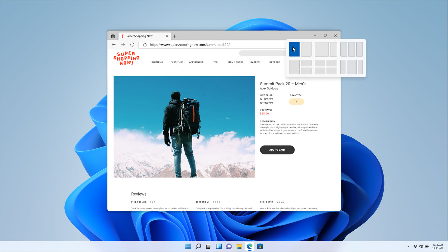
macOS needs to learn from Windows 11's multitasking
Throughout all of Apple's work to improve multitasking on the iPad, it still let macOS languish in this category. You still get two windows in split-view at the most, and that's not always enough — especially, I might add, if you've docked your Mac to an external monitor.
I'm using my MacBook Pro with a 29-inch monitor right now, one I'd never think to use split-view mode on, because of all the wasted space. Instead, I just have a giant stack of many, many windows. It's not ideal, but still gives me more visibility than a simple pair of applications does.
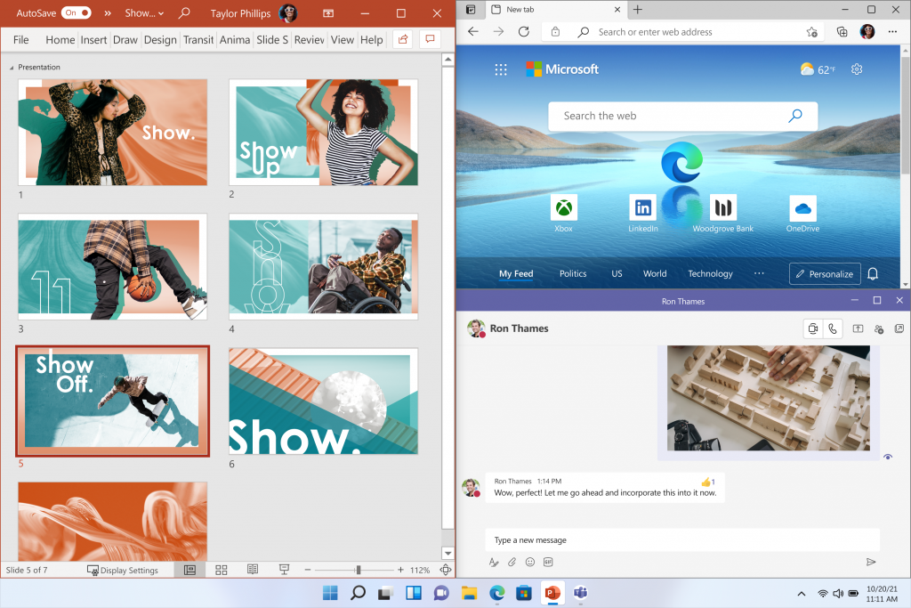
And so I look at Windows 11, which knows that four is better than two, especially in multitasking. Yes, Apple may design its split-screen options based around the notion of how many apps you need at once, but I could always use a third or fourth app open. Right now, I'd like to quickly glance at the company Slack while I write this article in one window and reference my notes in a second window.
Windows 11 even can remember the groupings of windows you used, via something called Snap Groups. This way, if you like a certain screen layout, you can minimize that cluster of windows, and bring it back up, to get back to work that easily.
Sign up to get the BEST of Tom's Guide direct to your inbox.
Get instant access to breaking news, the hottest reviews, great deals and helpful tips.
Windows 11 understands we live different lives
When I'm off the clock I try and stay that way. Of course, I'm always apt to lapse, because the work-life balance was shredded even further during the past year. But Windows 11 actually wants to help fix this problem, by letting you customize different desktops for the different ways you use your PC.
If I could have such a feature on my MacBook, I'd be able to edit down my dock for each section of my life. In the Work desktop, I'd have Slack, Chrome, Calendars, Stickies, Pixelmator and Voice Memos, and thinking about this now, I really want it. Because I don't want to use any of those apps (maybe Chrome) when I'm off the clock.
Then, I'd switch to indie favorites I can't use for work, such as Bear, Todoist, Drafts, Due and Deliveries. Heck, I'd also throw the Music app in there too, because I've got a weird habit where I don't like to listen to music while I work. Instead, I have a very elongated and crowded dock, filled with apps I don't really need half the time.
You're also going to be able to make further customizations in Windows 11 desktops, so your wallpaper and themes can differ across those zones as well. For example when I'm at work, I may be less comfortable having a desktop background of the laconic pro wrestler Orange Cassidy than I would when I'm at home. This way, you can easily slip from one mode to another.
Windows 11 shows Apple a way to touch the Mac
We get it, Apple doesn't want to make a touchscreen Mac. You know what? I wouldn't want to try and tap the icons and touch targets of macOS Monterey either. They're super-small, and made for a cursor.
That's why I chuckled, respectfully, at Microsoft when they showed that the Windows 11 interface changes ever so slightly when you go to tablet mode. For example, the space between the icons in the Taskbar expands, so it's easier to touch the one you want.
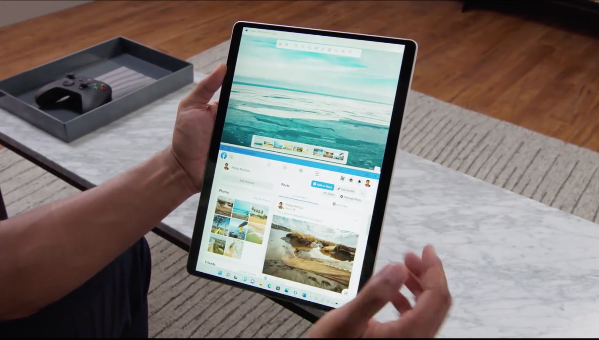
The demo also highlighted that this tablet mode adds visual cues and increases the sizes of the touch targets (buttons and corners of screens, the stuff you're trying to touch), so that everything feels natural.
I'm sure the braintrust at Apple could find a way to keep a touch-friendly mode of macOS 13 looking and feeling enough like macOS 12 that nobody got upset. Would that eliminate the need for the iPad? I doubt it. Some people want a device dedicated to touch, still, while others want the flexibility for both.
The Windows 11's Start menu gets one thing right
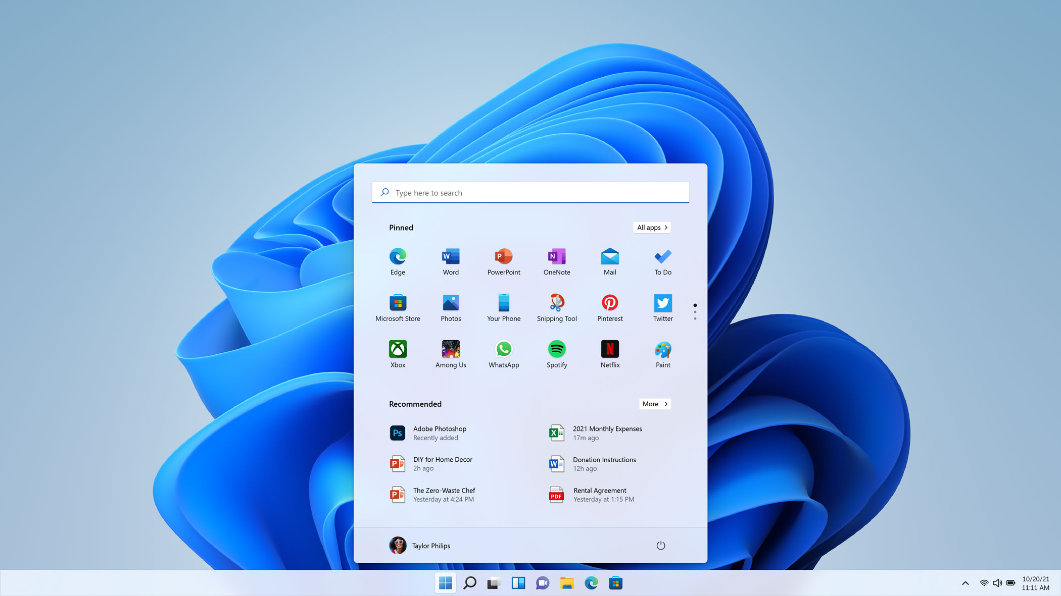
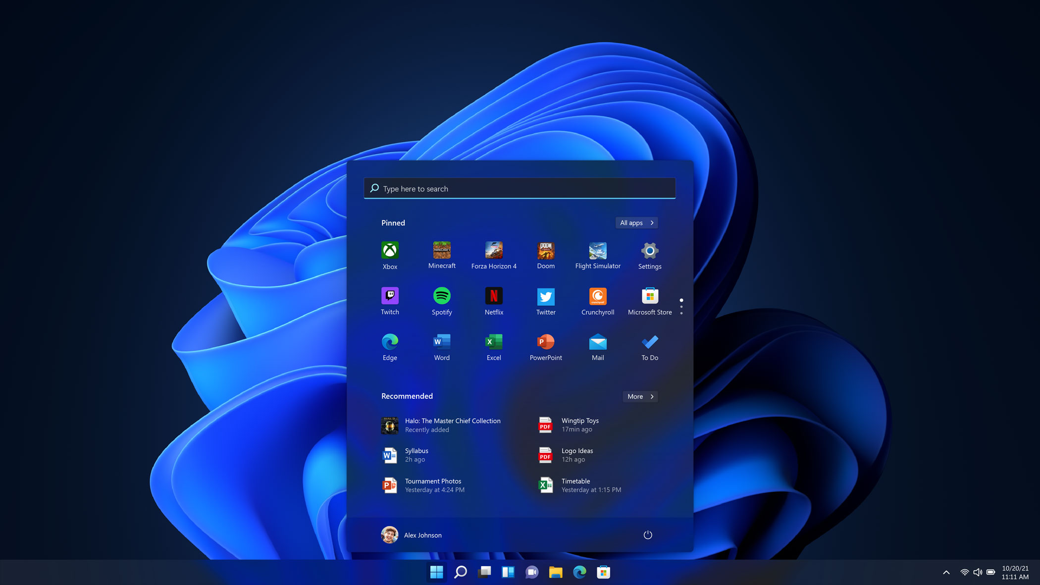
I was never huge on the Start menu, but Windows 11 adds one thing I really like: a section for Recommended documents. macOS does something similar, but different enough that I want it to change. A list of recent files is found both in the Finder Favorites list and hidden in the Apple icon in the Menu Bar under Recent Items.
This is a very straightforward way to show you files you may want, and doesn't leverage Apple's intelligence. Siri may be troubled as a voice assistant, but its apps and widget recommendations on the iPhone and iPad are spectacular. If Apple could find some way to use that information to suggest the pages or files you're more likely to want at that moment — and do all the processing locally for your own privacy — it would have a winner on its hands.
Windows 11 has a restrained use of color
In Safari on macOS Monterey and Apple's iOS 15 and iPadOS 15, the toolbar of the app now changes to match the website you're using. This is maybe cool for some people, but it's way too chaotic for me.
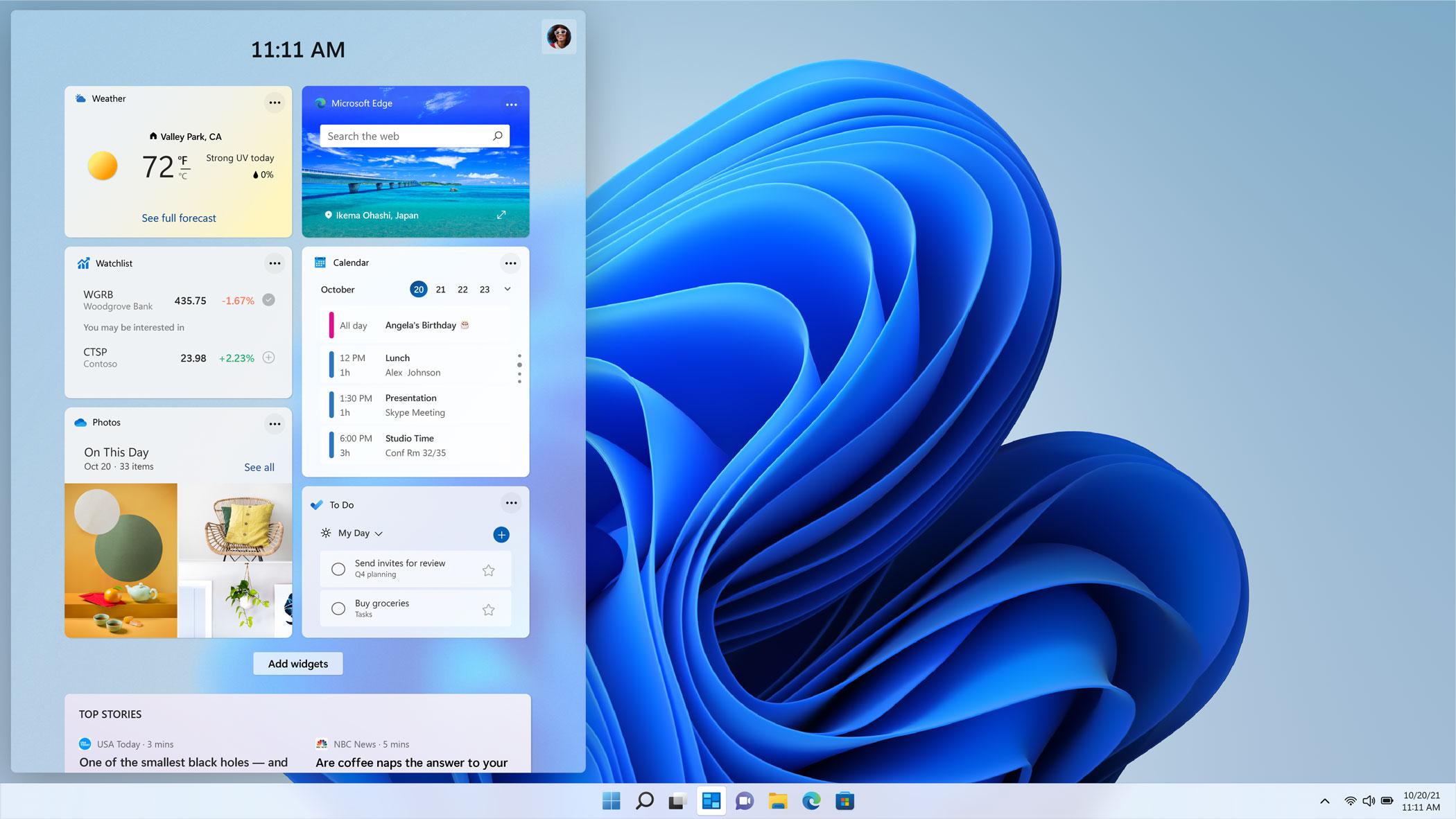
I'll know better when I get more time with it, but I respect how Windows 11's overall default hues seem to mix neutral tones and translucency. For now, I just hope I can quickly find the setting to disable Safari's new color-aware adjustments when I use the OS.
Apple, please ignore Teams
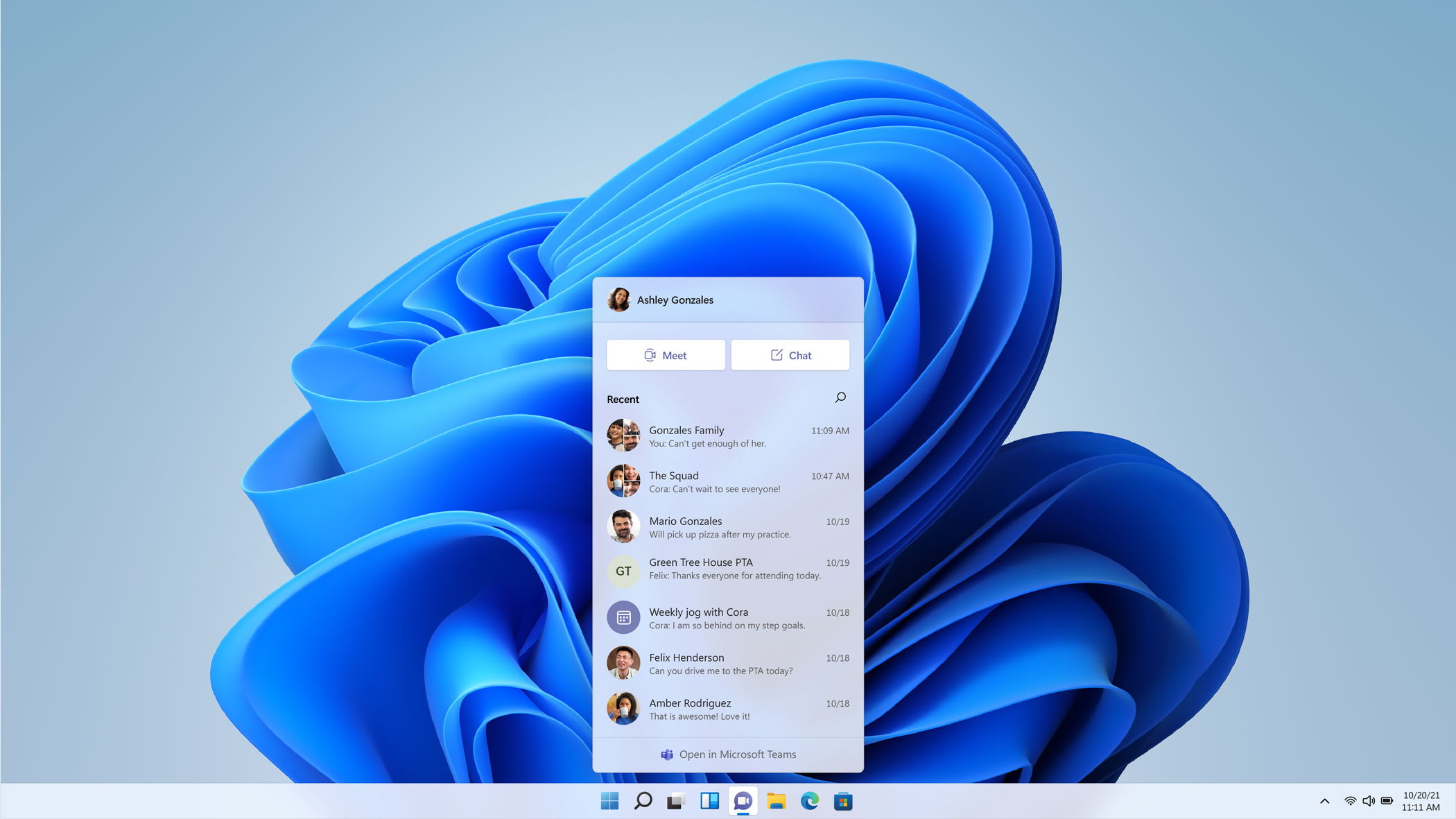
That said, the Windows 11 event showed me one thing I don't want Apple to copy. Teams may look minimal in the above implementation, but that little menu is hiding a world of complications.
I know enough about Teams, and its family and friends integrations, that I have zero interest in ever using it. There's just way too much stuff in there, and I prefer Messages and FaceTime on their own. It would be great if Apple and Microsoft could make them work together, though. Especially for bringing SharePlay to a wider audience. Let people continue to use the reminder and calendar apps they want, and not try and allow the type-A family members to push their relatives to use and conform to this big web of productivity.
Waiting to see how Windows 11 actually works
Spending more time observing Windows 11 in betas in the coming year should give everyone enough time to see what actually works and what makes for a good presentation and sizzle reel.
I’ll probably continue to split my time between PCs and Macs, but these new features give everyone reason to keep an eye Windows, even die-hard Mac users like myself.

Henry is a managing editor at Tom’s Guide covering streaming media, laptops and all things Apple, reviewing devices and services for the past seven years. Prior to joining Tom's Guide, he reviewed software and hardware for TechRadar Pro, and interviewed artists for Patek Philippe International Magazine. He's also covered the wild world of professional wrestling for Cageside Seats, interviewing athletes and other industry veterans.
