Apple defends MacBook Pro 2021 notch — here's why it exists
The MacBook Pro 2021 notch is “a really smart way to give you more space for your content.”

When the MacBook Pro 2021 was introduced last week, fans were beyond excited to see a new top-end Apple laptop with an SD card slot and MagSafe. But one design aspect wasn’t exactly welcomed: the introduction of a notch.
Only rumored at the very last minute, it wrongfooted plenty of people — why would Apple bring such a divisive design feature to the MacBook Pro, just as it's reportedly being removed from the iPhone 14 Pro?
- Best cheap laptop deals and sales in October 2021
- Apple M1 Pro vs M1 Max: What’s the difference?
- PLUS: Use a Mac VPN to stay anonymous online
Well now we have a partial answer, albeit one that puts a very positive spin on things.
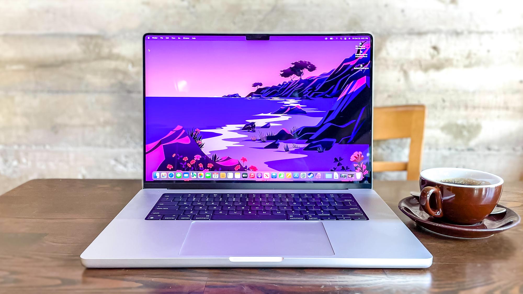
“What we've done is we've actually made the display taller,” explained Shruti Haldea, Pro Mac Product Line Manager at Apple on the Same Brain podcast. “Like on the 16-inch notebook, you still have a 16.0 active area on the diagonal in that 16:10-inch window, and we just grew the display up from there and put the Menu Bar up there.
“We just kind of moved it up and out of the way. So it's a really smart way to give you more space for your content, and when you're in full-screen mode, you have that 16:10 window, and it looks great. It's seamless.”
An imperfect solution

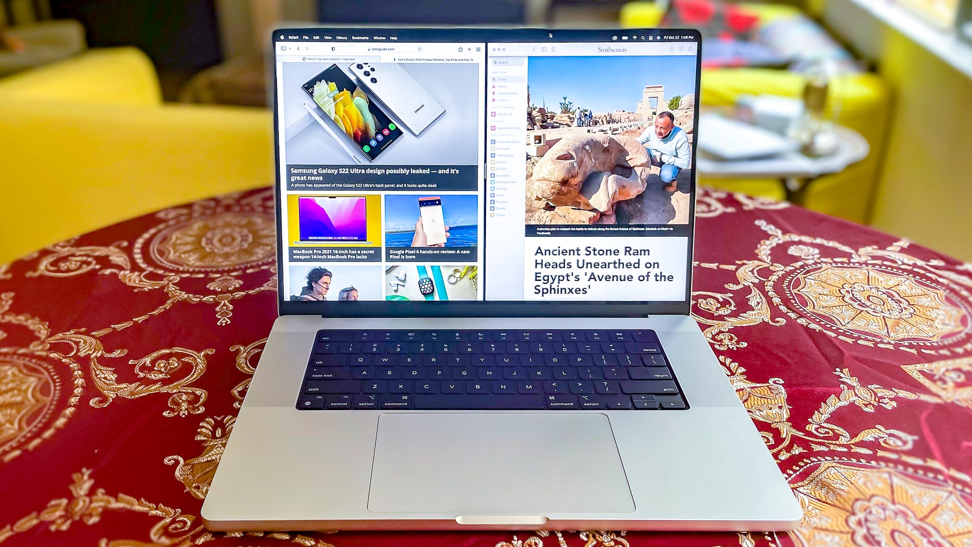
On one hand, I personally agree with this. The Menu Bar on macOS nicely hides the notch, especially if you have your system set to dark mode (as pictured above). And when you compare the new MacBook Pro side by side against the old model, it looks like you’re getting a lot more screen real estate than you’d expect, given their relative footprints.
But at the same time, it’s hard to take such a defense seriously when there’s no admission that this isn’t an option without drawbacks. Apple clearly does enough research to know that the notch isn’t exactly loved. A more believable response would be closer to “we know this isn’t ideal, but it’s the best option available” rather than to say “it looks great… it’s seamless.”
Sign up to get the BEST of Tom's Guide direct to your inbox.
Get instant access to breaking news, the hottest reviews, great deals and helpful tips.
There’s also the outstanding question as to why Apple needs a notch at all. On the iPhone it’s a necessary evil for Face ID, but given the new MacBook Pro doesn’t support face unlocking, why couldn’t Apple have included something smaller? The Dell XPS 15, after all, has slim bezels and still managed to fit a webcam inside. Admittedly, it’s a rather grainy 720p number, but it’s certainly unobtrusive. The MacBook Pros new webcam is leaps better.
Apple would no doubt argue that the space the new camera takes up is to avoid such disappointing footage when you’re in meetings, and as our MacBook Pro 16 review explains, the company has certainly succeeded on that front. Whether the performance improvement justifies the design cost is very much up to those weighing up whether to spend $1,999 or more on one.
- More: MacBook Air vs Pro: Which should you buy?
Freelance contributor Alan has been writing about tech for over a decade, covering phones, drones and everything in between. Previously Deputy Editor of tech site Alphr, his words are found all over the web and in the occasional magazine too. When not weighing up the pros and cons of the latest smartwatch, you'll probably find him tackling his ever-growing games backlog. Or, more likely, playing Spelunky for the millionth time.

