Android 12's new interface will bring some big changes to your phone
Android 12's interface will introduce the biggest change to Google's phone software in years

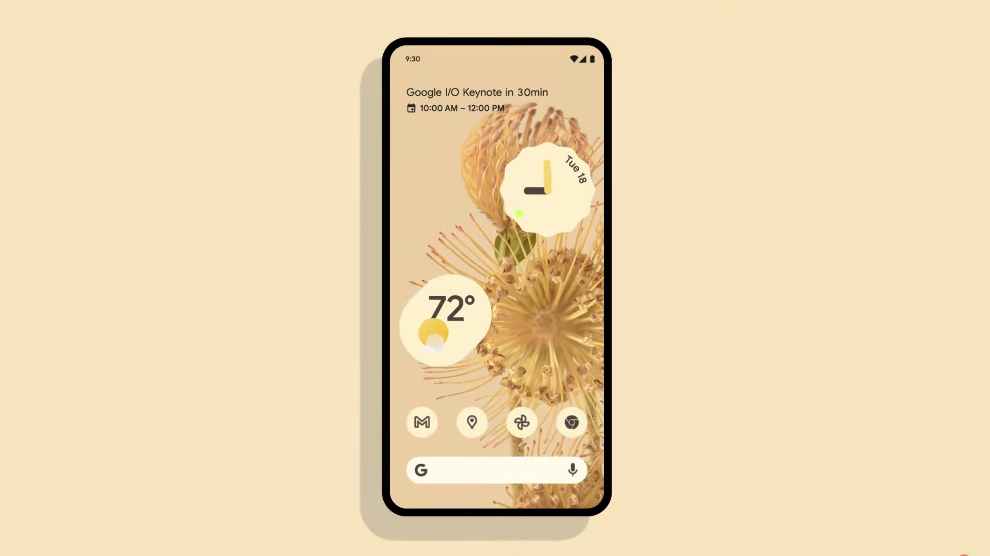
Android 12 is coming and now we know a bit more about what it'll look like. At Google I/O 2021, the company took the wraps off the new Material design and it looks gorgeous. There hasn't been this big of a change to the UI since at least Android Lollipop seven years ago.
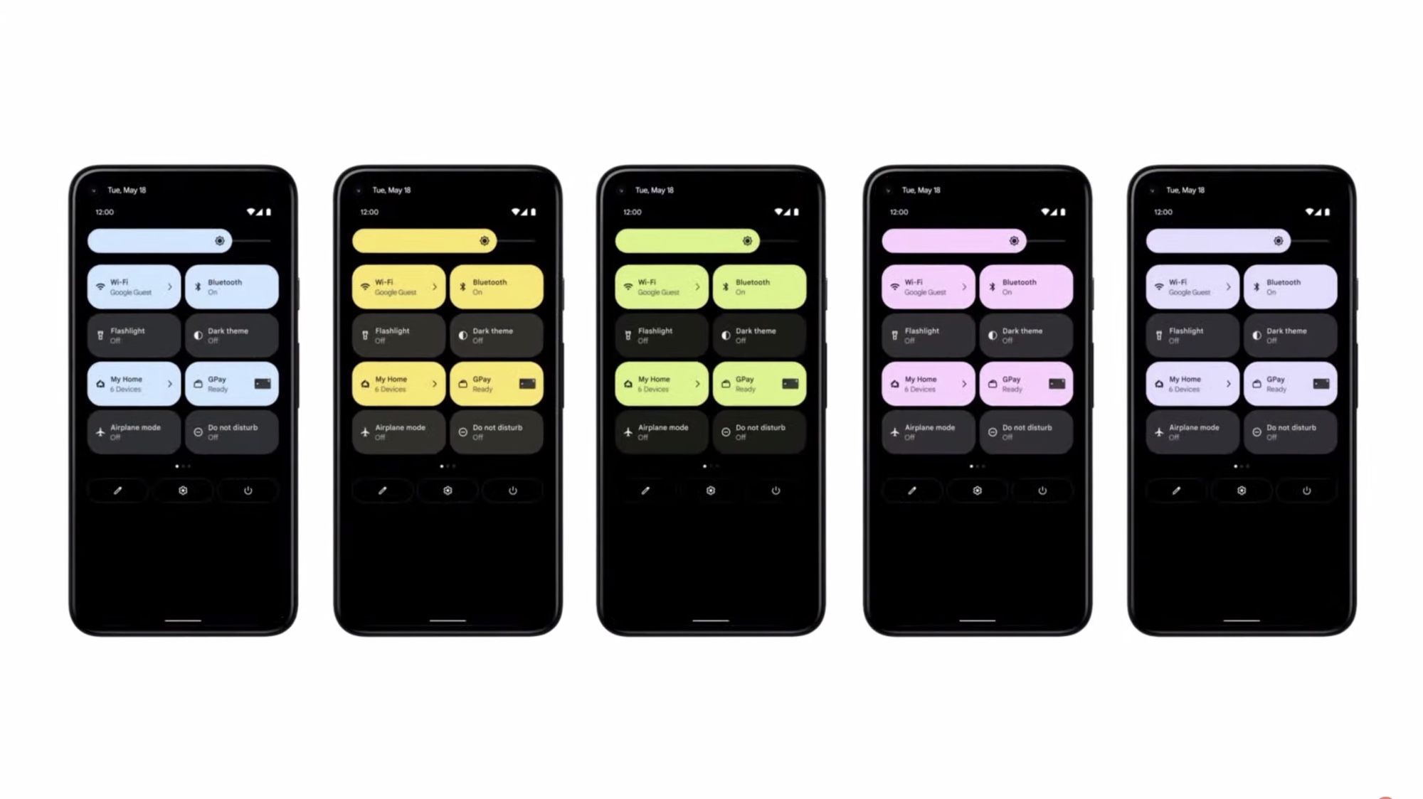
From color palettes that change based on your wallpaper to a whole new notification shade, Android 12 is a lot more than an iterative update. The Pixel phones slated for this fall will look a whole lot different later this year.
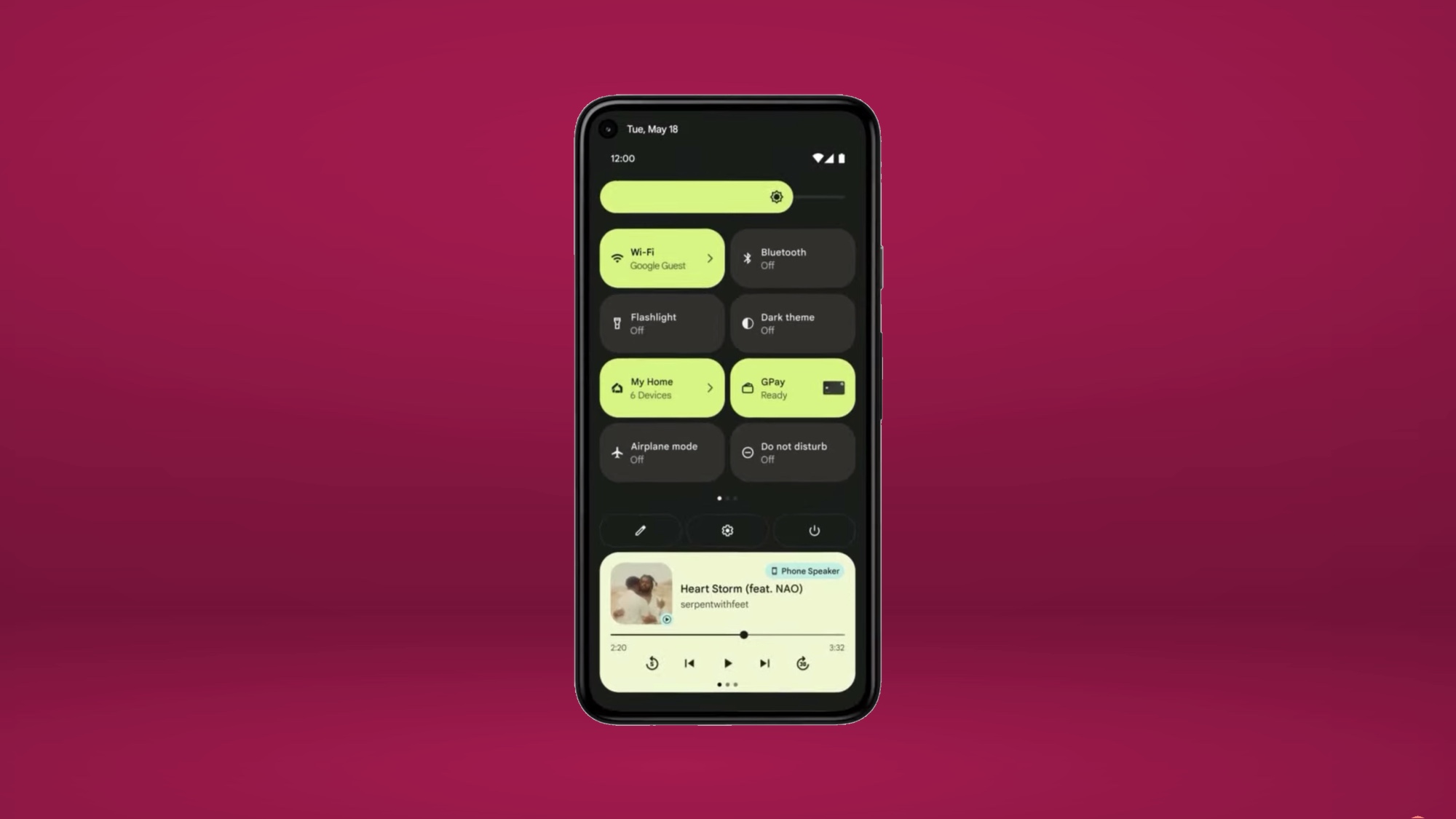
Specifically, Quick Settings has also been changed with much larger bubbles with labels. Android 12 places GPay and Home settings are front and center instead of hiding in the power menu.

Speaking of the power button, you can now summon Assistant with a long press (much like Siri on an iPhone or Bixby on a Galaxy).

Android 12 just got a lot more exciting. Stay tuned for more Google I/O coverage.
Sign up to get the BEST of Tom's Guide direct to your inbox.
Get instant access to breaking news, the hottest reviews, great deals and helpful tips.

Jordan is the Phones Editor for Tom's Guide, covering all things phone-related. He's written about phones for over six years and plans to continue for a long while to come. He loves nothing more than relaxing in his home with a book, game, or his latest personal writing project. Jordan likes finding new things to dive into, from books and games to new mechanical keyboard switches and fun keycap sets. Outside of work, you can find him poring over open-source software and his studies.
