Android 12 leak just revealed a complete makeover for Google’s OS
Android 12 looks like it's getting changes to notifications and widgets
Days after leaking a radical new design for the Google Pixel 6, the unnervingly accurate leaker Jon Prosser has returned with a video featuring, among other things, an official looking promo clip for Android 12.
While the latest version of Google’s mobile OS has been in Developer Preview for some time, the video shows off a playful new redesign, appealing new transitions, and hints at new features.
- Best cheap phones: Get a great phone for less
- iPhone vs. Android: Which is better for you?
- Plus: Twitter Blue reportedly coming for $2.99 per month — here’s what it is
The first slide Prosser shared is a “What’s new?” summary of the upgrade. It’s fairly standard stuff, with Google promising “a beautiful new experience," “stronger privacy and security protections,” and that “all of your devices [will] work better together.”
But it’s the second slide where Google puts its money where its mouth is, with a smattering of UI changes and new widgets.
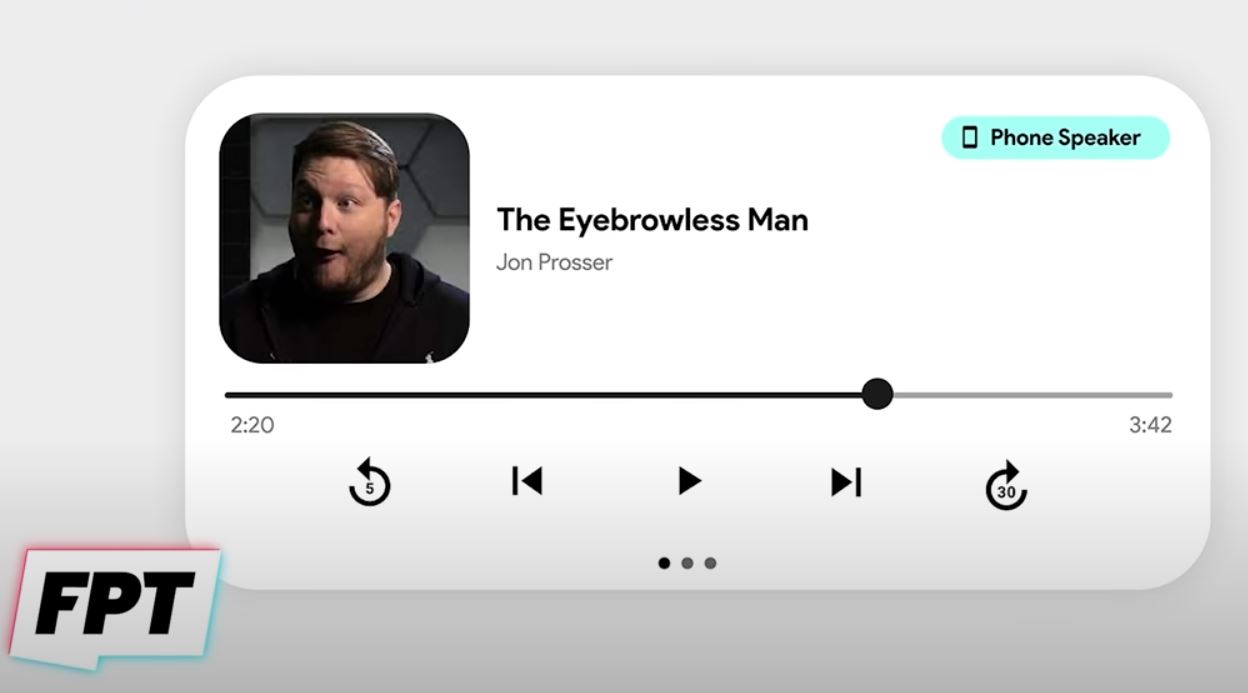
First, there’s a clean looking audio player widget:
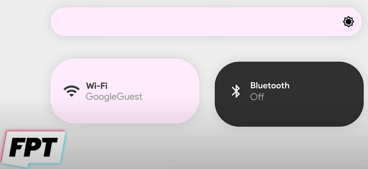
Then some curvy widgets to adjust the screen brightness, and toggle Wi-Fi and Bluetooth on or off.
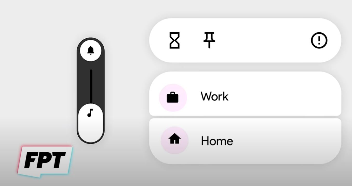
Next up is a volume slider, and some mysterious widgets with a pin icon, as well as "Work" and "Home" settings without any additional context.
Sign up to get the BEST of Tom's Guide direct to your inbox.
Get instant access to breaking news, the hottest reviews, great deals and helpful tips.
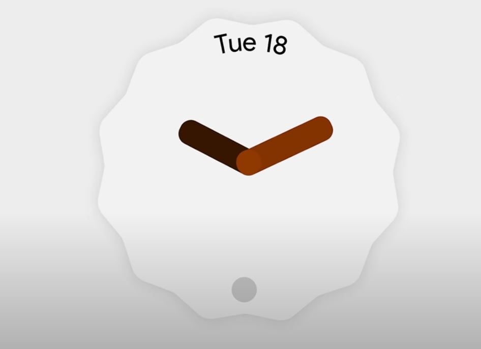
This stylized new analogue clock widget, meanwhile, is a lot more self explanatory:
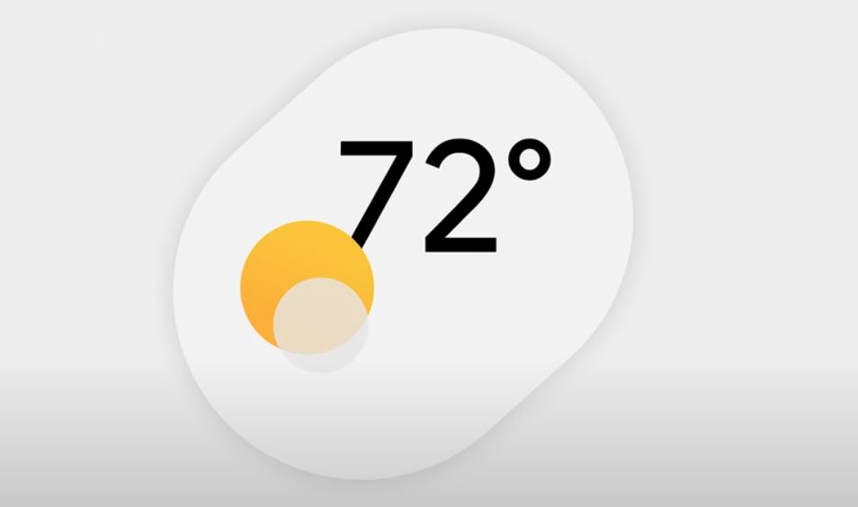
...as is this stylish new weather widget:
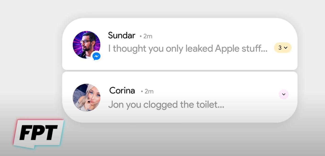
But most excitingly of all is support for stacked notifications, meaning your Android experience should be a little less cluttered soon.
Things get more interesting when Prosser reveals Google’s video promo with a montage of various Android 12 assets. It’s at 6:32 if you want to find it in the embed below.
The clip shows a number of things flashed up in quick succession including a larger lockscreen clock, notifications grouped across apps in a neat pill, and even a new looking keyboard.
But the main take home from the clip is how smooth the animations and transitions look in the new version of Android, with widgets stretching pleasingly as they’re tapped and touched. It’s a level of polish we’re not used to observing in Android updates, and it’s really exciting to see.
Given Google IO 2021 is just two days away, beginning on Tuesday, May 18, it would be surprising if this video wasn’t shown during the main keynote. If that’s the case, we don’t have long to wait before Google guides us through these new design changes, and tells us exactly what to expect with its promised security and device compatibility improvements. We’re also expecting to get our first official look at the upcoming Google Pixel 5a.
Freelance contributor Alan has been writing about tech for over a decade, covering phones, drones and everything in between. Previously Deputy Editor of tech site Alphr, his words are found all over the web and in the occasional magazine too. When not weighing up the pros and cons of the latest smartwatch, you'll probably find him tackling his ever-growing games backlog. Or, more likely, playing Spelunky for the millionth time.

