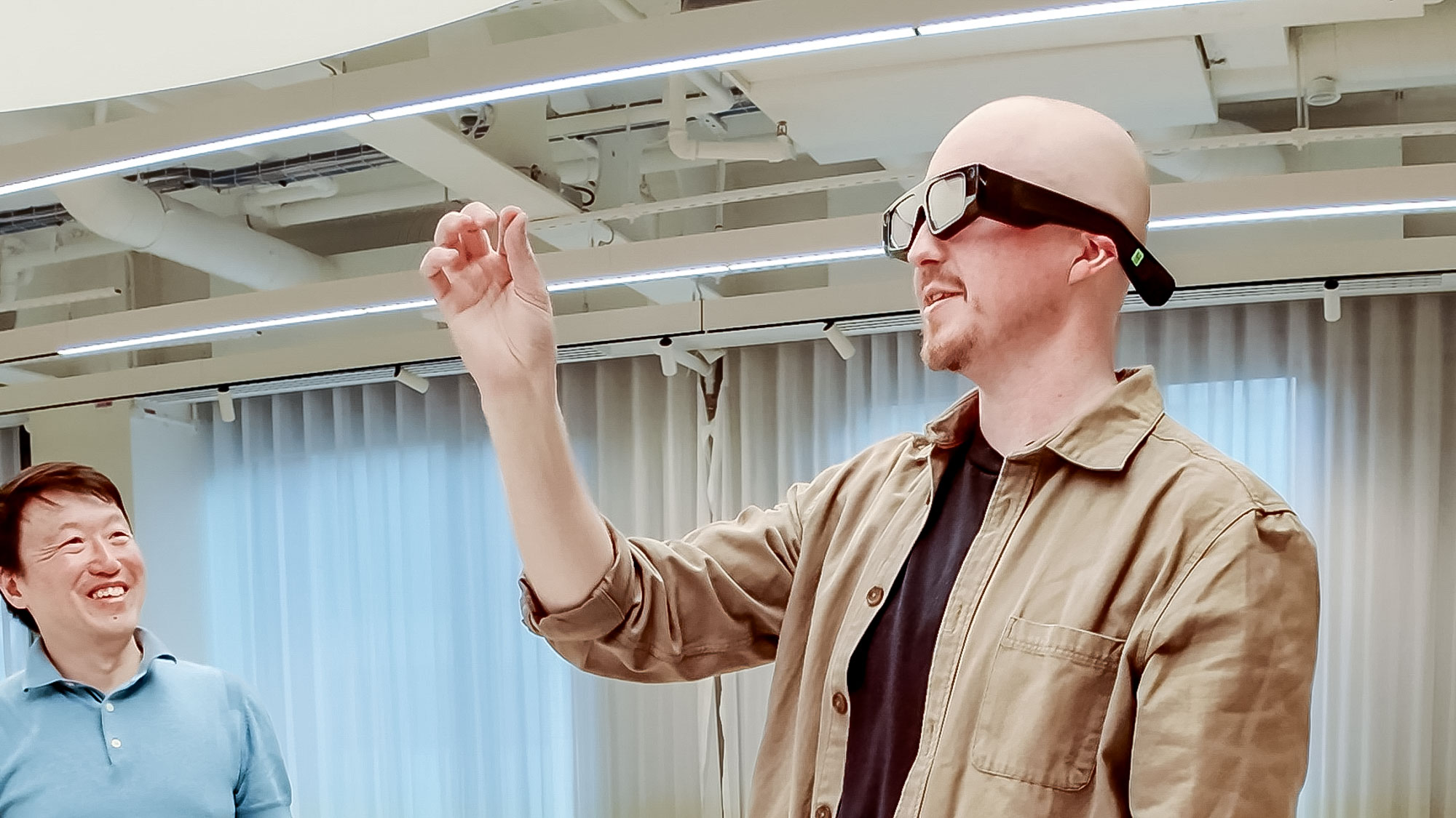
Android 12 — 5 big upgrades that change Android phones forever
Android 12 introduces lots of changes; here are the most important ones
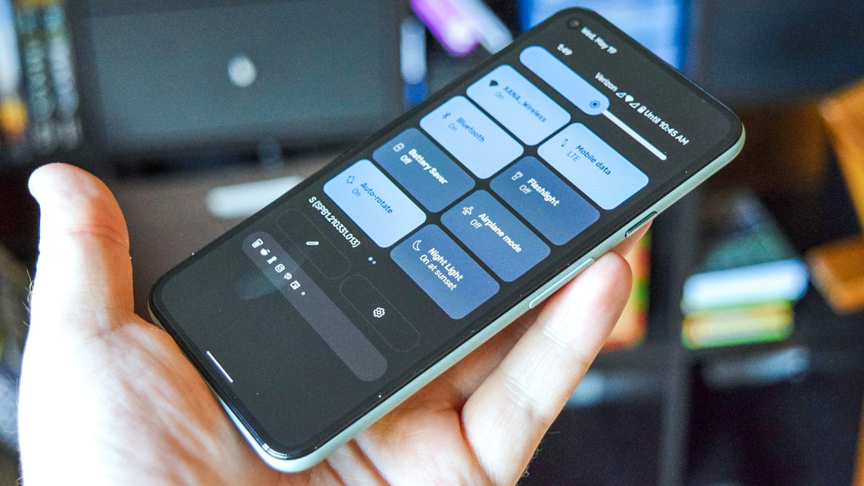
The changes in Android 12 are pretty massive. In fact, this is the biggest upgrade to Android since 2014's Lollipop update.
The first beta for the software update is available now and we already have a quick guide on how to install Android 12. If you own a supported Pixel, the process is quite simple and painless. In a few minutes, you can try out Android 12 for yourself and marvel at the new look for Google's phone software.
- Android 12: Everything you need to know
- How to change the Material You color in Android 12
- Plus: Android 12 is taking privacy seriously with a new dashboard and more
My full Android 12 impressions are coming shortly, but I wanted to take some time to walk you through the five biggest changes you'll notice when you finally get Android 12 on your phone later this year. We anticipate a full Android 12 release arriving around September, based on the timeline Google's shared.
Android 12 lock screen
Google has changed up Android's lock screen for the first time in a very long while. It adapts to what you have pending — if there are no notifications, you'll see a big, centered clock. But if you have items waiting for you, the clock will move up and to the left to make way for upcoming tasks and alerts. It's a really neat look, and the Always-on Display (AOD) feature also reflects this change and behavior.
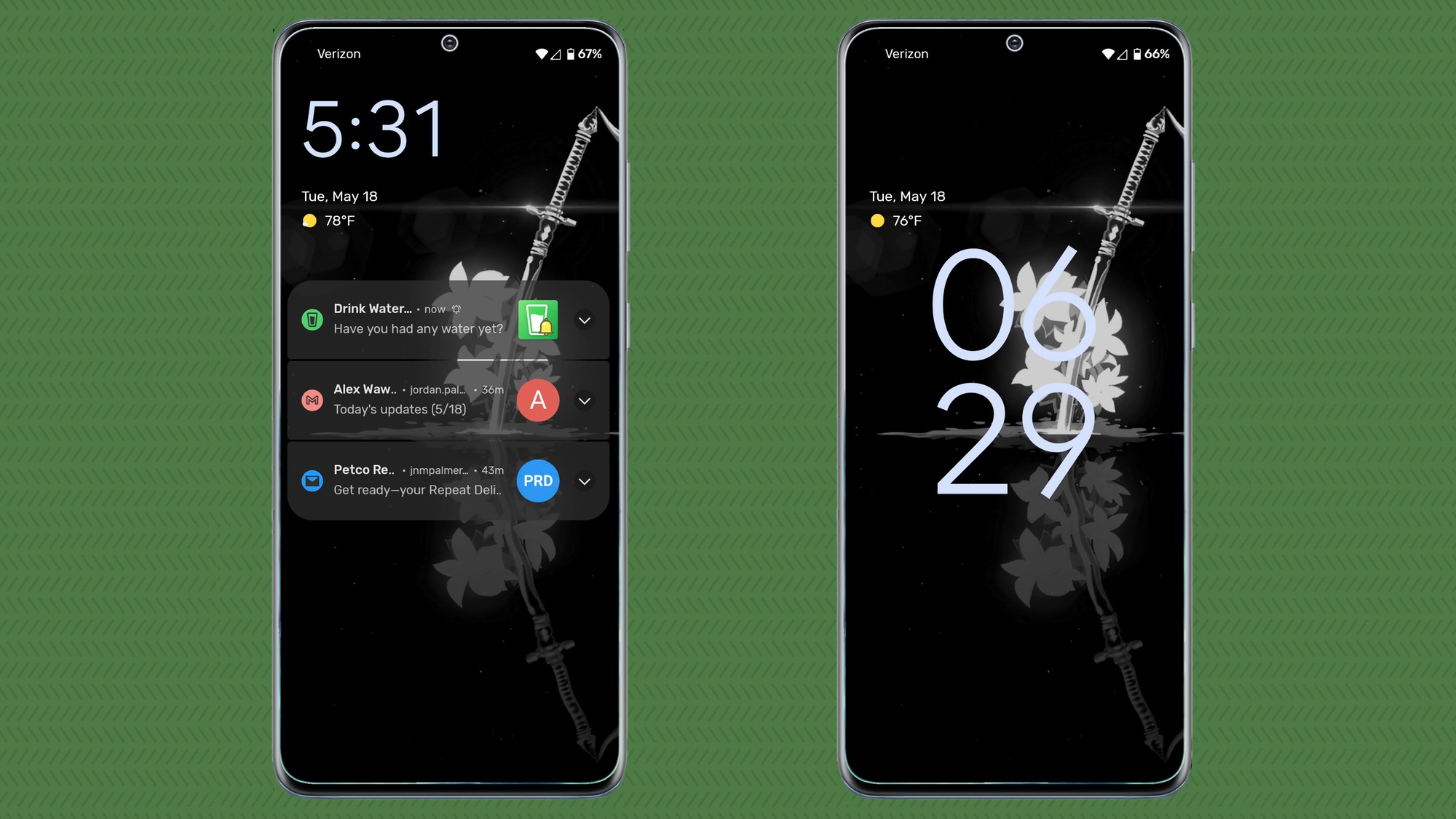
Honestly, I love the new lock screen, especially when there are no new notifications to contend with. The huge clock is really nice to easily see at a glance — especially in AOD. Having the date and weather info in the top left corner also looks really sharp.
Android 12 notification shade
We've seen subtle changes to the Android's staple notification shade for years, but Google has really stirred things up with Android 12. This all-important center to see and act upon your notifications gets a significant face lift.
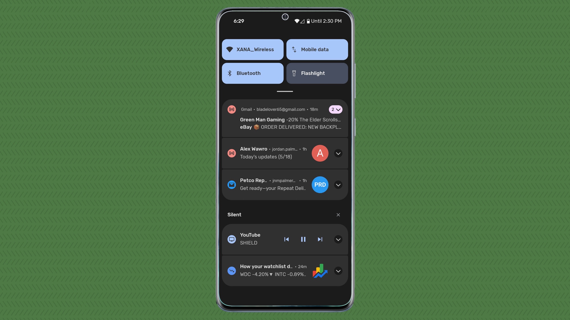
The notification shade now features a more rounded look, more than we've seen in previous Android 12 builds. Each item is clustered together based on category (Conversations, Notifications, Silent), but it's done so quite well. The shade doesn't feel cluttered at all, even when you have several items pending.
Sign up to get the BEST of Tom's Guide direct to your inbox.
Get instant access to breaking news, the hottest reviews, great deals and helpful tips.
I wasn't a fan of the revamped notification shade when I first saw it during the Google I/O keynote, but the change quickly grew on me. The updated notification shade uses space more efficiently than extra padding between each item. And if you favor smaller devices, like the Pixel 5, it's important to use your screen space wisely. The new shade adds a lot of polish to something so critical to Android's workflow.
Android 12 Quick Settings
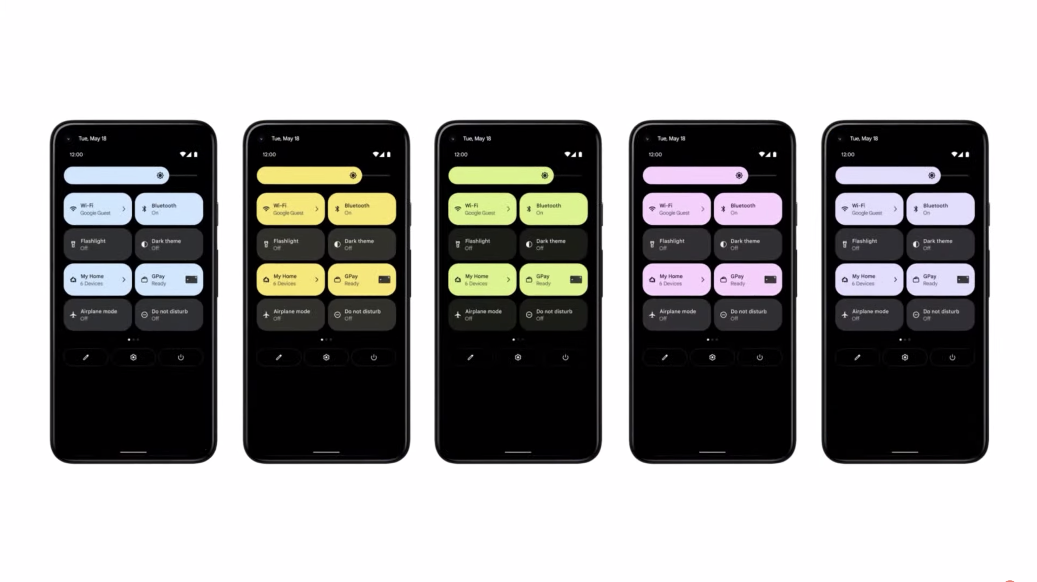
Quick Settings has gotten a huge redesign from the bubbles we've been used to for so long. They're now rounded rectangles in your accent color of choice with full labels.
Google mentioned specific buttons for GPay (that's Google Pay) and Home, too, though I haven't seen them yet in the first beta. It's definitely a new look for the toggles menu.
I'm quite ambivalent on this change. On the one hand, the shapes and colors feel cartoony. Then again, the effect looks quite nice and I like the much larger buttons. The extra space allows for the bigger labels, telling you what network you're connected to and all that. Even the brightness slider got retouched.
Android 12 Settings
Even the Settings menu has gotten a redesign in Android 12. Each menu has a large, colored icon and a clear label in a big font. There's not a whole lot else to say about this particular enhancement, but you will notice it when you try out Android 12 for yourself.
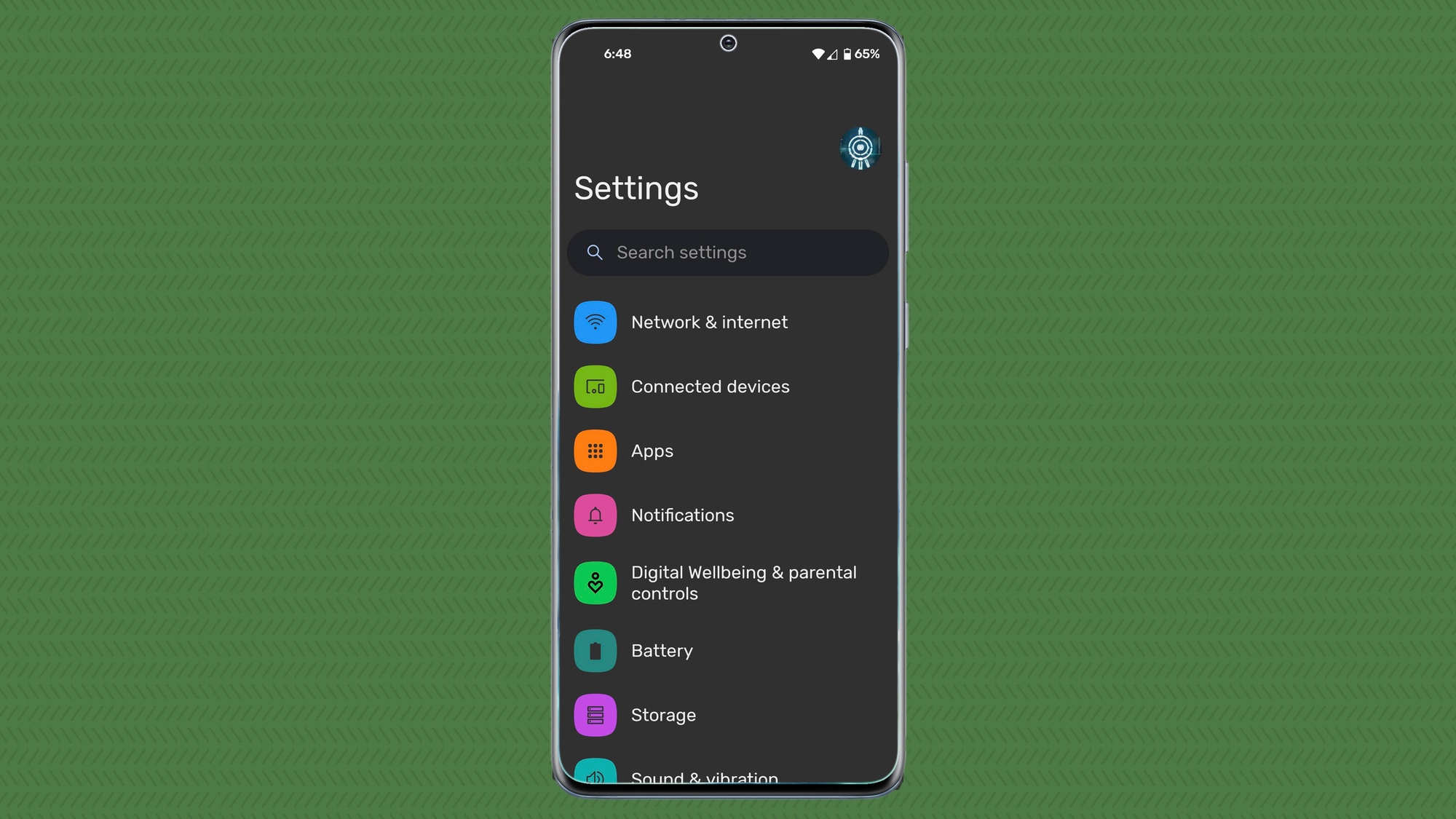
I'm once again torn on this new visual. The Settings menu looks really nice, but it also feels a bit cartoony and a bit too much like Samsung's One UI skin for my taste. I do like the bigger labels, though. Something about it just looks good.
Android 12 Material You
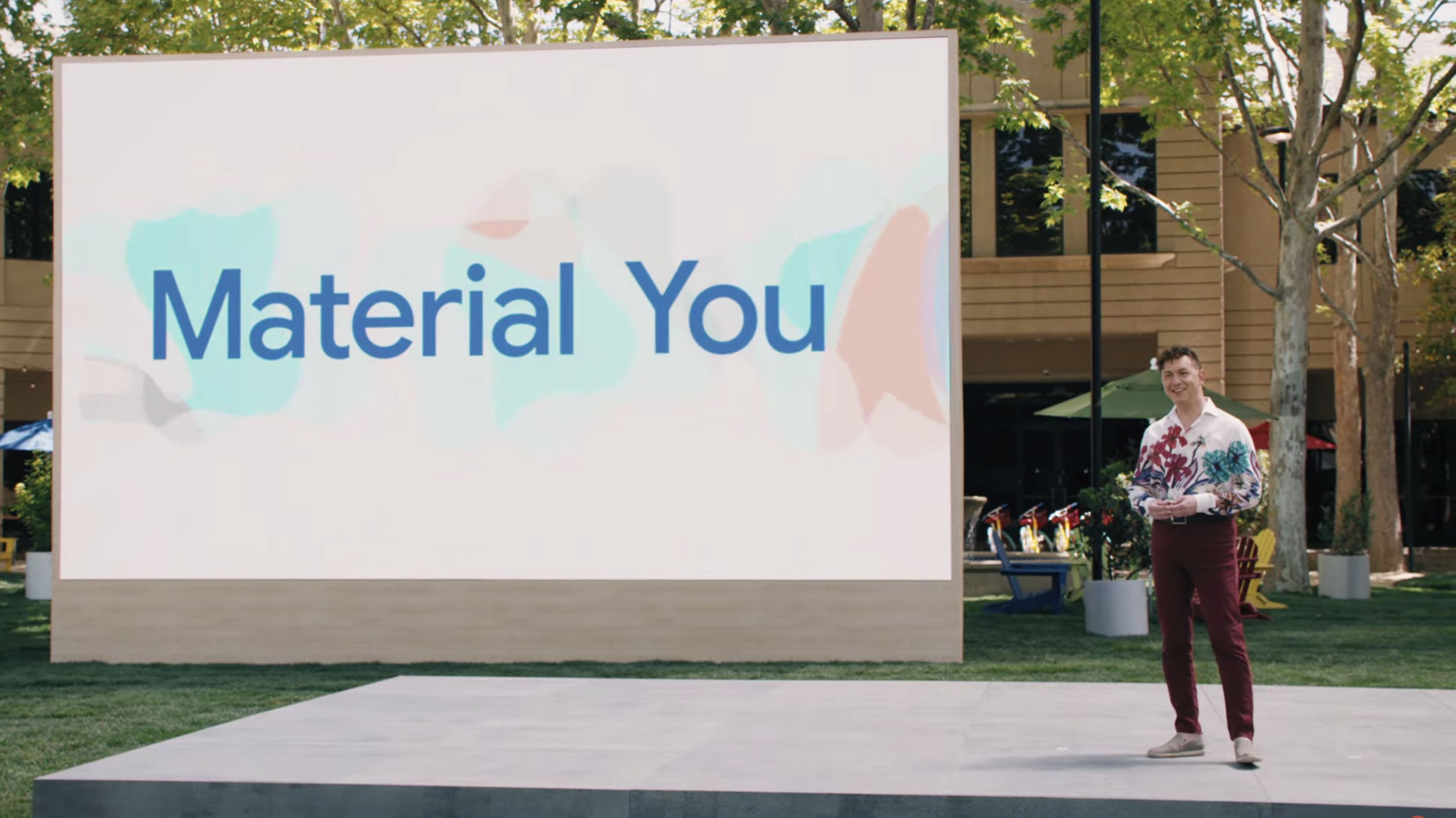
Ever since Android 5.0 Lollipop way back in 2014 (with the Nexus 6), Google has named its design language Material Design. The word "material" has stuck around and Google calls the new iteration Material You. Yeah, that's a little corny, but the point is to help you make your phone feel like it's truly yours.
Some changes will be subtle, like widgets and system elements tweaking their color palettes based on your wallpaper. Others look to be more direct, like the changes we've talked about above.
Overall, Material You is obviously still a work in progress, since the first Android 12 beta is missing some of the new features at this point. (We're expecting plenty of updates to the beta over the summer.) But I like where Google is going and I'm excited to see where we end up with the final Android 12 release later this year.

Jordan is the Phones Editor for Tom's Guide, covering all things phone-related. He's written about phones for over six years and plans to continue for a long while to come. He loves nothing more than relaxing in his home with a book, game, or his latest personal writing project. Jordan likes finding new things to dive into, from books and games to new mechanical keyboard switches and fun keycap sets. Outside of work, you can find him poring over open-source software and his studies.
