Amazon just gave Prime Video the big upgrade it really needed
Finally, Prime Video gets a cleanup

Perfect timing: with plenty of big shows on the way, Prime Video's finally getting the design refresh it's sorely needed for a while now. Yes, so when The Lord of the Rings: The Rings of Power hits the air, it will arrive on a streaming service that looks like it belongs in this era. For too long, Prime Video's had the same stodgy interface that reeked of a lack of TLC. That's over.
Announced today (and rolling out this week) the new Prime Video interface is coming to the app on some of the best streaming devices and its Android app. It should be on all of those units by "mid-to-late August 2022," giving users a newly streamlined Prime Video that's easier to navigate.
While a new interface might not sound like the sexiest thing, Prime Video's evolved a lot over the years, and these changes will make it so the apps you use now fit the service itself. Not only will Amazon's sports content be easier to find, but they're also highlighting key areas of the app, including free and live content.
Check out this hype trailer:
Top Prime Video app improvements
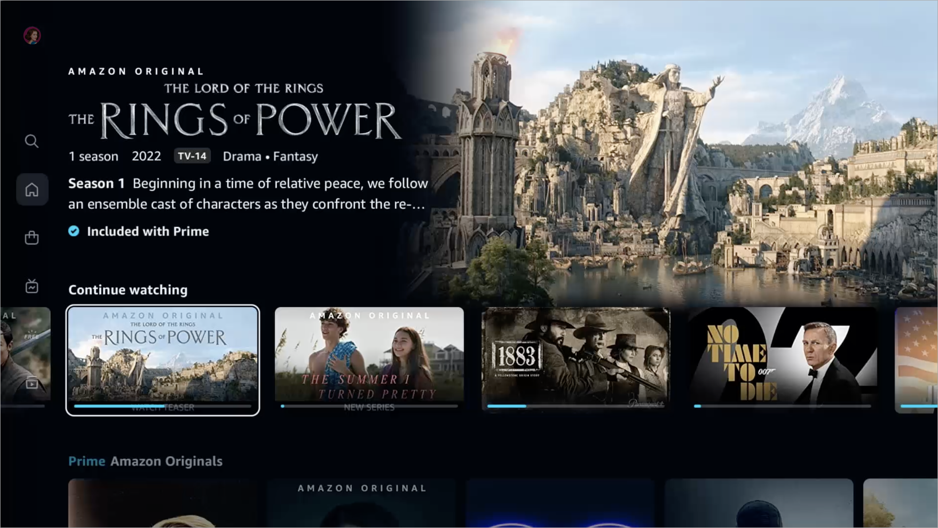
On the left side of the screen, you'll see a new set of navigation tabs that break down what's in the app. With the Home, Store, Find, Live TV, Free with Ads and My Stuff buttons, you can quickly jump to where you're trying to go (though the word "free" in that button should be in a different color to pop out more).
On the main screen, there are now filter buttons for All, Movies, TV shows and Sports, making it easier to hide what you're not interested in. Through the Sports button, you'll find Thursday Night Football and other sports-based content available through Prime and any connected subscription services such as MLB.TV or Paramount Plus.

Other new features include: larger carousels of content promoting Prime Video, the ability to filter searches by 4K and the top 10 list of what's popular on Prime Video.
Sign up to get the BEST of Tom's Guide direct to your inbox.
Get instant access to breaking news, the hottest reviews, great deals and helpful tips.
Analysis: The best Prime Video improvement is subtle
If you ask me, the top improvement, though, isn't that obvious. Now you'll have an easier time finding things you don't have to pay for.
All content marked with a blue checkmark icon is available to users without paying extra, either via the apps you already subscribe to or through a free, ad-supported service. The new Fallout TV series? That's a Prime Original, so it will have a blue checkmark next to it. But anything with a shopping bag icon? You're gonna have to pay for that.
This is a huge boon because Prime Video is filled with content you can buy or rent from Amazon or stuff you could stream via an Amazon Channel. Clarifying this, so people know what they're clicking on, is important.
Next: The new No. 1 Netflix movie is 31% on Rotten Tomatoes, so why are people watching? The 7 best new movies of the week feature a big Netflix Original. The Gray Man release date is almost here.

Henry is a managing editor at Tom’s Guide covering streaming media, laptops and all things Apple, reviewing devices and services for the past seven years. Prior to joining Tom's Guide, he reviewed software and hardware for TechRadar Pro, and interviewed artists for Patek Philippe International Magazine. He's also covered the wild world of professional wrestling for Cageside Seats, interviewing athletes and other industry veterans.
-
Commentor "CONTINUE WATCHING" Section Removed by Amazon Geniuses Who Ran Out of Ways to Make the Prime Video App any WORSE Than it already was... Brilliant!.......... UPDATE 2022-SEP: ROCKET SCIENTISTS ALSO Removed "PRIME" Symbol on (currently) Available-to-Play Videos --- MAKING IT IMPOSSIBLE TO DISTINGUISH ((the few)) AvaiLabLe-Videos from (the THOUSANDS of (queued)) UN-AvaiLabLe-Videos -- WITHOUT.....C-L-I-C-K-I-N-G.....O-N.....E-V-E-R-Y.....S-I-N-G-L-E.....T-I-T-L-E.....F-I-R-S-T.....!-!-!-!Reply
