9 decor mistakes that are making your home look smaller
Are you making these decor mistakes?
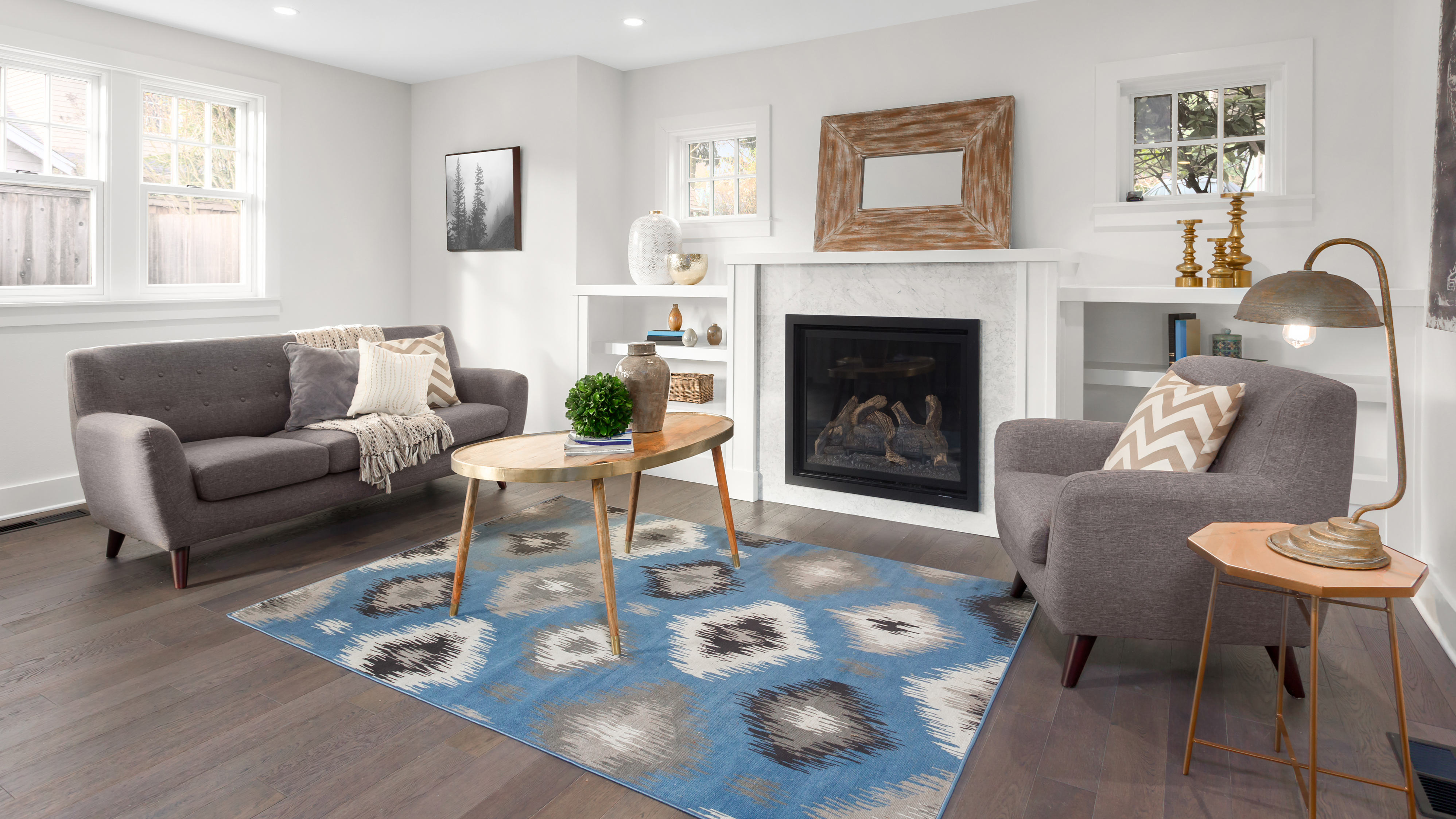
Whether you live in a cozy apartment or busy house, we all want to create our ideal home. But if you feel that your space is “shrinking”, you might be making these decor mistakes that are making your home look smaller.
By avoiding these common decor mistakes, you can make even the smallest room look bigger. All it takes is a clever layout, savvy storage, and the right color scheme to maximize your living space, and add more style. In addition, a well-designed home will not only look more aesthetically pleasing, but can improve the quality of your mental health and lifestyle. Best of all, you won’t even have to pack up and move anytime soon!
So, if you want to enlarge your space, avoid these 9 decor mistakes that are making your home look smaller.
If all else fails, you can try these 7 paint colors to make a small room look bigger. Alternatively, here are 5 easy ways to make your home feel warmer, according to interior experts.
1. Wrong-sized furniture
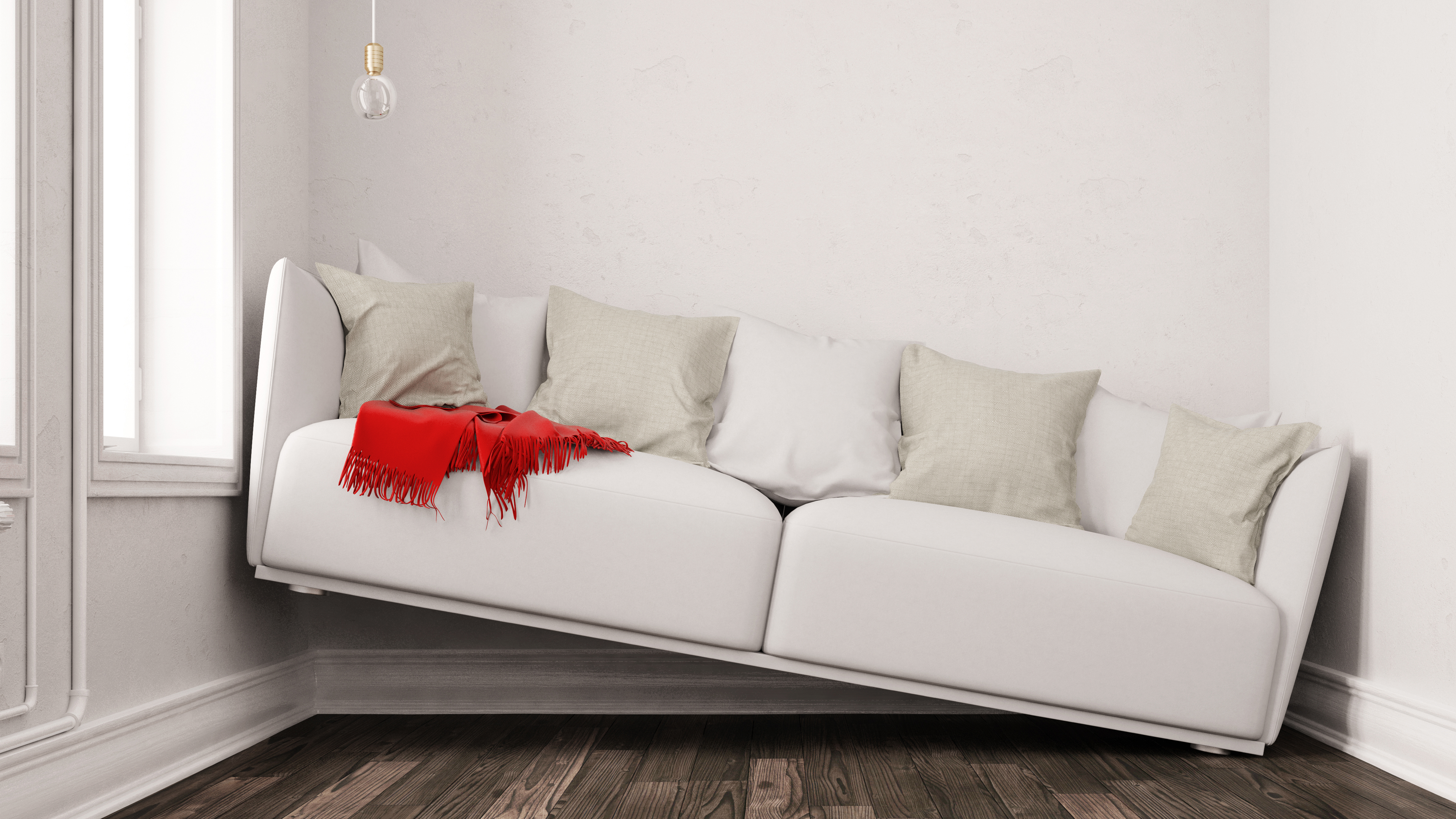
There’s nothing worse than furnishings that look too “cramped” in a room, making your home look smaller. Whether it’s your favorite sofa taking up half the room, or a huge coffee table, buying the wrong-sized furniture is a common decor mistake.
Choosing the wrong scale for rooms can make your space look either too small or too big, so it’s important to always check the dimensions of furniture before buying. This is especially true if you’re buying furniture/decor online, and the reality is far different from the pictures! You may find it helpful to use an AR app such as IKEA Place to get a better idea of how an item of furniture will fit into the space you have.
In addition, avoid heavy pieces of furniture, and cumbersome sofas — especially in compact rooms. Instead, choose sofas and armchairs with narrow arms, and raised on taller legs — so you can see the floor underneath. The trick here is when you see more floor, it will give the illusion of a bigger room, and allow natural light to flow better.
Sign up to get the BEST of Tom's Guide direct to your inbox.
Get instant access to breaking news, the hottest reviews, great deals and helpful tips.
Plus, it will also look stylish, and add a more contemporary style to the space. Another top tip is to opt for circular tables, or glass or reflective surfaces, to make a smaller space look bigger.
2. Too much furniture/furnishings
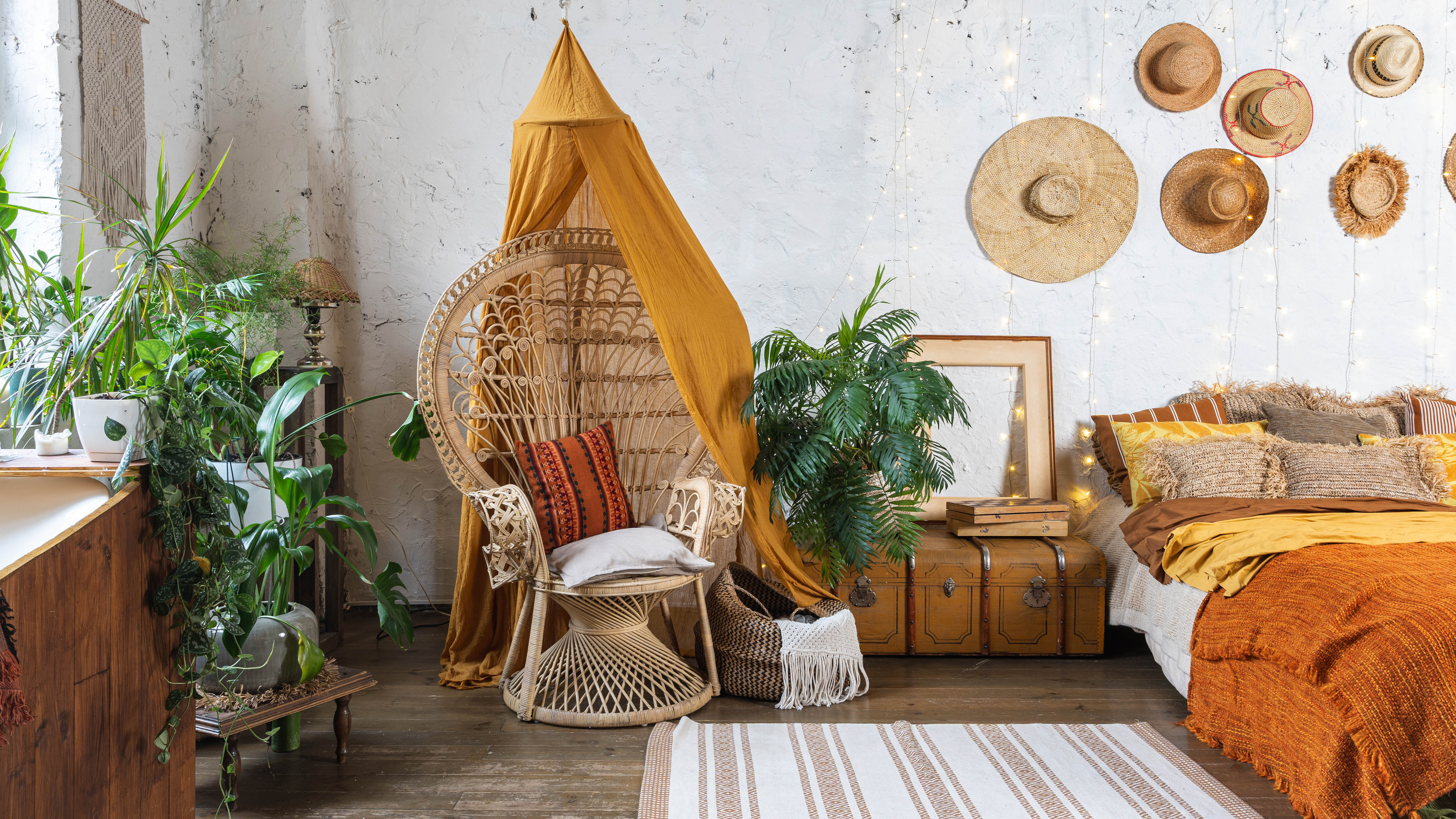
It can be easy to get carried away with the latest trends, or buy things on impulse, however, this is another decor mistake that is making your home look smaller. What’s more, splurging out on new furnishings just for the sake of it can make your home look cheap, according to interior designers.
Experts advise to always consider layout, and how you plan to move around the space for efficiency. Where possible, streamline your large furniture to avoid overcrowding, and keep pieces minimal.
In addition, keep your interior scheme simple, and stick to neutral styles, tones or accessories that will still be timeless years later. You can always add bursts of bold color in soft furnishings or accessories. After all, less is more!
3. Too many patterns
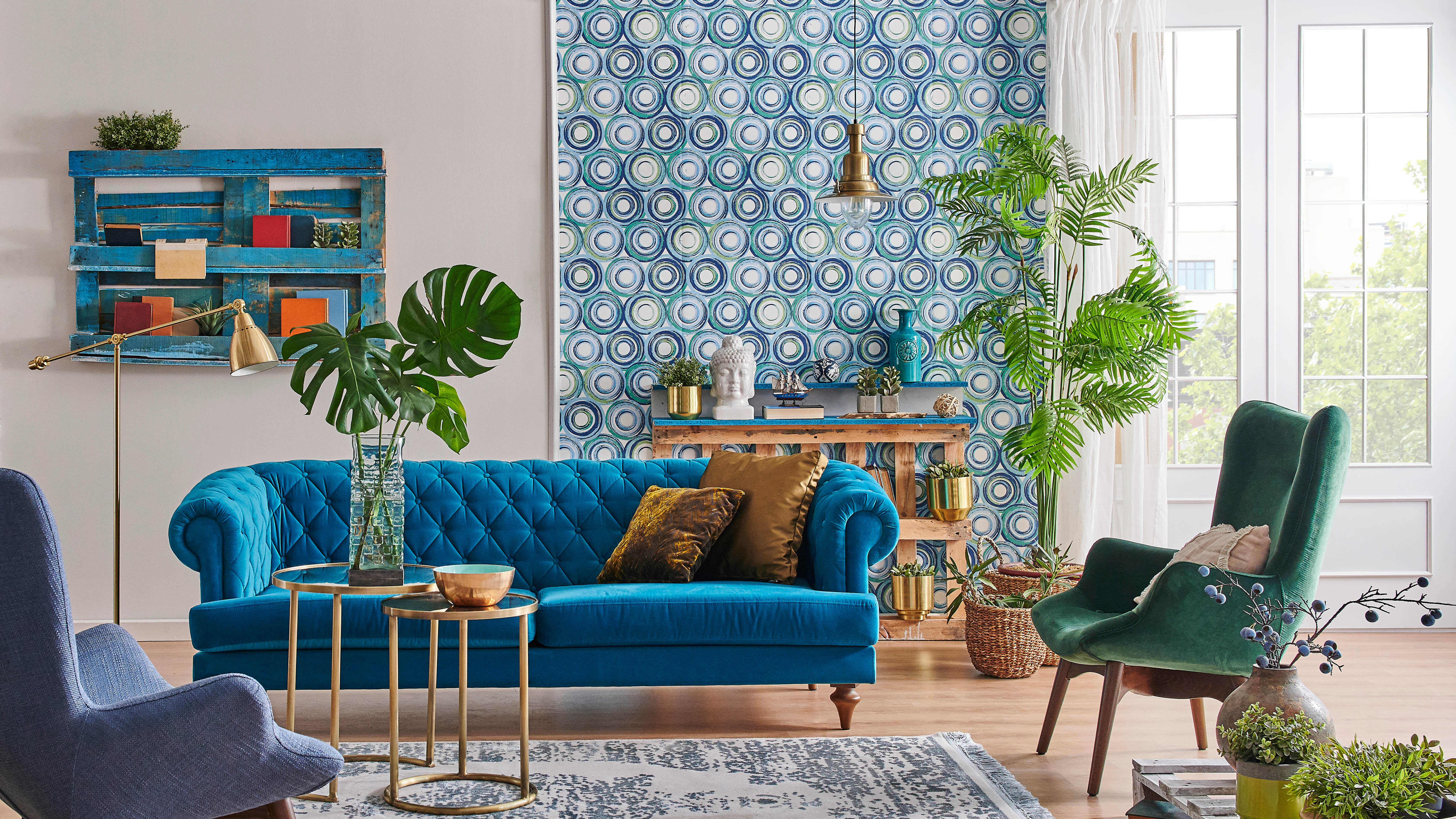
Whether you have patterned wallpaper, rug or geometric cushion covers, avoid matching different patterns together. It’s no surprise that this will make your home look smaller (and look busy!).
Experts recommend to decorate with solid block colors, and only use a limited color palette. Then, you can throw in a few, select patterns, which will be a more subtle addition — rather than a heavy overkill.
4. Dark walls
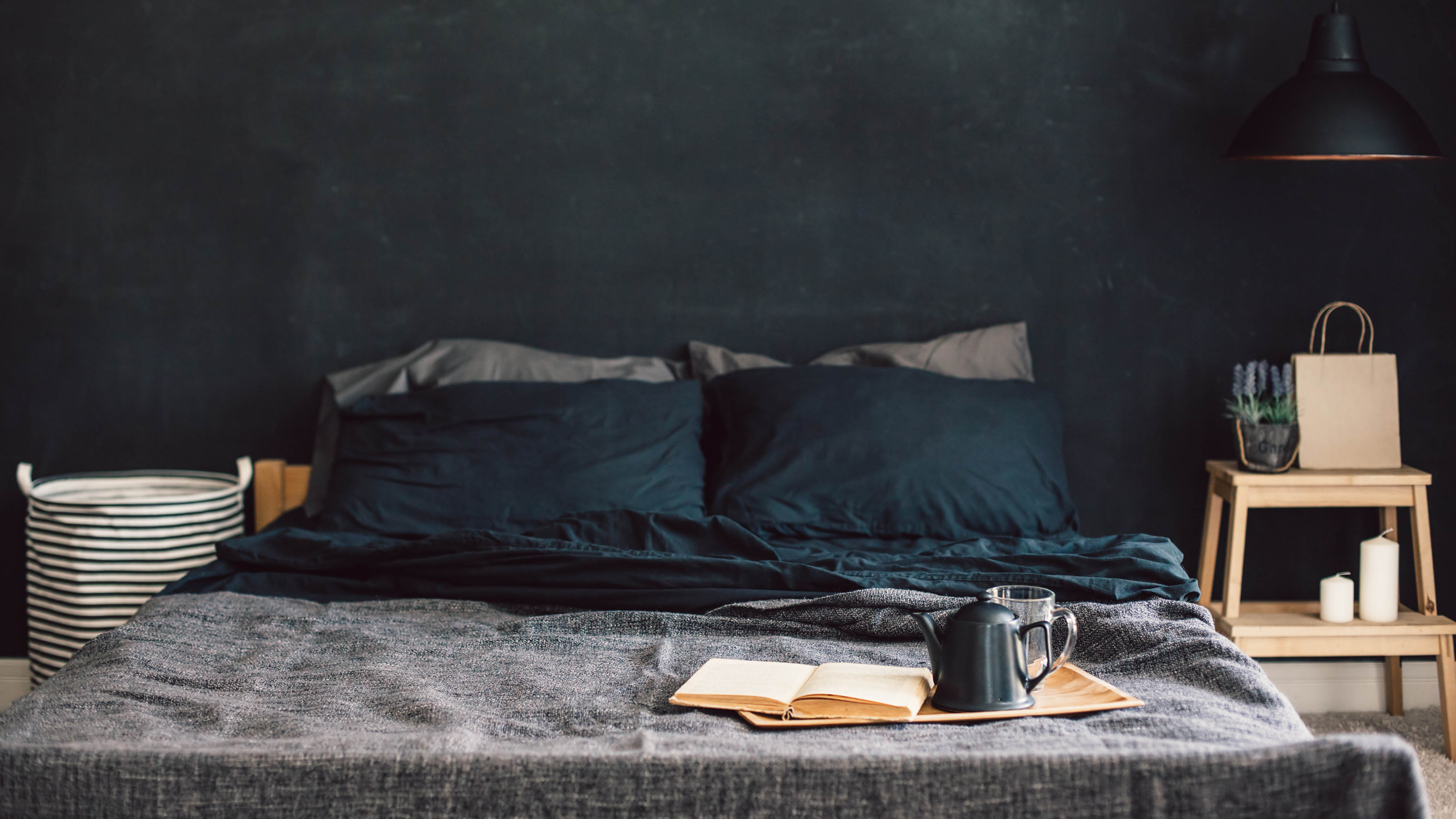
Although darker paint tones have risen in popularity, dark walls are also known to make a small room look smaller. This also depends on the amount of natural light, and how many windows there are.
Instead of painting all the walls in a dark color, experts recommend to just paint one feature wall, or single area. Not only will this avoid ‘drowning’ a room in darker tones, but will also add a stunning, bold color and character in a neutral space.
5. Too many pictures on the walls
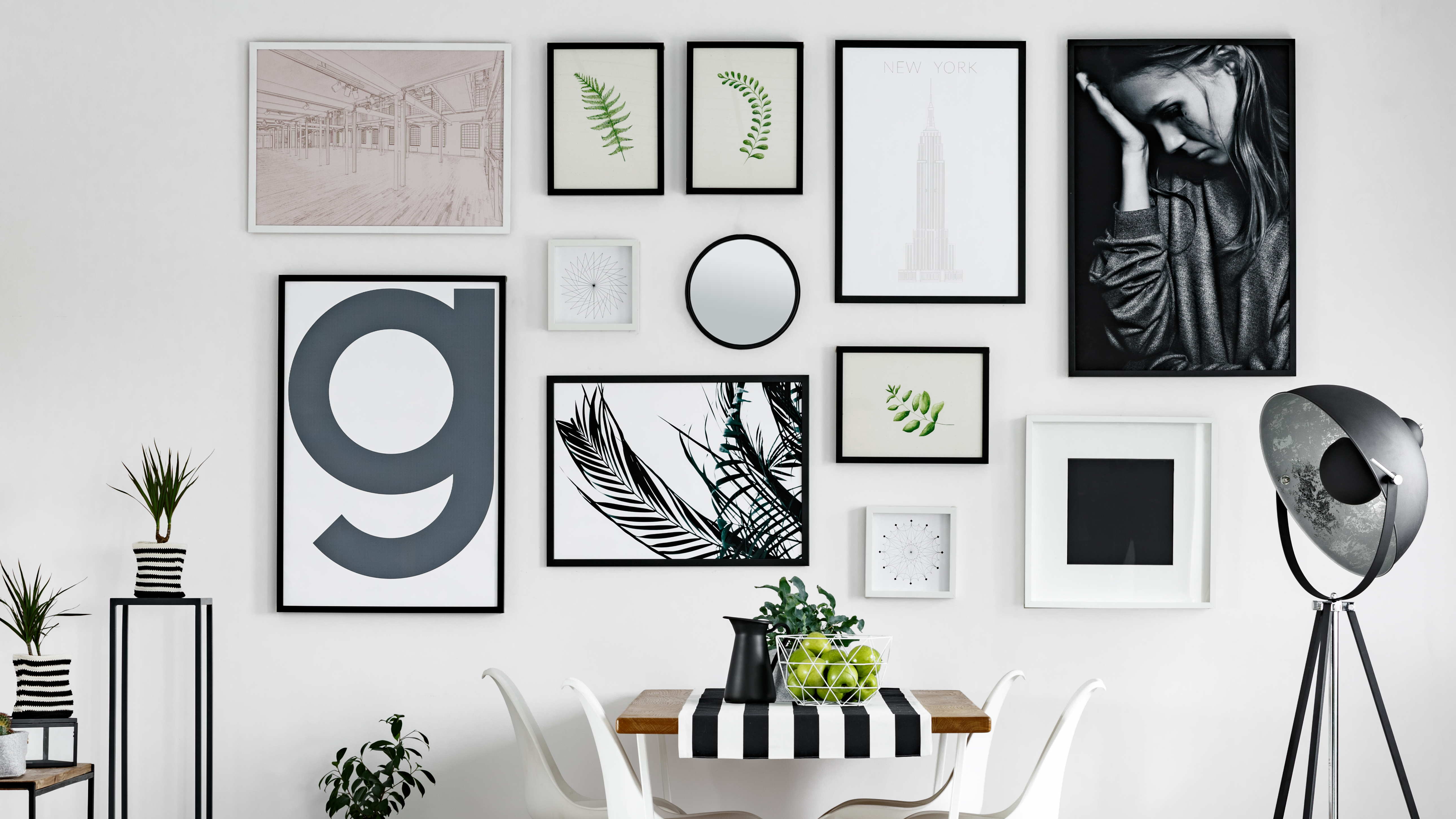
Be it family photographs, abstract art, or stylish posters, pictures on the walls can add a personal touch to the home. However, there is a danger of going overboard with the gallery walls — making your home look smaller.
The key here is balance, and experts recommend the ‘odd number rule’ when hanging pictures. So rather than hanging in even numbers, stick to three or five on one wall, or even one large frame. This rule is considered to be more visually appealing, and looks less cluttered.
If you did want to hang two pictures side by side however, make sure the frames are identical, and hung at the same height. Although this should be 57 inches, generally, pictures should be hung at eye-level.
6. Not making use of vertical space
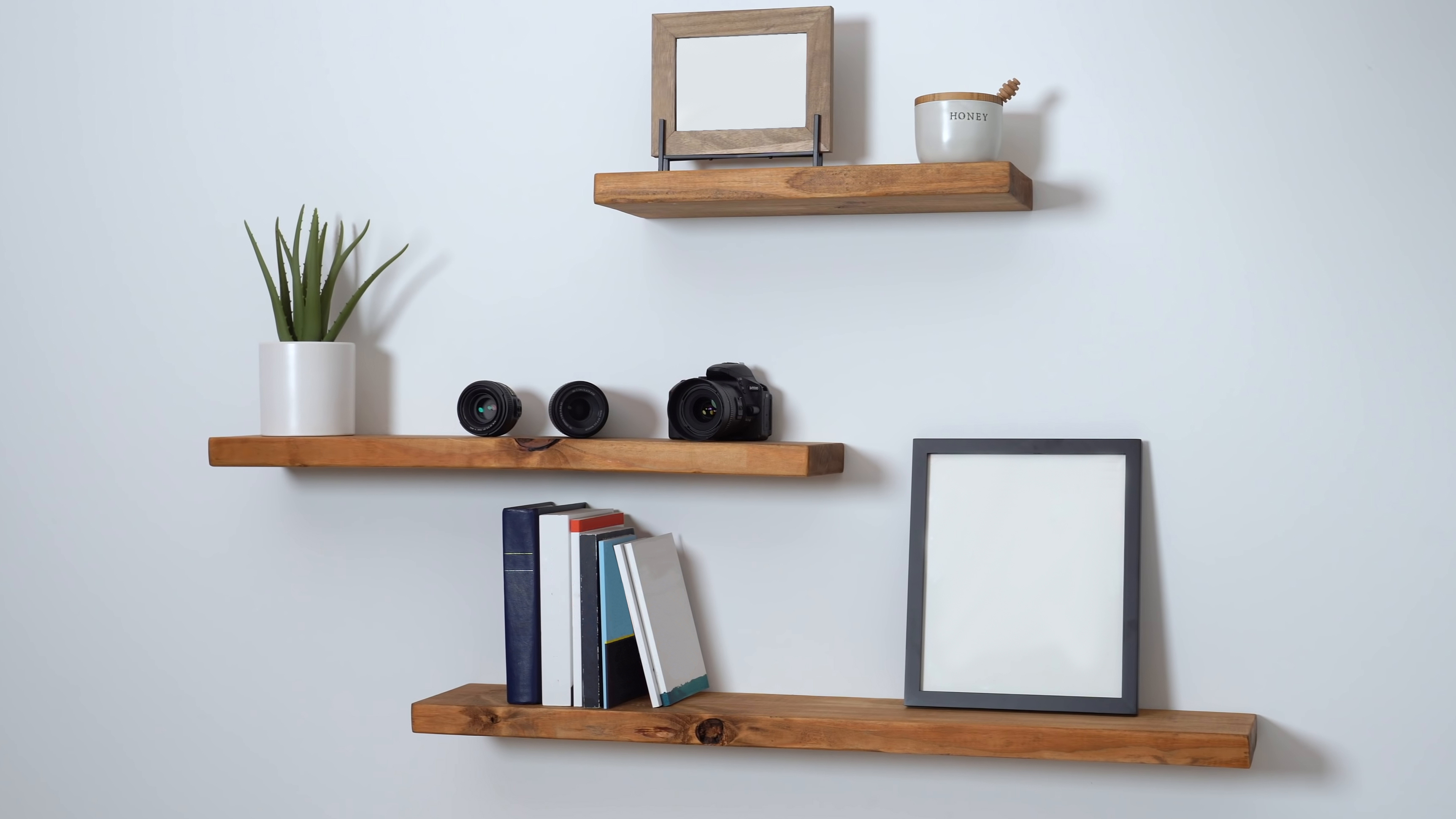
Another common decor mistake that is making your home look smaller, is not utilizing wall/vertical space. Furniture doesn’t always have to be spread out and on the ground. Depending on how strong your walls are, you can easily wall mount floating wall shelves, cabinets, or clever storage units to free up valuable floor space.
For home offices, hanging smaller things on wall-mounted rails can be handy, as you’ll have more desk space making it less cluttered. Just don’t forget to check what’s behind the wall before you start drilling holes everywhere!
In addition, consider built-in wardrobes or vertical cabinets that can give you extra storage space without having a chunky piece of furniture protruding into the room. There are also plenty of stackable storage ideas to keep everything in order. For instance, if you want to keep children’s toys tidy, storage organizers like this Humble Crew Extra-Large Toy Organizer ($79, Amazon), will save you valuable space
7. No multifunctional storage
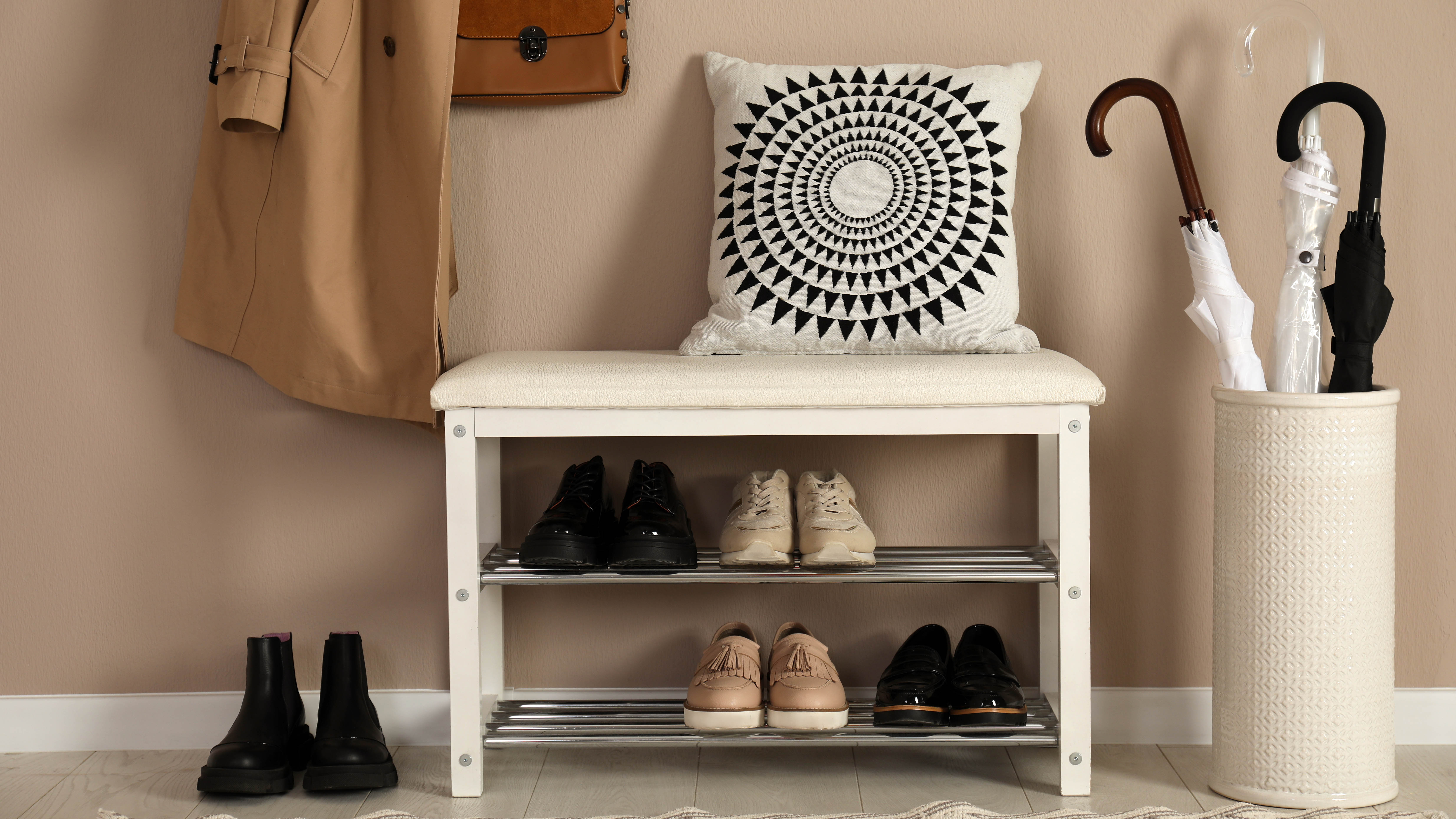
Similarly, when designing a space, we forget about practical storage solutions, and end up with cluttered spaces. Multi-purpose furniture such as storage ottomans or blanket chests are clever ways of hiding clutter, as well as doubling up as extra seating for your guests.
In addition, if you don’t have space for a huge coffee table, invest in a nest of tables to tuck away in the corner, or invest in a comfy sofa bed if you don’t have a large guest room.
If you have cluttered shoes, here's 7 space-saving ways to organize shoes in your entryway.
8. Using heavy curtains/drapes
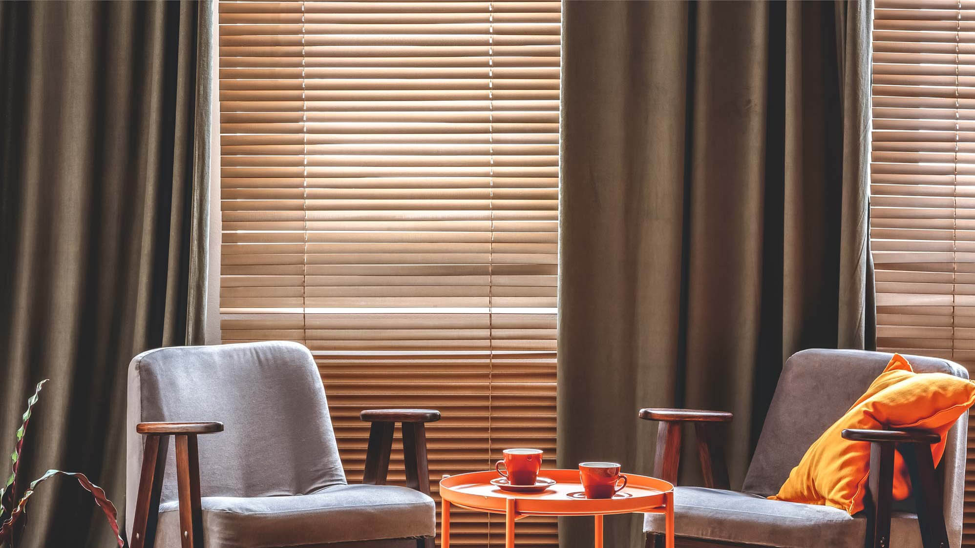
Natural light can really brighten up a dark room, and make a small space look bigger. Experts always advise against using heavy or long drapes to cover your windows, as this blocks the light from coming through.
Instead, opt for light window treatments such as slatted or roller blinds that you can lift up, or sheer curtain fabrics. These will allow you more control over how much light you need, and blackout blinds are available to help you sleep better at night.
If you’re undecided however, check out blinds vs curtains: which is better?
9. Wrong lighting
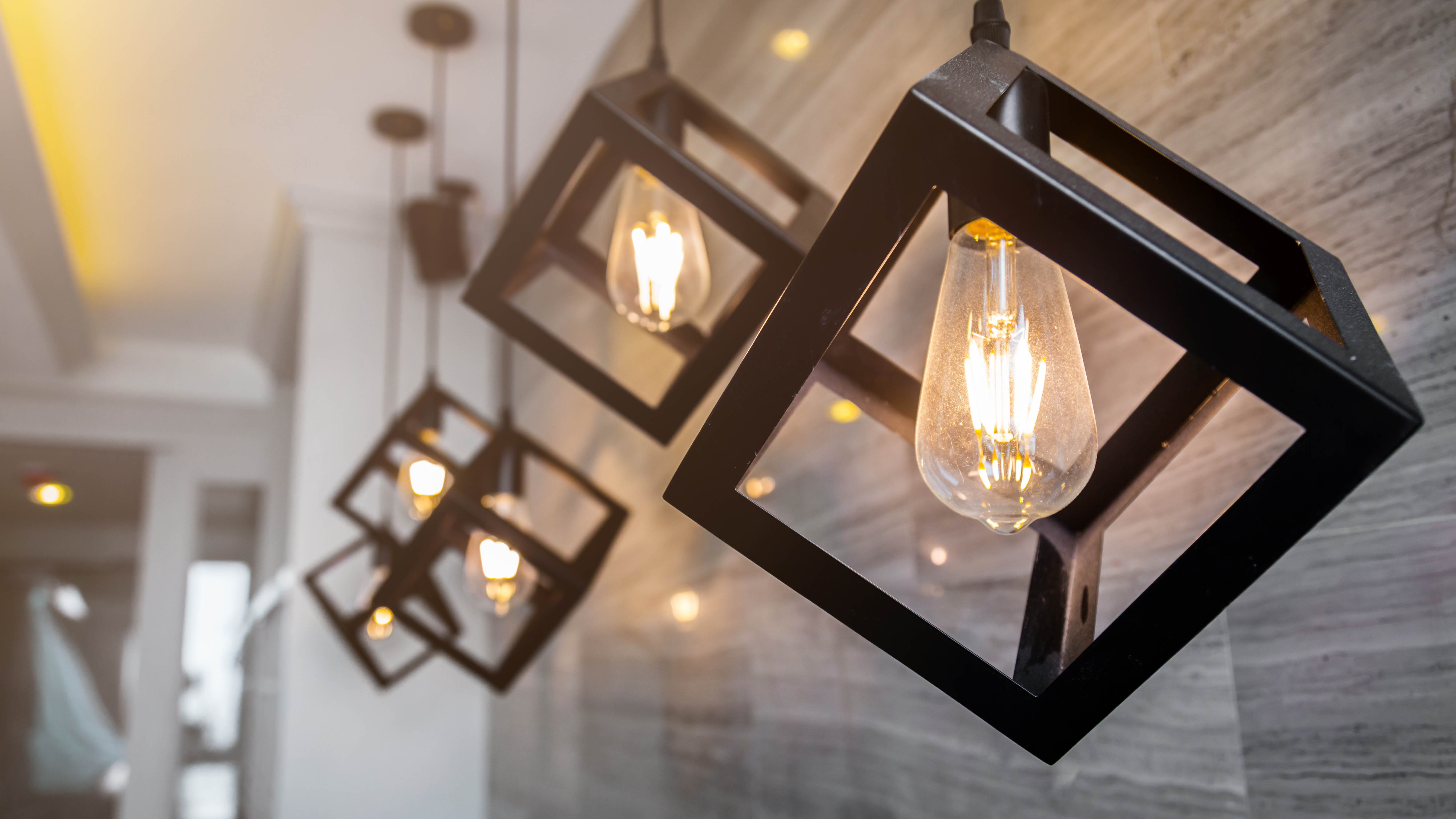
The right lighting can make all the difference to your home, however, we often make common lighting mistakes. Things like the wrong color temperature, dim lights or not ‘layering’ lighting around the room, can all make a room look smaller.
Distribute your light sources by using wall scones or hanging pendant lights to illuminate your space. Once hung at eye-level, this will allow more space — making your room look bigger. Generally, wall sconces are easy to install, and you can opt for either hard-wired or cordless USB types like these Indoor LED Wall Lamp with Touch Switch ($52, Amazon).
Also, instead of cumbersome, floor or table lamps taking over the space, opt for sleek, slender lamps that will look more elegant.
Another thing to consider is getting the right color temperature. Typically, Warm White lighting (up to 3000K) is ideal for family rooms, dining areas or bedrooms with earthy tones or wood furniture. Cool White light (up to 4500K) is known to have an energizing effect on moods, so suitable for kitchens, bathrooms and home offices, while Daylight (up to 6500K) provides a bright amount of blue-white light (similar to daylight), which could enhance work productivity at home.
More from Tom's Guide

As the Homes Content Editor, Cynthia Lawrence covers all things homes, interior decorating, and garden-related. She has a wealth of editorial experience testing the latest, ‘must-have’ home appliances, writing buying guides and the handy ‘how to’ features.
Her work has been published in various titles including, T3, Top Ten Reviews, Ideal Home, Real Homes, Livingetc. and House Beautiful, amongst many.
With a rather unhealthy obsession for all things homes and interiors, she also has an interior design blog for style inspiration and savvy storage solutions (get rid of that clutter!). When she’s not testing cool products, she’ll be searching online for more decor ideas to spruce up her family home or looking for a great bargain!
