iOS 18 lets you customize your Photos app — here's how you can do it
Snap into iOS 18

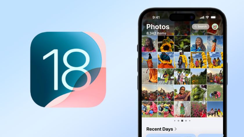
The iOS 18 public beta brings significant changes to the Photos app, reshaping how users interact with their digital memories. While iOS 18 lets you send messages via satellite and introduces other new features, the Photos app update is particularly exciting for anyone that takes a lot of pictures.
Once you've updated your phone to iOS 18, you'll discover a new single-screen layout that brings all your photos, albums, and memories together in one place. We'll walk you through the new collections feature, which smartly groups images based on factors like recent trips or frequent companions.
We'll also cover the new customization options, including how to pin collections and use improved filtering abilities. Whether you're a long-time iOS user or new to iPhones, this guide will help you navigate the Photos app's new capabilities. And keep in mind the upcoming Apple Intelligence feature will be a game changer for your iPhone, promising even more photo management.
1. A fresh new look
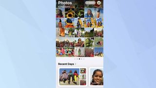
When you open the updated Photos app in iOS 18, you'll notice a big change. The main screen now presents a streamlined view that combines your familiar photo grid with new collections.
This redesigned layout makes browsing your entire photo library more intuitive, allowing you to easily switch between individual photos and organized groups of images.
2. Smarter photo groups

The Collections feature in your Photos app has received a significant upgrade. Now, you'll find your photos automatically organized into thoughtful themes, such as Recent Days.
This new feature creates a curated album of your latest snapshots, making it easy to revisit your most recent memories.
3. Photos or movies

In each Recent Days album, you can choose between two viewing modes: 'Photos' for a gallery view, or 'Movie' for a slideshow-like experience.
One of the most exciting features of the Recent Days 'Movie' mode is its customization options. To personalize your memories, tap the music icon in the bottom left corner to access 'Memory Mixes'.
4. Customize your movies
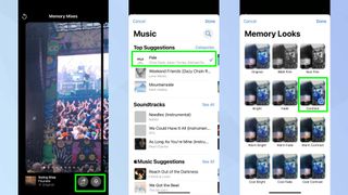
Once in Memory Mixes, you can select your movie's soundtrack by tapping the music note icon in the bottom right. If you want to change the visual mood, tap the three-circle icon to explore Memory Looks, where you can apply various filters to your video.
When you're happy with your movie, simply tap the three-dot icon in the top right corner to share or save it for later.
5. Build your own collections
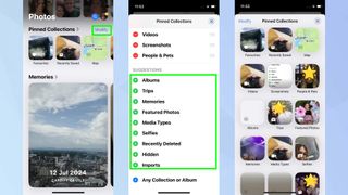
Returning to the main page, iOS 18 introduces a customizable carousel view that prominently displays your photo collections. You'll find it populated with photos of your favorite people, beloved pets, memorable places, and more.
To create new themed collections, tap the plus (+) button next to each category option. You can add various collections like 'Selfies', 'Map', or 'Memories'.
You can view all your collections by swiping left, or tapping Pinned Collections for an expanded view.
6. Have fun organizing!
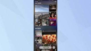
As someone who's been an iPhone user for as long as I can remember and has nearly 15,000 photos in my library, this update feels awesome. I've watched the Photos app evolve over the years, but this iOS 18 update finally addresses the chaos that comes with a massive photo collection.
As you explore the new Photos app in iOS 18, remember there's more features to play with. You can bring messages to life in iOS 18 with Text Effects, to liven up your conversations. Before updating, it's important to note that only certain iPhones are compatible with iOS 18. And if you're eyeing an upgrade, the iPhone SE 4's key features may have just been tipped in a new leak.
Sign up to get the BEST of Tom's Guide direct to your inbox.
Get instant access to breaking news, the hottest reviews, great deals and helpful tips.

Kaycee is an Editor at Tom’s Guide and has been writing for as long as she can remember. Her journey into the tech world began as Cazoo's Knowledge Content Specialist, igniting her enthusiasm for technology. When she’s not exploring the latest gadgets and innovations, Kaycee can be found immersed in her favorite video games, or penning her second poetry collection.
-
Mplsguy Absolutely awful redesign. I dont want to see photos from text messages in my album. If I wanted them to be there, I would save the photos there. I want the ability to see all photos I have taken or saved, by date only, and that is it. And whats with the multiple sub menus for just about everything now? I guess good UI design went right out the window with iOS 18. Why do I have to go anywhere other than the app itself OR settings to change things? Seems like they split it all up and put half of the options in one area, and half in another. Doesnt make any sense. I dont want Apple (or any other company) guessing the locations of photos, or grouping them according to some arbitrary metric as "Featured Content" or "Memories", the filter option is worse than having separate folders/tabs somehow. Id give it a 1 out of 10 for usability, and a 1 out of 10 for design. Truly awful.Reply
