New Android Auto Hands-On: Big Update Brings Much Better Interface
It's going to make a lot of drivers happy

It's been about five years since Android Auto first graced our vehicles' infotainment screens, and in that time, Google's automotive platform has changed very little.
Whether you think that's a good or a bad thing largely depends on your feelings about Android Auto's interface, and Google's vision for cars was always a bit polarizing. Personally, I never quite got comfortable with Android Auto's card-centric, Google Now-esque experience. Presenting drivers with a river of relevant information is a good idea in theory, but for those who simply wanted to get to the app of their choosing and set off on their way, this approach was a bit of a pain.
That all changes today (July 30). Google is pushing out a substantial update to Android Auto that transforms the interface into something that more closely resembles Apple's CarPlay. We've gone hands-on with a prerelease build of the new software, and here's what we think of the changes.
Less tapping, more driving
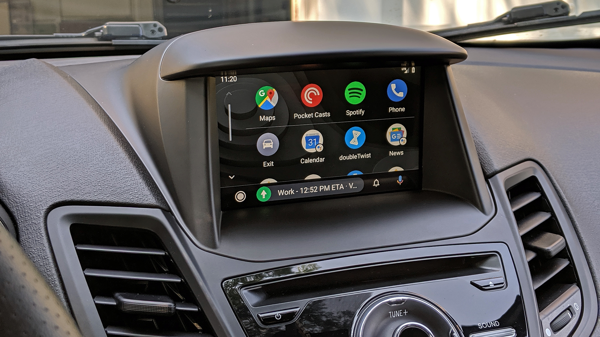
The first thing you're likely to notice booting up the new Android Auto on your next drive is the presence of an app launcher. This marks a huge deviation from the way you'd previously access software in Android Auto. Before now, you'd tap either the maps or media icon to return to your last-used app within that category, and you'd tap that same icon again to change apps (like switching from Spotify to Google Podcasts, for example).
The problem with the old system was that you wouldn't always get into your car particularly mindful of the last music or podcast app you'd opened. So getting to the software you actually wanted to use was often an exercise in frustration, requiring that you tap the same icon multiple times. I appreciated Google's intention to simplify things by placing fewer icons on the screen, though this had the opposite of the intended effect and made system navigation more ambiguous.
All of that is mercifully gone in the new Android Auto. The default landing screen for the interface is your default maps app; if you tap the circular icon in the corner, you'll move to an app launcher that presents a row of your most commonly used software first, followed by everything else, along with suggestions for Google Assistant news and weather briefings. These briefings aren't strictly new; before, you could access them with voice commands, but now there are handy shortcuts at your disposal, too.
Overall, I much prefer Android Auto's new interface to the old one; it's just more immediately obvious how things work. I do wish there were an option in the settings to choose a custom landing screen, since I don't always want to see Google Maps when I get in the car and would rather go straight to the app launcher. However, that's a small gripe and one that Google could easily rectify if it chooses to.

A better navigation bar
To the right of the app launcher icon, you'll see another big change to the Android Auto interface: a dynamic bar that presents different information depending on what's on screen.
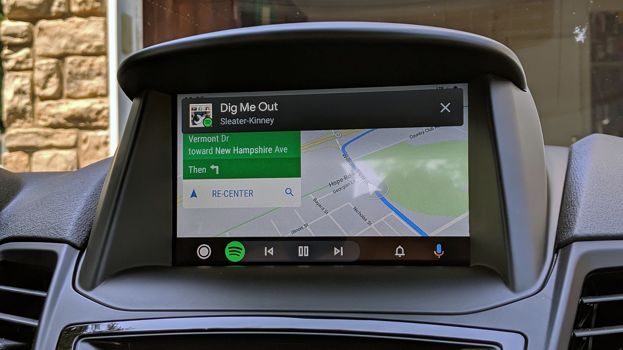
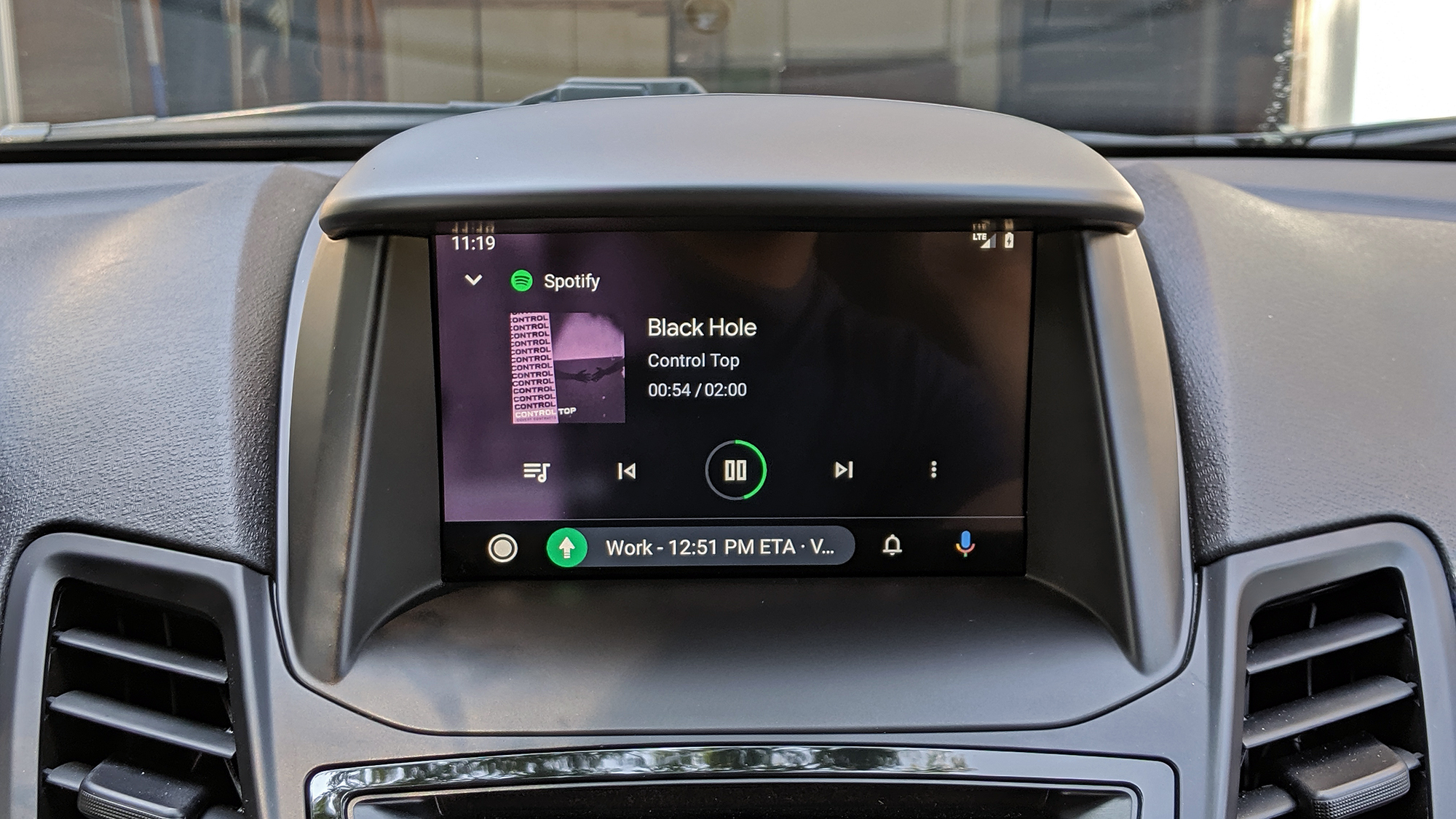
Specifically, this bar offers controls or contextual information for apps that aren't on the main display. In other words, if you're currently using Google Maps or Waze to navigate, the bar will display media controls for the app that's playing music or podcasts in the background. Alternatively, if Spotify, YouTube Music, Pocket Casts or another media app is front and center, the bar will spell out the next direction or turn on your journey. And when you want to switch between maps and media, all you have to do is tap the shortcut to the left of the bar.
The dynamic nav bar is probably my favorite addition with this Android Auto redesign, especially because it's a clever use of space for those of us who drive vehicles that haven't got the largest screens on their dashboards. The display in my Ford Fiesta ST measures 6.5 inches. There are smartphones with larger panels than that, and so I really admire Google giving drivers a way to interact with multiple apps at once, without detracting too much from whatever is currently in the foreground.
To the right of the bar is a new notifications hub, which is really just self-explanatory: Tap it, and you'll get an overview of alerts, with the option to respond to some of them via the Android Auto interface. (Most notifications will require you to pick up your phone.) A Google Assistant button lives to the right of that, though accessing the Assistant is still probably easier via the voice-control button on your car's steering wheel.

A generally nicer interface
The bulk of other changes in this update are stylistic. There's a new, dark theme that appears to be present at all times, and it's easier on the eyes. Google is also utilizing its Product Sans font, the one that appears most frequently on Pixel devices, in more places around the interface.
Neither of those changes is particularly significant for functional use. However, they certainly freshen up Android Auto's look and feel, which longtime users should appreciate. Additionally, Google says it's made provisions for cars that have wider displays. And the company says that Android Auto will make use of the expanded screen real estate on 2019 and 2020 models from Jaguar, Lexus and Mazda to provide even more information at once, like side-by-side media controls, navigation and ongoing call information.
Bottom line
With today's update, Google has finally given the in-car Android experience the fresh lick of paint it's deserved for quite a while now. While Apple has been doling out improvements to CarPlay at a regular clip over the last few successive iOS updates, Android Auto has stagnated.
Thankfully, the new app launcher, navigation bar and generally refreshed interface have disrupted that stagnation. They lend a more inviting and powerful experience to Android Auto and put more insights within drivers' reach than ever before.
Some of the software's old gremlins remain. I would love to see Google speed up or increase the frame rate of animations to make its platform feel as snappy as CarPlay does. And for what it's worth, I've encountered the same volume glitches in this new Android Auto release as I have in past versions. These occasionally wreak havoc on my car stereo's volume until I've disconnected my phone. (Your mileage will vary depending on your vehicle; every manufacturer's software is different.)
Overall, though, this is a much-needed step forward for Android Auto — and one that should make your car feel a little bit smarter, no matter what you drive.
Sign up to get the BEST of Tom's Guide direct to your inbox.
Get instant access to breaking news, the hottest reviews, great deals and helpful tips.
Adam Ismail is a staff writer at Jalopnik and previously worked on Tom's Guide covering smartphones, car tech and gaming. His love for all things mobile began with the original Motorola Droid; since then he’s owned a variety of Android and iOS-powered handsets, refusing to stay loyal to one platform. His work has also appeared on Digital Trends and GTPlanet. When he’s not fiddling with the latest devices, he’s at an indie pop show, recording a podcast or playing Sega Dreamcast.
