Netflix is getting a big redesign — here's the new look
Netflix's homepage is about to look very different
Here at Tom’s Guide our expert editors are committed to bringing you the best news, reviews and guides to help you stay informed and ahead of the curve!
You are now subscribed
Your newsletter sign-up was successful
Want to add more newsletters?
Join the club
Get full access to premium articles, exclusive features and a growing list of member rewards.
The Netflix homepage is going to look quite different for some users today. That's because the streamer is currently testing out a redesign on the TV app (as reported by The Verge), one which could make finding your next watch a little easier.
The new layout replaces the library tiles with interactive boxes that stretch out when selected, bringing up a movie or show synopsis plus other relevant details like the release year, the number of episodes and the title's genre and rating. Linger on a title long enough and the app will play a preview within the tile.
This is a departure from the old TV app layout, where title info and the trailer remain in the top half of the screen while you scroll down through Netflix titles and varying categories.
Article continues below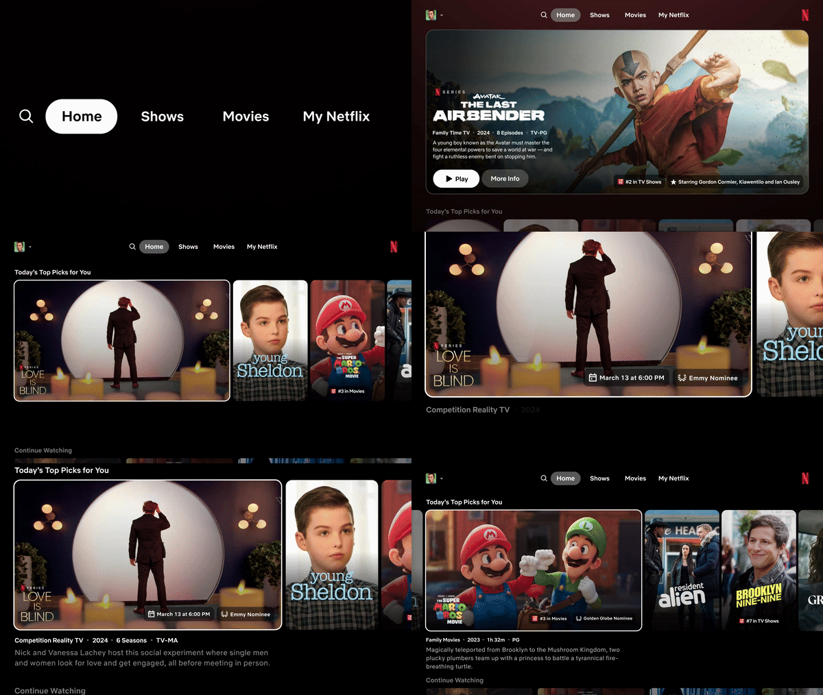
Has anything else changed?
Along with the above changes, the new layout does away with the pop-out menu previously found on the left side of the Netflix app. This menu's been replaced with a smaller selection of options listed along the top of the screen: "Search", "Home", "Shows", "Movies", and the "My Netflix" tab that rolled out to the mobile app in 2023.
This does mean the "Categories", "My List" and "New & Popular" sections are gone, but you'll still be able to find "Categories" from the search tab. At least you won't have to scroll all the way up to use the new list; apparently, you can reach it just with a push of the back button on your device's remote.
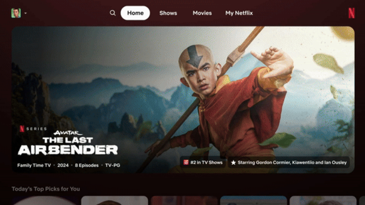
If you're yet to try that out, "My Netflix" is billed by the streamer as "a one-stop shop'" section of the app that's fully tailored to individual users. It's where you can find content recommendations from Netflix, plus carousels of shows and movies you've liked, trailers you've watched, anything you've set reminders for, content you've downloaded, and a "Recently Watched" list.
Does this change affect everyone?
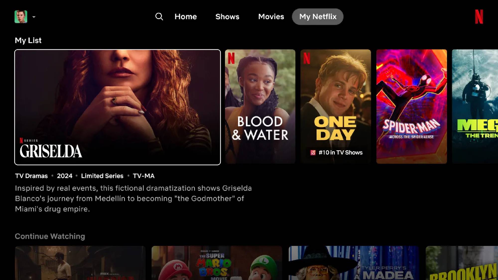
The streamer started rolling out these changes to a small number of subscribers on smart TVs and other streaming devices on Thursday, June 6, so you might not see any changes just yet.
Get instant access to breaking news, the hottest reviews, great deals and helpful tips.
But if the redesign is well-received by that small subscriber base, Netflix's senior director of product, Pat Flemming, says the change could be expanded to the majority of users before long. He told The Verge: "Think of this as a first effort, our best initial swing, at what we think is a great new TV experience.
"If it goes well, which we are enthusiastic and hope that it will, then we would love to share this with most of the member base in the coming months and quarters."
More from Tom's Guide
- Netflix’s best original movie in ages drops today — and it’s 98% on Rotten Tomatoes
- Netflix app is getting axed from these older Apple TVs — see if yours is on the list
- 7 top new movies to watch on Netflix, Max, Hulu and more (June 4-10)

Martin is a Streaming Writer at Tom’s Guide, covering all things movies and TV. If it’s in the theaters or available to stream somewhere, he’s probably watched it… especially if it has a dragon in it. Before joining the team, he was a Staff Writer at What To Watch where he wrote about a broad range of shows that stretched from "Doctor Who" and "The Witcher" to "Bridgerton" and "Love Island". When he’s not watching the next must-see movie or show, he’s probably still in front of a screen playing massive RPGs, reading, spending a fortune on TCGs, or watching the NFL.
 Club Benefits


