7 ways Apple Vision Pro beats Meta Quest 3
Where the Vision Pro wins
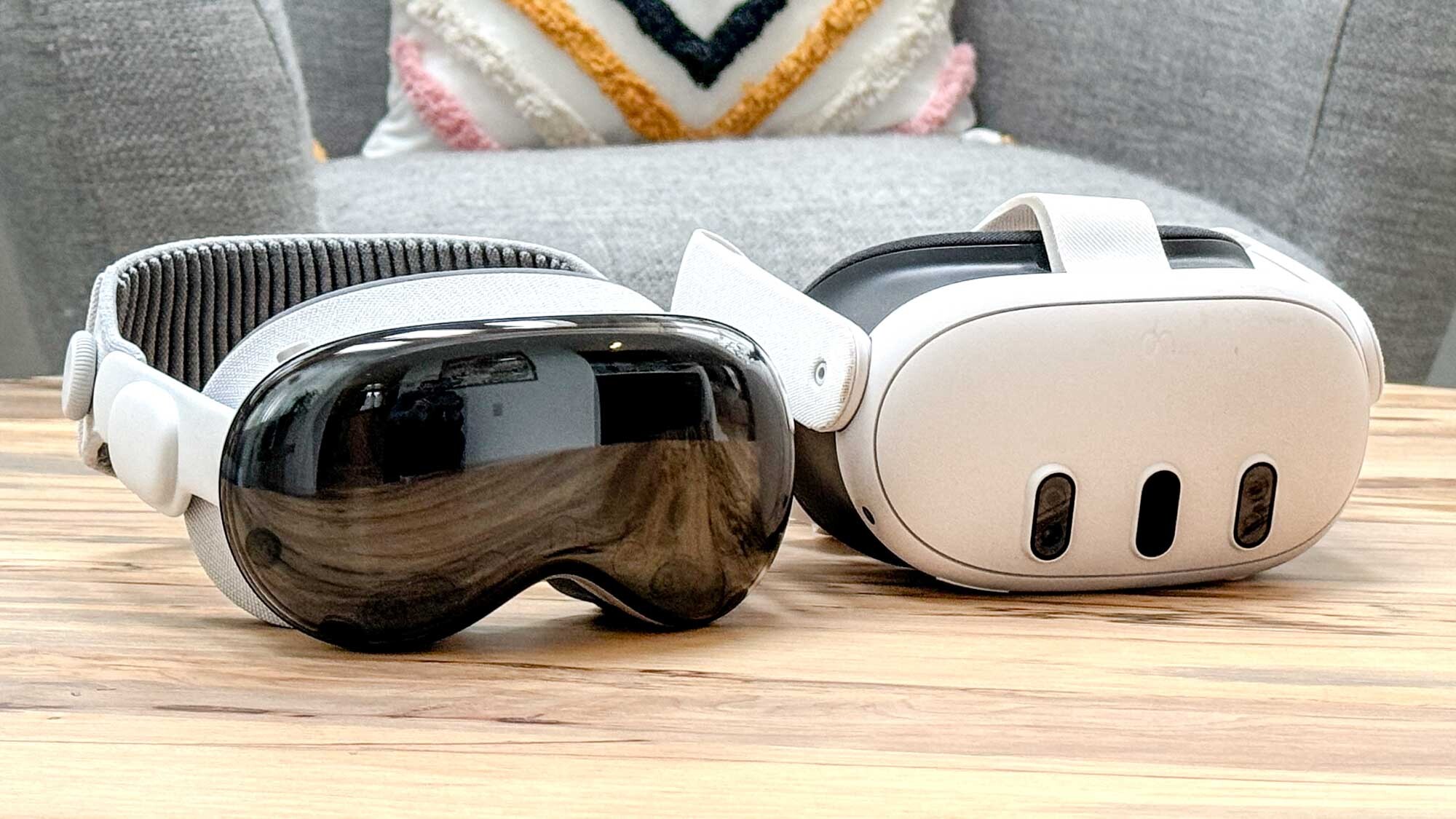
The Apple Vision Pro wants to be the best spatial computing headset yet, but at $3,500 it has a lot of people asking if it's worth the money. After all, the $499 Meta Quest 3 offers many of the same features and experiences as Apple's headset for much less. I've been using both headsets side by side and the Vision Pro is superior overall — and it should be for that kind of premium.
I've already detailed the ways the Meta Quest 3 beats the Apple Vision Pro. But now I wanted to turn the tables and outline where Apple's super premium device wins. From the eye-tracking interface and exclusive apps to how it syncs with your iPhone and Mac, here's 7 ways the Apple Vision Pro beats the Meta Quest 3.
Superior eye and hand tracking
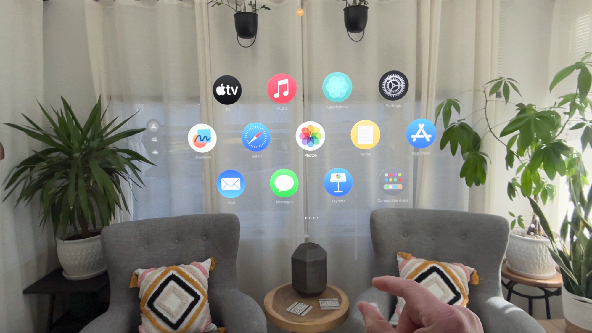
There's one major feature the Apple Vision Pro has the Meta Quest 3 lacks, and that's eye tracking. (The Meta Quest Pro does have it). With eye tracking, using the VisionOS interface is remarkably intuitive. You just look at the app or item you want to select and tap your fingers together. Yes, the Meta Quest 3 offers hand gestures but without eye tracking it's not as accurate or reliable, as I've found during my own testing. It's very hit or miss with the Meta by comparison and feels like work.
Much higher resolution
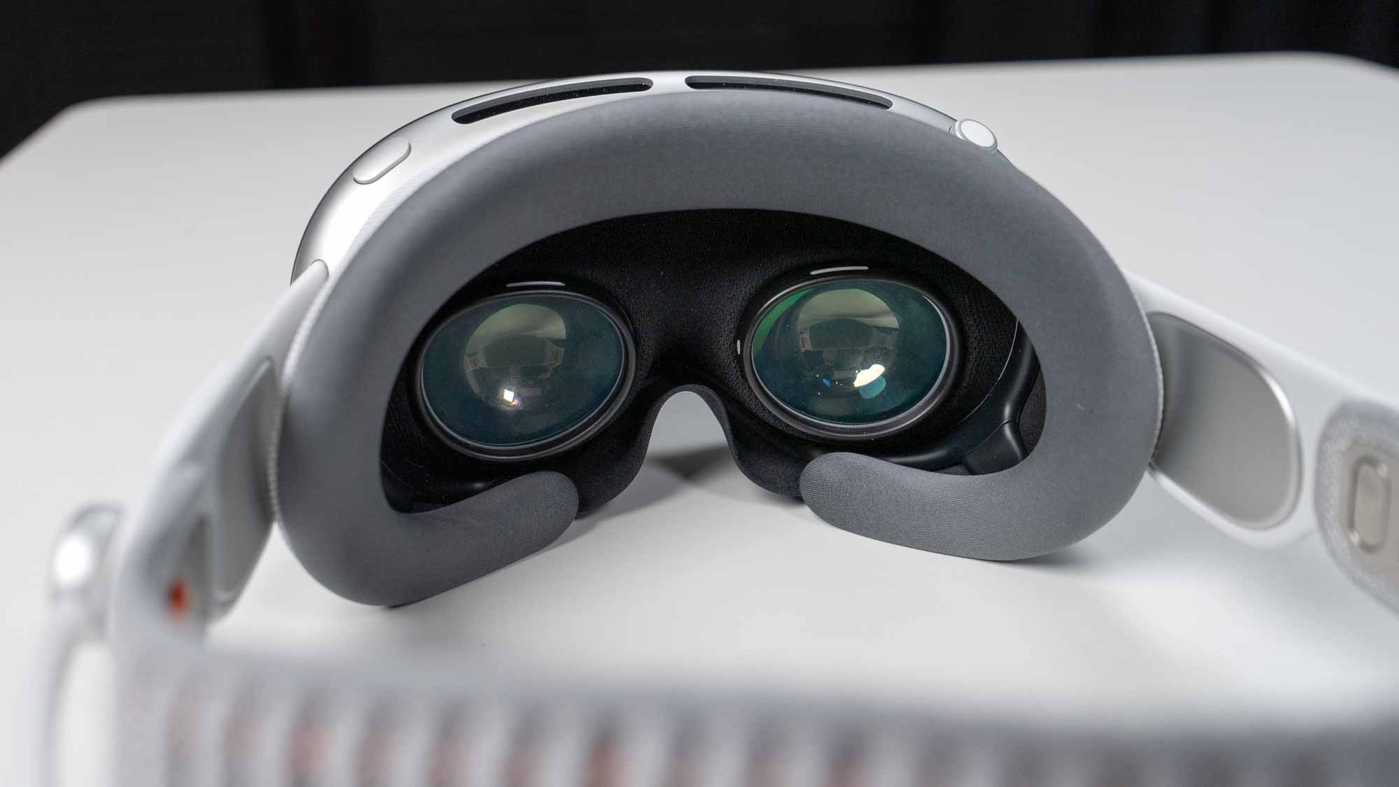
The Apple Vision Pro offers dual micro-OLED lenses with a total of over 23 million pixels. That works out to more than 4K resolution per eye, which makes this headset ideal for watching content and interacting with AI apps. Apple doesn't list the official resolution but it's reportedly 3660 x 3142 according to one Reddit posting.
By comparison, the Meta Quest 3 has a lower resolution of 2064 x 2208 per eye. While that's 30% higher than the Meta Quest 2, it's still way behind the Vision Pro. I really noticed the difference when surfing the web and watching movie trailers.
Syncs with your iPhone and iCloud automatically
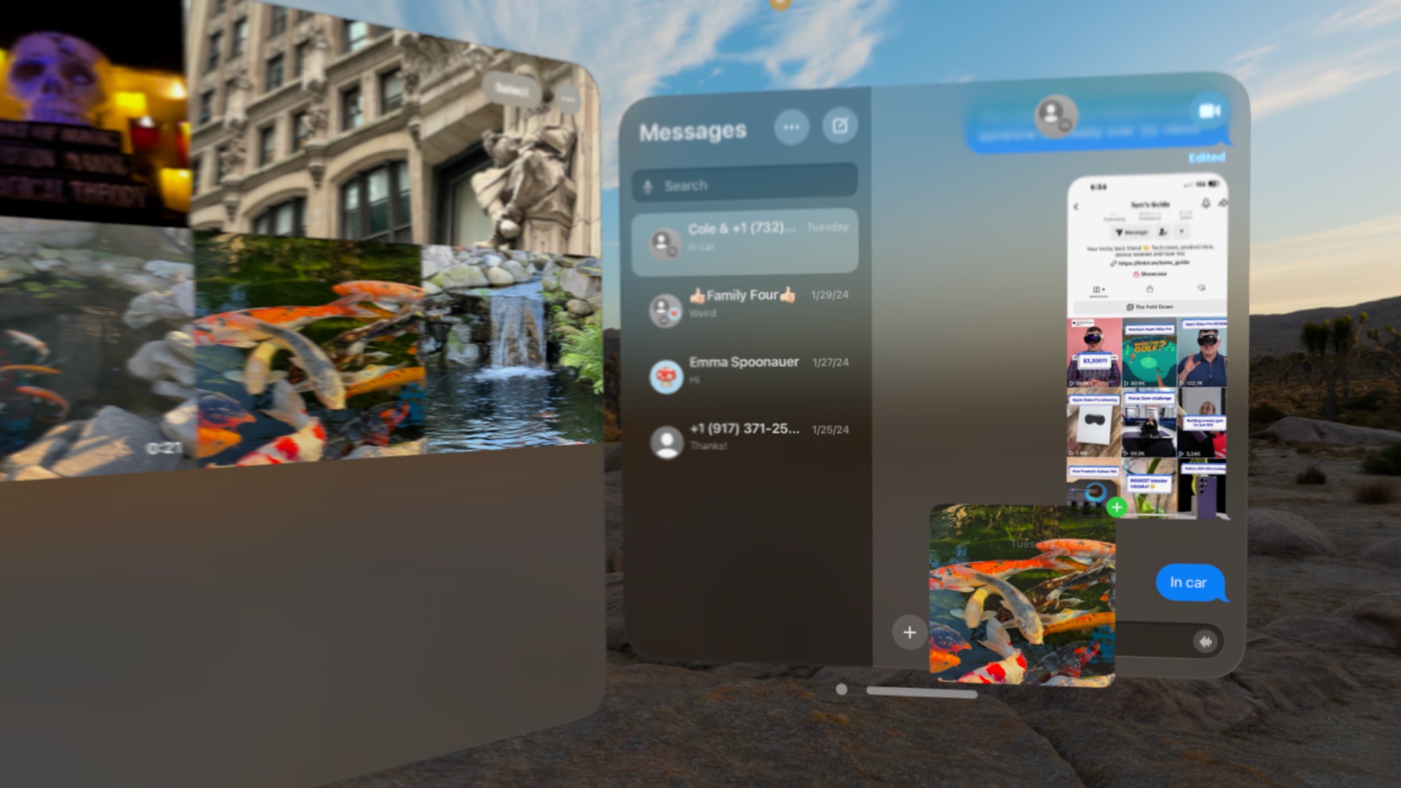
One of the selling points of the Vision Pro is how seamlessly it sucks in all of your digital stuff from iCloud, from your photos and messages to your notes. Once you sign in with your Apple ID, all your content just starts to show up. The Meta Quest 3 has its own dedicated Meta Quest app for storing your photos and videos in its Gallery, as well as easy access to casting, but it's at a disadvantage because you simply don't need a separate app with the Vision Pro.
MacBook integration is magical
@tomsguide ♬ Aglow (Intro) - Slowed Down Version - Karamel Kel
Yes, the Meta Quest 3 has a Meta Quest Remote desktop app in beta that you can launch manually and supersize your Windows or Mac desktop, but it doesn't work as seamlessly as this. You simply walk up to your MacBook Air or MacBook Pro and you'll see a floating Connect button above it through your Vision Pro. Just tap your fingers to connnect and you'll see the desktop pop into your view, and then you can make it as big as you want and see text in crisp 4K. With the Meta Quest 3 app, the resolution was less crisp and you get only one size.
Dedicated Disney Plus and Max apps and more
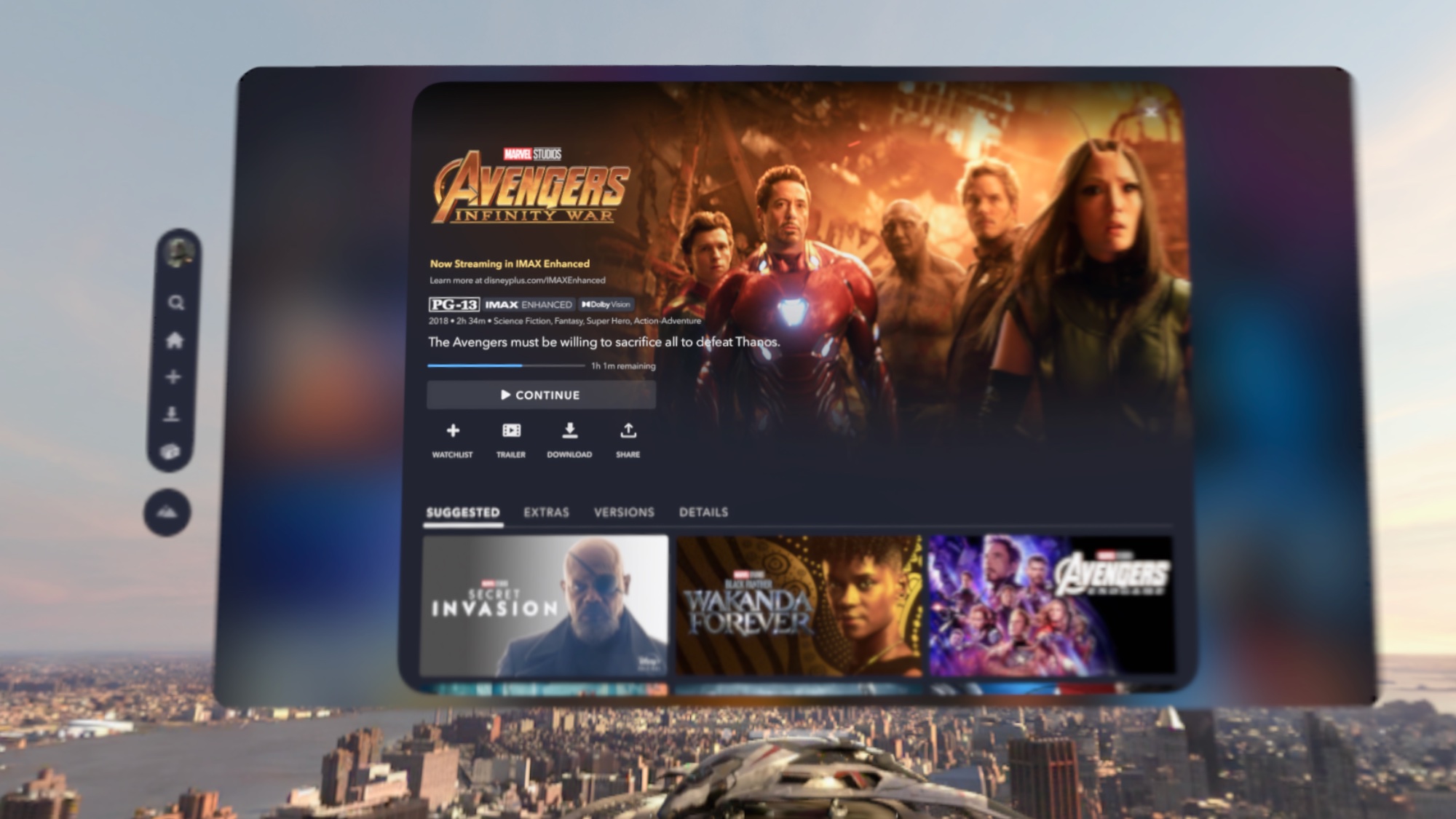
The Apple Vision Pro already has dedicated apps for Disney Plus and Max at launch and more are on the way. The Disney Plus app offers access to the full catalog as well as several Environments to make the watching experience more immersive, such as The Avengers Tower and Tatooine. There's also more than 40 3D movies to watch and counting.
The Vision Pro's Max app offers all of the HBO originals you'd expect along with breaking news and live sports, with select titles available in 4K and Spatial Audio. For Game of Thrones fans, there's also a Red Keep Environment you can turn on. In addition, the Apple Vision Pro offers iPad-compatible apps for Peacock, ESPN, Paramount Plus and others. At least for now you don't get YouTube or Netflix, both of which the Meta Quest 3 has, though you can access these services via the Vision Pro's Safari browser.
Sleeker, modular design
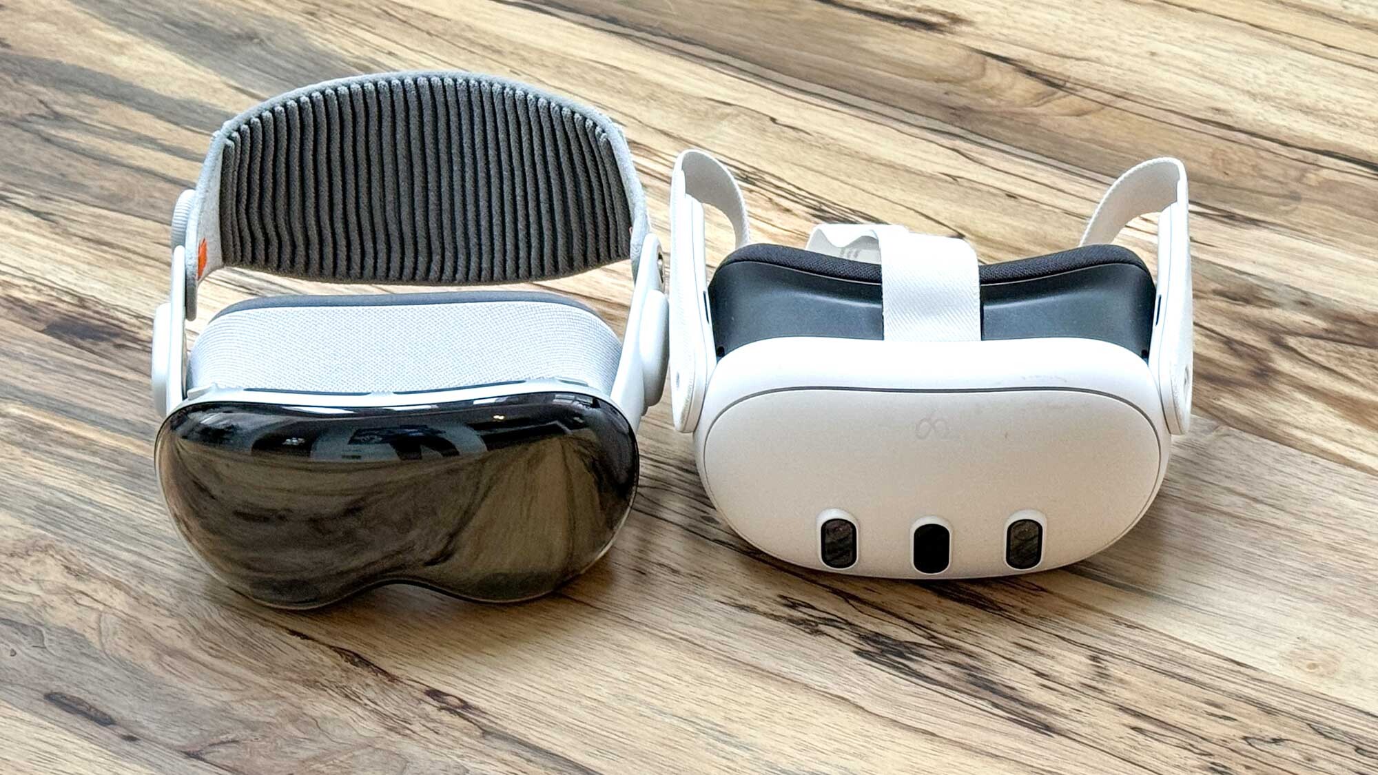
The Vision Pro is definitely heavier than the Meta Quest 3, but Apple's headset looks and feels more premium by comparison. It's glass and metal design is sleeker and more futuristic looking than the plastic Meta Quest 3, and I like that it comes with two headband options in the Solo Knit Band and Dual Look Band.
In addition, I prefer the buttons and controls on the Vision Pro. The Digital Crown is easy to operate and launches the main menu, recenters your view and controls both the immerison level (spatial computing or full VR mode) and the volume depending on where you look. The top button on the left does double duty for capturing spatial photos and videos and authenticating App Store purchases.
Another plus for the Vision Pro is that the light seal and light seal cushion are customized to your face before you buy it, so there's much less of a chance light will leak into your view.
Spatial computing is just better
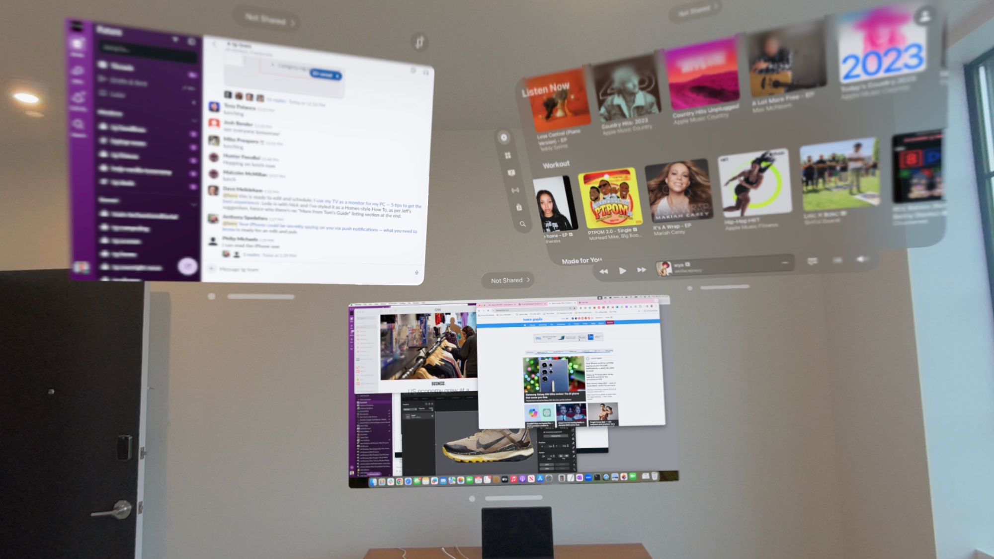
While the Meta Quest 3 lets you run apps side by side and move them around, I found it to be inelegant. For example, I couldn't easily resize the Messenger app I pinned in my space, and when I went to drag and drop a photo from the Camera app into an outgoing message nothing happened. I had to select the share button first in the Camera app and then pick the app I wanted to share with and then the person. Too many steps. With the Vision Pro it just works.
Where the Meta Quest 3 wins and bottom line
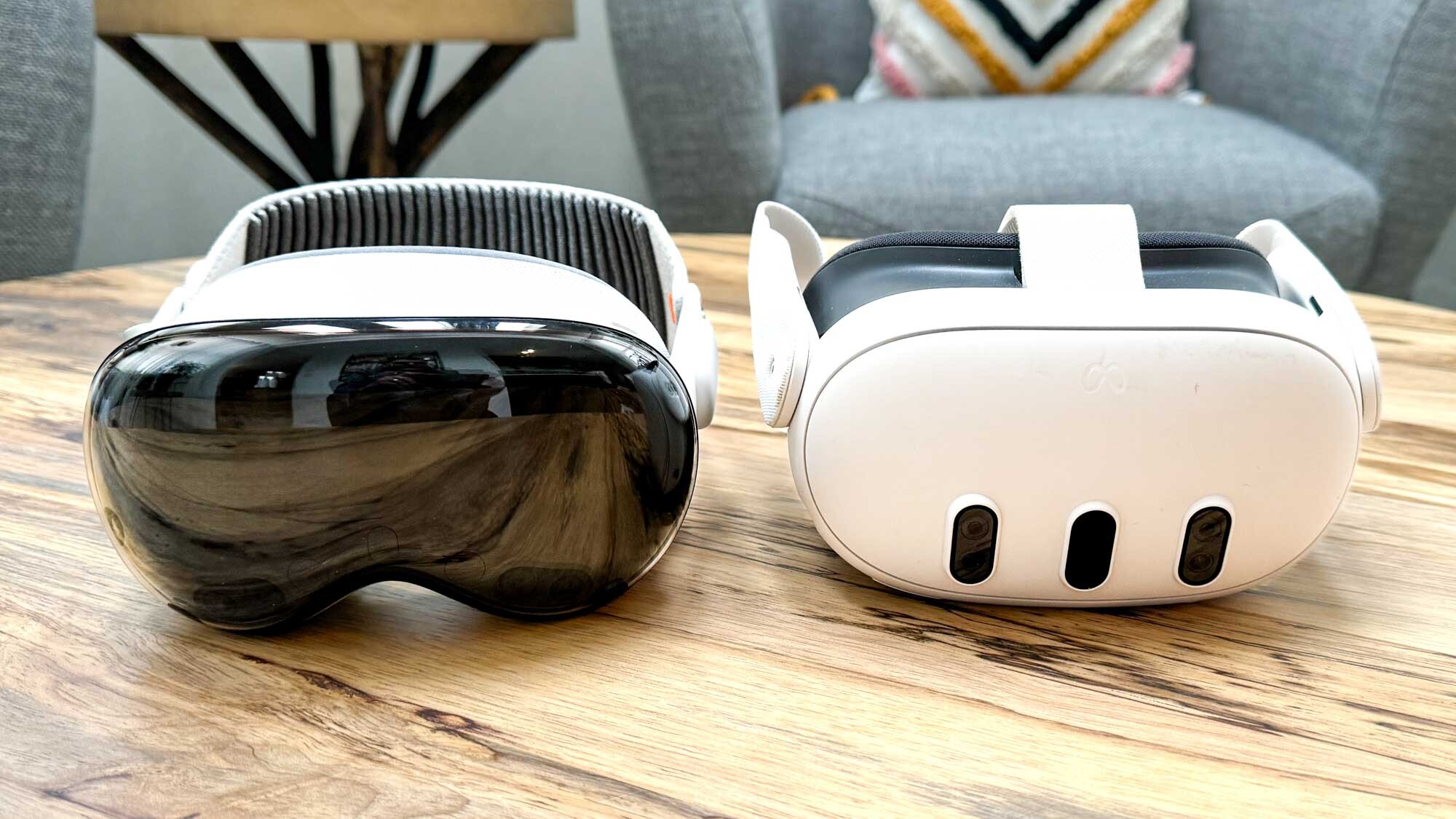
The Meta Quest 3 is a good mixed reality headset for the price, and it's especially ahead of Apple when it comes to games, but the Vision Pro is better in several ways. Its eye- and hand-tracking interface puts the Meta Quest's 3 hand tracking to shame, and the resolution is way higher through the Vision Pro, making the video pass-through, AR apps and especially videos look a lot sharper.
The Vision Pro is far from perfect, though, as you need to be tethered to a battery all the time, and the additional heft of the headset will bother you after a while. If money were no object I'd pick the Vision Pro as I expect the app selection to improve. But the Meta Quest 3 is a solid and affordable option.
More from Tom's Guide
Sign up to get the BEST of Tom's Guide direct to your inbox.
Get instant access to breaking news, the hottest reviews, great deals and helpful tips.
Mark Spoonauer is the global editor in chief of Tom's Guide and has covered technology for over 20 years. In addition to overseeing the direction of Tom's Guide, Mark specializes in covering all things mobile, having reviewed dozens of smartphones and other gadgets. He has spoken at key industry events and appears regularly on TV to discuss the latest trends, including Cheddar, Fox Business and other outlets. Mark was previously editor in chief of Laptop Mag, and his work has appeared in Wired, Popular Science and Inc. Follow him on Twitter at @mspoonauer.
-
husky91 I don't understand. Each review should begin and end with, "It's 700% more than a similar headset". I don't know why anyone other than in influencer who is given the headset for free or 1% of early adopters who preorder every new gadget sight unseen would buy it.Reply

