Apple just repeated its worst design mistake in the last 20 years — the M4 Mac mini got Magic Mouse’d
Stop putting important things on the bottom
I won’t lie, the M4 Mac mini is incredibly exciting to me. I’ve been on the mini PC hype for a while now for their size and capability — falling in love with the Geekom Megamini G1 as a slick games console replacement.
The last bastion is what I use atop my desk. Currently, I’ve got an M3 Pro MacBook Pro connected to the Ugreen Revodok Max 213. But it looks very cluttered and the prospect of stripping all this out for a 5 x 5-inch square puck makes for the clean setup of my dreams.
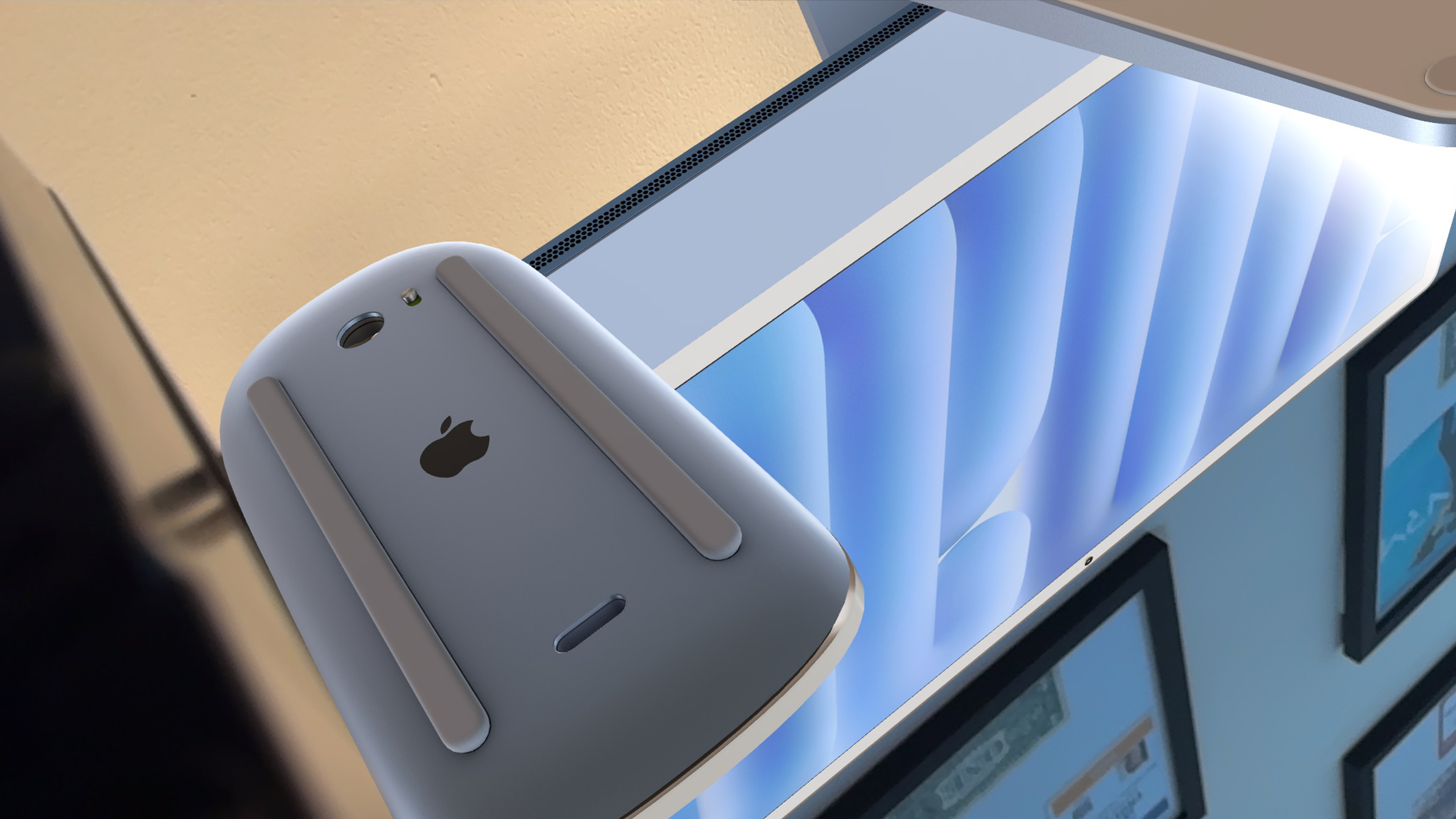
But there’s a problem. You see, Apple’s design team have been mostly bang on with its hardware creation. Mostly…except for putting a port on the underside of the Magic Mouse. I mean why put something so important as this in a position where you won’t be able to use it!?
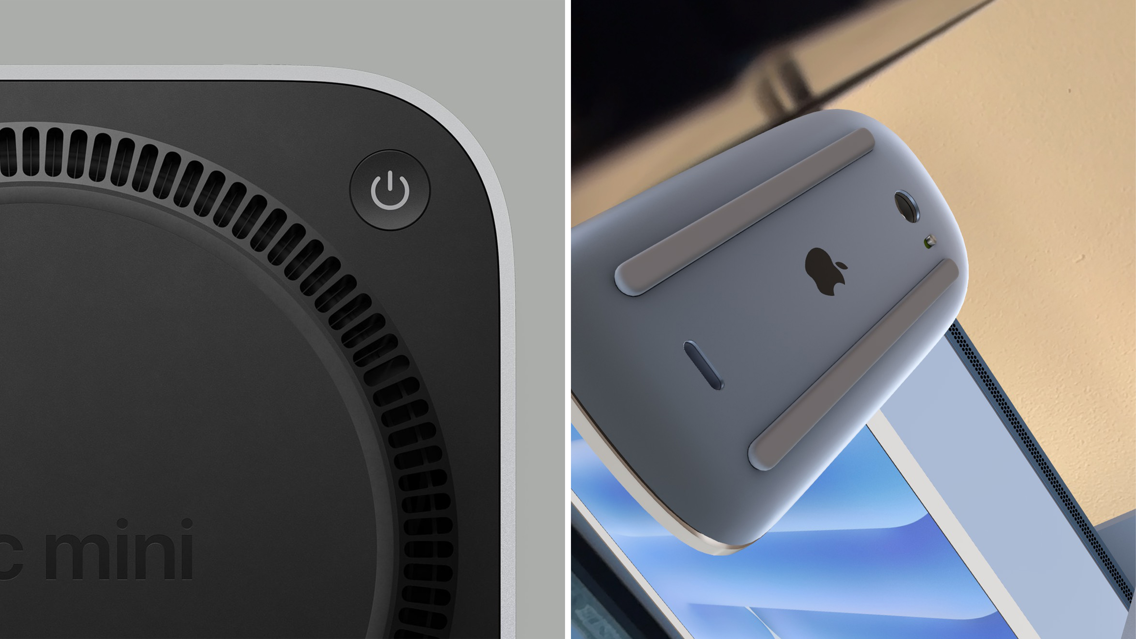
And now, in a split second shot during Apple’s mini keynote about the Mac mini, I can see the Cupertino crew’s at it again with the power button being squished under the corner of this aluminum box. Yes, I realize this may sound like nitpicking on another level — a level equivalent to me trying to argue a 5+ year-old coupon is still valid at the local Walmart.
However, there are some valid concerns here that are making me rethink whether I should buy it or opt for one of the other best mini PCs you can snag.
Form over function
With any design decision, you have to achieve both of these in equal measure — something that looks good but isn’t there just for the looks. Apple is usually good at this tightrope balance with clean, functional hardware like the MacBook Pro and Apple Watch Ultra 2. Sometimes there’s a little wobble (looking at you, randomly placed Camera Control button that makes vertical shooting tricky), but on the main hand, the team nails it.
Putting the USB-C port directly in the center of the base of the Magic Mouse is an example of Apple falling off this tightrope. With literally any other wireless mouse, plugging in a cable to charge it doesn’t directly impact your ability to use it — but in the vein of keeping things clean, you physically can’t use the Magic Mouse while it’s charging.
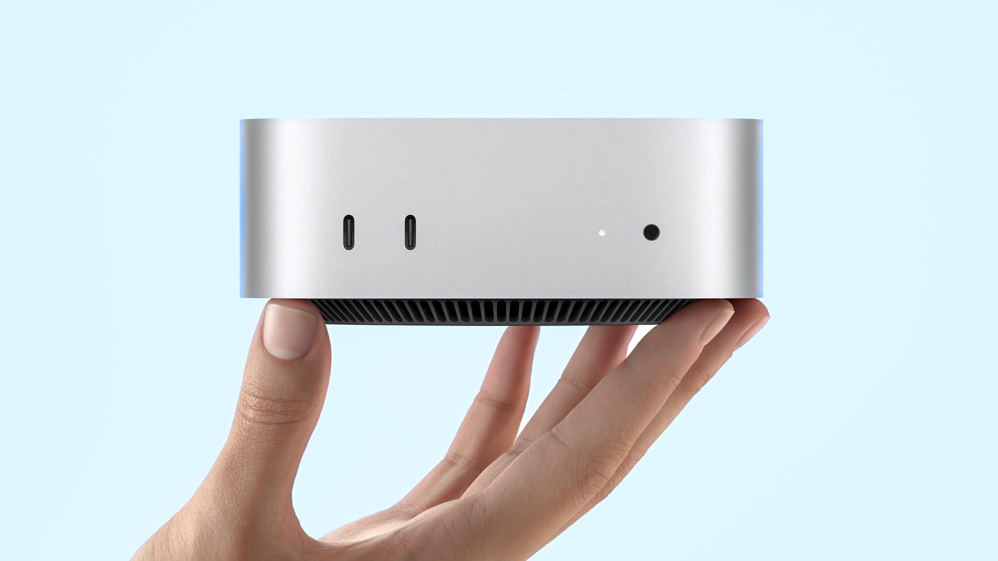
And as for the Mac Mini, while the power button isn’t at least directly on the center of the underside (off on one of the corners that is slightly raised), the super low profile 2-inch height of this machine means you will have to wiggle your thumb underneath and lift the machine a little to power it on.
I get this sounds like the mother of first-world problems, but think about how mini PCs are integrated into setups. You’ve seen the kind of magic that my writer Anthony Spadafora gets up to right?
The prime use of a mini PC is to hide it as effectively as possible for a clean af setup. This means two things: memorizing its position and a little feeling around guesswork to hit the power button. For that use case, putting it in such a precarious position will make it next-level difficult to feel for that switch.
In both of these circumstances, form has absolutely taken over function.
What’s the fix?
Well, for both the Magic Mouse and Mac mini, it’s kind of easy. I know you’ve probably read hundreds of versions of this rant over the last couple days, so let's do something different and entertain Apple’s fancy of wanting to hide buttons and ports.
For the Magic Mouse, Qi wireless charging is right there. There are a ton of new mice that sport it and completely eliminate the need for a visible charging socket. The easiest option would be to raise the touch surface slightly on the mouse and add a USB-C port to the front, but moving to wireless charging would be the Apple way to do it.
Whereas for the Mac mini, while the primary fix is always going to be “put the button on the front,” let’s think like Apple and look at the AirPods 4 for a second. The case for these buds has completely eliminated the need for a physical button, and in its place is a touch sensitive button area. Is it annoying? A little. But at least it’s in a logical place where your finger will go when pairing these little blighters.
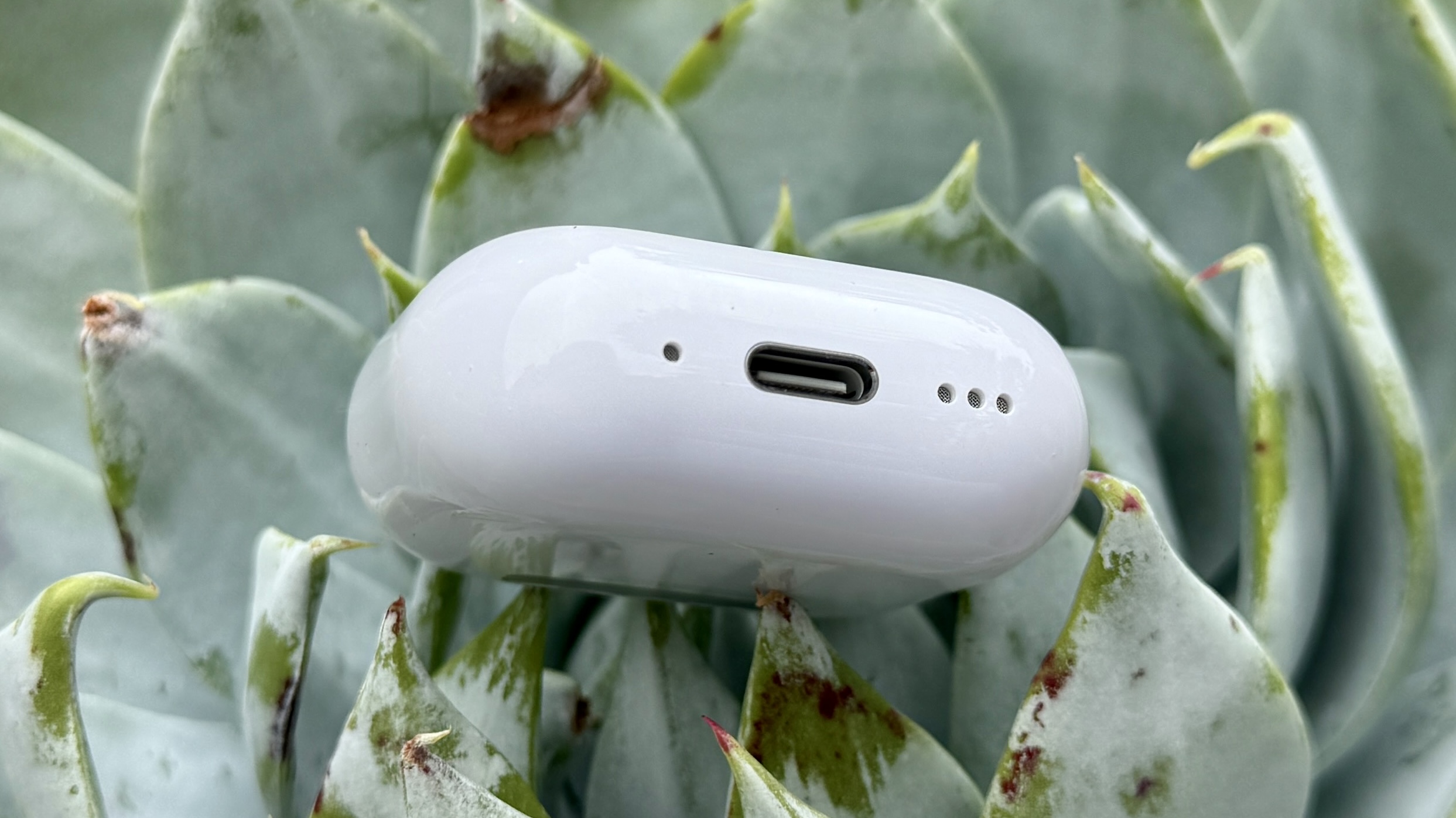
Popping a touch sensitive button upon the front, side or back of the Mac mini (preferably with a raised ridge around it so I can feel for it when hidden into my setup) is immeasurably better than trying to stash a physical switch out of sight.
But in the immediate, I have one request going forward: please stop putting crucial interaction elements of your design in hard-to-reach, nonsensical places!
More from Tom's Guide
- All the M4 Mac news this week — iMac and Mac mini confirmed, MacBook Pro rumors
- M4 Mac mini vs M2 Mac mini — here's all the biggest upgrades
- iMac M4 vs iMac M3 — biggest upgrades explained
Sign up to get the BEST of Tom's Guide direct to your inbox.
Get instant access to breaking news, the hottest reviews, great deals and helpful tips.

Jason brings a decade of tech and gaming journalism experience to his role as a Managing Editor of Computing at Tom's Guide. He has previously written for Laptop Mag, Tom's Hardware, Kotaku, Stuff and BBC Science Focus. In his spare time, you'll find Jason looking for good dogs to pet or thinking about eating pizza if he isn't already.
-
BKman It's a mini. The whole point is that power consumption is so low you can keep it running 24/7/365.Reply -
wcate Crucial info missing: is it under a front-side corner, or a back-side corner? Front would be better (because of course) but why do I fear that won't be the caseReply -
Southlakewa Well, at least you freely admit your neurosis!Reply
Seriously, the location of the button isn’t ideal, but I can see myself needing to press it more than 3 times a year, based on current experience with my Intel iMac, which rarely needs a hard reset or requires starting up after power outage.
If the button becomes truly problematic for people, I could see someone designing a small device with a spring that clips on and enables the button to be pressed from the back of the mini. -
highlanderplaysgames People who turn off their computer when they're not using it also clap when the plane lands.Reply -
toddlich Oh thank the Lord they moved it. I can't count the number of times I inadvertently pressed the power button when unplugging the power cable, taking my mini home for the day. I don't care where they moved as long it was away from where you have to grab the power cable to undo it.Reply -
Louglugger Reply
Front right. With the fan on the bottom, it creates a small gap that should be enough to get a finger onto the switch.wcate said:Crucial info missing: is it under a front-side corner, or a back-side corner? Front would be better (because of course) but why do I fear that won't be case -
charlesb88 These two complaints about the new Mac Mini IMO are way overblown. First, regarding the power button location, I don’t expect most people will have much trouble with the power button being on the bottom as a lot of people using this Mac Mini will mostly just put it to sleep when not using in and will wake it via the keyboard/mouse. Only when you need to do a hard reset it this going to be an issue at all and I expect most average people can easily get their finger under the button to press it IMO and for you fat fingered types you can lift up the Mac Mini slightly if need be as it very light.Reply
As for the Magic Mouse’s “USB-C charging port on bottom” issues, thats another overblown issue. Changing the port location requires a redesign of the mouse and makes the back of the mouse look ugly IMO (YMMV). I would be willing to accept this change if charging the mouse via the bottom was really a major hassle and inconvenience but it’s not. The mouse runs a full week on a charge and charges back to full in 5-10 minutes. So all you really need to do is when the. Mouse’s charge is too low is to take a break for 5-10 min, for a snack, coffee, bathroom stop, to check your phone, etc. All you’d really gain by having the ability to use the mouse while charging is maybe 10 min per week of extra use which is hardly worth redesigning the mouse for IMO. Had the charging of the Magic Mouse via USB-C been a slow process then I agree with you there about this being a problem. -
wcate Reply
Sweeeeet -- thank youLouglugger said:Front right. With the fan on the bottom, it creates a small gap that should be enough to get a finger onto the switch. -
DAHh When I read through the initial blurbs on the new Mini and saw the photos of the power button placement, I was pleased with the change. This removes the risk of paperwork/accessories bumping into it. It also makes a button with almost zero use invisible (I hardly ever turn my computers off—restarting maybe once every couple of weeks). It’s only real function today is turning the thing back on after a power outage (once every quarter if that in my area—UPS for time to shut down as the outages tend to be long when they happen) or the very rare hard reset someone else mentioned. Putting the thing near the fan may impact dust intrusion, but whether in a positive or negative way, I couldn’t say. Your article actually confirms my positive impression of the button placement.Reply -
DavidGurney The "can't accidentally bump it" rationale is a red herring. You have to press and hold the power button for it to work. Come on, that has been true for decades.Reply
The Magic Mouse sucks anyway, but the charging-port location is embarrassingly dumb. Another testament to the incompetence of Jony Ive.
In the scheme of things, this power button is a pretty minimal issue and this "article's" headline is asinine hysteria. The soldered-in RAM and SSD are far bigger offenses, on an otherwise cool product.

