Midjourney vs Ideogram — which AI model makes the best phone wallpaper?
Making wallpaper with AI

Here at Tom’s Guide our expert editors are committed to bringing you the best news, reviews and guides to help you stay informed and ahead of the curve!
You are now subscribed
Your newsletter sign-up was successful
Want to add more newsletters?
Join the club
Get full access to premium articles, exclusive features and a growing list of member rewards.
Midjourney and Ideogram are two of the leading and most photorealistic AI image generation platforms on the market. They have similar features and similar styles and both feature in my list of the best AI image generators.
Ideogram is much younger than Midjourney but has quickly cemented its place. Both claim the ability to produce legible text and can create a variety of image styles.
To put those claims to the test I've put them head-to-head in a series of seven prompts, including some requiring legible text, to create my next phone wallpaper.
Article continues belowCreating the image prompts
I set out to create 7 relatively simple and generic prompts that I could use with both Midjourney and Ideogram to see what they came up with. In each case both produce four images and I picked the one I felt was nicest of the four.
In each case I set the aspect ratio to 9:16 which is fine for Android devices but a little thin for the iPhone — but it should still work fine.
1. Abstract Geometric Patterns
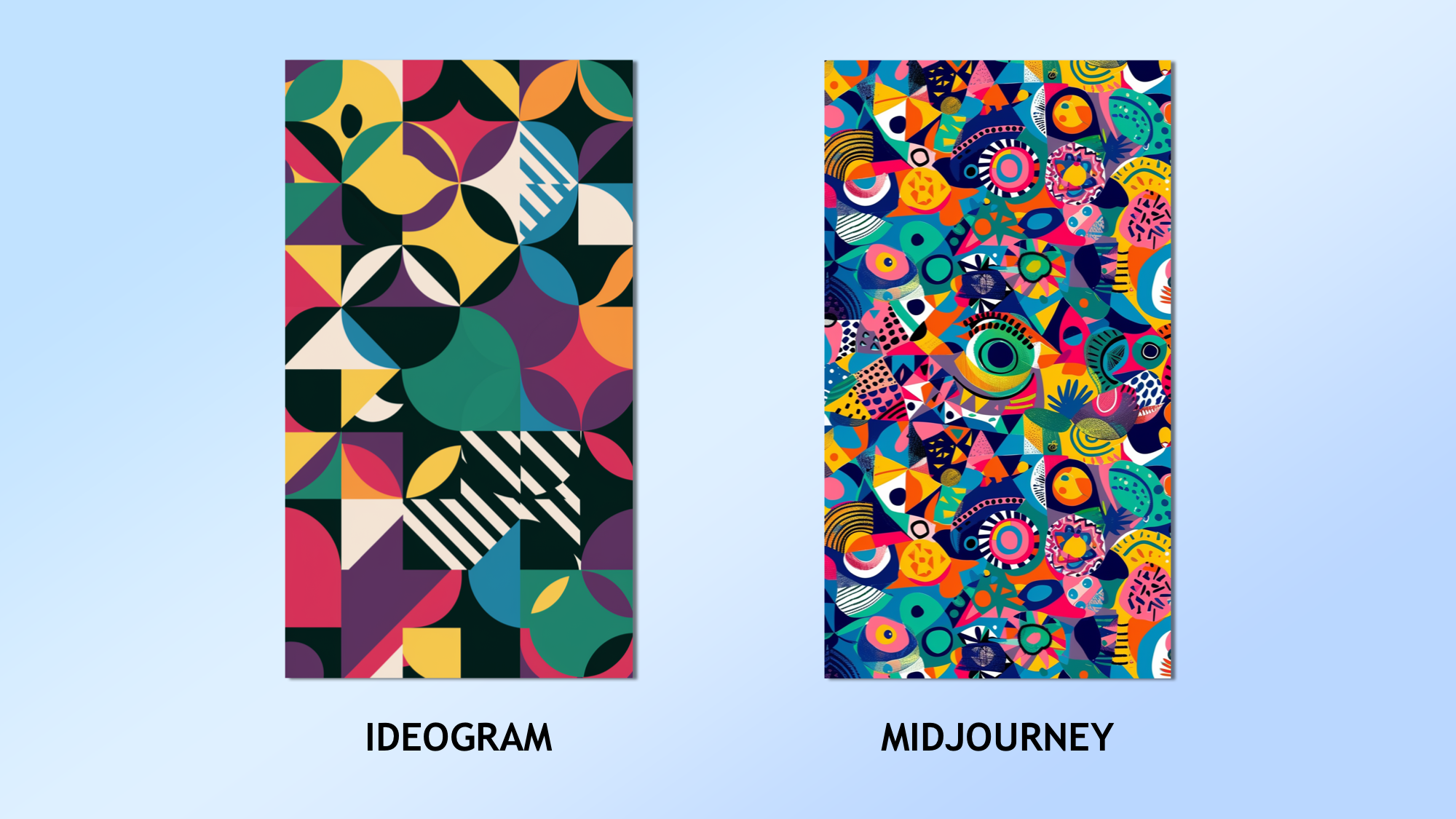
The prompt: “A vibrant and colourful geometric pattern with various shapes and sizes. Think of overlapping circles, triangles, and squares in bold hues. The design should have a modern, artistic feel with a sense of depth and movement.”
Here both were good and surprisingly different considering they were from the same prompt. There was something about the Midjourney image that captured my imagination.
Get instant access to breaking news, the hottest reviews, great deals and helpful tips.
Winner: Midjourney
2. Nature's Beauty
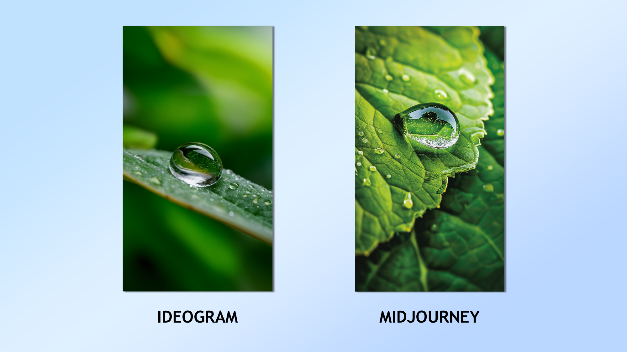
The prompt: “A high-resolution close-up of a dewdrop on a leaf, capturing the intricate details and reflections within the droplet. The background can be a soft blur of lush green foliage, giving it a serene and calming effect.”
Midjourney was an easy winner here. The leaf design was better, it captured simplicity while also maintaining realism.
Winner: Midjourney
3. Space and Astronomy
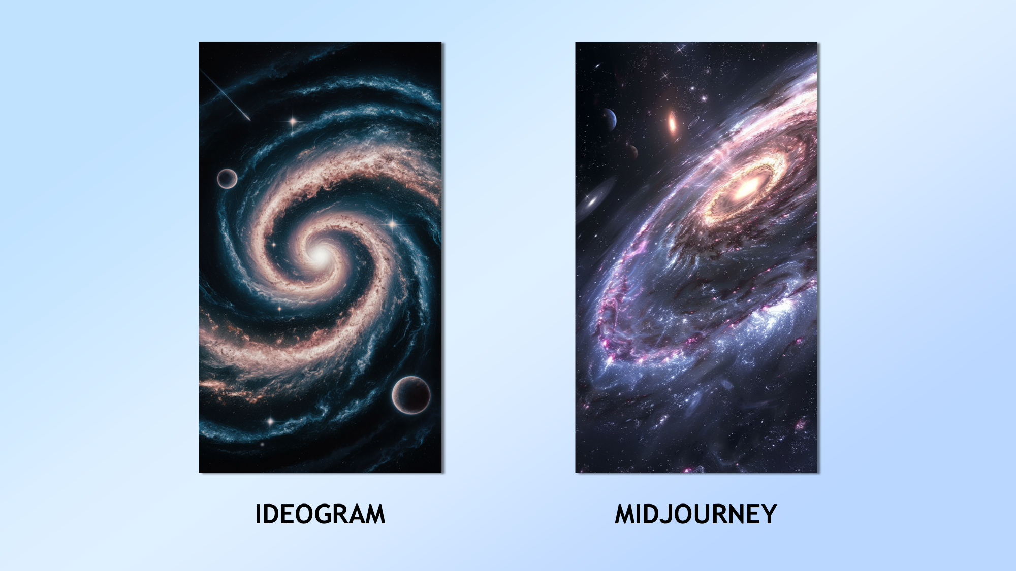
The prompt: “An artistic rendering of a cosmic scene, such as a spiral galaxy with swirling stars and nebulae. Include planets and perhaps a shooting star, creating a sense of wonder and infinite possibilities.”
This was close as I think Ideogram was closer to the concept of an artistic rendering. I kept it deliberately vague to see how it handled the confusion and I liked how Ideogram handled it — but the Midjourney image was simply stunning.
Winner: Midjourney
4. Retro Gaming Theme
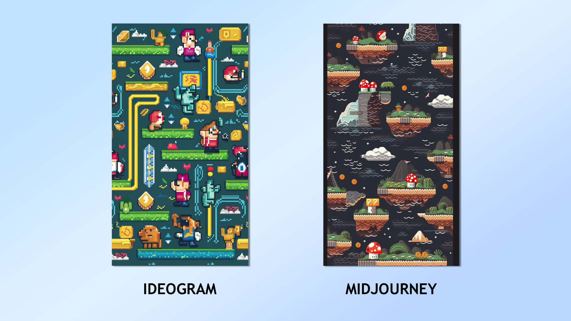
The prompt: “A nostalgic 8-bit style wallpaper featuring classic game elements. Pixelated characters, coins, and landscapes reminiscent of old-school video games like Super Mario or Pac-Man can add a fun and playful touch to your screen.”
This was a very close one between Ideogram and Midjourney as I liked both images. In the end I came down on Ideogram simply because the design was closer to the concept in the prompt. It created a Pac-Man style layout with Mario imagery.
Winner: Ideogram
5. Minimalist Quote
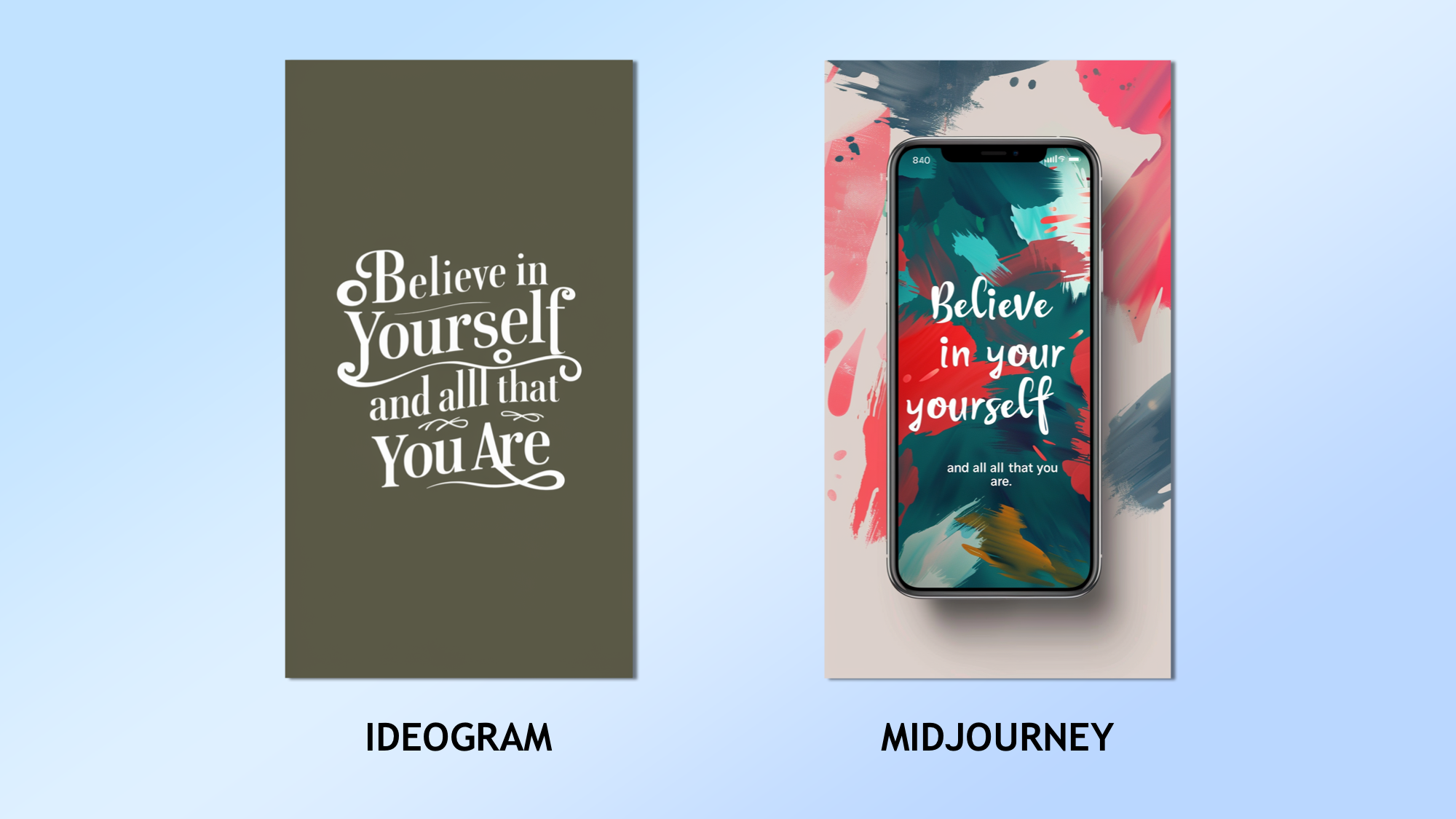
The prompt: “A clean and elegant design with a motivational quote in stylish typography. The background can be a solid colour or a subtle gradient, making the text the focal point. The quote should be: "Believe in yourself and all that you are." This can inspire or bring a smile every time you unlock your phone.”
The only thing it had to get was a clean design and a correctly rendered text. Midjourney failed on both accounts here and was even over literal with the phone idea. Ideogram not only created a simple elegant design but the quote was spot on.
Winner: Ideogram
6. Whimsical Doodle Art
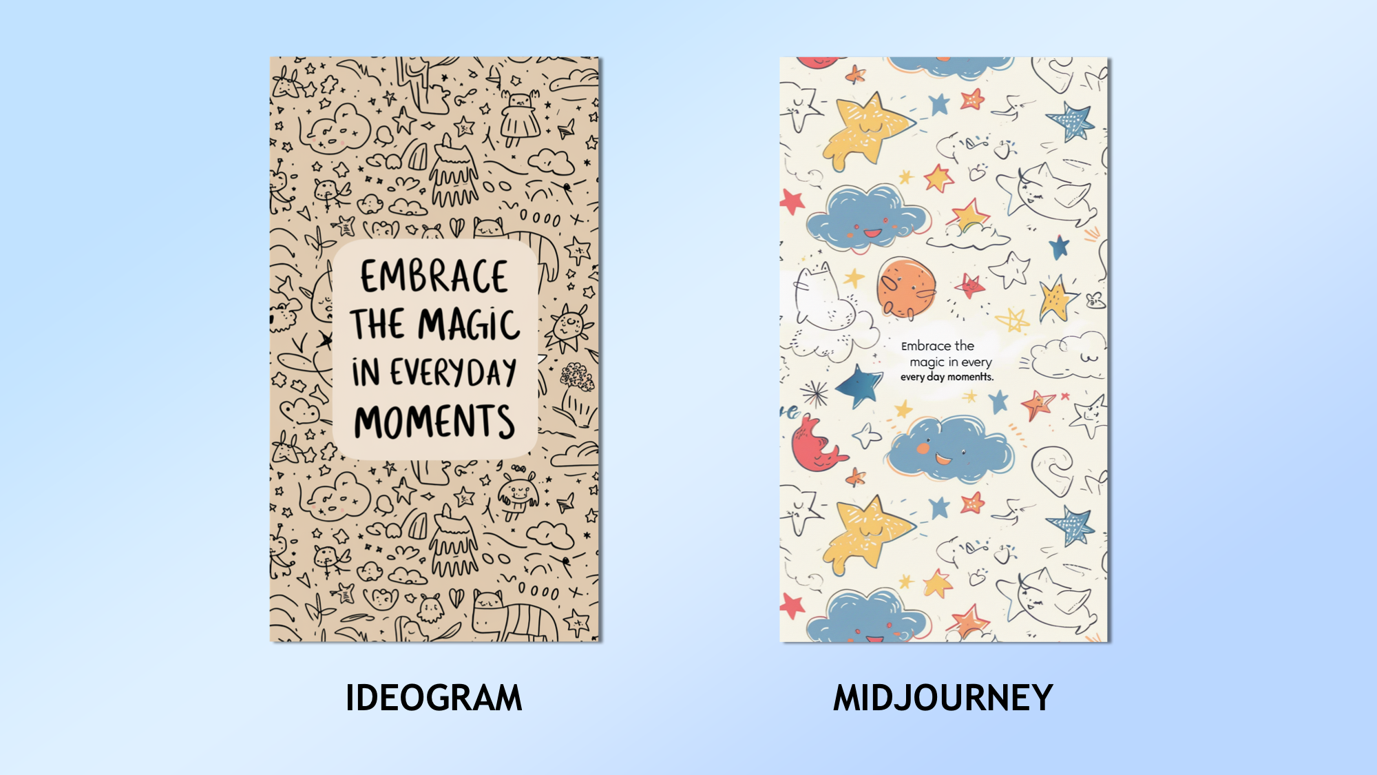
The prompt: “A playful and whimsical wallpaper filled with hand-drawn doodles and illustrations, such as stars, clouds, and cute animals. The design should be light-hearted and fun, with a quote in the centre in a casual, handwritten font: "Embrace the magic in everyday moments."”
The Midjourney image was closer to the playful and whimsical concept but that isn't to say Ideogram failed, in fact it captured the idea of doodling well. In the end it was the rendering of the quote that won it for me and Ideogram was legible.
Winner: Ideogram
7. Vintage Travel Poster
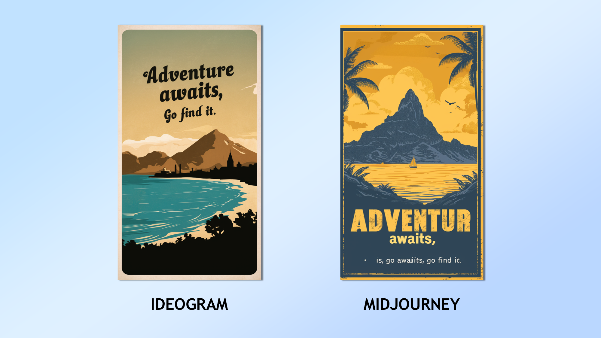
The prompt: “A retro-inspired travel poster design, showcasing an idyllic destination like a beach, mountain, or famous cityscape. The colours should be warm and inviting, with a vintage feel. The quote in a classic, elegant font can be: "Adventure awaits, go find it."”
Same as the other image tests with text, Ideogram is miles ahead of Midjourney when it comes to rendering text on an image. However, I think the Midjourney image was more stylish and a better overall design. But the text was so bad it lost it.
Winner: Ideogram
Winner: Ideogram
| Header Cell - Column 0 | ideogram | Midjourney |
|---|---|---|
| 1. | Row 0 - Cell 1 | ✅ |
| 2. | Row 1 - Cell 1 | ✅ |
| 3. | Row 2 - Cell 1 | ✅ |
| 4. | ✅ | Row 3 - Cell 2 |
| 5. | ✅ | Row 4 - Cell 2 |
| 6. | ✅ | Row 5 - Cell 2 |
| 7. | ✅ | Row 6 - Cell 2 |
If it wasn't for the issues rendering legible text this would have been a win for Midjourney. In most cases the generated images were more stylized, of a higher quality by default and more photorealistic when required.
However, I found Ideogram was better able to both follow the specifics of the prompt and can generate text unlike any other model I've tried. That is why I handed victory to Ideogram, although it was still very close.
More from Tom's Guide
- ChatGPT Plus vs Copilot Pro — which premium chatbot is better?
- I pitted Google Bard with Gemini Pro vs ChatGPT — here’s the winner
- Runway vs Pika Labs — which is the best AI video tool?

Ryan Morrison, a stalwart in the realm of tech journalism, possesses a sterling track record that spans over two decades, though he'd much rather let his insightful articles on AI and technology speak for him than engage in this self-aggrandising exercise. As the former AI Editor for Tom's Guide, Ryan wields his vast industry experience with a mix of scepticism and enthusiasm, unpacking the complexities of AI in a way that could almost make you forget about the impending robot takeover.
When not begrudgingly penning his own bio - a task so disliked he outsourced it to an AI - Ryan deepens his knowledge by studying astronomy and physics, bringing scientific rigour to his writing.
 Club Benefits


