I just tried Midjourney's new 'Personalize' feature — here's the results
Making images more personal
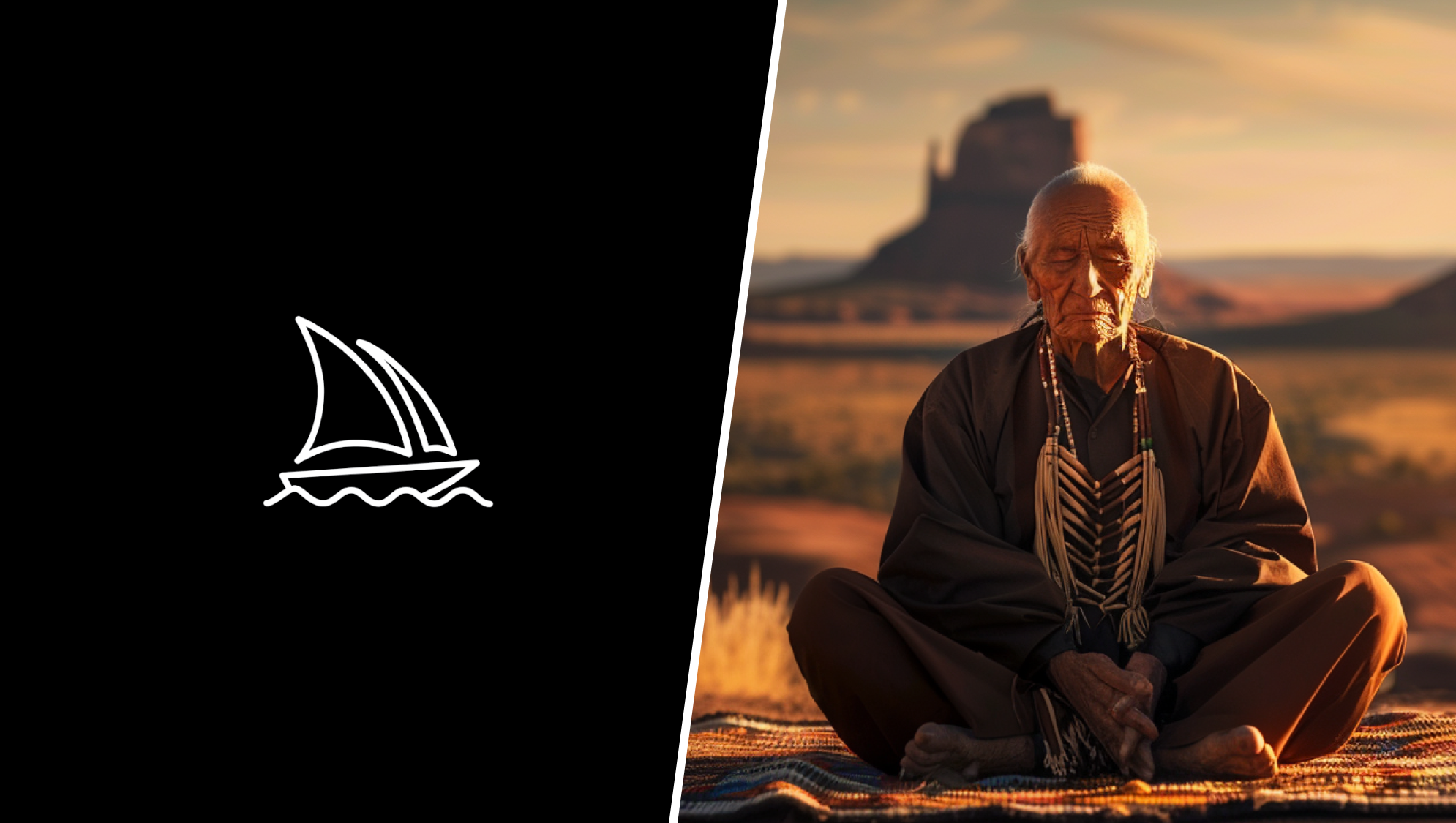
Midjourney just made it easier to generate AI images the way you want them with a new ‘personalize’ feature. Using it overrides the style biases the AI model developed in training.
In most cases, there won’t be much difference, especially if you’re not a particularly heavy user of Midjourney — but those putting in the time to generate images can make something unique.
Before you can use Personalize you need to work through an image ranking process, where you compare two Midjourney-generated pictures and pick your favorite. This trains your personalization algorithm and feeds into the image-generation process.
Once you’ve trained up your personalization model you can then add --personalize to the end of your prompt and it will generate based on the preferences you selected while ranking.
Creating prompts to test Personalization
To put Personalize to the test I came up with five varied prompts and ran each of them twice, once with and once without the setting. What it showed is I think I need to spend more time ranking images to further fine-tune my algorithm.
If you are using Midjourney web it is just a switch available under the create settings at the time of writing your prompt. If you use Discord you need to add --personalize to the end. This will also generate a code you can share with others so they can try out your own personal style.
1. Vibrant Vitality
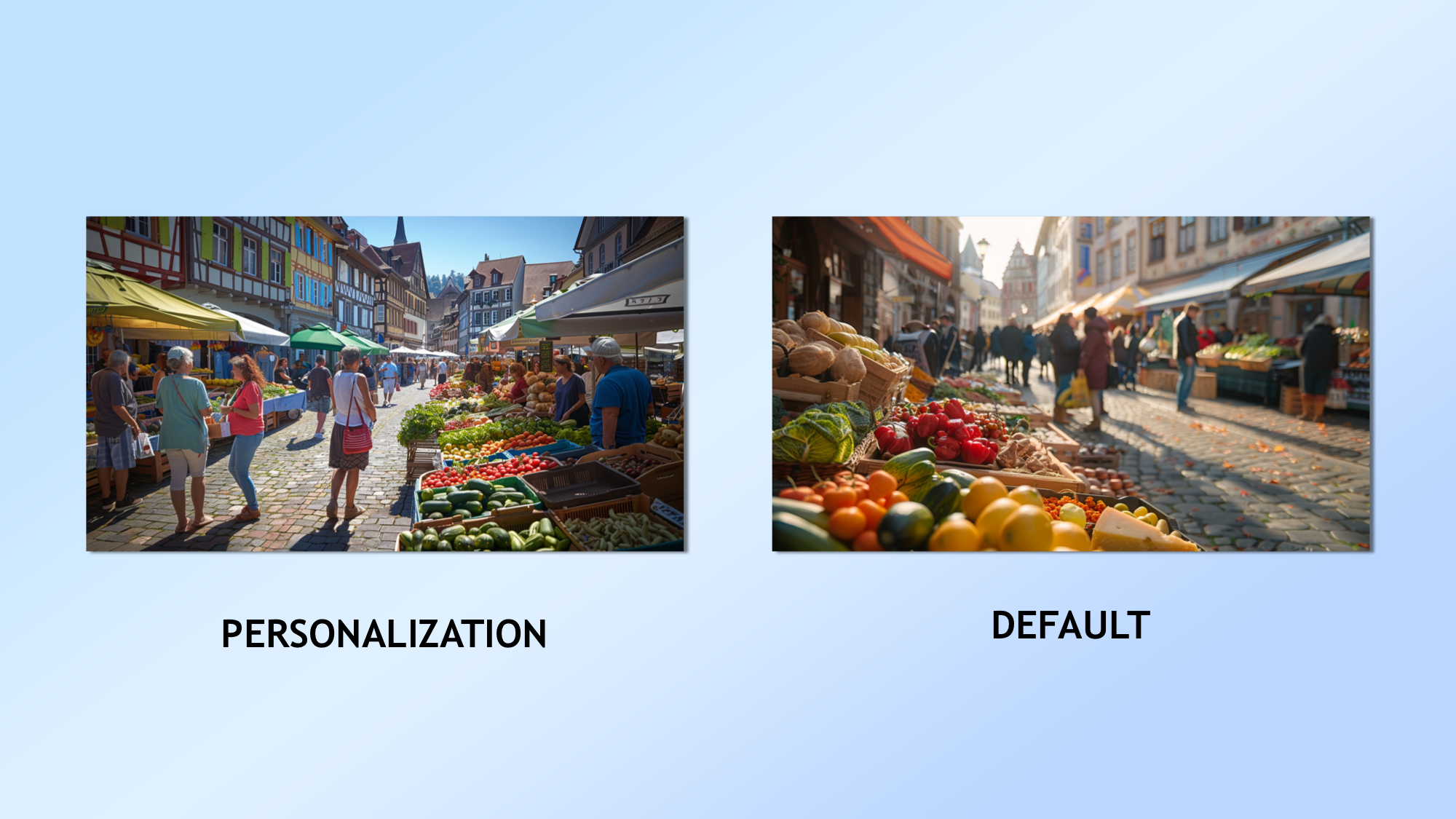
First up I wanted to see if I could get it to create a smartphone-style photograph of something most people wouldn't be able to resist photographing — a beautiful market in a small town.
Sign up to get the BEST of Tom's Guide direct to your inbox.
Get instant access to breaking news, the hottest reviews, great deals and helpful tips.
The prompt: “An ultra-realistic candid smartphone photo of a bustling, open-air farmers market in a quaint, European town square, with vendors selling colorful, fresh produce, artisanal cheeses, and handcrafted goods, as locals and tourists alike browse the stalls and engage in lively conversation, captured in natural, diffused sunlight with a shallow depth of field.”
I think the personalized image captured the idea of it being a smartphone photo better but I think the default image looks nicer.
2. The Living Room Daydream
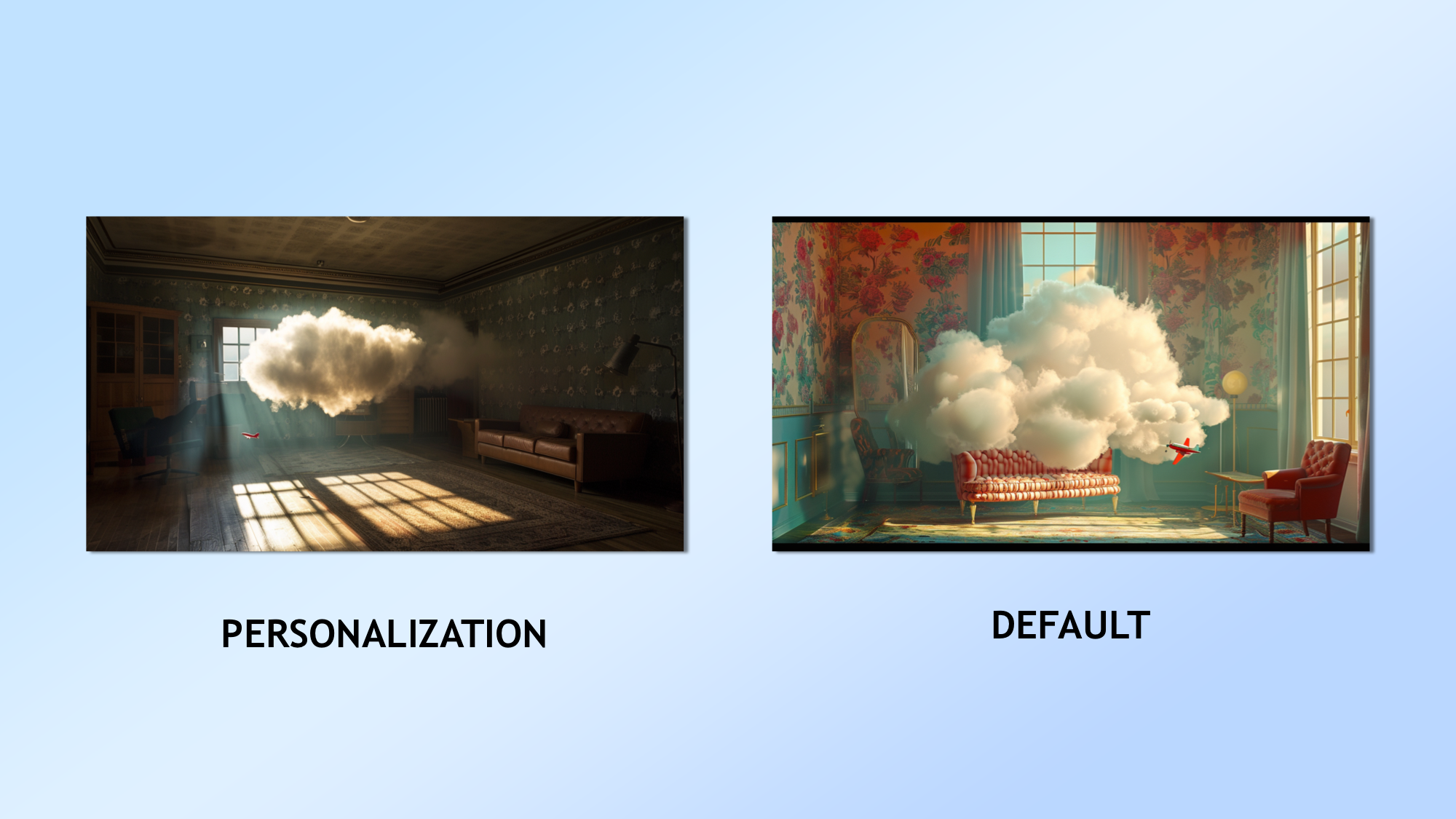
I went surreal with the next image, creating something inspired by René Magritte, the Belgian surrealist. Here I wanted to show a cloud in a vintage room.
The prompt: “A surreal, Magritte-inspired scene featuring a giant, fluffy, white cloud floating inside a dimly lit, vintage 1950s living room, casting a soft shadow on the floral-patterned wallpaper and mid-century modern furniture, while a small, red toy airplane emerges from the cloud's surface, leaving a trail of miniature, puffy clouds in its wake.”
Here the default was much closer to something you'd see in Magritte's work but I actually prefer the way the personalized version looks.
3. Wisdom of the Ages
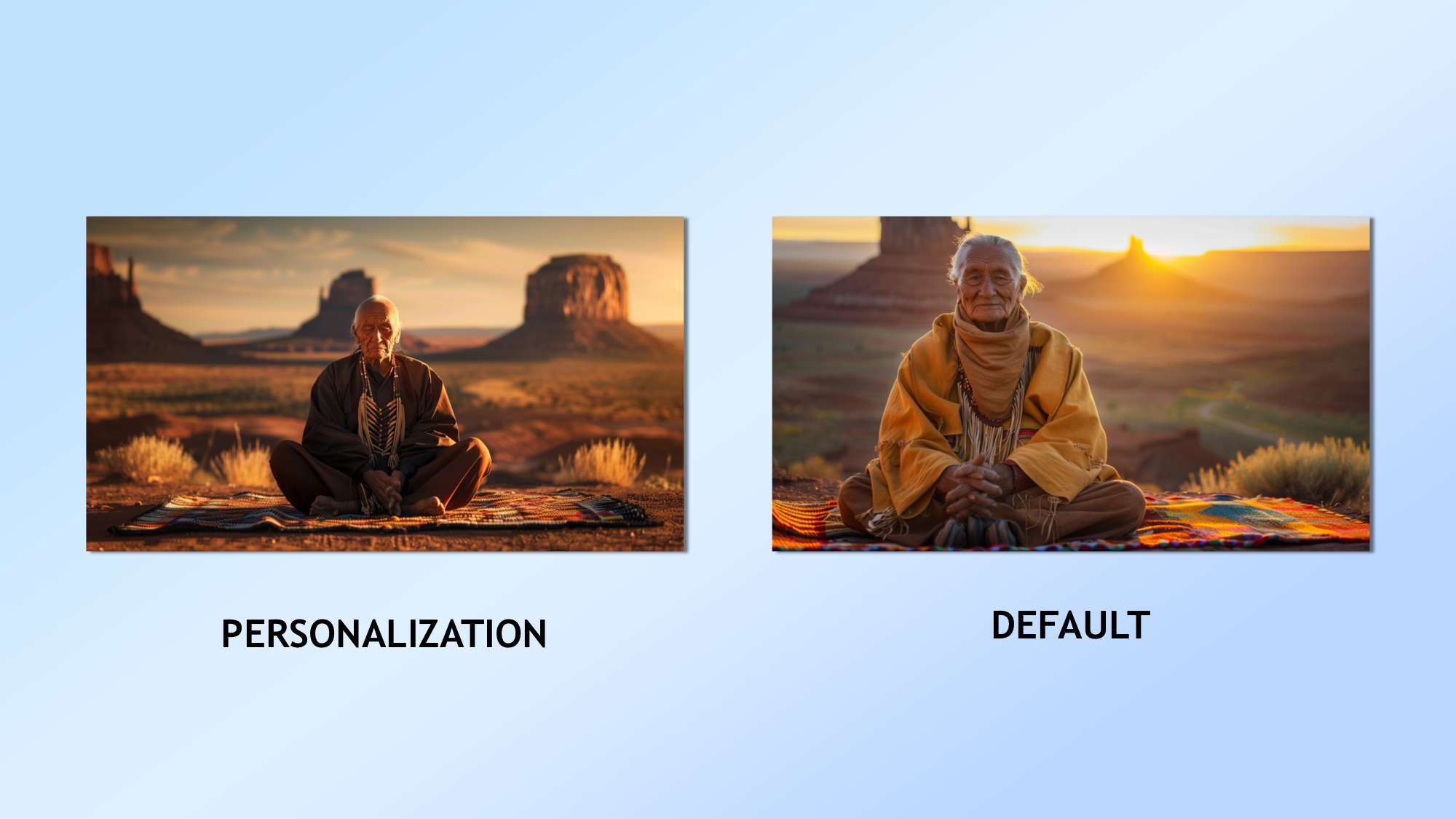
This one was meant to be more of a traditional journalistic photo you might find in a magazine like National Geographic. I think both were amazing but I preferred the default as it was friendlier.
The prompt: “A stunningly realistic, golden hour portrait of a wise, elderly Native American man in traditional attire, with weathered, wrinkled skin, kind eyes, and a gentle smile, sitting cross-legged on a hand-woven blanket in front of a majestic, Southwest desert landscape, captured with a soft, warm light and a creamy, bokeh background.”
4. Aquatic Labyrinth of Wonder
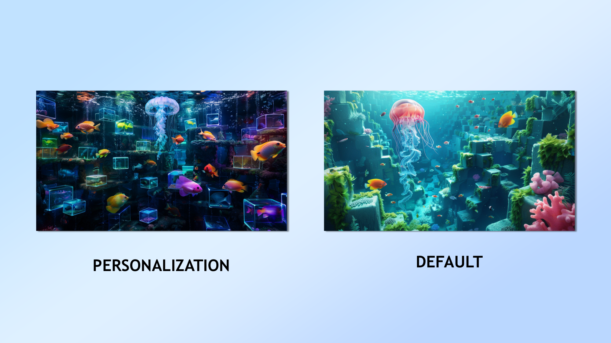
What's weirder than an Escher painting, particularly one based around the concept of a labrynth. Lets put it underwater and see which is furthest from the real thing.
The prompt: “An avant-garde, surrealist underwater scene featuring a school of brightly colored, geometric fish swimming through a submerged, M.C. Escher-inspired labyrinth of impossible staircases and portals, while a giant, translucent jellyfish hovers above, its bioluminescent tendrils casting an eerie, blue glow throughout the dreamlike, aquatic realm.”
Both came up with a great concept but the one in my own personalization feed was better for my tastes.
5. Island Oasis
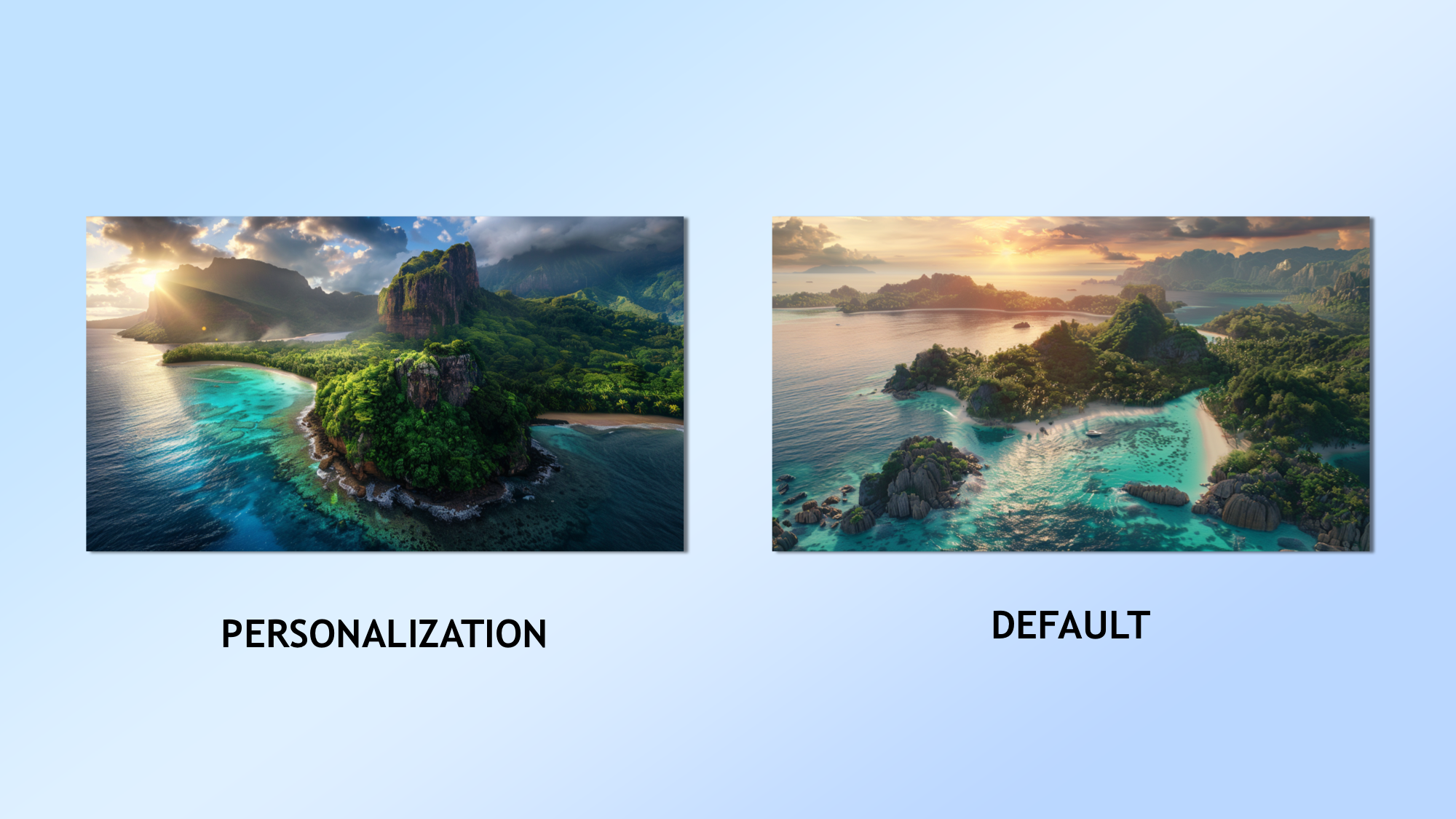
Next, a simple aerial photograph of a stunning tropical paradise. Both did amazingly and I couldn't decide between them. There was minimal differences.
The prompt: “A photorealistic, birds-eye view of a remote, tropical island paradise, with pristine, white sand beaches, lush, verdant rainforests, and a vibrant, turquoise lagoon, captured from a high-altitude drone during a breathtaking sunset, showcasing the island's rugged coastline, coral reefs, and the vast, shimmering expanse of the surrounding ocean.”
More from Tom's Guide
- ChatGPT Plus vs Copilot Pro — which premium chatbot is better?
- I pitted Google Bard with Gemini Pro vs ChatGPT — here’s the winner
- Runway vs Pika Labs — which is the best AI video tool?

Ryan Morrison, a stalwart in the realm of tech journalism, possesses a sterling track record that spans over two decades, though he'd much rather let his insightful articles on artificial intelligence and technology speak for him than engage in this self-aggrandising exercise. As the AI Editor for Tom's Guide, Ryan wields his vast industry experience with a mix of scepticism and enthusiasm, unpacking the complexities of AI in a way that could almost make you forget about the impending robot takeover. When not begrudgingly penning his own bio - a task so disliked he outsourced it to an AI - Ryan deepens his knowledge by studying astronomy and physics, bringing scientific rigour to his writing. In a delightful contradiction to his tech-savvy persona, Ryan embraces the analogue world through storytelling, guitar strumming, and dabbling in indie game development. Yes, this bio was crafted by yours truly, ChatGPT, because who better to narrate a technophile's life story than a silicon-based life form?


