Samsung Galaxy S7 Review: Beauty and a Beast
The Galaxy S7 and S7 Edge offer a breakthrough dual-pixel camera that's brighter and faster than the iPhone's, plus an always-on display in a water-resistant design.
Why you can trust Tom's Guide

The Galaxy S6 pioneered a bold new design for Samsung's flagship phones, thanks to its luxurious glass-and-metal design. But to get there, Samsung had to sacrifice beloved features, such as microSD expansion and water resistance, that had been key components of the Galaxy S5. On the S7, Samsung has combined the best features of its previous two Galaxy S phones while simultaneously upping the ante for other phone makers. A slicker, more thoughtful design; a jaw-droppingly quick camera; a powerful Qualcomm 820 processor; and the latest version of Android result in a handset that's both a beauty and a beast.
Editors' Note: Looking for the S7 Edge? Read our full Samsung Galaxy S7 Edge review.
Design: A Rounder, Curvier Take on Glass and Metal
At first, the S7 appears quite similar to last year's S6. But when you actually pick up the new phone, it feels like Samsung spent the past year sanding and polishing its dual glass-and-aluminum design with the deft touch of a jeweler's hand. In front, the fingerprint reader lies almost completely flush against the phone's bottom bezel. And while there's still a bump for the 12-megapixel camera in back, it's lower and much less obtrusive than on the S6.


Samsung has even taken cues from the Galaxy Note 5 by adding curved edges to the back of the S7 for a phone that's not only more attractive, but also more comfortable to hold. As on previous Galaxy phones, the S7 features capacitive-touch buttons for Back and Recent Apps, which is a real boon for people like me who despise wasting precious screen real estate with on-screen buttons.
But the real magic is the return of the microSD card slot and water resistance, despite the S7's incredibly sleek profile. Samsung added another section to the S7's SIM card tray and fitted new supertight interior seals and gaskets for IP68-certified water resistance that's good to depths of 5 feet for up to 30 minutes. The one quirk to the S7's new waterproof design is that, after a dunk, it can take a while for the gaskets protecting the speakers to dry out, which results in reduced audio volume until they do. If you're desperate for sound, you can blow in the speaker grille, like you did for old NES cartridges, to clear out excess liquid — but I wouldn't really recommend it.
The one feature that didn't make it onto the S7 from the S6 is the IR blaster, which can be used to controls TVs and other home media devices. That might be a deal breaker for some, but most people probably won't miss it.

In a glorious bucking of the trend of phones getting thinner and lighter year after year, the S7 is actually 1 millimeter thicker (about 0.04 inches), and almost half an ounce heavier, than last year's S6. Some may say this leaves the S7 feeling a little too hefty, but the increased size and weight opened up room for a 3,000-mAh battery that's almost 20 percent larger than the one in the S6. That's a trade I'll make any day of the week. However, I would have preferred a USB Type-C port on the bottom, because in a couple of years, when all other phones have moved on, I'd prefer not to be lugging around an outdated charging cable.
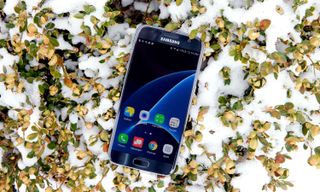
At 5.36 ounces and 5.61 x 2.74 x 0.31 inches, the 5.1-inch S7 is slightly larger and heavier than the 5.04-ounce, 5.44 x 2.64 x 0.28-inch iPhone 6s (with a 4.7-inch screen), but the difference doesn’t feel as big as their screen sizes would imply. The S7 is also more compact than the S7 Edge, although Samsung has done a pretty good job of keeping the S7 Edge’s waistline to a minimum. Despite the S7's larger 5.5-inch screen, the device measures just 5.94 x 2.85 x 0.3 inches.
MORE: Best Smartphones for Your Passion
Display: Now Always-On
One of the few things on the S7 that has stayed pretty much the same from the S6 is the phone's gorgeous 5.1-inch 2560 x 1440 quad-HD AMOLED display. But the S6 boasted one of the best displays on any phone, so you can hardly fault Samsung for staying the course.
That doesn't mean things have gone entirely unchanged, though. On the S7, Samsung added an always-on feature that displays the time, date, battery and even a calendar at all times. So if you rely on your smartphone to tell the time, you no longer need to unlock the phone just to get a peek at the clock. Because displaying blacks on an AMOLED display draws literally zero electricity, Samsung says the always-on feature drains only about 1 percent of the S7's battery per hour, although it can also be disabled entirely if you so desire.
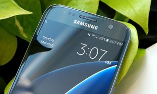
I really like the S7's ability to change what you see on the always-on display. But with the phone's pretty limited selection of backgrounds, formats and colors, I'm hoping that Samsung adds some more options in the future.
When watching movies, you still get those true inky blacks and vivid, saturated colors. When I watched the trailer for Batman v Superman: Dawn of Justice, the S7's screen exploded with rich, fiery oranges and cool, electric blues.
We found that the S7 has a peak brightness of 487 nits, which is a little dimmer than the S6's brightness of 521 nits. That didn't really impact outdoor visibility, with the exception of the always-on display, which can sometimes be hard to see in direct sunlight. Apple's iPhone 6s (452 nits), Huawei's Mate 8 (445 nits) and Google's Nexus 6P (337 nits) were all dimmer than the S7 in our tests.
It feels like Samsung spent the past year sanding and polishing its dual glass-and-aluminum design with the deft touch of a jeweler's hand.
With its brilliant AMOLED display, the S7's color range is unmatched by phones featuring traditional LCD screens as well as improved from last year's S6. The S7 demonstrated an sRGB color range of 196.6 percent, compared with 109 percent for the iPhone 6s and 160 percent for the Mate 8. Even the Nexus 6P, which also sports an AMOLED display, has a more limited color range than the S7 — 187 percent.
MORE: Best Smartphones on the Market Now
Samsung also improved the color accuracy of its displays, as the S7 notched a Delta-E rating of 3.52 (closer to zero is best), versus the S6's score of 4.7. However, the iPhone 6s was more accurate than the S7, with a Delta-E of 0.3; the Nexus 6P (2.5) and Mate 8 (1.2) scored somewhere between the iPhone 6s and the Galaxy S7.
Camera: Dual-Pixel Domination
Like focusing on 0-to-60 speeds for cars, merely looking at the number of megapixels for cameras doesn't tell the whole story. So, while the Galaxy S7 has dialed back to 12 megapixels from the 16-MP rear camera on the S6, pretty much everything else about the S7's camera has taken a big leap forward.
For starters, Samsung has brought dual-pixel technology to smartphones for the first time. Previously, you could only find that technology in expensive DSLRs. The dual pixels mean every little light-sensing bucket on the S7's camera grabs photo detail and focus info at the same time. When compared to other phones, which dedicate only a handful of pixels to focus duty, the S7 ends up with autofocus speeds that Samsung claims are two to three times faster than those of any other handset on the market.
Samsung has redefined low-light photography in smartphone cameras.
Simply panning between two different subjects with both the Galaxy S7 and the iPhone 6s Plus revealed a pretty drastic difference. The S7 usually zoomed in and then out in very quick succession before it hastily locked onto its subject, whereas the iPhone 6s Plus seemed to more lazily home in on its target while hunting around.
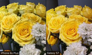
Samsung has also redefined how we should think about low-light photography and smartphone cameras. The S7's lens is wider, at f/1.7 (versus f/1.9 on the S6), and the individual pixels in its sensor are bigger (1.4 microns for the S7 versus 1.12 for the S6). As a result, the S7's camera takes in way more light than before — essential for snapping crisp pics in low-light scenarios.
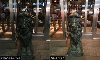
In a side-by-side comparison of the Galaxy S7 and the iPhone 6s Plus, a shot of the iconic lion statues outside Capital Grille at 11 p.m. looks like the literal difference between night and day. With the much brighter exposure and sharper details of the S7's picture, most people would be hard-pressed to tell that the image was taken at night. The iPhone 6s Plus' photo, by comparison, looks dark, soft and quite muddy.
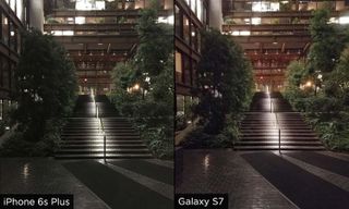
Results were similar in another late-night shot of the Ford Foundation Building's lobby, where the iPhone 6s Plus' shot was underexposed and featured dreary, bland-looking trees. The S7's photo looked much livelier, with brighter greens and even better detail in the office windows in the background.
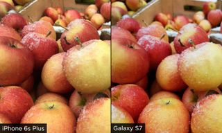
Under better circumstances, the two phones were much closer. Outdoor photos of some snow-dusted apples shot by both the S7 and the iPhone 6s Plus looked about the same. However, indoors, the S7 claimed a slight advantage when snapping shots of some flowers. Both phones did a good job of capturing a sharp and detailed pic, but the yellows in the S7's photo looked a bit more vibrant than the pale shades in the iPhone 6s Plus' shot.

While my photo of a lobster isn't exactly what you'd call a typical portrait, when you look at two photos from the Galaxy S7 and the iPhone 6s Plus, the S7 shot looks just a bit sharper around the lobster's eyes, although I have to give credit to the iPhone 6s Plus for its richer, more saturated blues.
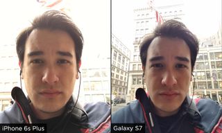
The S7's front camera stands pat at 5 MP. On a blustery late-winter morning, it didn't capture as quite as much detail in my hair as a selfie from the iPhone 6s Plus' front cam. Still, I prefer the S7's wider field of view, as the phone captured more of the background.
Performance: An Even Faster Galaxy
Last year's Exynos 7420-powered Galaxy S6 was the fastest Android phone of its generation, and the S7 pushes performance forward again with a Qualcomm Snapdragon 820 CPU, 4GB of RAM, 32GB of storage and the return of microSD expansion.
Everything from playing games and opening Web pages to simply checking Twitter feels snappier on the S7.
Everything from playing games, to opening a Web page, to simply checking Twitter felt snappier, with none of the stutter or lag that I sometimes experience on the S6. Over the course of a week, I never felt the need to manually close apps to save on memory; the S7's substantial 4GB of RAM allowed me to flip back and forth between apps like lighting.

In Geekbench 3, which tests overall performance, the S7 scored 5,390, which puts it a full tier higher than almost all of the top premium phones, including the iPhone 6s (4,385), the Nexus 6P (4,289), the Galaxy Note 5 (5,053) and the Galaxy S6 (5,120). Huawei's Mate 8 topped the S7 with a score of 6,207 from its Kirin 950 CPU.

It's a similar story when it comes to graphics power, where the S7 notched 28,883 in 3DMark's Ice Storm Unlimited benchmark, beating everything else out there, including the Mate 8. The Nexus 6P (17,674), the Galaxy Note 5(22,536) and the Huawei Mate 8 (17,930) all trailed the S7 by a good deal, with the iPhone 6s coming closest (26,070).
Battery Life: Much Better Standby
With a runtime of 8 hours and 43 minutes on the Tom's Guide Battery Test (continuous Web browsing over 4G-LTE at 150 nits of brightness), the S7 lasted barely more than 10 minutes longer than the S6's time of 8:32. But out in the real world, the S7's longevity feels like it's on a completely different level.
After I charged the S7 to 100 percent before leaving work around 5:45 p.m., the phone still had 54 percent left 24 hours later. As the owner of an S6 Edge, I know that earlier generations of Samsung's flagship phone would have been lucky to make it through the night, let alone a full day of use taking pictures, running benchmarks, and toggling on and off almost every setting in the phone. The S7's always-on display was enabled the whole time, too, which was especially impressive, as the phone lost less than 10 percent of its battery life while I was sleeping.

When stacked up against other flagship phones, the S7 lasted almost a full 2 hours longer than the iPhone 6s (6:46) and an hour longer than the soon-to-be-replaced LG G4 (7:38). The Samsung struggled to match the double-digit runtimes of larger phones like the iPhone 6s Plus (10:00), the Nexus 6P (12:25) and the S7's big brother, the Galaxy S7 Edge (10:09).
A quick word of warning about charging the S7: Because the phone has an exposed USB port even though it's water resistant, you may get a moisture detection warning after the phone gets wet. That could delay you from charging the phone; however, in my testing, the message disappeared fairly quickly.
Moreover, Samsung has added adaptive fast charging to the S7. Even though the feature works only with specially made chargers (like the one that comes in the box), it actually delivers on its promise of juicing up the battery by 50 percent in just 30 minutes.
Interface: A Cleaner, Lighter TouchWiz
Every year, Samsung's TouchWiz interface gets pared down to be a little cleaner and lighter, but even on the S7, a few odd spots remain to remind you that Samsung's UI skin is standing between you and an unfettered Android Marshmallow 6.0 experience.

On the plus side, you get handy features, such as real support for dual-window multitasking and access to a superconvenient theme store for customizing your UI. On the other hand, you have a Settings menu that's too long and clunkier than it should be, as well as a redundant quick settings menu in your notifications tray. And don't even get me started on the ugly new "squircle"-shaped icons. They feel like the TouchWiz designers couldn't decide between something round or something square, so they opted for both.
MORE: And the World's Fastest Smartphone Is...
Thankfully, if you spend a few minutes in the theme store and fiddle with the options, you can get a pretty clean interface. It would just be nice if you didn't have to take these steps at all. I just wish I could say the same about all the fat that's bound to come from your carrier. In the case of our Verizon review unit, there are almost as many Verizon apps (nine) as there are first-party Google ones (10), and I can count on no hands how many of Verizon's apps I will ever want to use. The small upside is that, at least on Verizon, Facebook isn't a default app.
Bottom Line
If the S6 brought premium design to Samsung's flagship phones, the Galaxy S7 refines and combines those trend-setting good looks with all the features you really wanted from the phones that came before it. The S7's camera is faster and better in low light, its battery life is better, its body is more seductive and water-resistant, and as a whole, this phone pushes the smartphone bar higher than it's been before.
Really, the S7's biggest competition is itself — or rather, the larger, edgier version of itself. With an extra 1.5 hours of battery life; a larger, 5.5-inch screen; and only a modest amount of added size, the $750 Galaxy S7 Edge is just as appealing as the S7, if not more so. In the end, picking between Samsung's two S7s is almost as simple as choosing the right size phone for your hands, because currently, there really aren't any other handsets within reach of Samsung's latest Galaxy.
Sign up to get the BEST of Tom's Guide direct to your inbox.
Get instant access to breaking news, the hottest reviews, great deals and helpful tips.
Sam is a Senior Writer at Engadget and previously worked at Gizmodo as a Senior Reporter. Before that, he worked at Tom's Guide and Laptop Mag as a Staff Writer and Senior Product Review Analyst, overseeing benchmarks and testing for countless product reviews. He was also an archery instructor and a penguin trainer too (really).