Tom's Guide Verdict
An intuitive interface, an always-on color screen and long battery life make the Pebble Time a smartwatch worth your time.
Pros
- +
Always-on display
- +
Long battery life
- +
Comfortable band
- +
Attractive, simple UI
Cons
- -
Most notifications are too skimpy
- -
No way to reply to email from watch
- -
Can't do much with microphone
Why you can trust Tom's Guide
Back in 2012, when the Apple Watch and Google's popular Android Wear platform weren't even on the radar, startup Pebble built the first credible smartwatch hardware and OS. Fast forward to 2015, and the company's original, gray-scale Pebble Watch is still available but feels outdated when compared to full-color competitors powered by other platforms. Enter the Pebble Time, a wrist companion with a color e-paper screen, a built-in microphone and a new timeline-centered UI. While the watch's current software and apps offer less functionality than we'd like, the Time's simple interface, long battery life, always-on display and comfy design make it a very compelling option.
Editor's Note (12/7/16): After being acquired by Fitbit, Pebble is discontinuing its entire product line, and is no longer selling or supporting its smartwatches. As such, we cannot recommend purchasing any Pebble.
Design
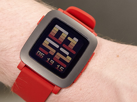
The Pebble Time has a bright, plasticky design that's aesthetically polarizing but comfortable to wear. The rectangular polycarbonate body is available in several colors: red, white, and black with color-coordinated silicone bands. No matter what color you choose, the bezel is a dark-gray, matte color but is made of stainless steel.

In lieu of a touch screen, three physical buttons — for up, down and select — adorn the right side, while a fourth — for back — sits on the upper-left side. A couple of small metal receptors sit on the back and connect to the included USB charging cable, which is not compatible with earlier Pebble cables.
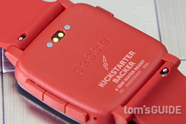
I really liked the bright-red body and band on our review unit, because its vibrant aesthetic reminded me of a candy-colored Swatch watch. However, most people who saw the Time on my wrist said it looked like a child's toy. Shoppers who want a more conservative look should probably opt for the black color or wait for the more-expensive Pebble Steel, which is metal and comes with a metal or leather band.
MORE: Pebble Steel Review
The Time's silicone band is the most comfortable and easy to adjust of the bands we've tested. For some reason, most competitors use awkward clasps that require a lot of force to close and a delicate touch to resize. The band on the Asus ZenWatch was so bad that it kept popping open and sliding down my wrist. However, the Pebble's band has a simple metal buckle that's very easy to close and adjust, and the soft material feels very gentle against the skin.
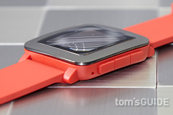
You can change out the default band with any 22-mm replacement. Pebble is also working with a number of third-party developers on "SmartStraps," bands that will offer additional features like Wi-Fi, GPS, NFC or a backup battery.
The watch's relatively small rectangular body measures just 1.6 x 1.5 x 0.37 inches, which is narrow enough not to overwhelm a smaller wrist. Both of the Apple Watch sizes (1.5 x 1.3 x 0.41 inches and 1.7 x 1.4 x 0.41 inches) are within a tenth of an inch of the Pebble's size, while the rounded LG Watch Urbane, our favorite Android Wear device, is noticeably larger (2.0 x 1.7 x 0.43 inches). At just 1.5 ounces, the Time feels really light on the wrist — a far cry from the Urbane (2.3 ounces) and even svelter than the 1.8-ounce Apple Watch.
Durability
Pebble says its new watch is water-resistant for up to 30 meters (about 100 feet) and can operate in extreme heat and cold (14 to 140 degrees Fahrenheit, or minus 10 to 60 degrees Celsius). Although I didn't take it swimming, the watch had no issues when I wore it in the rain a couple of times.
Display
The Pebble Time sports a 1.25-inch color, e-paper display — an upgrade over the original Pebble's gray-scale screen. Because e-paper uses electricity only when the image changes, the Pebble screen can stay on 24/7 without gobbling up battery capacity. All of the other major smartwatches on the market use LED screens that either turn off entirely or go into a dim mode (with only a limited version of the face showing) when the watch is not in active use.
With the Pebble Time, you can peer at your wrist at any time and see either the face or the most recent notification. At one point, I had the ESPN app open on my wrist, and it showed me the score of the Yankees game as I walked around. An Android Wear watch would have gone to sleep after a few seconds of inactivity.
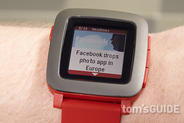
Capable of displaying only 64 colors at 144 x 168 resolution, the Time's screen doesn't have the rich, vibrant palette of colors of an LED display, but it's easy to see in sunlight. In a dark room, I had a little difficulty reading small text, but shaking my wrist or hitting a button to turn on the backlight solved the problem.
Overall, the e-paper display reminded me of a Kindle or Nook screen with pleasant dashes of color here and there. I particularly enjoyed the modern-art look of the Mondrian watch face, with its blue and red squares. Facebook alerts had a blue bar at the top of the screen, while Gmail alerts had a red one, making it visually easier to tell where a notification was coming from.

However, I wouldn't recommend using the watch for photo viewing. Articles in the News Headlines app had grainy, dithered images in them.
Perhaps the most frustrating thing about the screen is that it doesn't support touch input. I kept forgetting this limitation and trying to swipe or tap on the display anyway. On the other hand, touching the screen leaves fingerprints.
Phone App and Setup
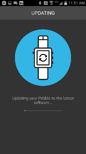
Setting up the Pebble Time is a breeze. You can pair the watch with either an iPhone or an Android handset, both of which have native apps. After installing the Android app on my phone, a Galaxy Note 3, I turned on the Time and was prompted to pair the two devices via Bluetooth. After the pairing, the watch ran a firmware update, which took a couple of minutes and asked me a couple of questions — and I was good to go.
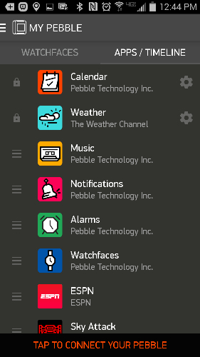
The Pebble Time app for Android provides a lot of important functionality, letting you configure notifications, choose which music service you use, and add or remove watch faces and third-party apps. You can also change the order in which the apps appear on the watch and change custom settings, like the colors of a face or whether the weather app shows the temperature in Celsius or Fahrenheit. The iOS version of the app promises similar functionality, but at present, iPhone users cannot reply to messages or use the built-in microphone on the watch.
User Interface
Pebble has completely revamped the interface on its proprietary operating system to make it focus on a timeline view of your day. Hitting the "up" button from the watch face takes you back up the timeline to previous days or past events, and hitting the "down" button scrolls it down to future events. You can also open events to see more information on them. The interface can display more than just your calendar, as third-party apps add entries such as baseball games and weather forecasts.
However, the timeline has nothing to do with some of the watch's most important capabilities. You won't find notifications there, nor a way to control your music, nor, as far as I could see, any activity data. Perhaps apps will add some of these functions to the timeline, but notifications just don't belong there. Even if you could, would you really want to scroll through a timeline littered with time stamps for every email that came in?
Despite Pebble's marketing focus on the timeline, as a user, you can easily avoid it and focus on apps and notifications. By hitting the center button from the watch face, you get transported to a scrollable list of apps, with one icon on each screen as you move up and down. The app list contains any third party apps you've installed, along with Pebble's built-in apps for weather, music, notifications, alarms and watch faces. You can also assign shortcuts to the up and down buttons so that, when you long-press them, you get transported directly to the apps of your choice.
MORE: Apple Watch vs. Pebble Time Steel: What Should You Wear?
The Pebble OS doesn't have the modern material design of Android Wear or the sleek looks of Apple's watchOS, but it has some amusing icons and animations scattered throughout its interface. For example, when you switch back and forth from apps and the face, the screen appears to fold into itself. When you send a text message or email, a paper airplane appears; and when you delete a notification, you see a paper rolling through a shredder.
Faces
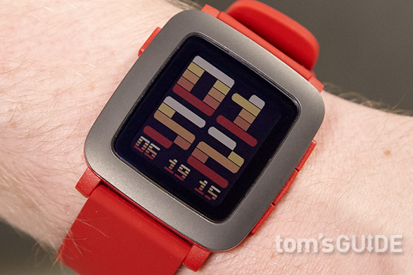
The Pebble Time comes with several preloaded watch faces and the ability to download more from an extensive library of hundreds of watch faces. While you can still download monochrome faces that were designed for the original Pebble, the store already has more than 500 color faces to choose from. With that many choices, you can change the look of your watch every day, just to keep your wrist looking fresh.
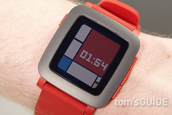
After experimenting with several options, I particularly liked the Mondrian face, because of its colorful cubist aesthetic, and the 91 Dub face, which looks like a Casio sport watch face but lets you customize its color scheme. Some faces show the current weather, and some, such as Path Time, have animations on them. But I wish there were a face that showed your count of unread emails, the subject line of your most recent message or your next appointment.
Notification Handling
The Pebble Time handles notifications much better than Android Wear, but its email handling leaves room for improvement. Using the bundled Pebble app on my Android handset (there's also an iPhone app), I looked through a list of all my installed phone apps and checked off those I wanted to send alerts to my phone: Facebook, Gmail and the built-in Samsung email client that I use for my work account.
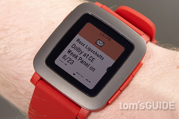
Each time a new email or Facebook alert occurred on my phone, the Pebble Time vibrated and showed a notification on-screen. Incoming calls and text messages also generated alerts. Unlike Android Wear watches, which revert back to their watch faces and go to sleep after a few seconds of inactivity in most situations, the Time keeps the latest notification on-screen until you either do something on the watch or a new alert arrives. That's a huge plus for users who may be in the middle of an activity such as driving and aren't able to look down at their wrists right away. An ordered archive of all the notifications you've received is available in the Notifications app on the watch, so you can revisit anything you didn't act on right away.
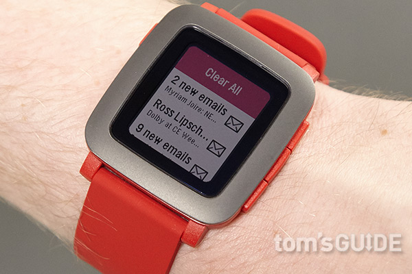
Sadly, many of the notifications don't show enough information to help you decide whether you need to act on them right away or ignore them. Although text-message alerts show the whole body and Gmail alerts show several paragraphs of body text, the non-Gmail email alerts usually show only a mishmash of several subject lines or senders on top of one another. This problem may be partly the fault of the email phone app itself because it doesn't share enough text in its notifications; Android Wear has similar limitations with non-Gmail email clients, though some third-party apps promise to fix this.
As with Android Wear, the flood of notifications can become annoying because Pebble doesn't provide a way to filter message alerts by subject matter or sender, giving a spam message the same buzz as an urgent missive from the boss. One possibility is to use an email client such as Nine Exchange Mail that will send notifications only when you receive a message from designated "VIPs."
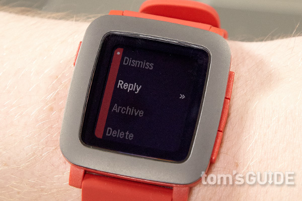
While viewing a notification, you can hit the Select button to see a list of available actions you can take, and these vary based on the type of alert you receive. All notifications give you the option to dismiss them, but Gmail and SMS text-message alerts allow you to send a reply from the watch, by using either a canned response or the built-in microphone for text-to-speech. Unfortunately, non-Gmail email alerts do not offer this functionality, and iOS users will have to wait for a future firmware update to use it. Also, you cannot reply to messages from the archive, so if you don't act on one right away, you'll need to reach for your phone.
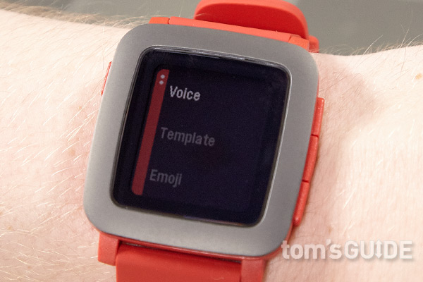
When I got a Gmail message asking me if I was free for lunch, I composed a two-sentence reply with my voice and hit the Select button to confirm and send it. Text messages offer the same voice and canned response options, along with the ability to send emoji. Android Wear offers the same functionality but starts sending your message as soon as you're done talking, without asking for confirmation (although you can hit Cancel, if you're fast enough). Considering that all voice-recognition software makes mistakes, I appreciated having the ability to approve my replies before they went out.
Microphone
The Pebble Time is the first Pebble watch to come with a built-in microphone. However, there's not much you can do with it right now, and iOS users can't use the microphone at all. On Android, you can reply to Gmail messages or SMS messages by dictating a response. Though it's not perfect, the software accurately recognized most of my words and didn't need to spend a long time processing or hitting the cloud to do it.
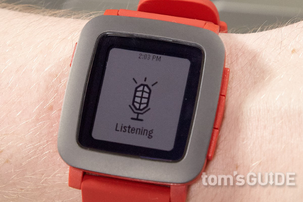
Pebble says that future software updates will allow iOS users to send voice responses to messages and empower third-party apps to use the microphone. However, I found one third-party app that uses the microphone today. The app, called OK Pebble, allows you to send queries to Google using your voice. However, these messages are sent to and interpreted by your phone as text, which means that your handset doesn't talk back to you. When I asked, "Who is the president of the United States?" my phone pulled up a set of search results, along with a knowledge graph card that had my answer. However, when I asked the same query aloud into my phone, it read back an audio answer.
Music
The Time comes with a very basic music controller that lets you skip forward or back a track and play/pause audio apps on your phone. The Pebble phone app lets you select which player you wish to control but offers no other options. I used the Pebble music app when listening to some songs on Rhapsody, which was useful when the phone was in my pocket. However, I wish I could select specific songs or playlists rather than just hitting forward and back. The Pebble store has a couple of third-party players that let you select a Spotify playlist or vote songs up and down in Pandora.

Activity Tracking
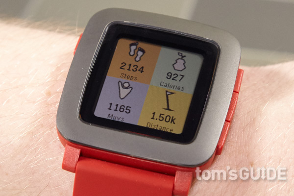
The Pebble Time has a built-in accelerometer that allows it to track your steps but doesn't come with any fitness apps preloaded. I installed LetsMuv, a simple app that keeps your step count, reminds you to stand up a few times a day and tracks your sleep. However, the Pebble appstore has a slew of alternatives, including PlexFit, which syncs with Google Fitness. Unfortunately, you can have only one fitness app at a time and must configure, in the Settings menu, which one gets access to the accelerometer.
Third-Party Apps
Pebble already has more than 7,000 third-party apps and watch faces available in its app store, which you access from the phone app. Though the Time started shipping only recently, the store already has hundreds of apps and watch faces that run in color and many that can integrate with the timeline interface. Some of these are useful, some are entertaining and others are just plain mediocre. Many require you to install accompanying Android apps on your phone, but others operate exclusively on the Pebble Time.
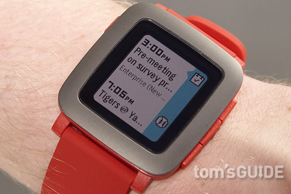
The ESPN app allowed me to add the Yankees to my timeline so that all of their games appeared on my schedule. While the games were in session, I could see an updated score and set the app to alert me at every score change, though that feature did not work the several times I tried it.
There are many color games that you can play by using the buttons. I enjoyed Sky Attack, which is like a 3D version of Space Invaders, where you control a tank and shoot up at attacking spaceships. There are a few newsfeed apps that provide headlines and RSS reading, but I found only one, appropriately called News Headlines, that has color photos.
In addition to several music players that control audio services on your phone, the Pebble appstore has dozens of other apps that remotely control a wide variety of products, including Netflix, Nest, Philips Hue lights and LG TVs. The watch doesn't have an IR port, so all of these commands go through your phone. There are even a couple of apps that control the camera on your handset and let you take pictures remotely.
Unfortunately, there are no native apps for Facebook, Twitter or browsing through your email inbox, though you can browse through notifications you've received from any of these services. A utility called Pebble Rocker promises to let you see a Facebook newsfeed on your watch, but it would not connect when I tried it.
Battery Life
Pebble claims that the Time can last up to seven days on a charge. Although the wrist piece didn't quite live up to that claim, it lasted through a still-solid three days in my tests, going from a 100 percent charge at noon on Monday to a 10-percent capacity by Thursday morning. That's still significantly better than Android Wear watches, most of which last about a day. iPhone users may see better endurance than I did with my Samsung Galaxy Note 3, because the watch establishes a power-efficient Bluetooth Low Energy connection with Apple devices but uses standard Bluetooth with Android handsets.
Bottom Line
The Pebble Time isn't a perfect smartwatch, but it's the most practical wrist companion for Android users who want to stay organized, thanks to its long battery life, always-on display, simple UI and strong app ecosystem. While we wish notifications were more detailed and provided more ways to respond, they are easier to navigate and read than on Google's watch platform. The timeline UI is useful for people with busy schedules (but not as much for people who have one or two appointments a day). Perhaps most important, of all the smartwatches we've tested, the Pebble Time is the best at being a watch; the time is always clearly visible, and it has so many great faces to choose from.
People who want a more immersive watch experience should consider Android Wear watches, such as the LG Urbane and the Asus ZenWatch. Those watches have better screens and a lot more functionality, including Google Now and GPS, but they have shorter battery life, screens that go dim or off and a UI that makes it difficult to navigate through your alerts. iPhone users can get a powerful UI, plenty of apps, voice calling and Siri from the Apple Watch, but that device starts at $349. However, if you want a watch that helps you avoid whipping out your phone, the Pebble Time should be at the top of your list.
- Our Favorite Smartwatches for iOS and Android
- The Best Android Apps to Try Today
- Smartwatch Buying Guide: Everything You Need to Know
Follow Avram Piltch @Geekinchief and on Google+. Follow us @TomsGuide, on Facebook and on Google+.
